


We’ve seen a lot of company signs in our time—great ones, weird ones, and a fair few that made us do a double-take (not always in a good way). Good signage can completely transform a space, but if it's done poorly, it can just as easily confuse customers or go unnoticed altogether.
Here are a few of the most common business signage mistakes we’ve come across, and some easy ways to fix them.
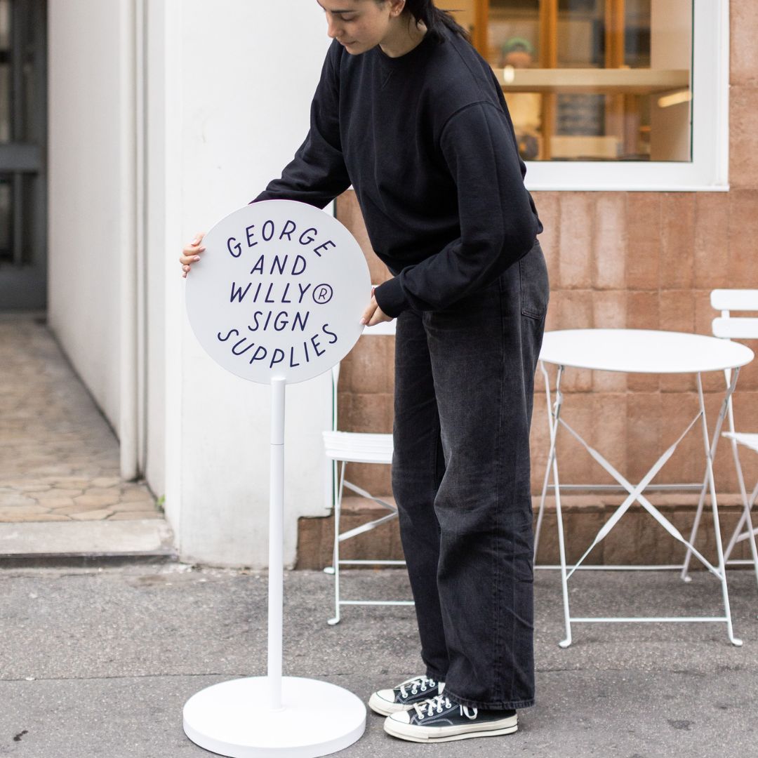
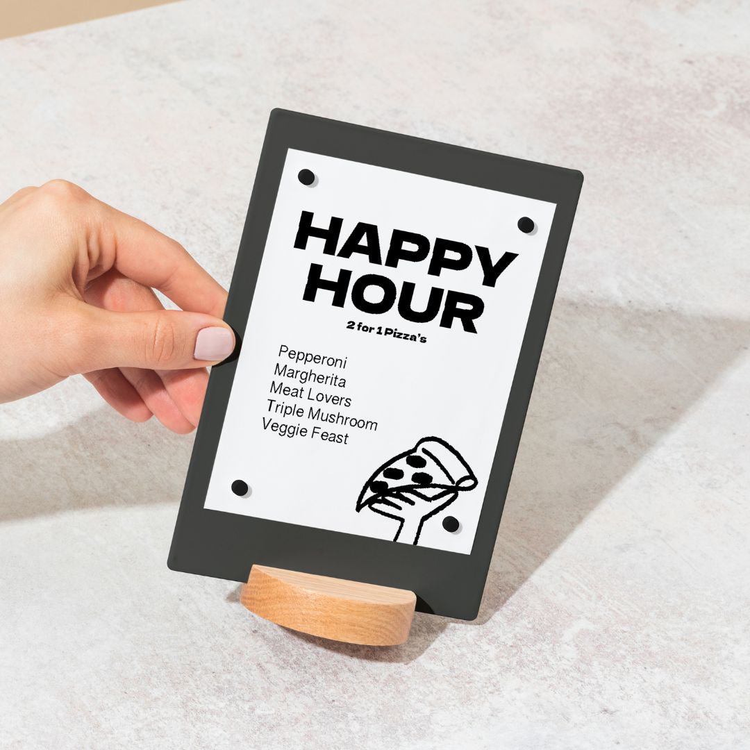
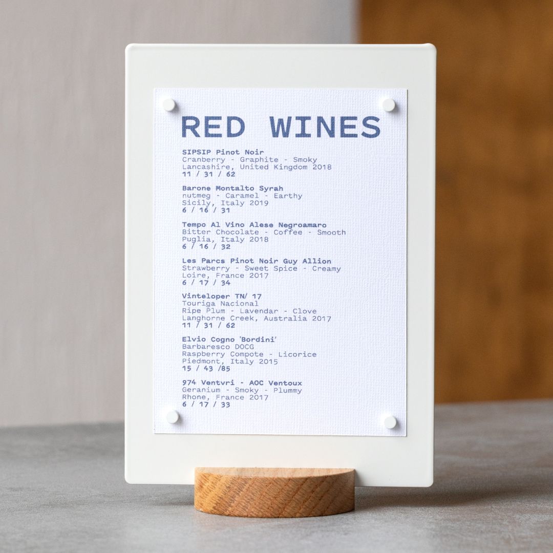
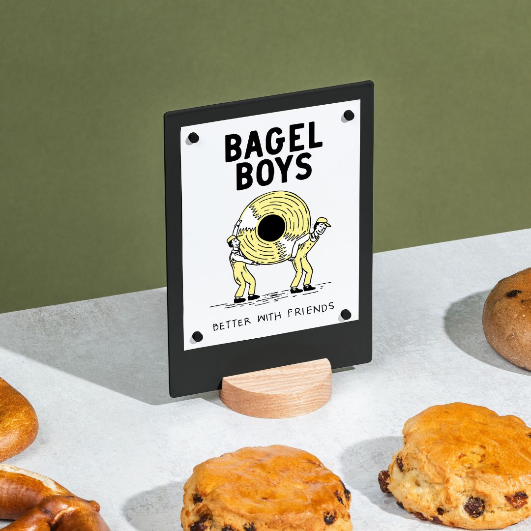
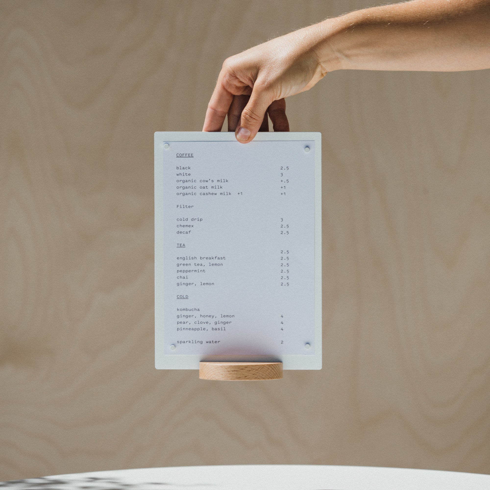
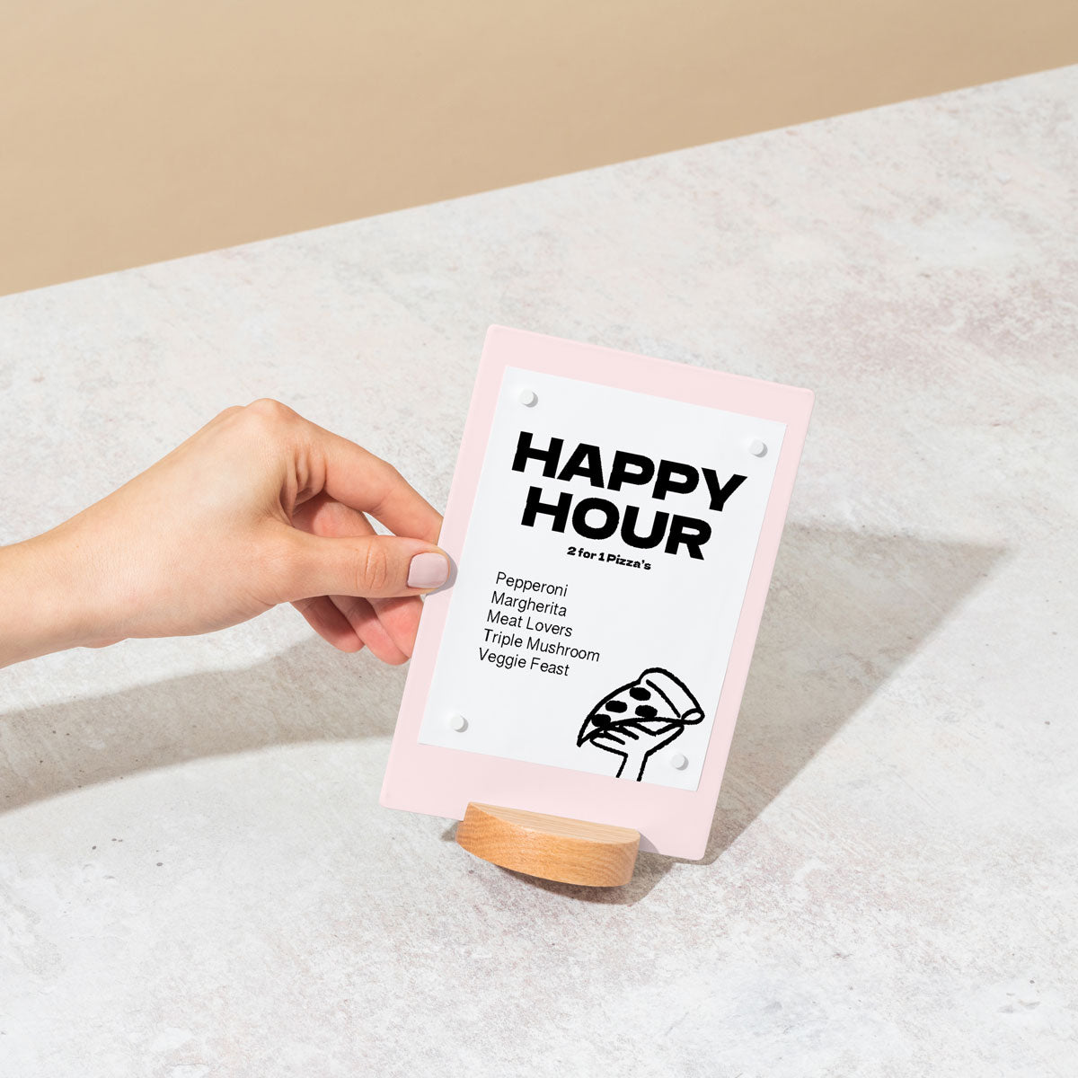
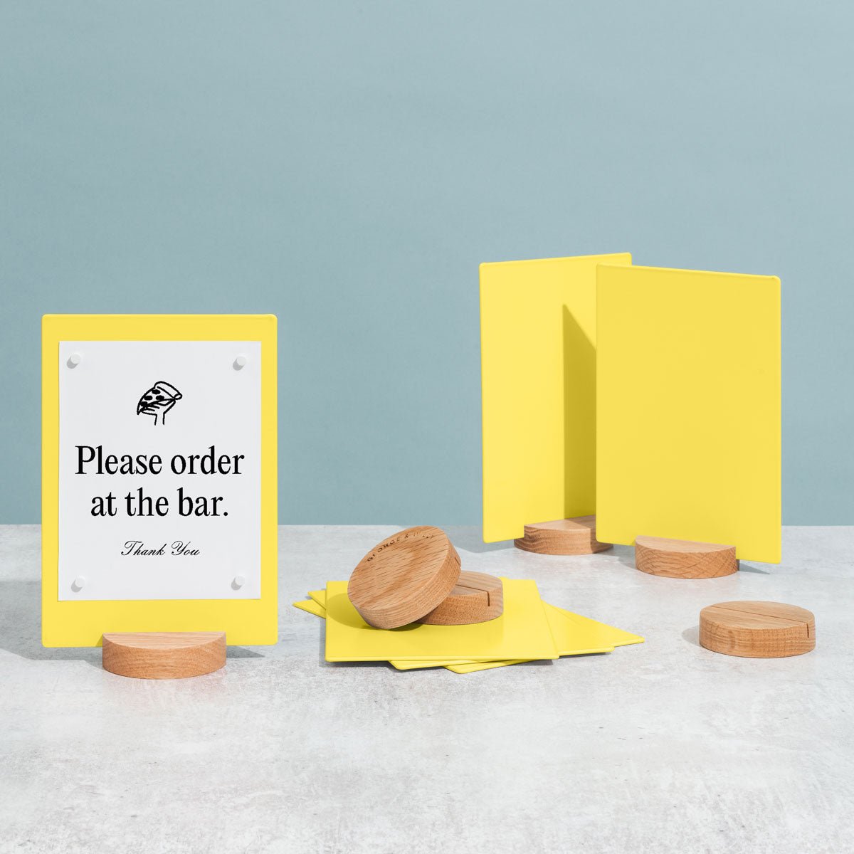
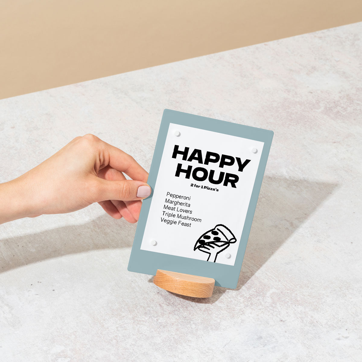
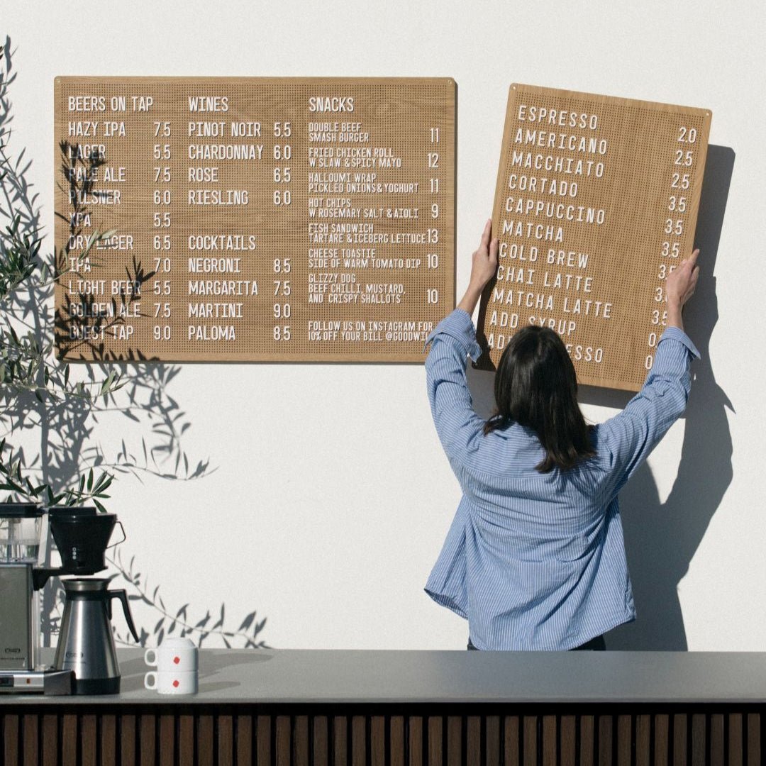
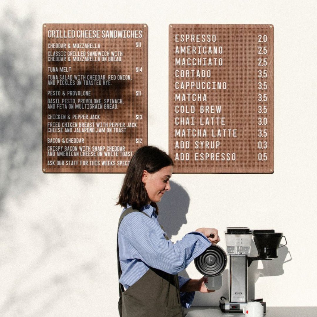
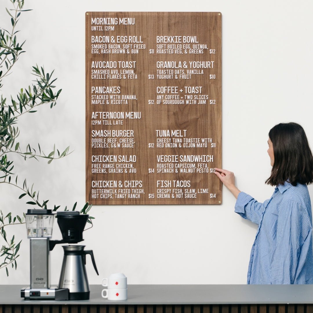
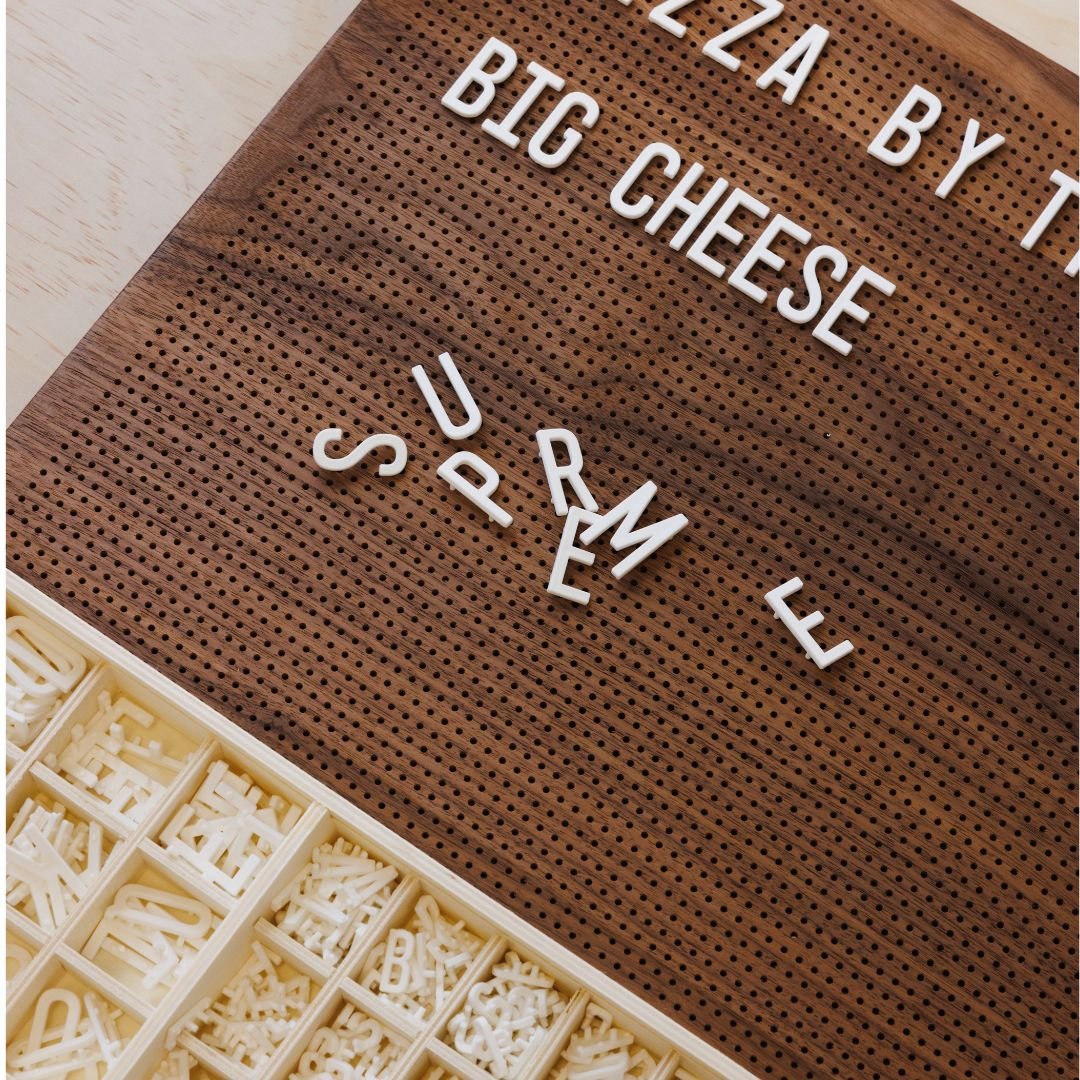
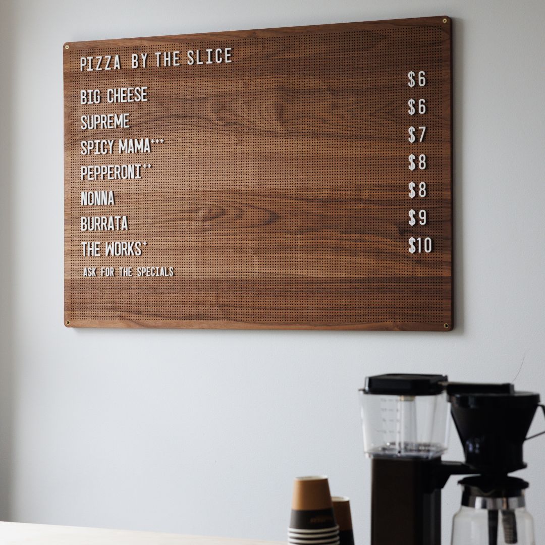
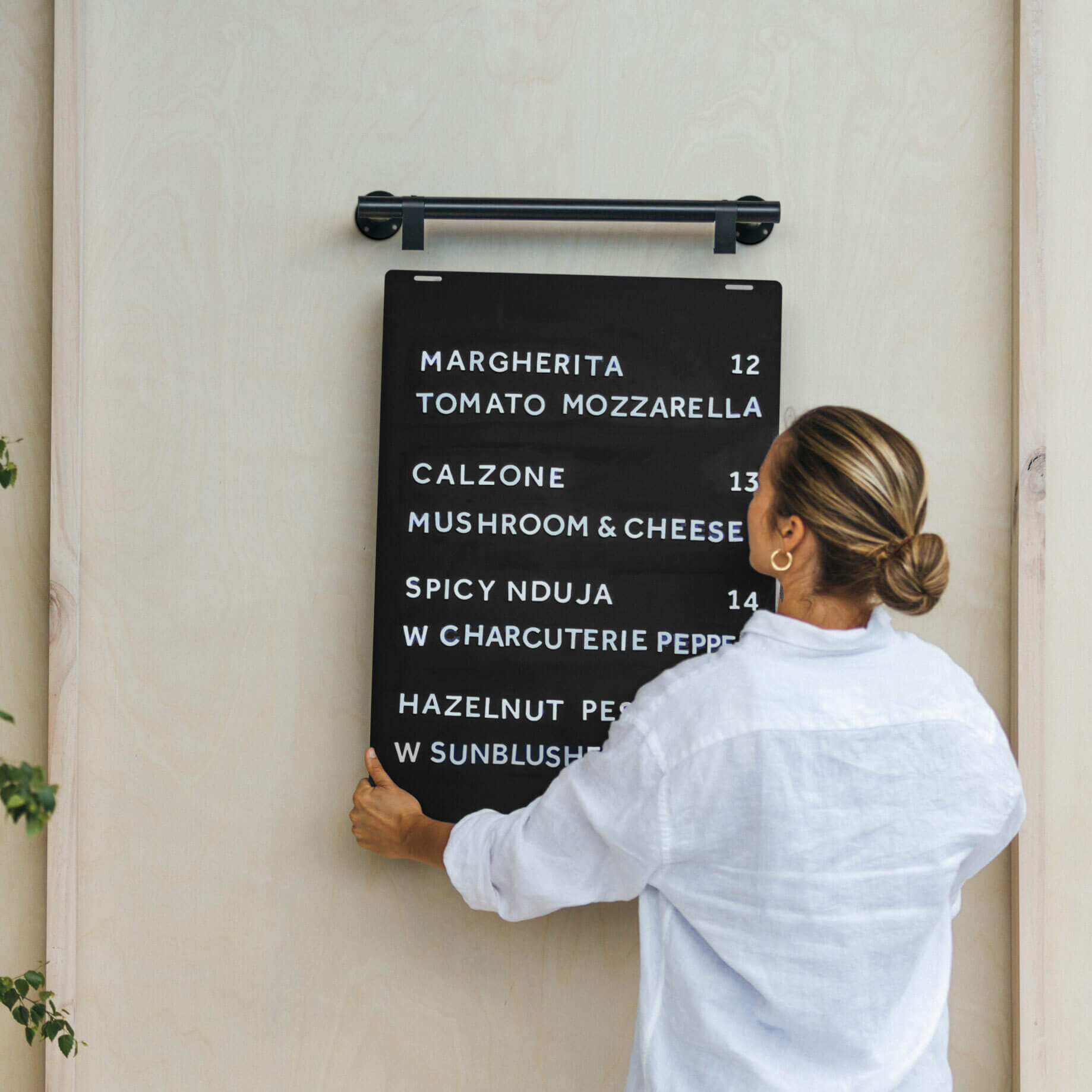
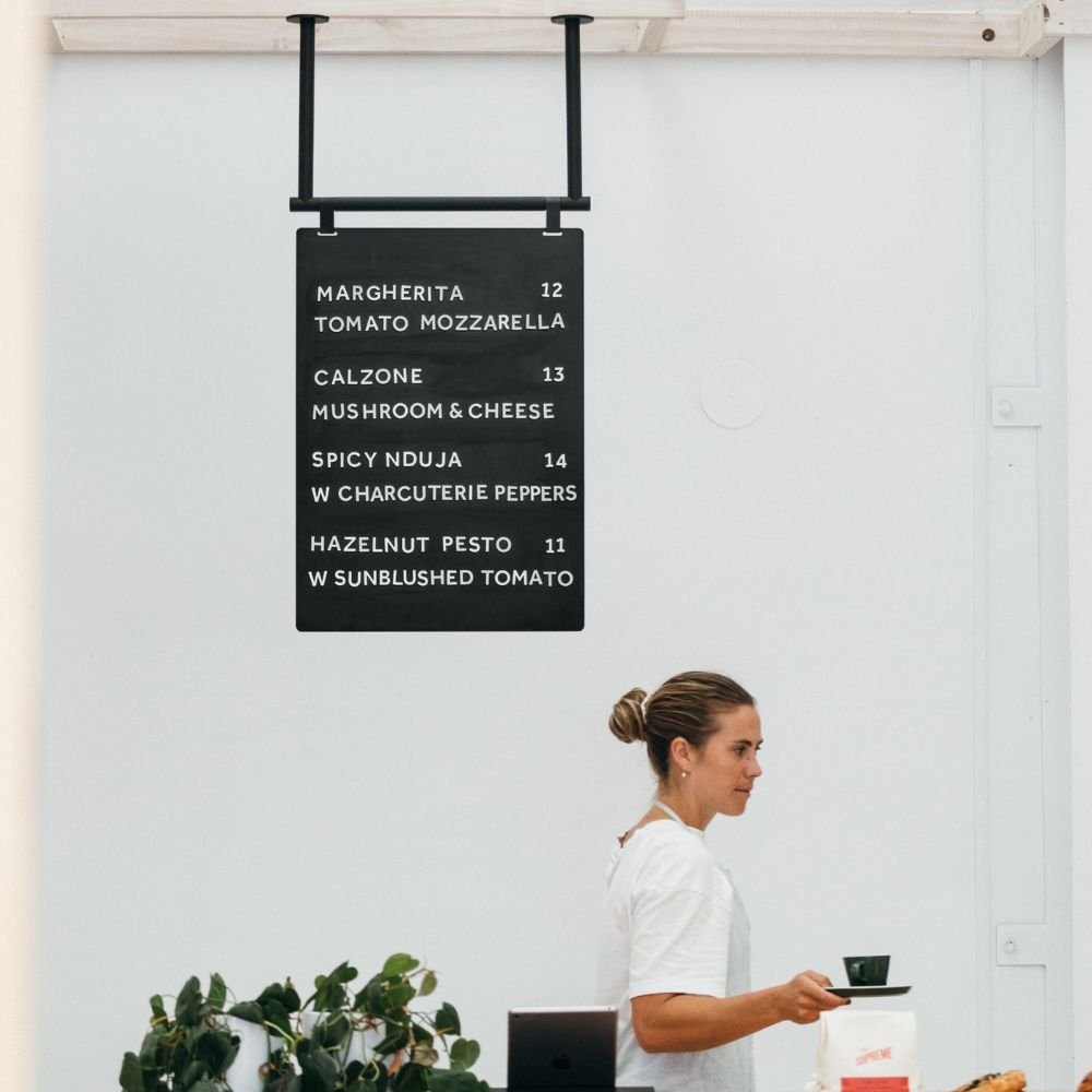
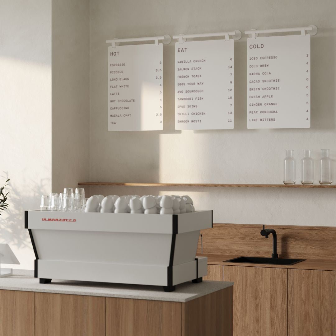
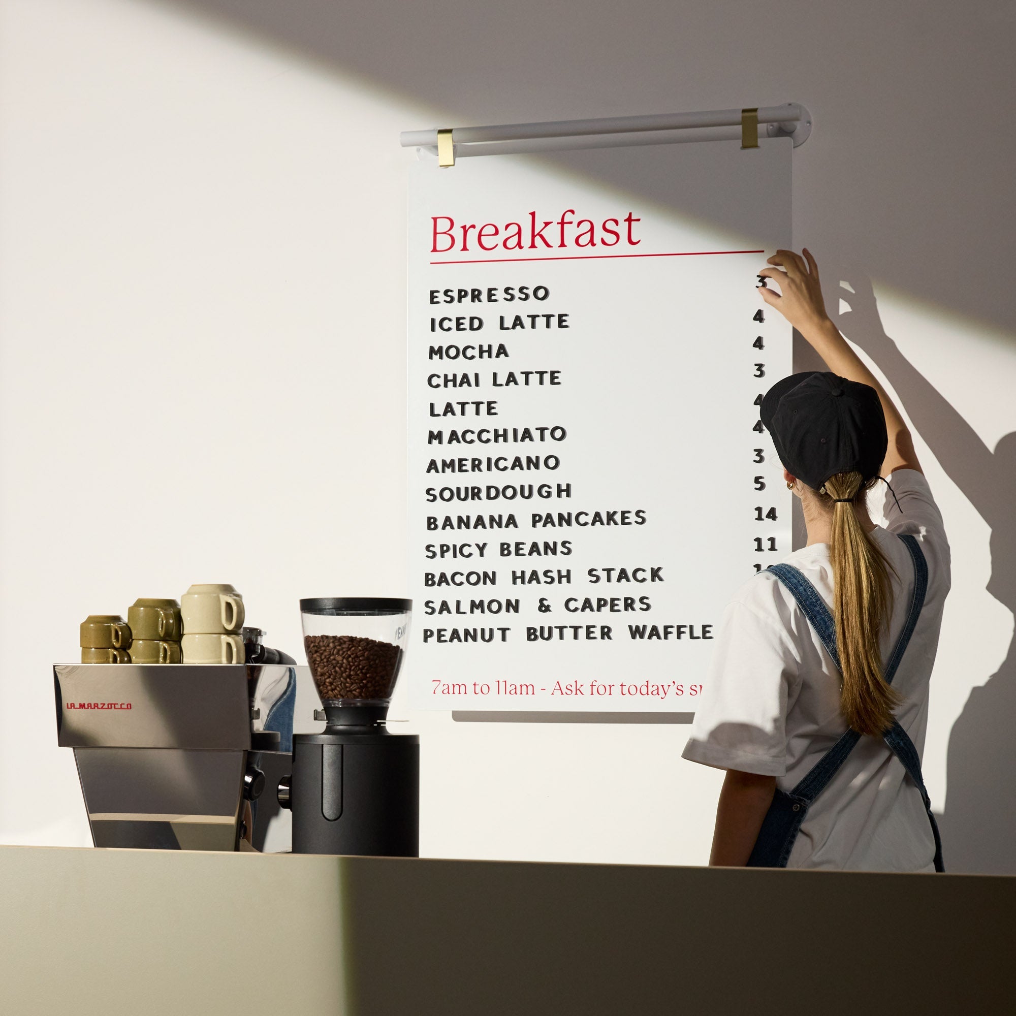
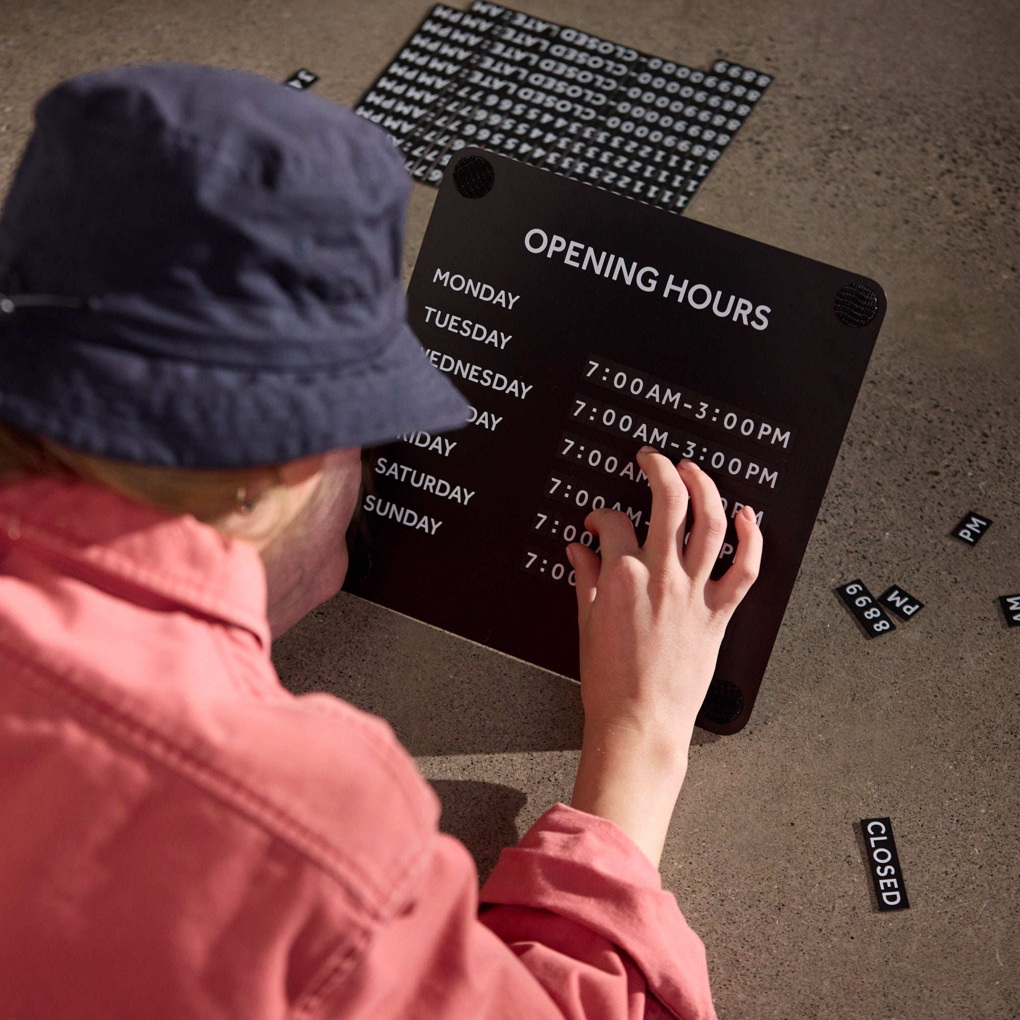
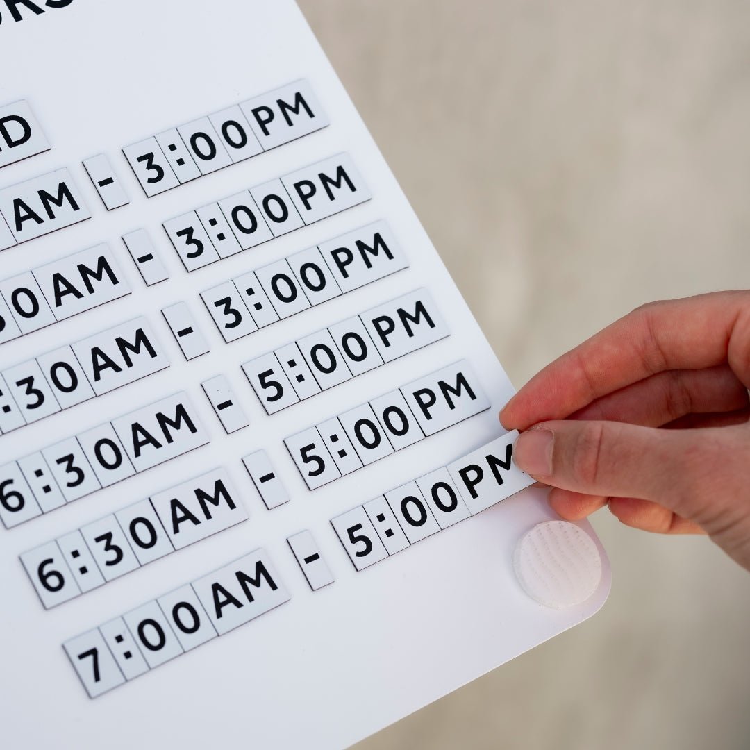
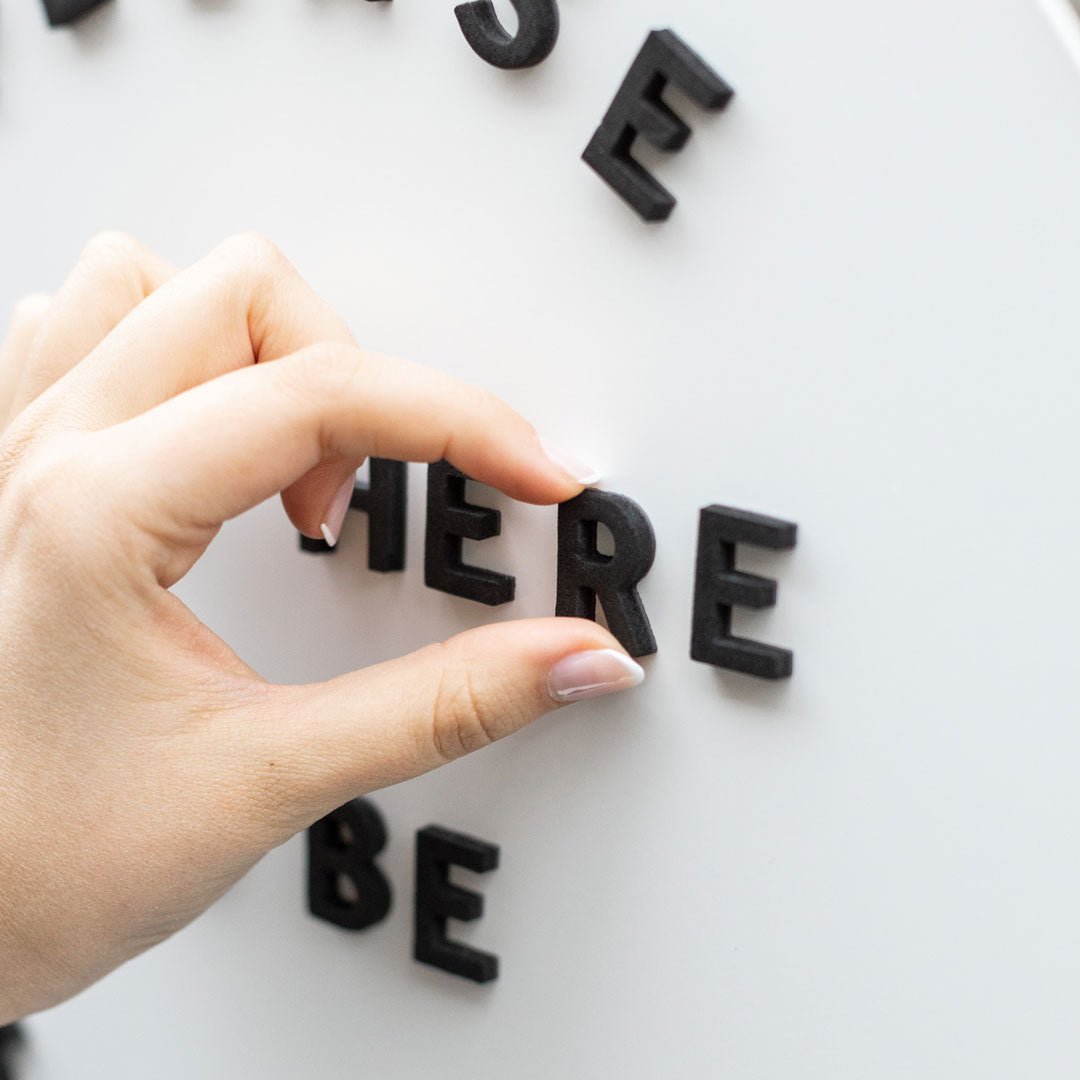
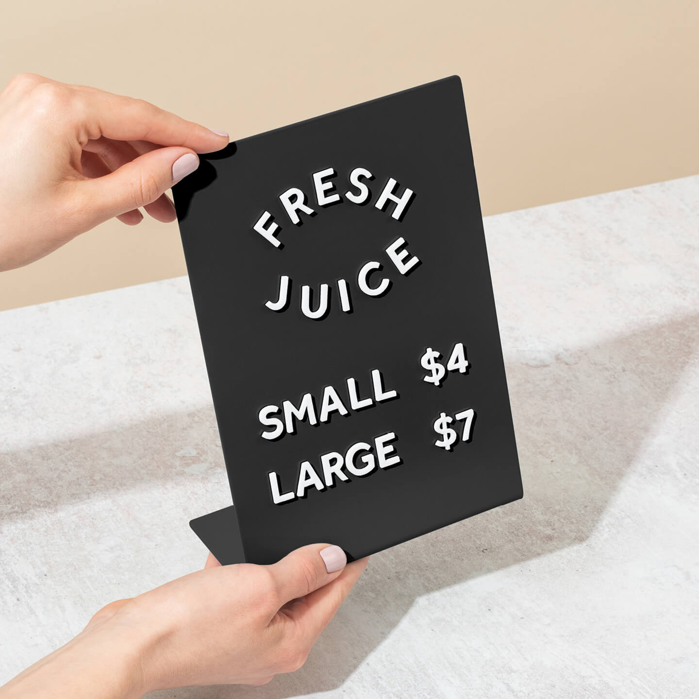
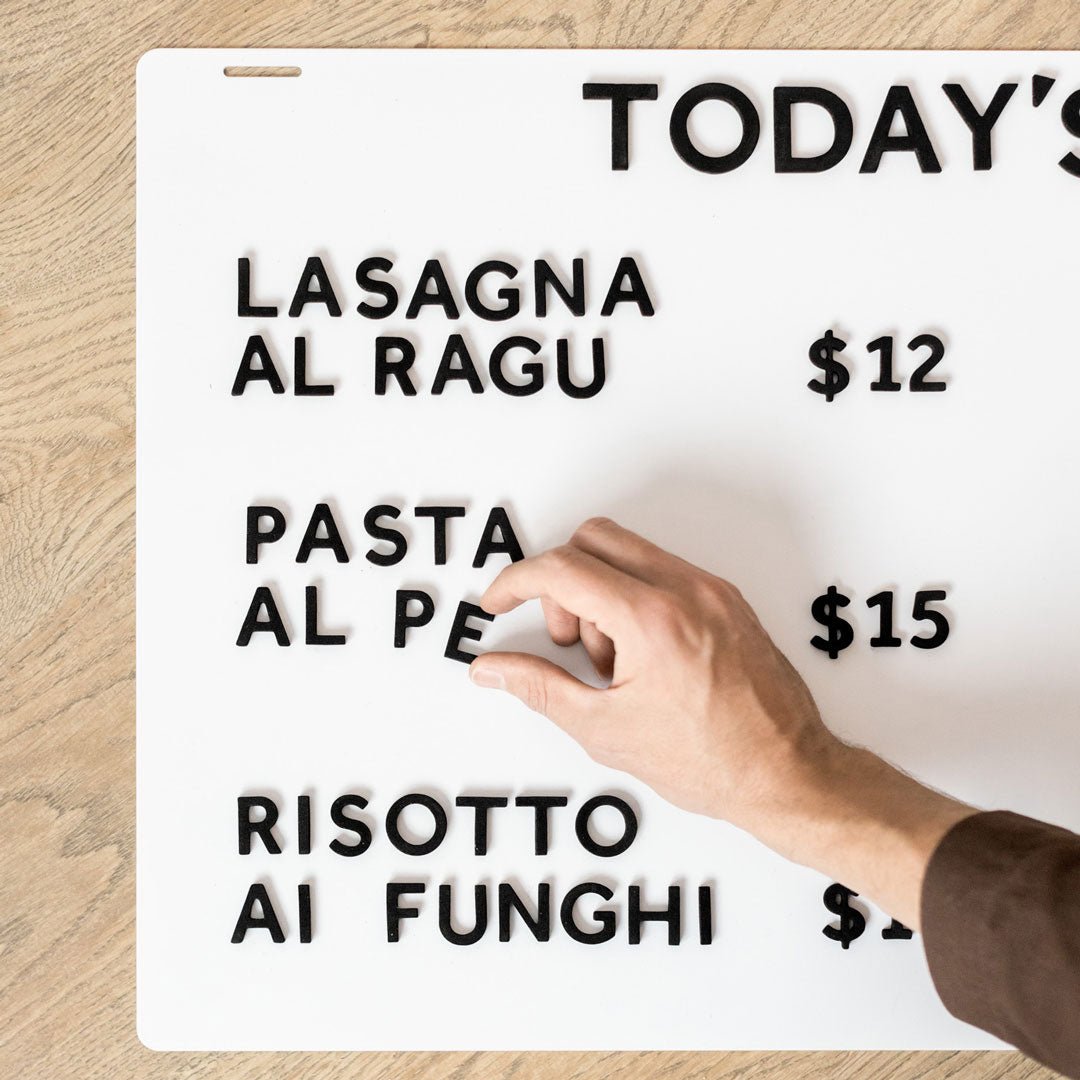
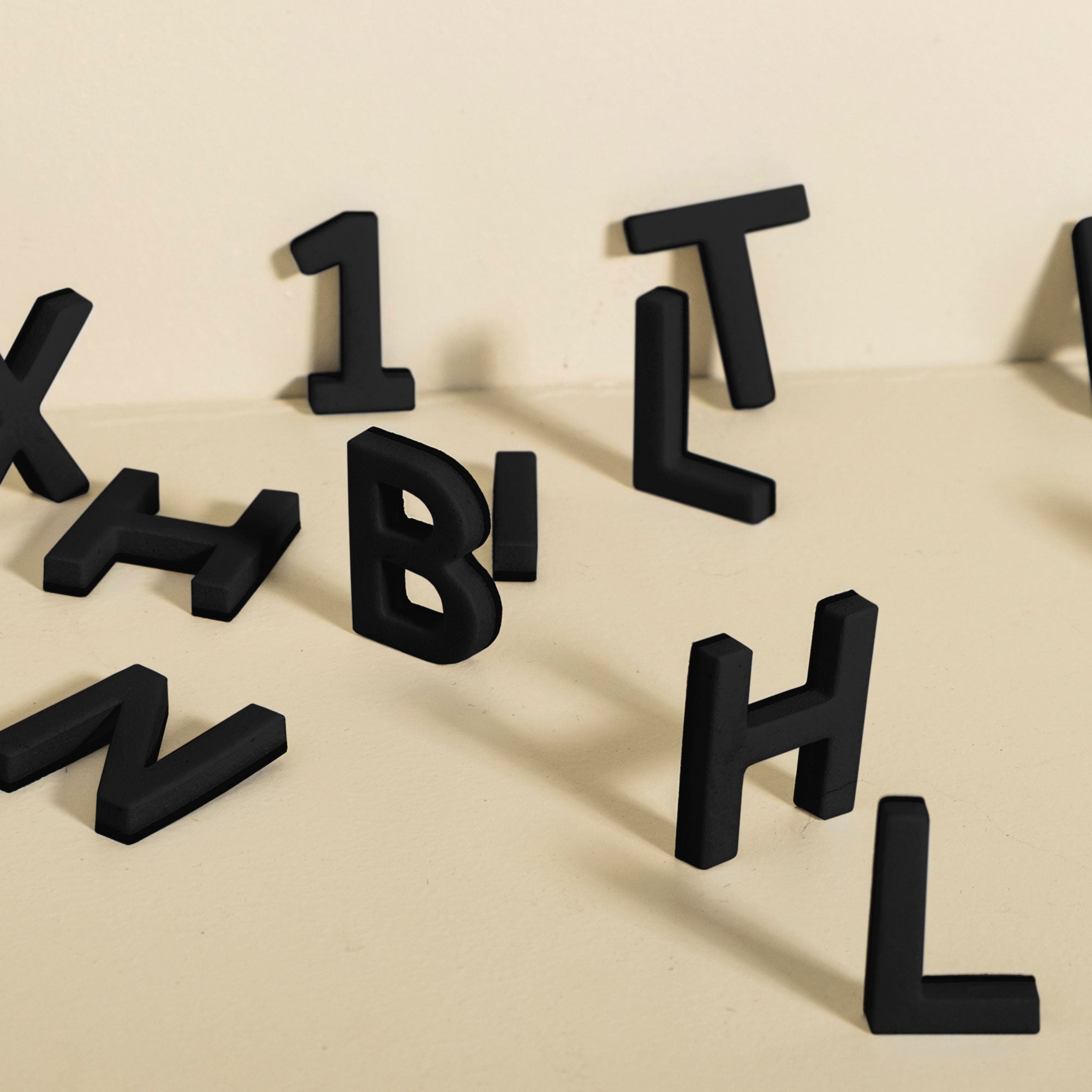
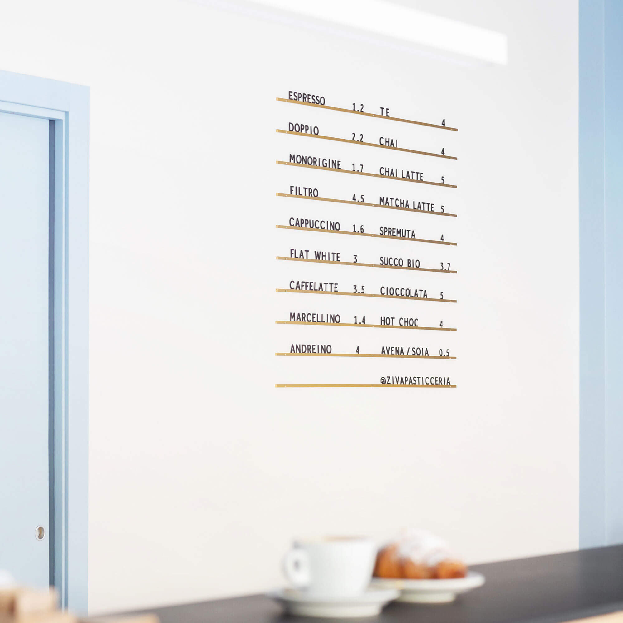
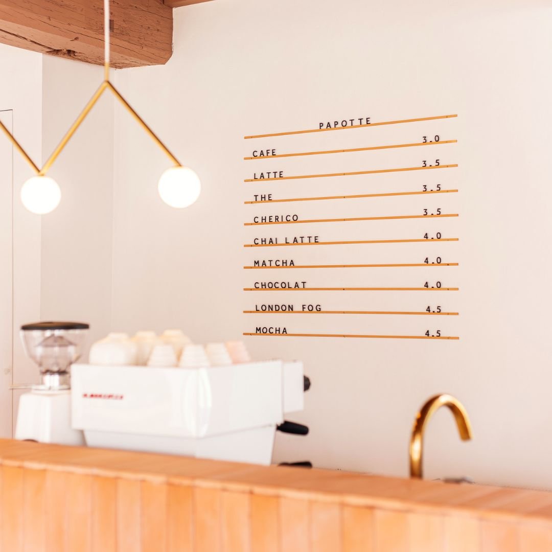
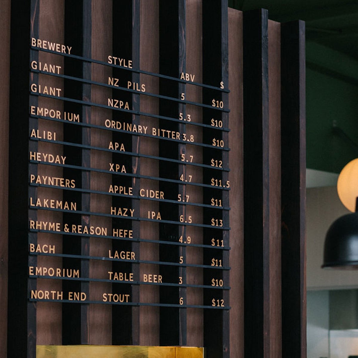
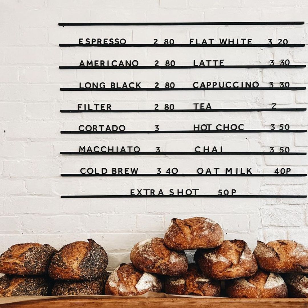
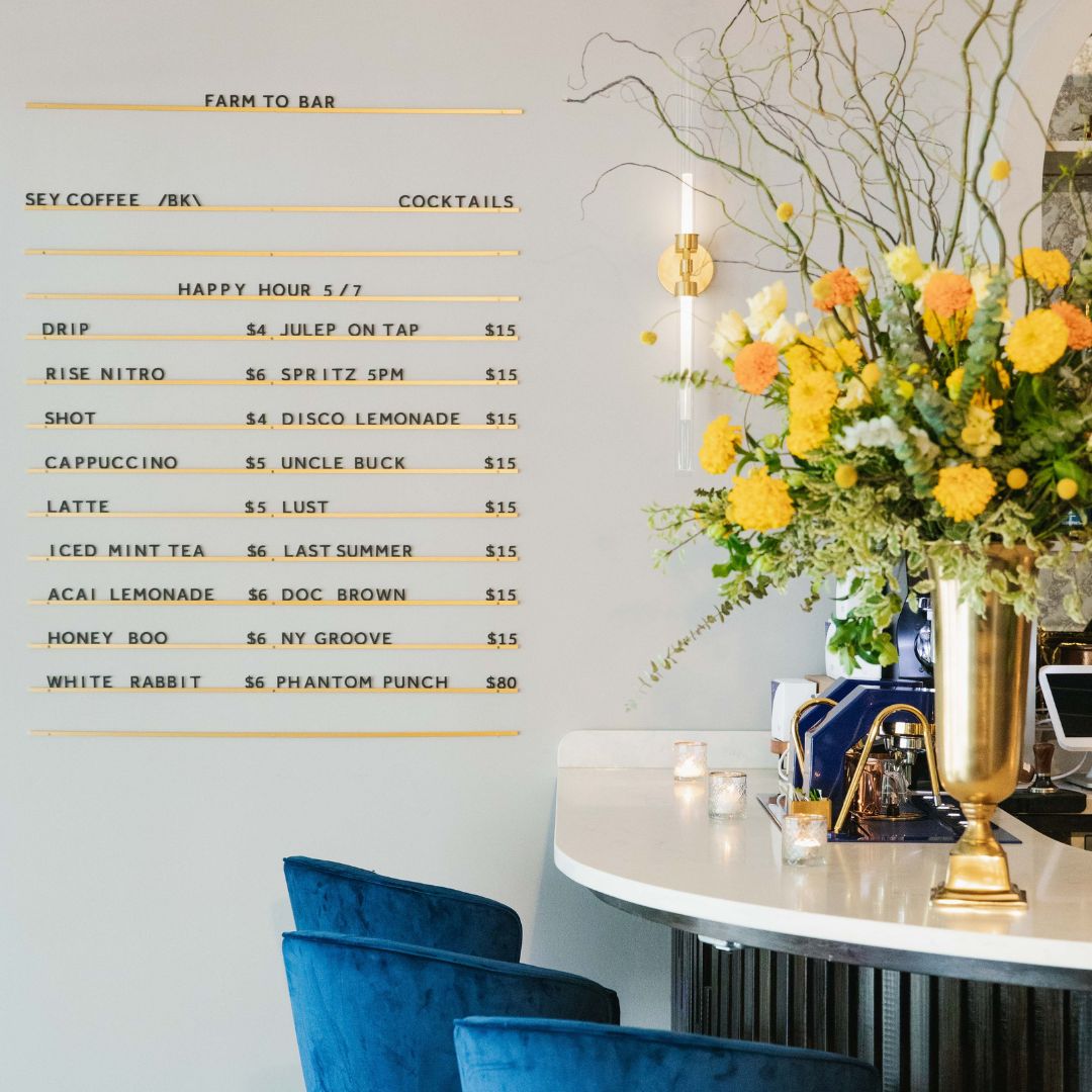
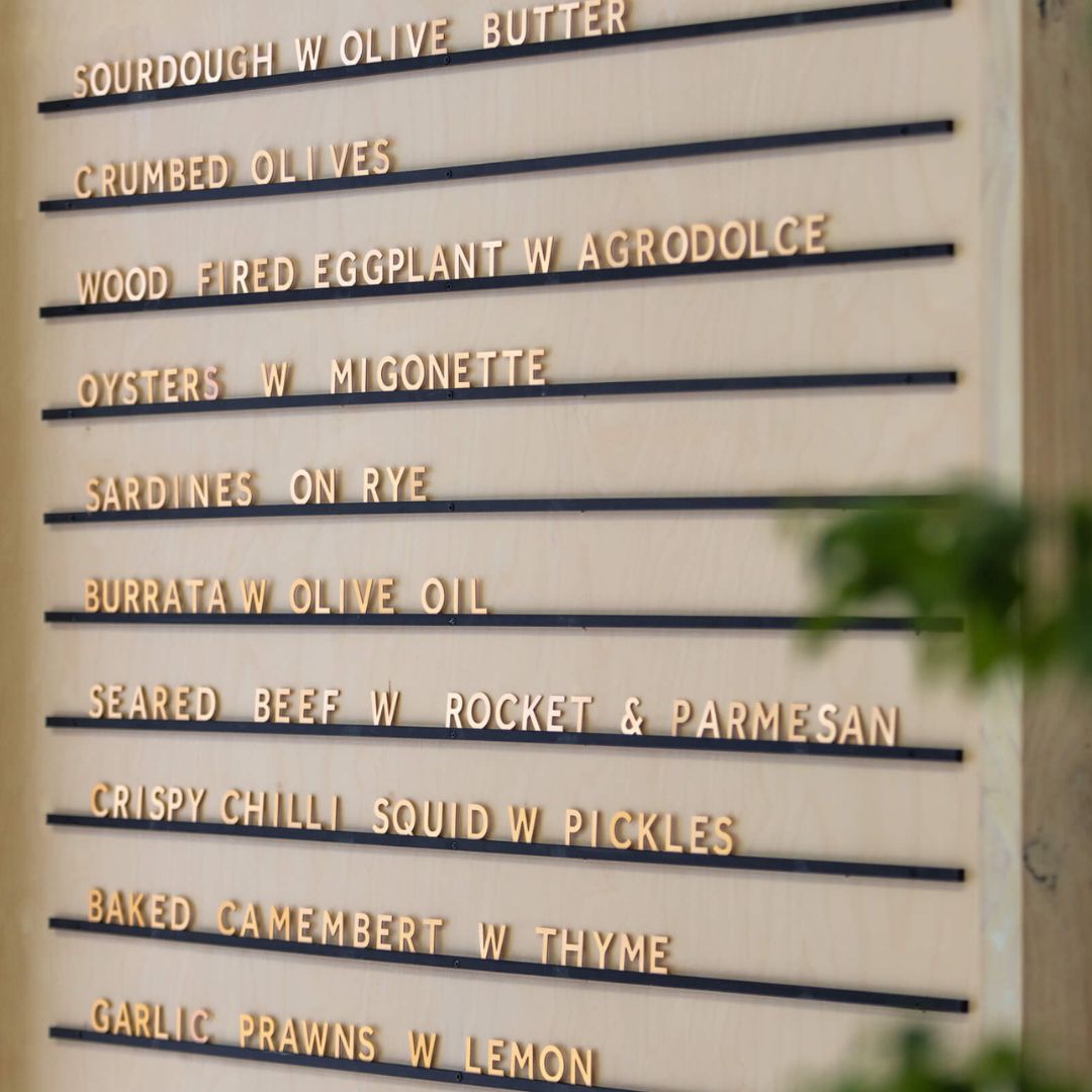
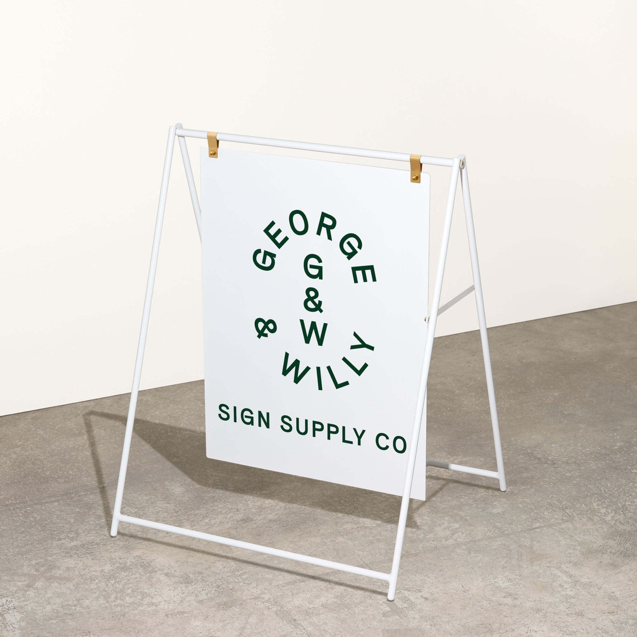
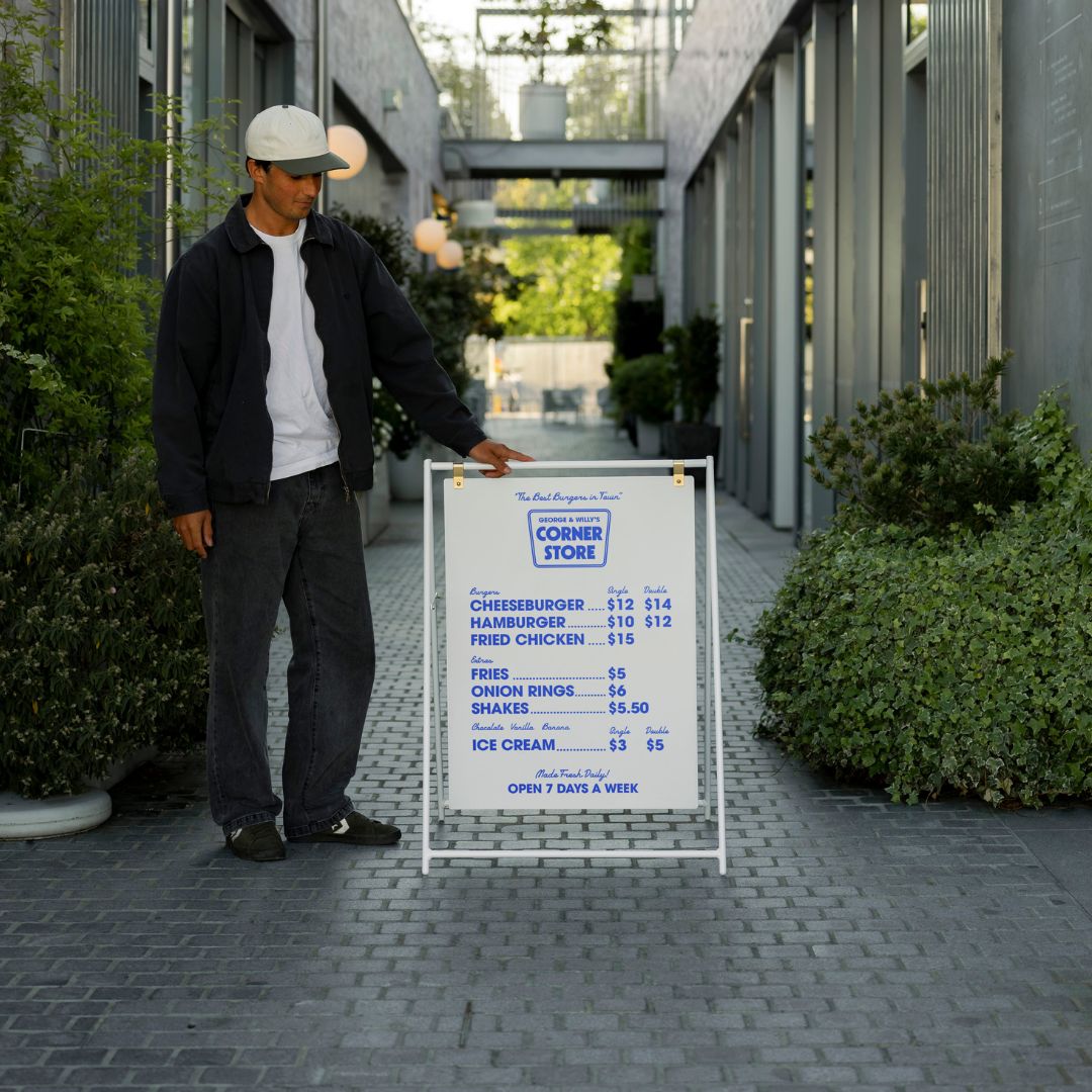
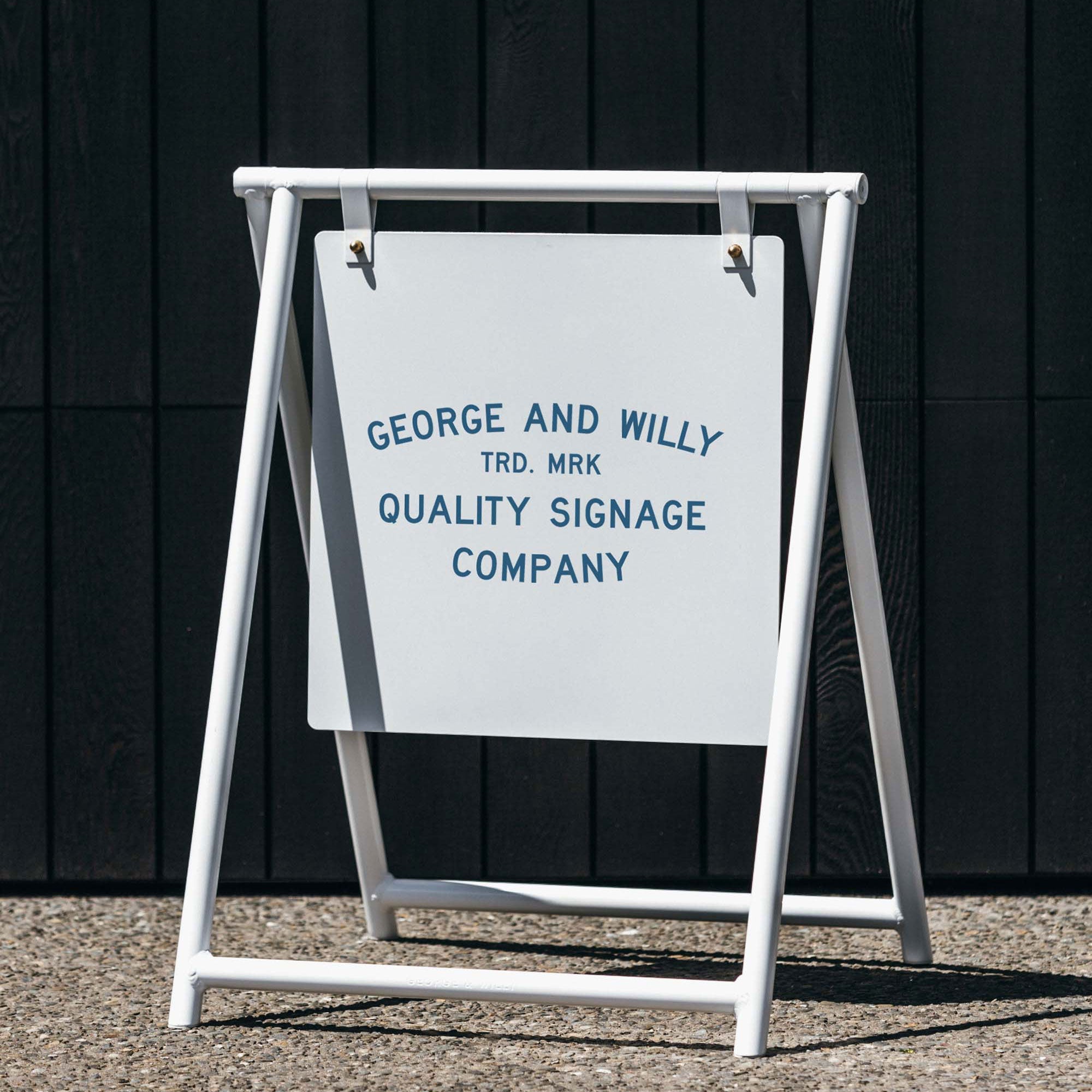
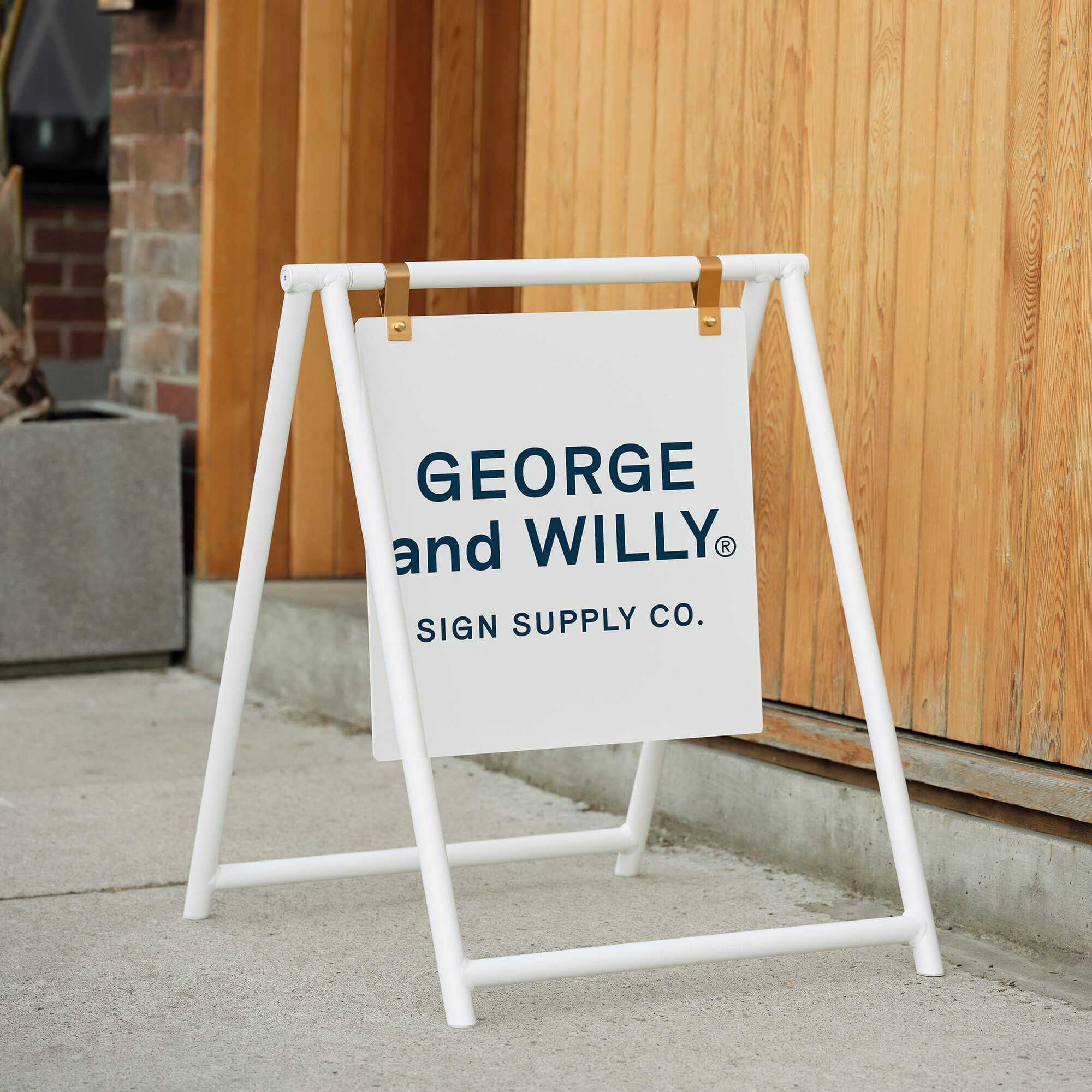
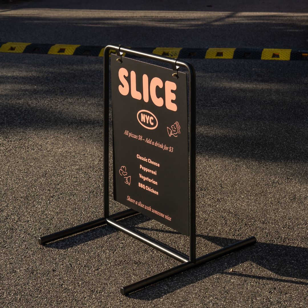
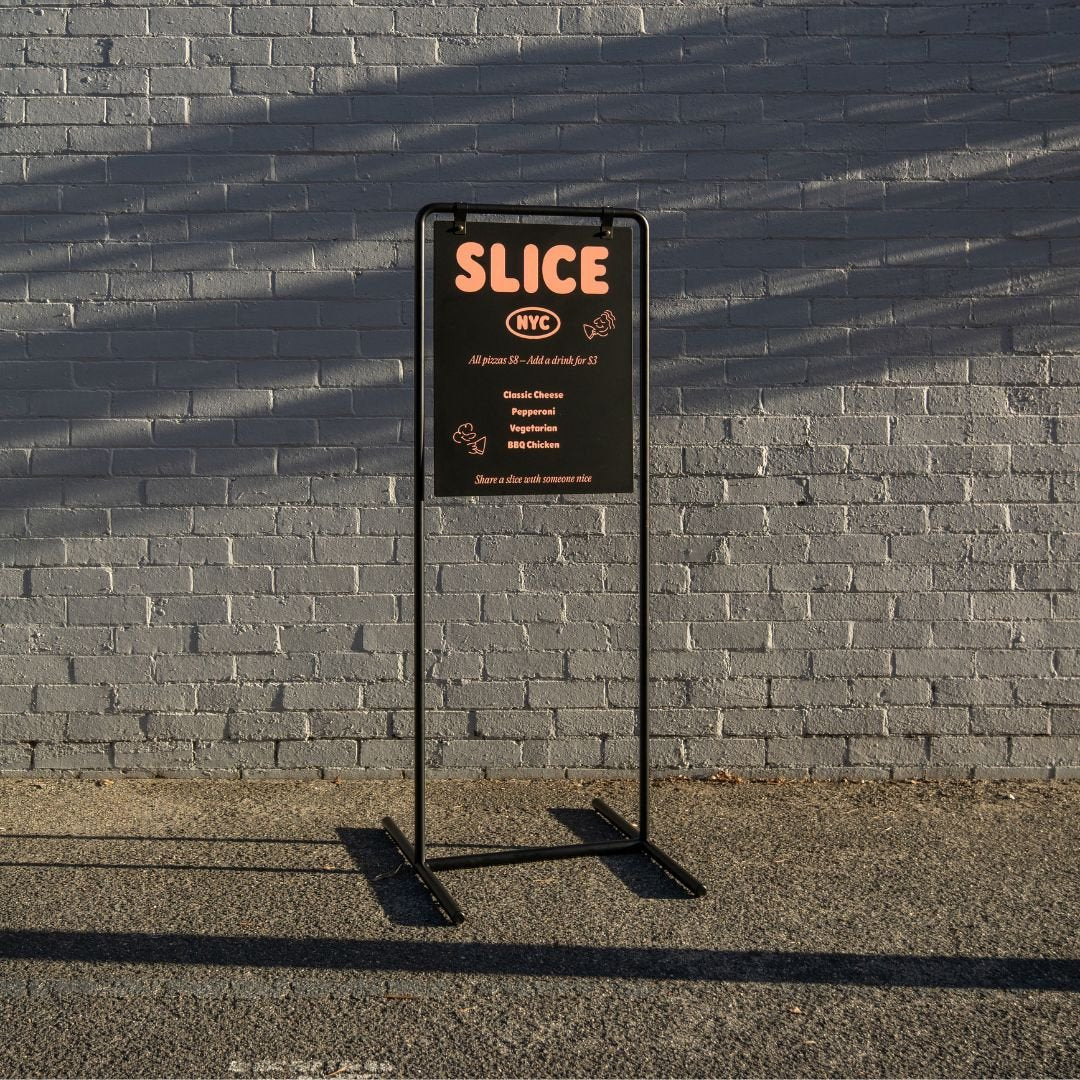
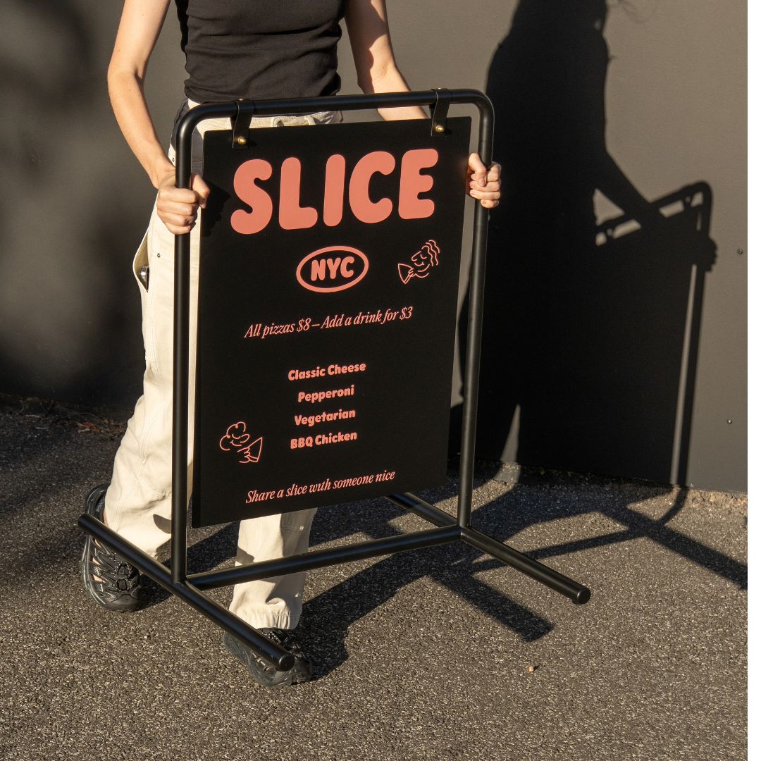
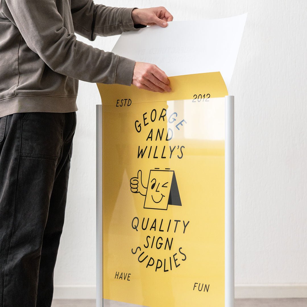
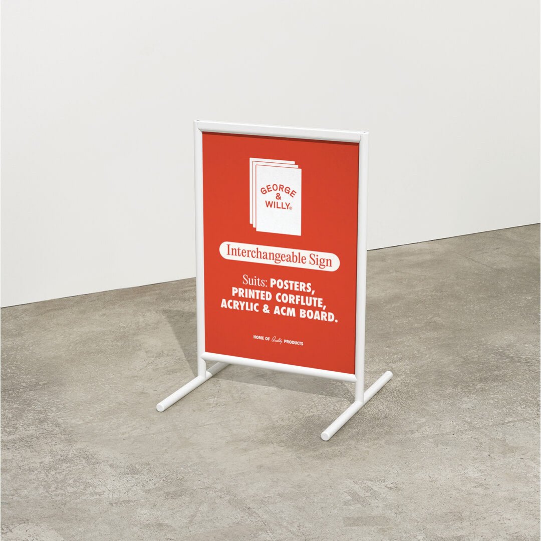
1. Too Much Info
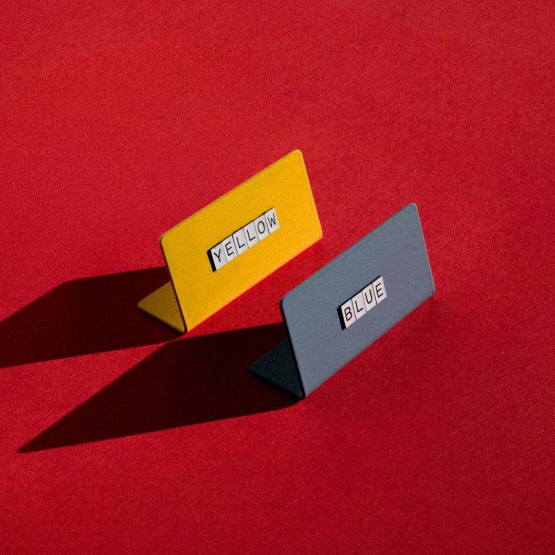
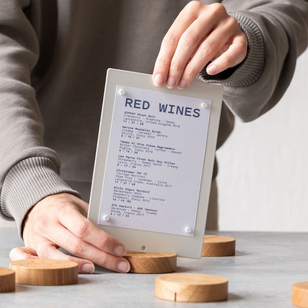
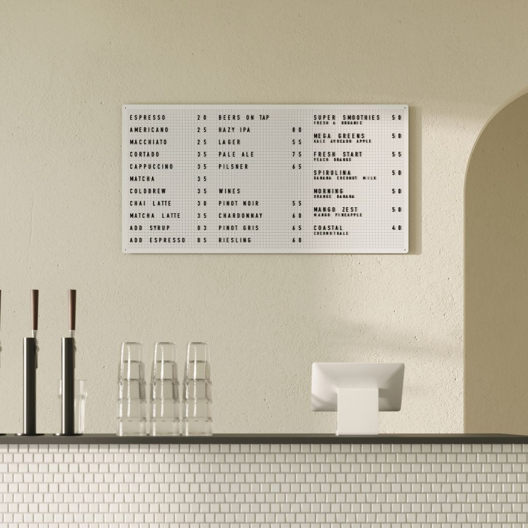
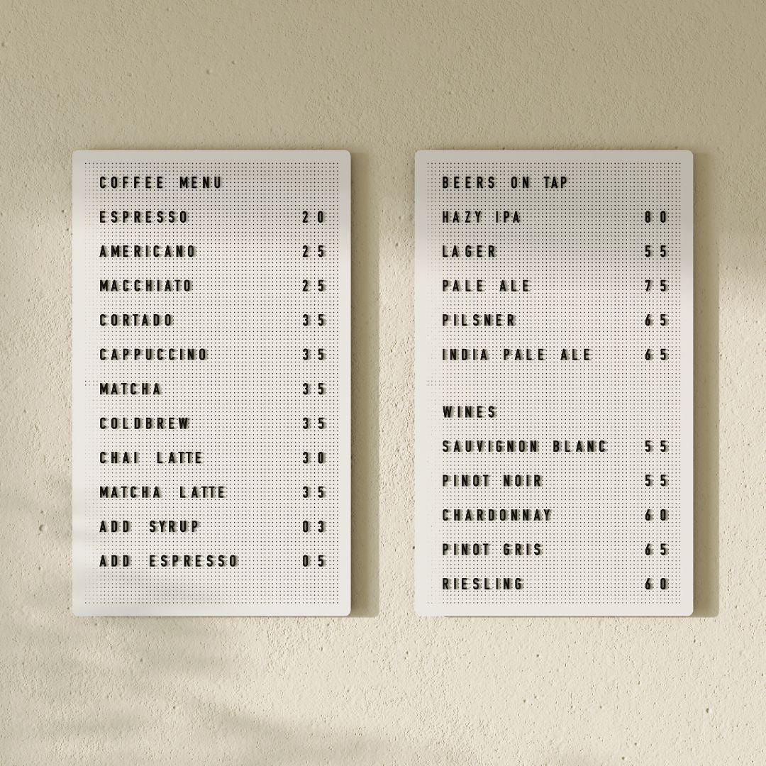
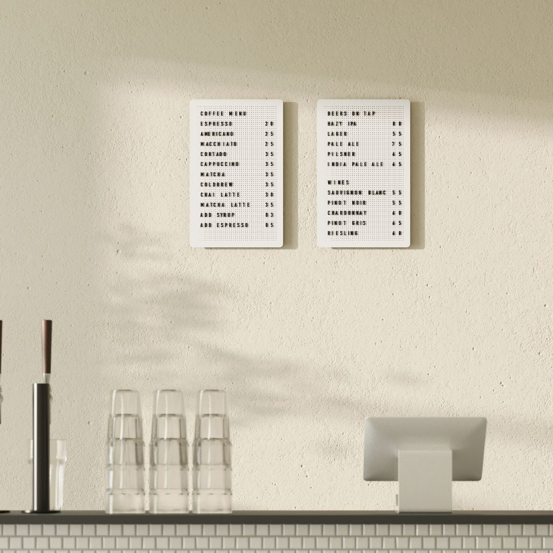
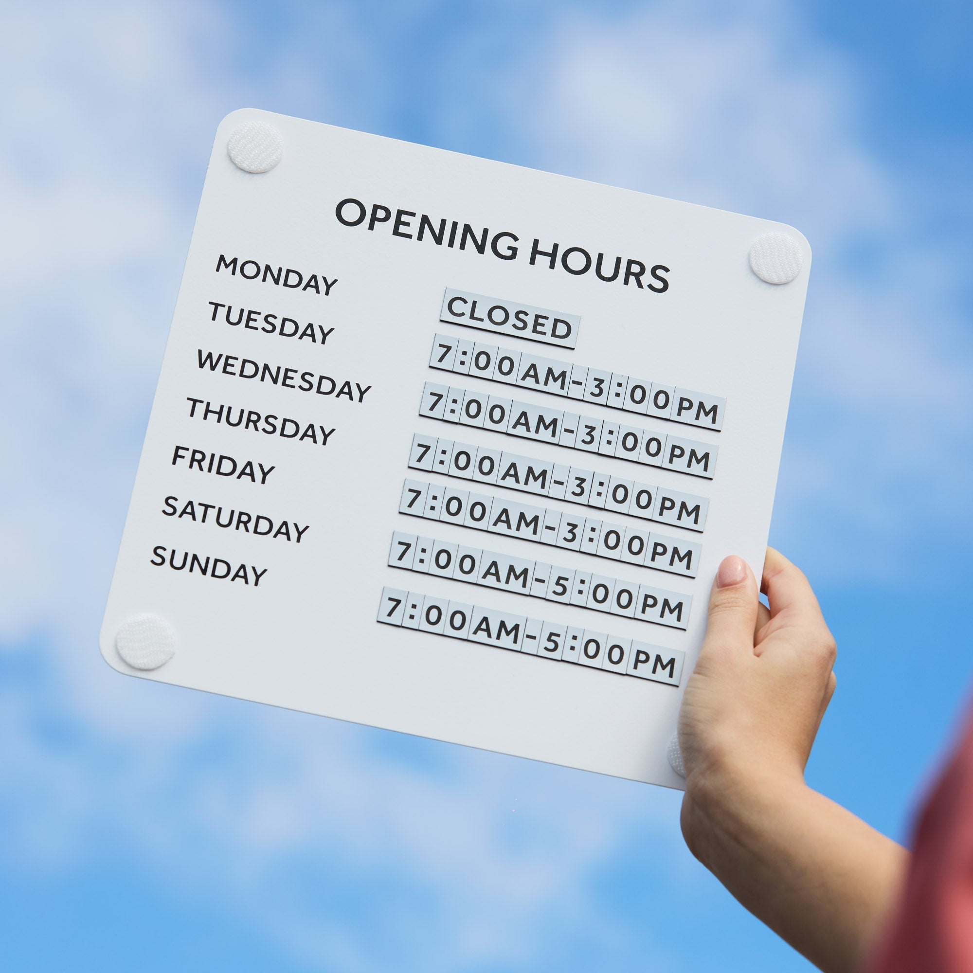
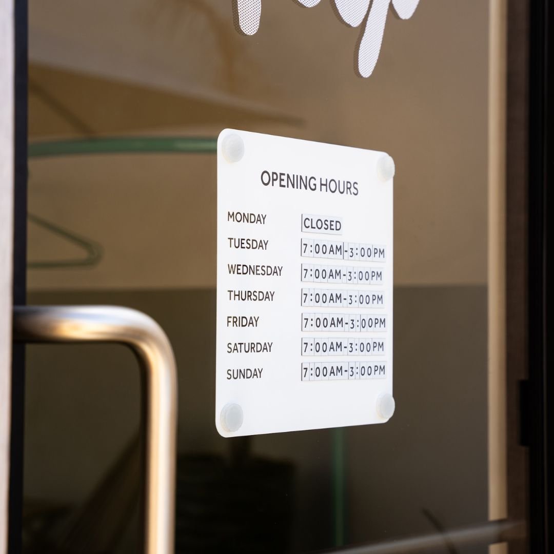
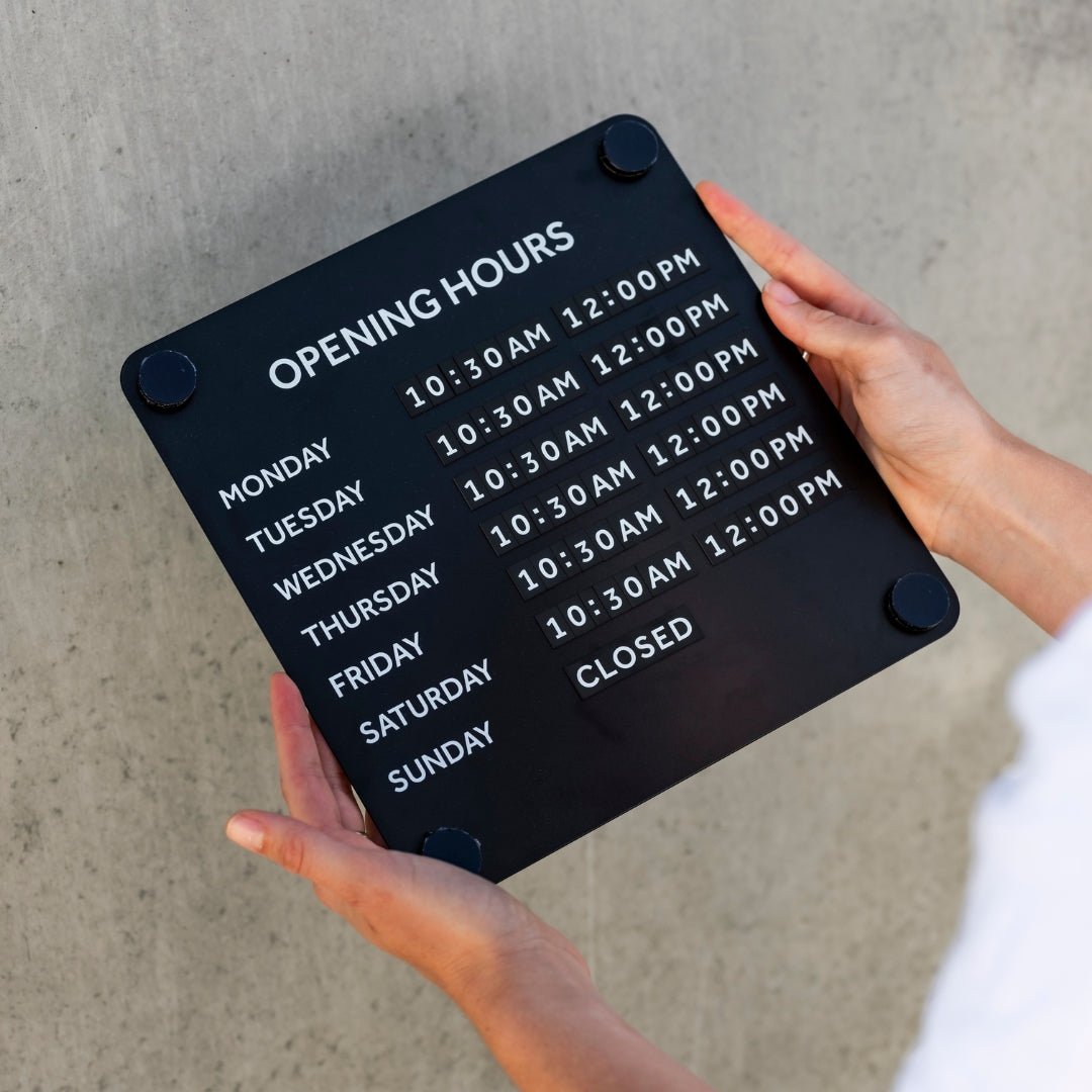
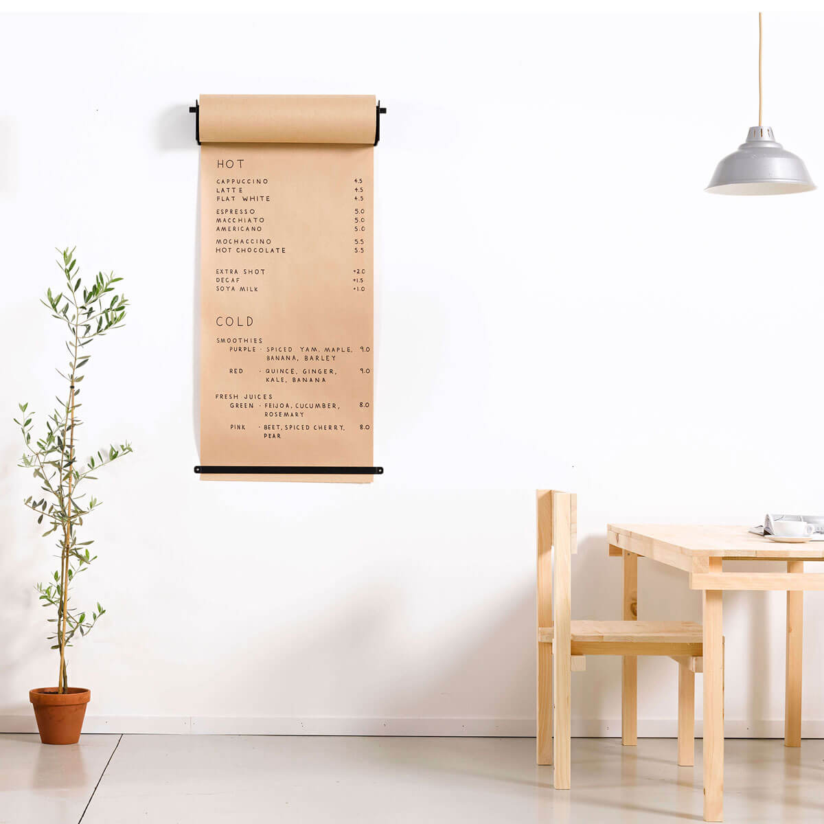
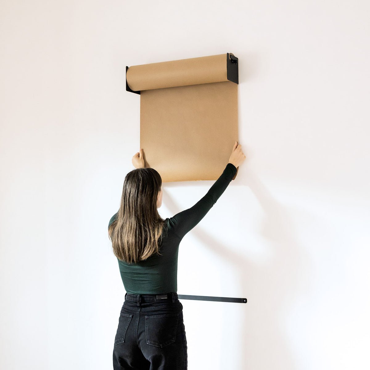
It’s tempting to try to say everything on your retail sign—your business name, hours, tagline, full menu, social handles, favourite quote... You get the idea. But clutter is the enemy of good cafe or retail signage. When there’s too much text, nothing stands out.
Fix:
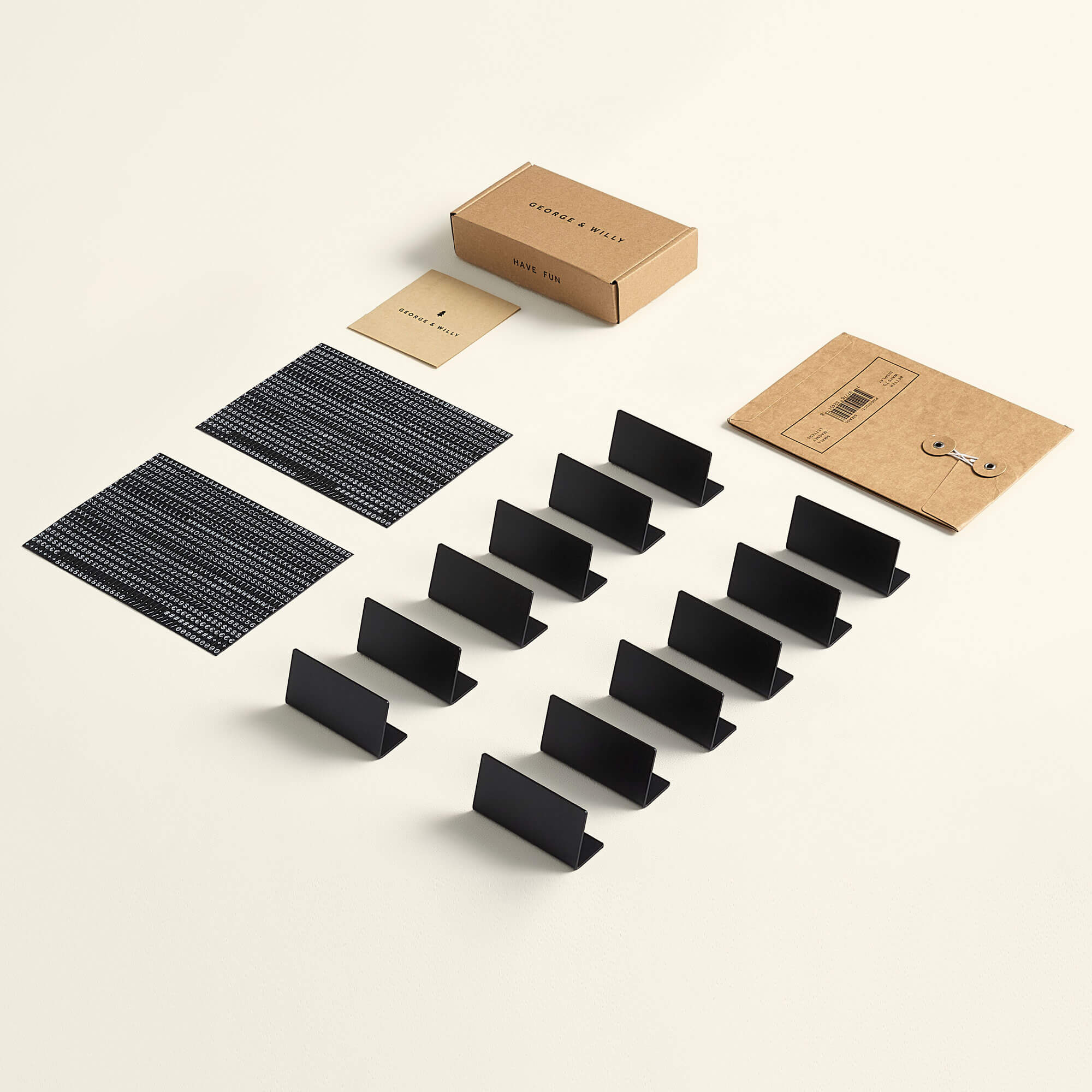
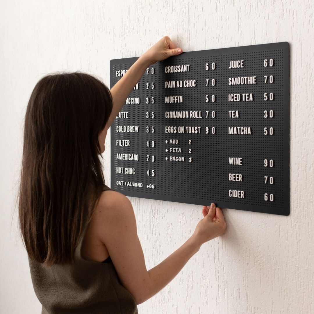
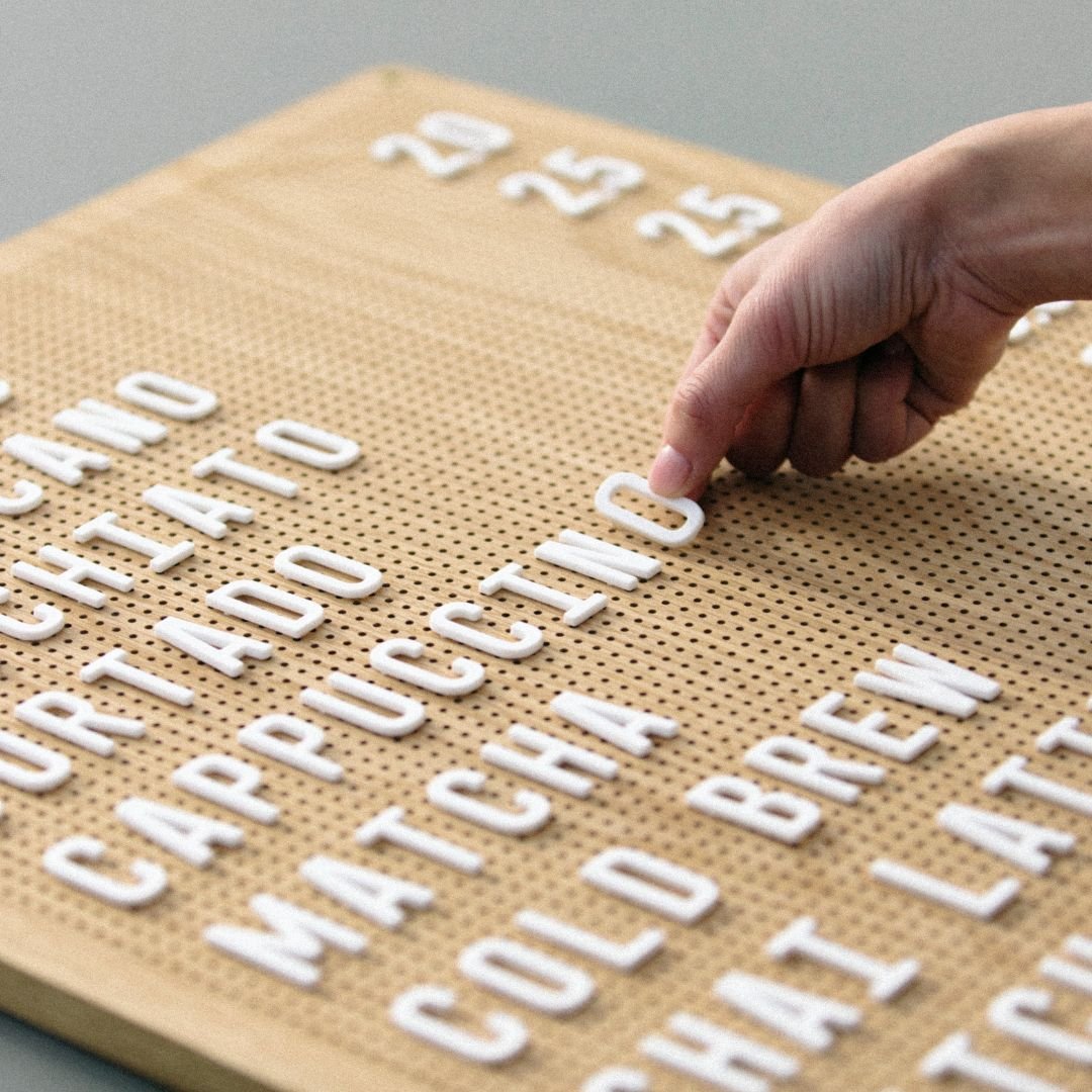
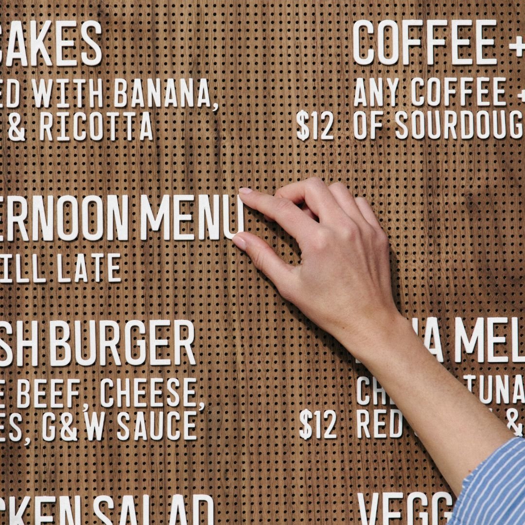
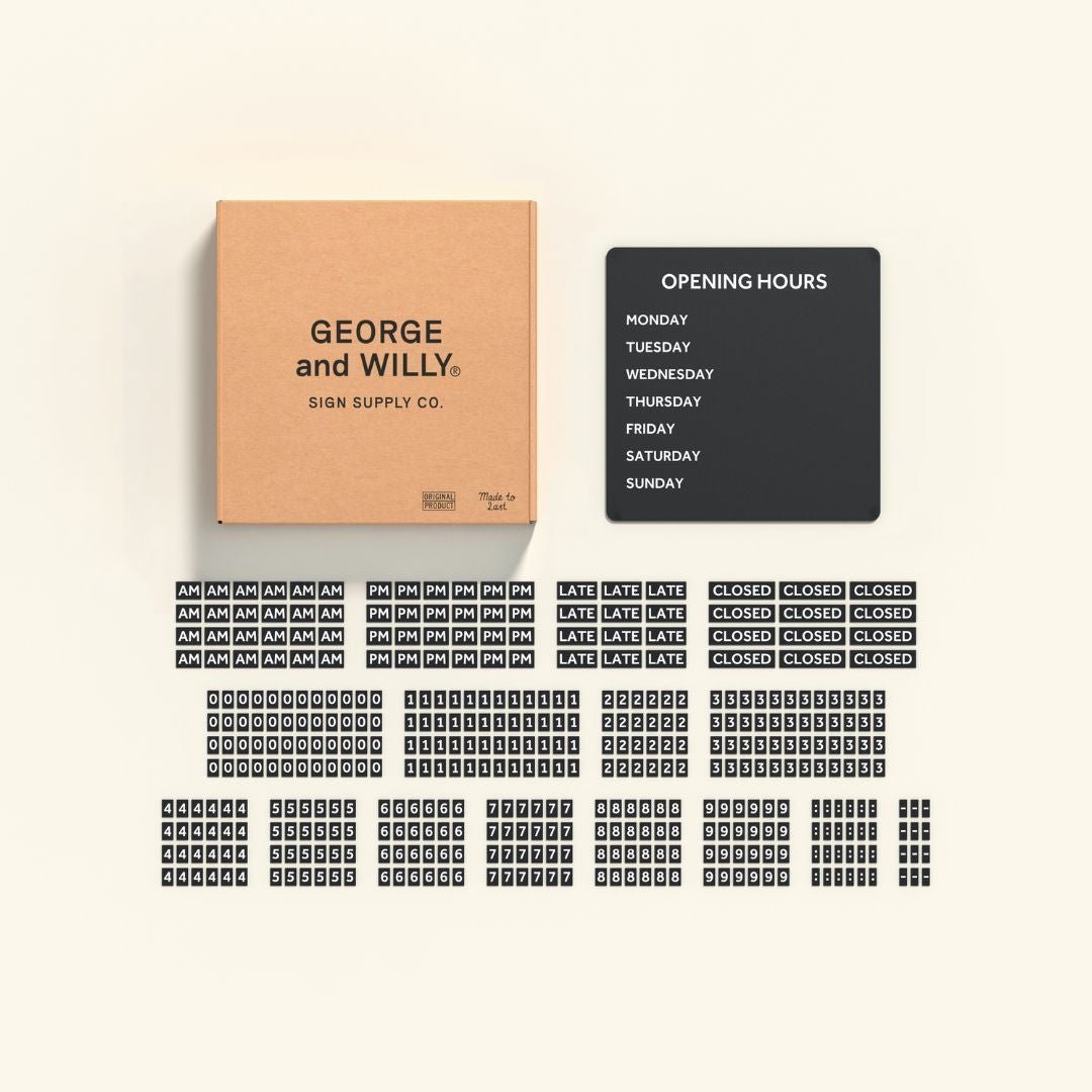
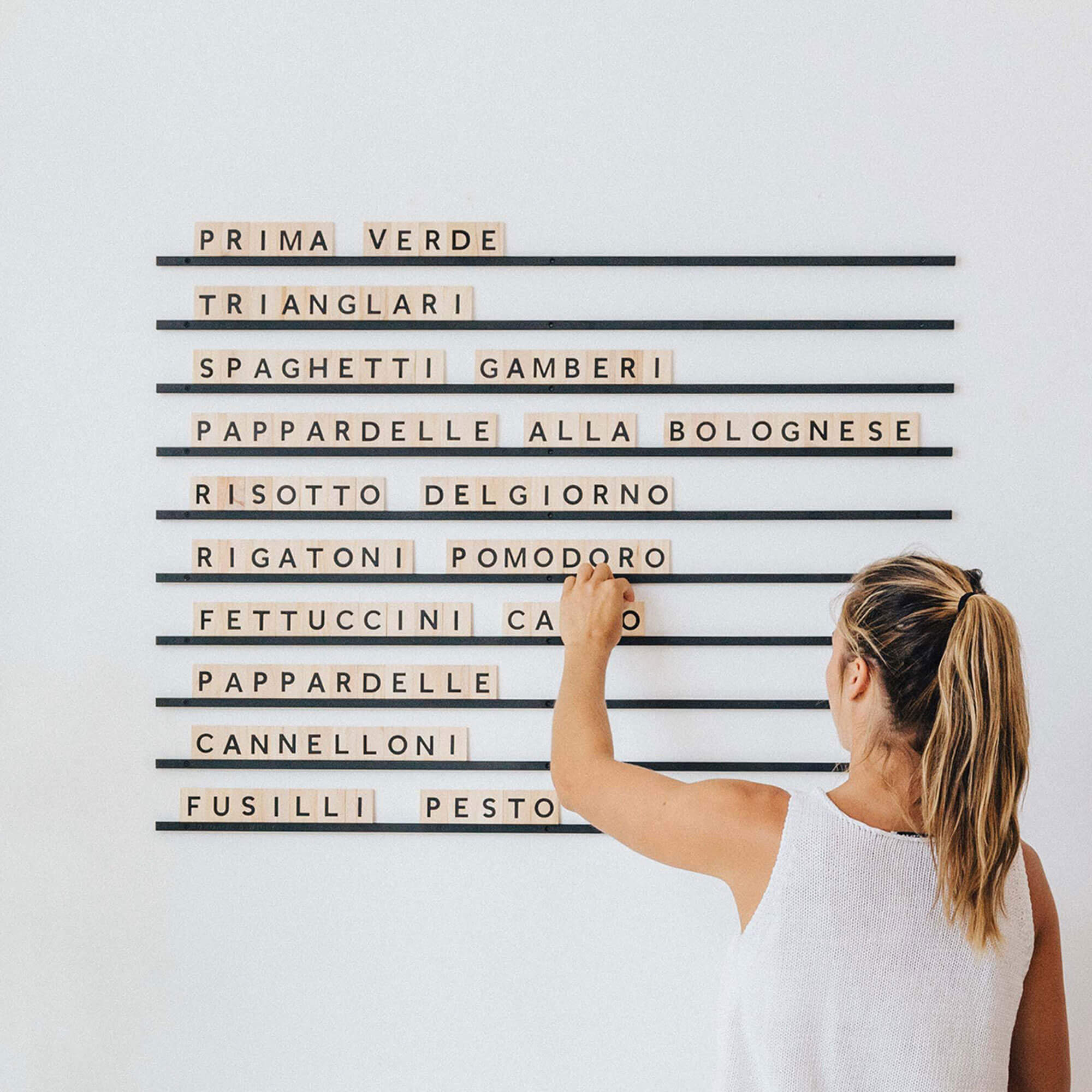
Keep it simple. One clear message per sign is usually all you need. If you’re working with a letter board, try swapping out info regularly instead of cramming it all in at once.

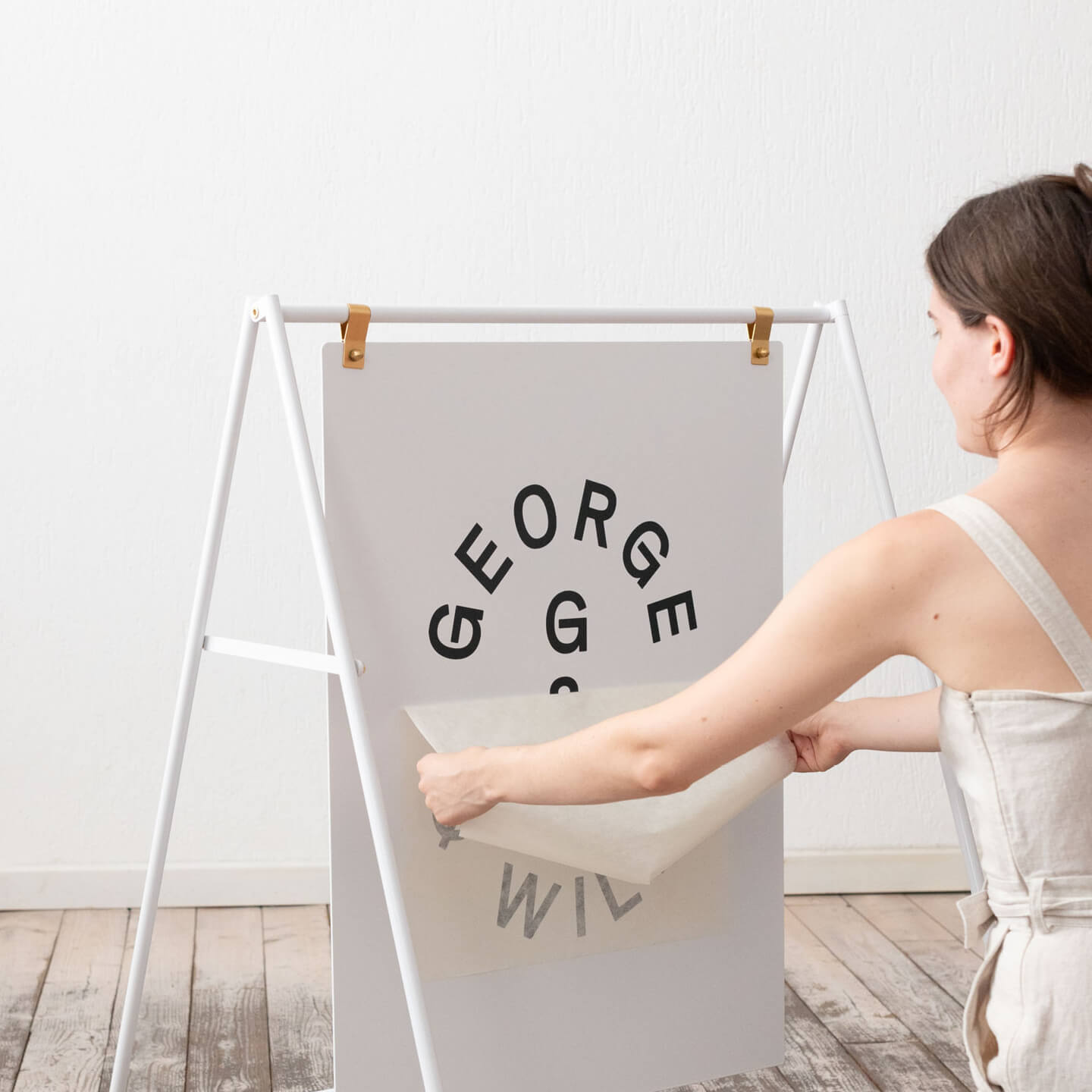
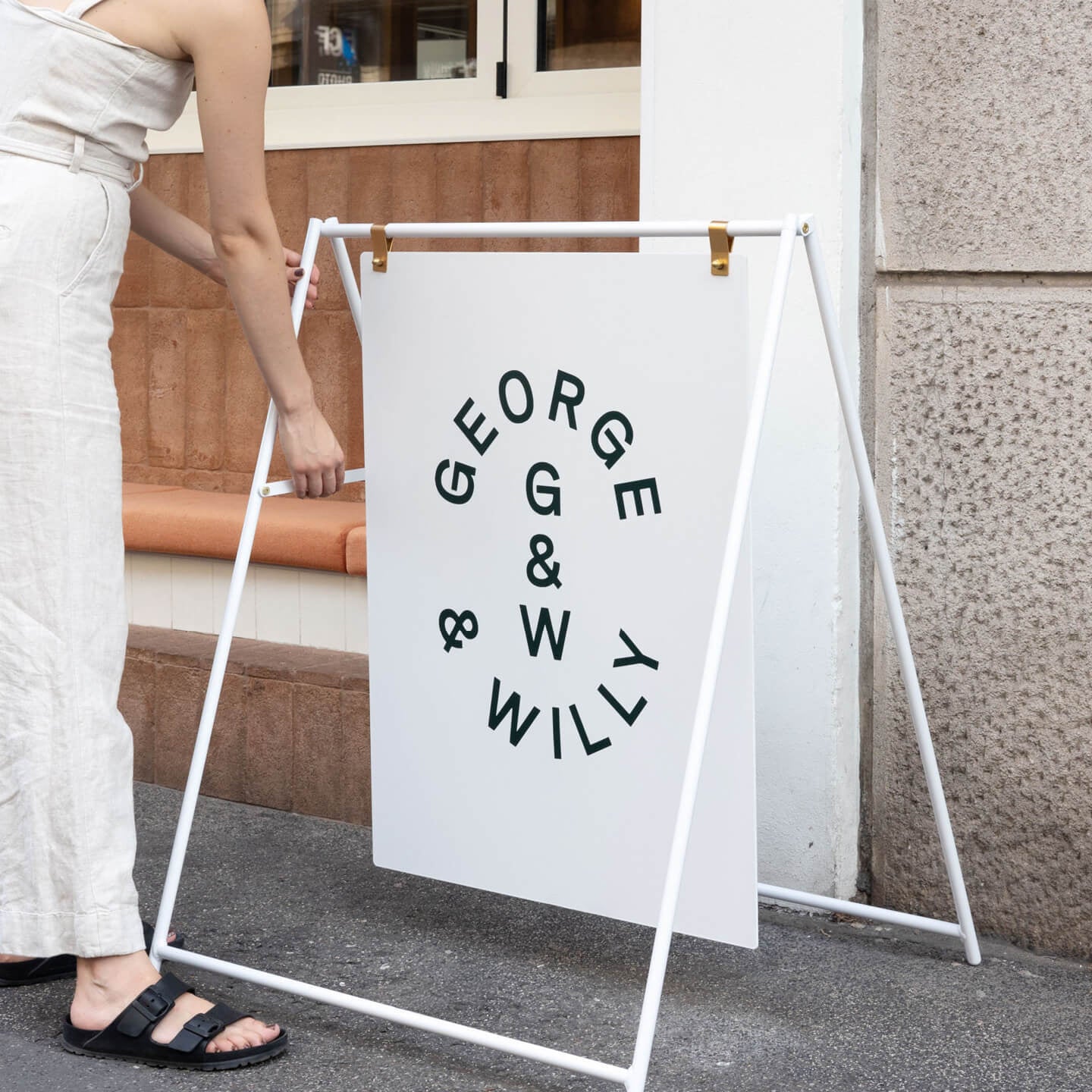
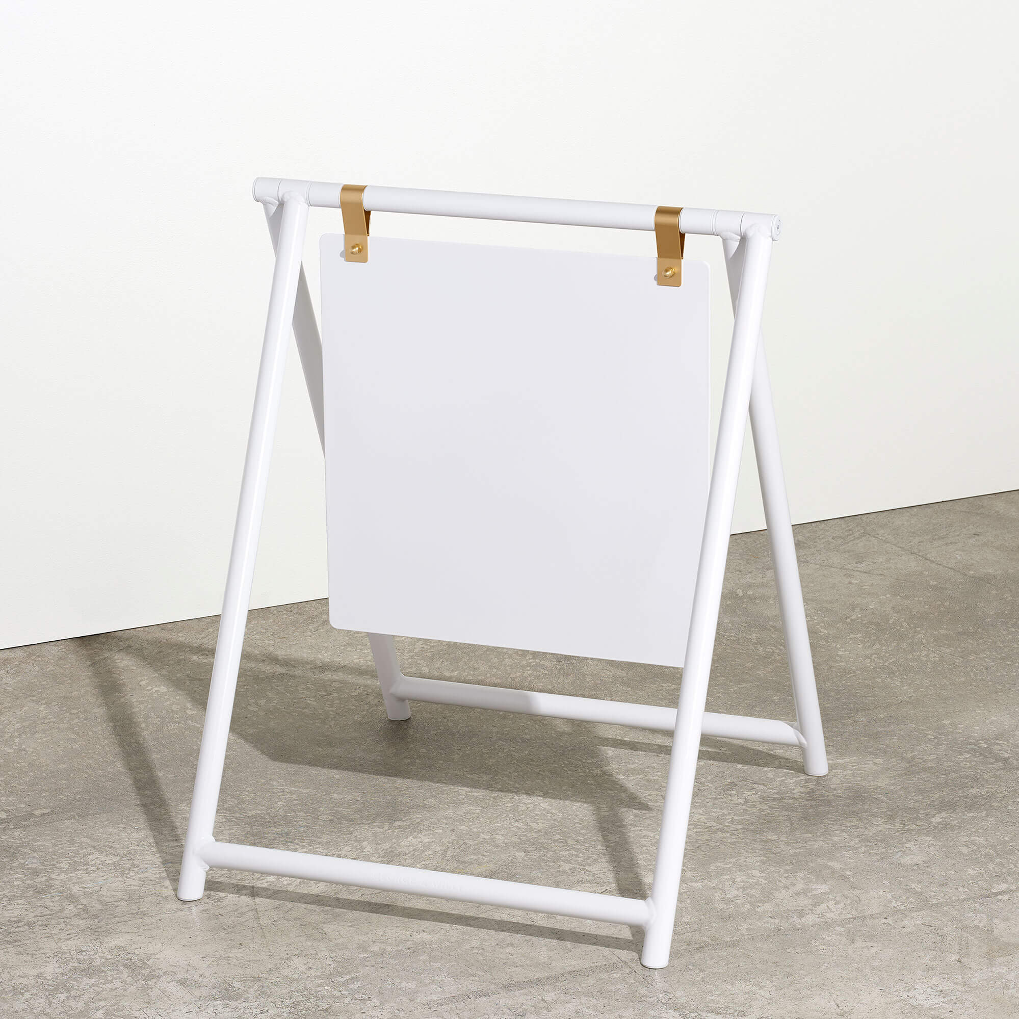
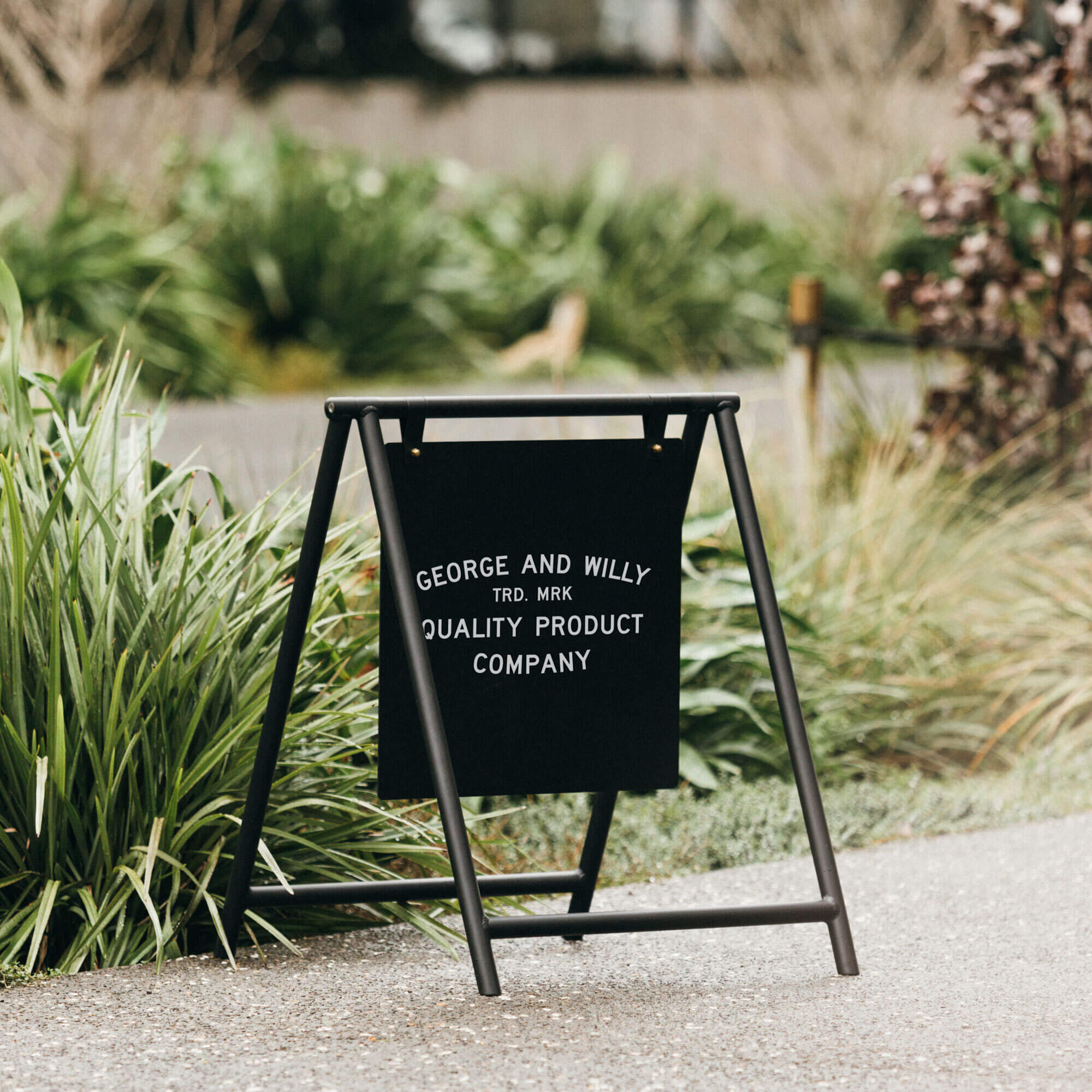
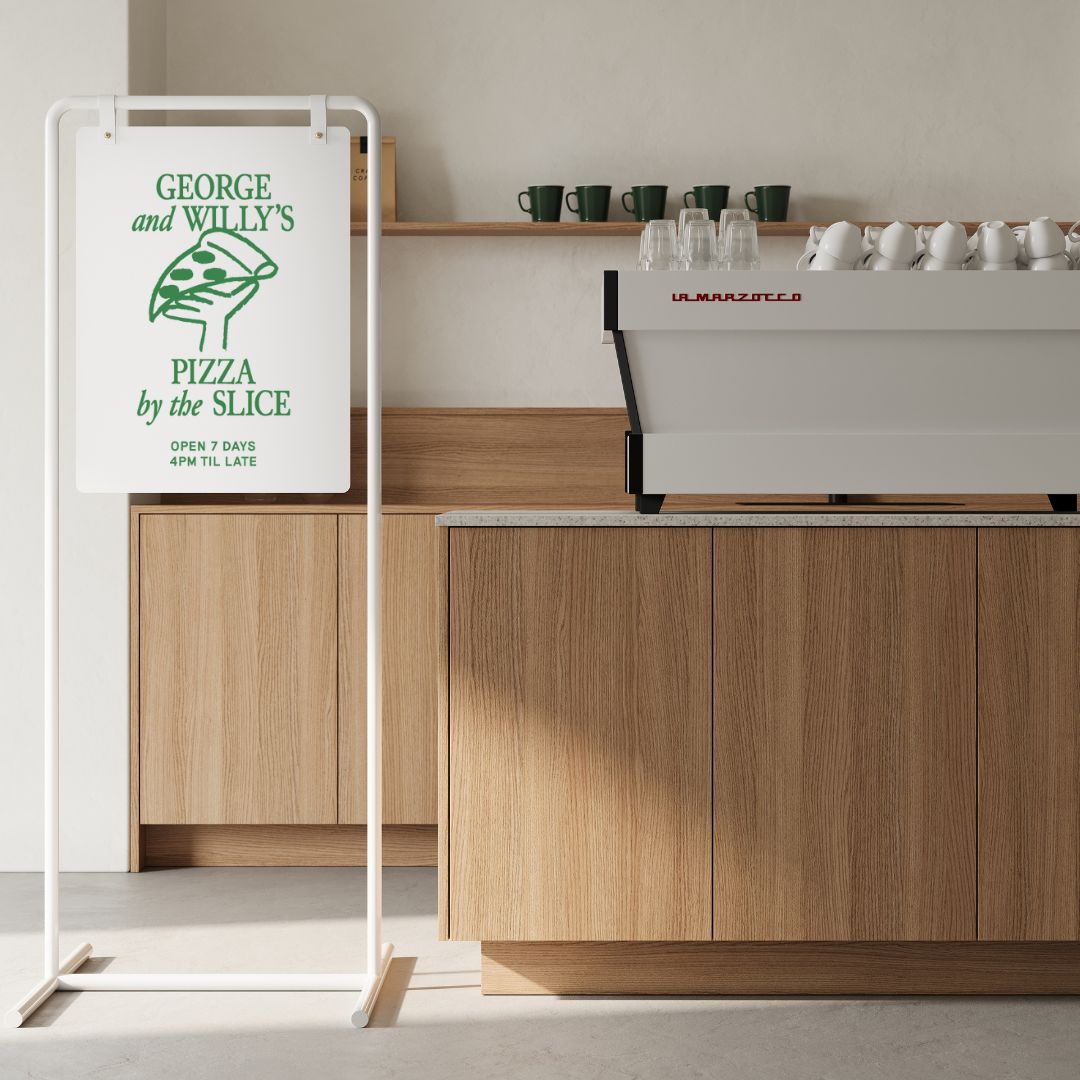
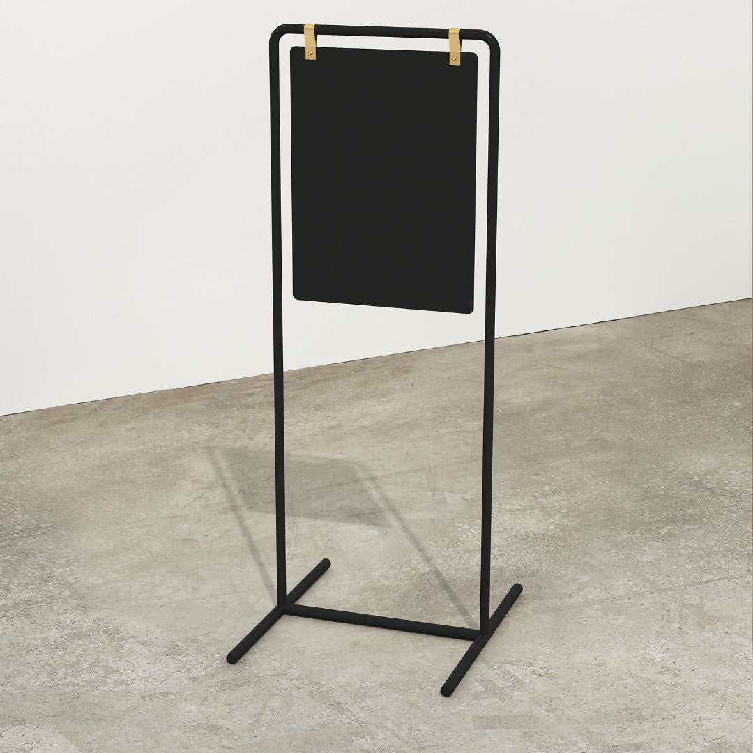
Our friends at Double Shot Coffee show the true meaning of 'less is more' with their innovative logo branding on their George & Willy A-Frame Sign.
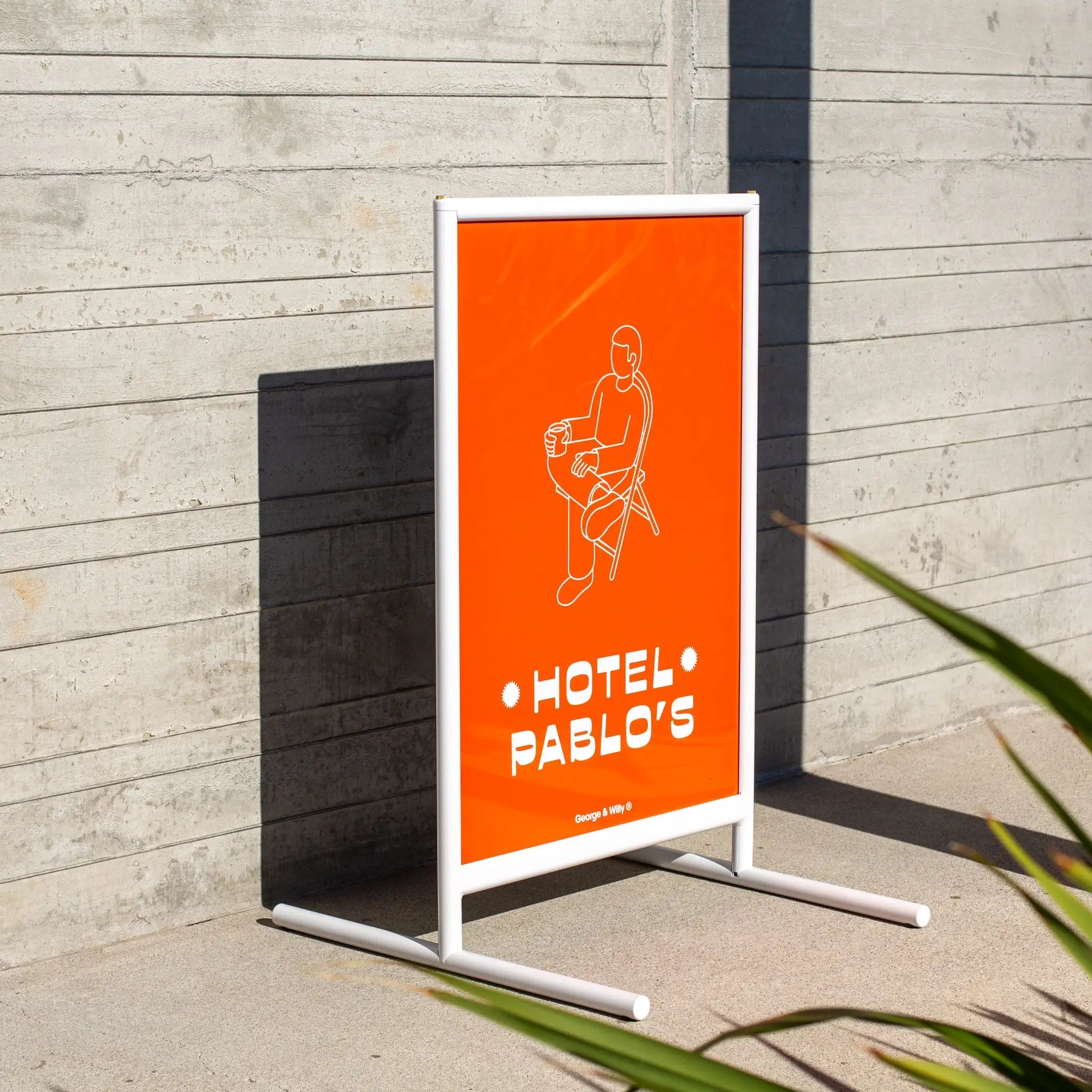
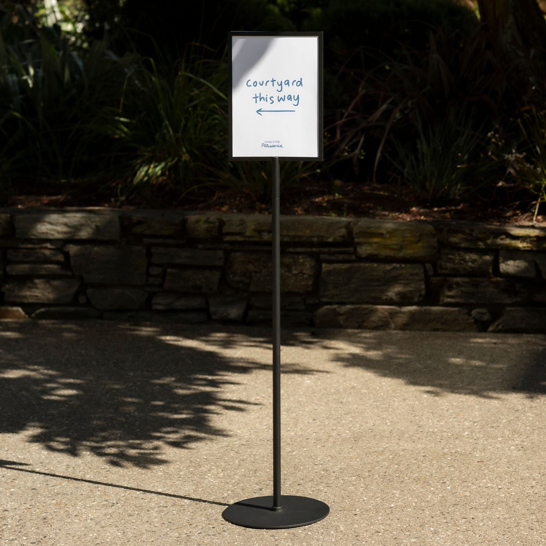
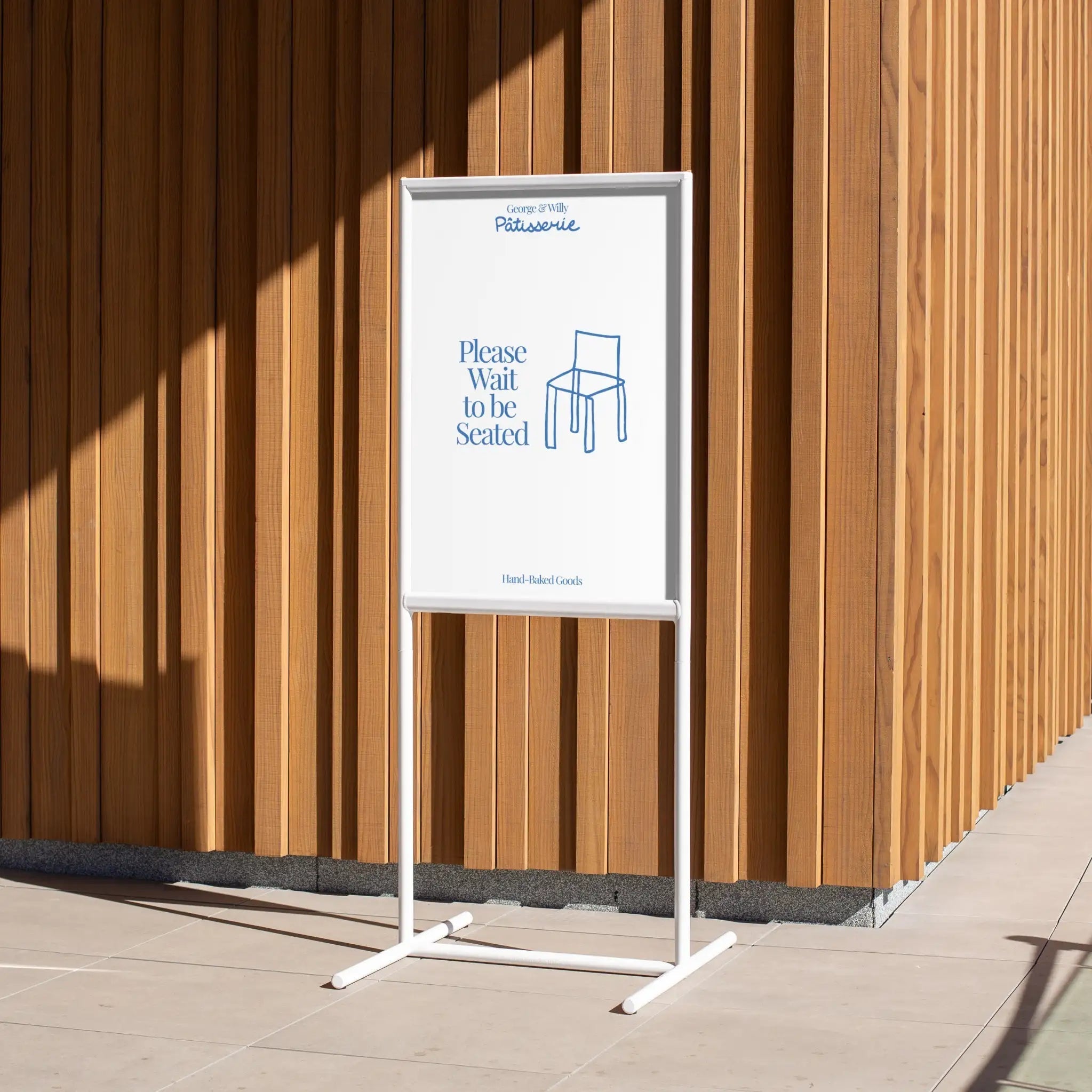
2. Bad Placement
You could have the best-looking business sign in the world, but if no one sees it, it’s not doing its job. We’ve seen entranceway signs tucked behind plants, placed too high or low, or hidden behind open storefront doors.
Fix:
Step back and walk through your space like a customer. Is the storefront sign easy to spot from the entrance or street? Is it at eye level? Little tweaks in placement can make a huge difference.

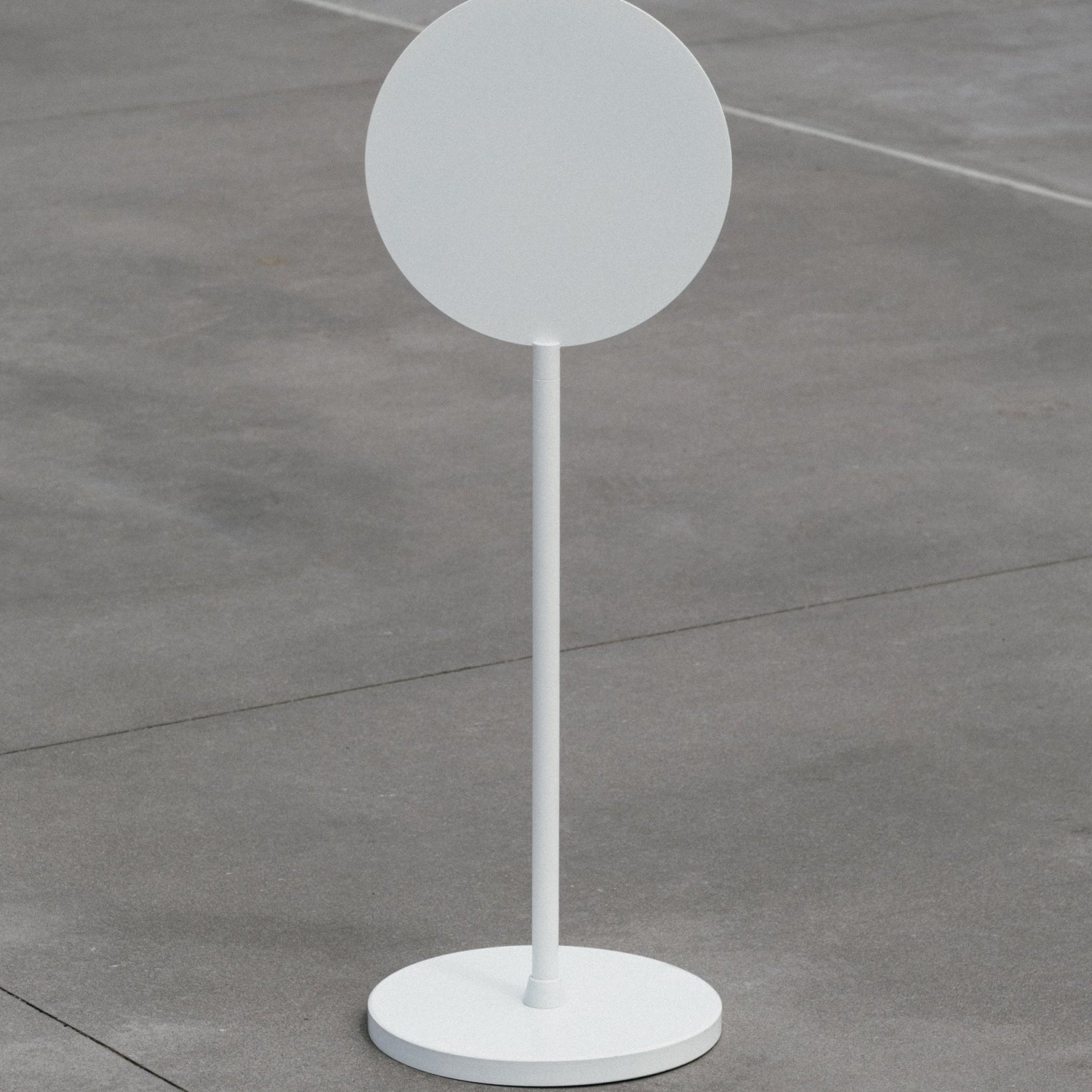
The illuminated LED Round Light Box Sign is a guaranteed way for your storefront sign to stand out, night or day.
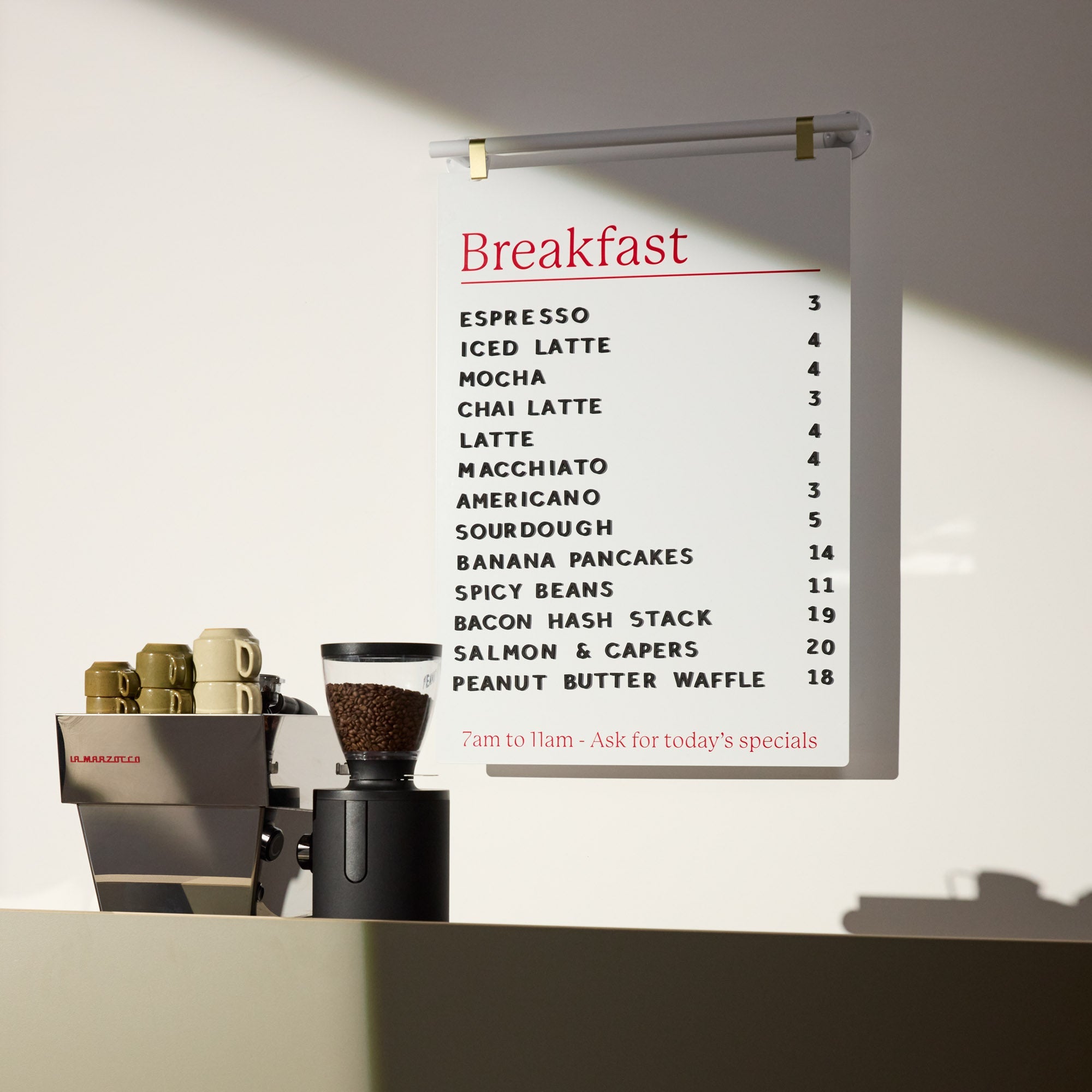
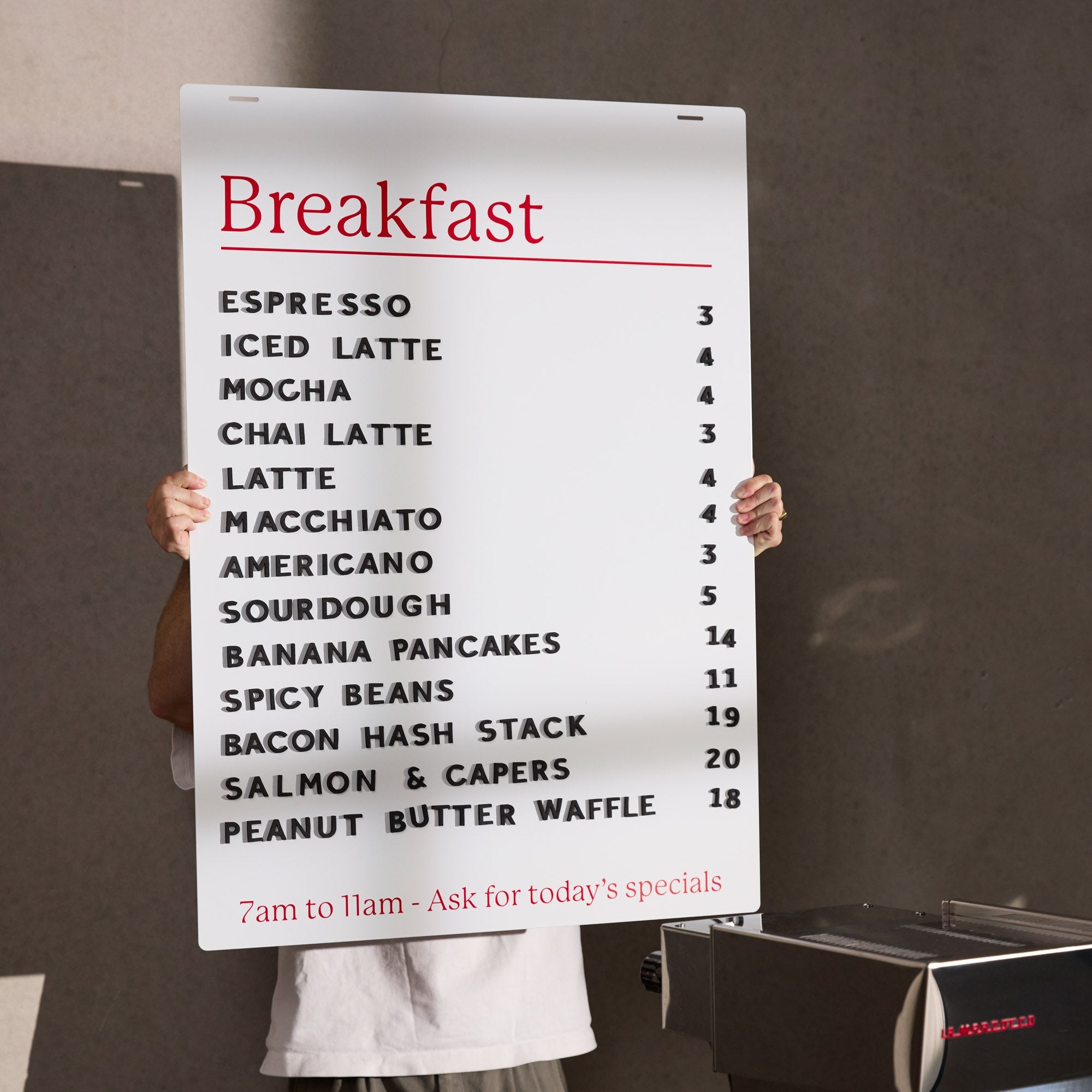
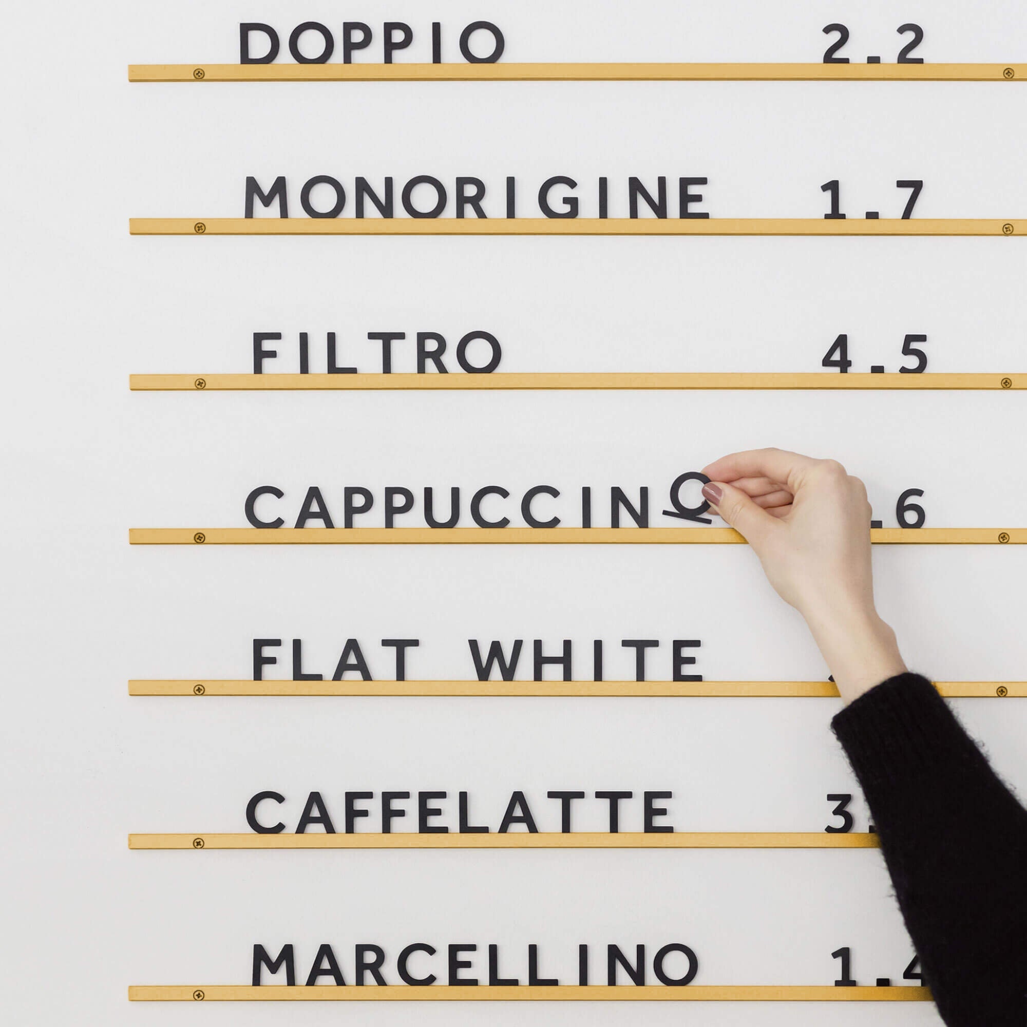
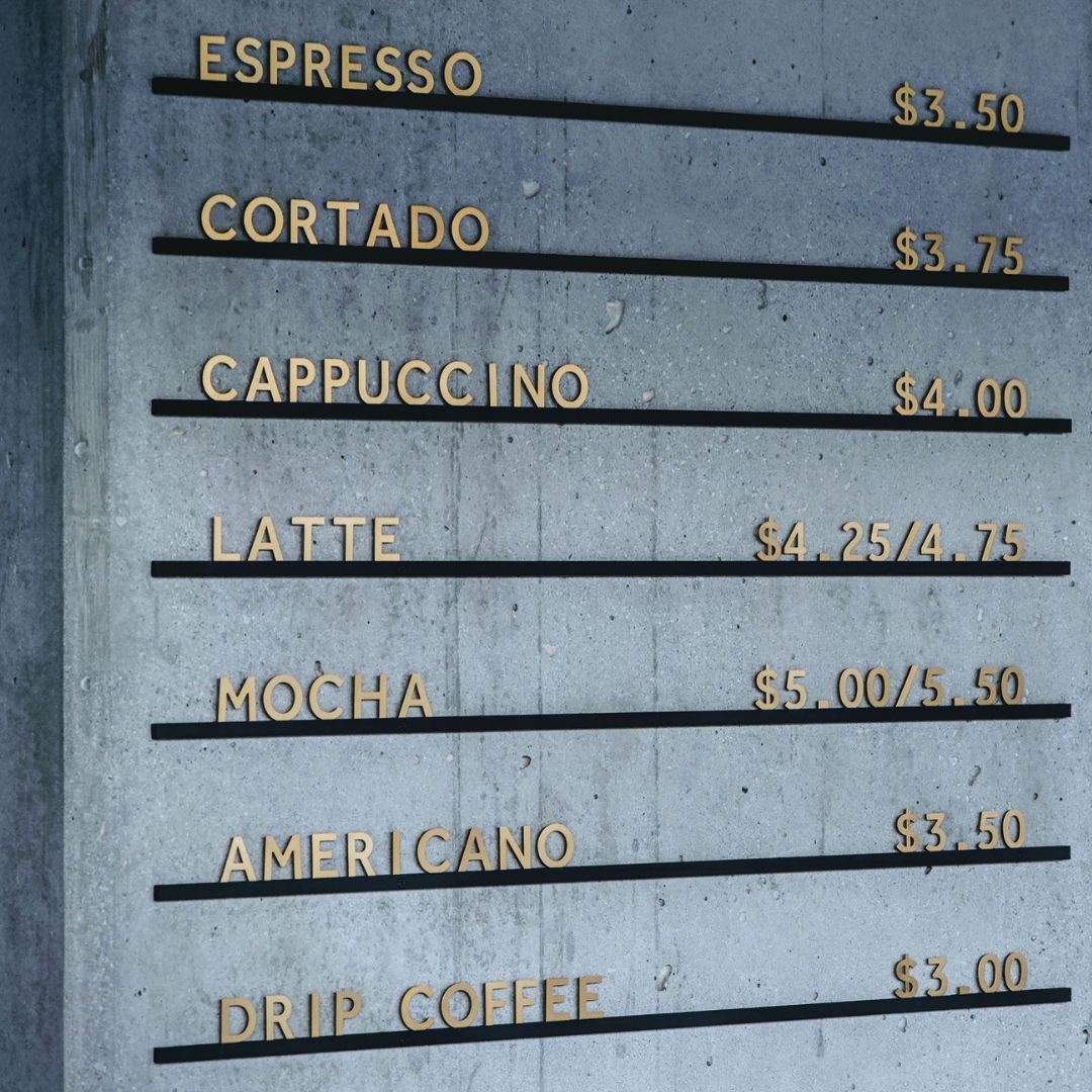
3. Poor Contrast
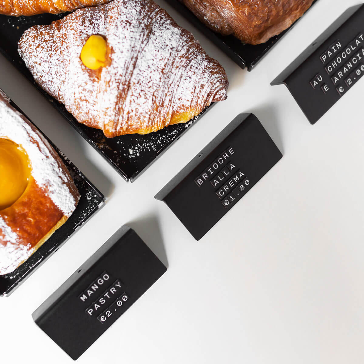
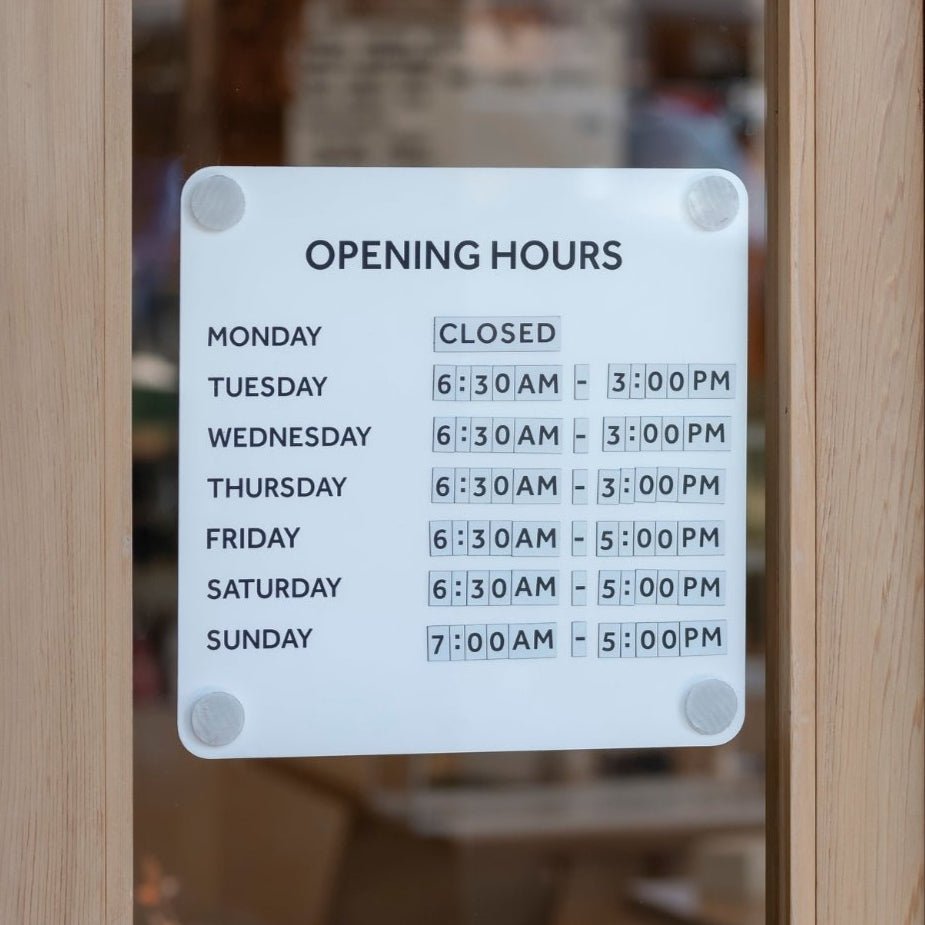
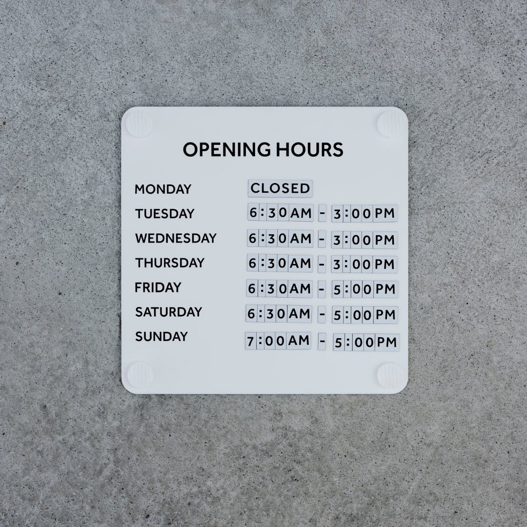
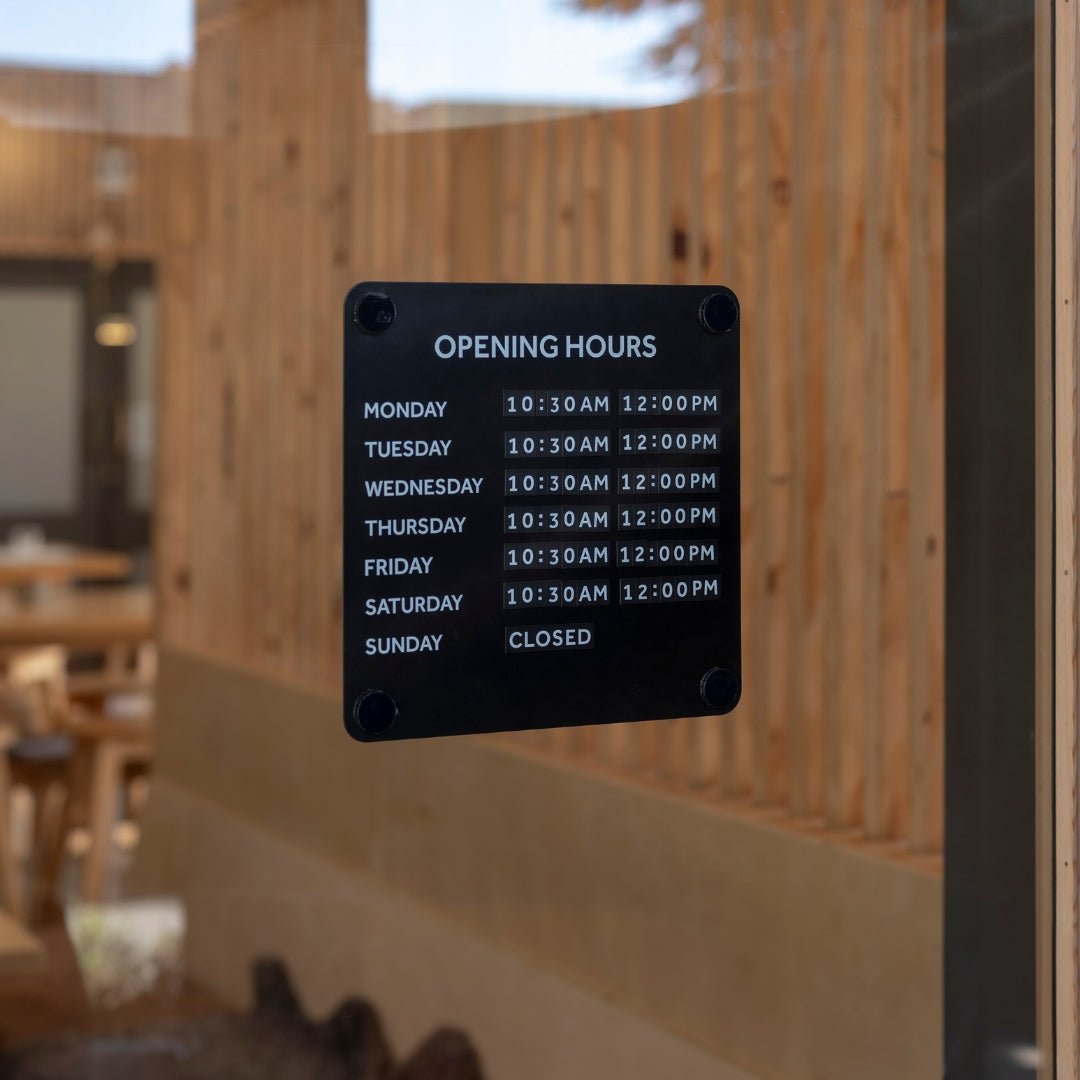
If your sign is too light against a pale wall or too dark in a dim corner, people will struggle to read it. This is especially common with restaurant menus or directional wayfinding signs.
Fix:
Make sure there's enough contrast between your wayfinding sign and the background. Light letters on dark menu boards or vice versa always work well. If you're outdoors, think about how the lighting changes throughout the day.

A customer's example of creative bold colours to help their Rectangle Blade Sign stand out...

...while another customer shows that bright colors aren't the only solution. With the right contrasting logo branding, you can have a Square Blade Sign that's both subtle and a statement.
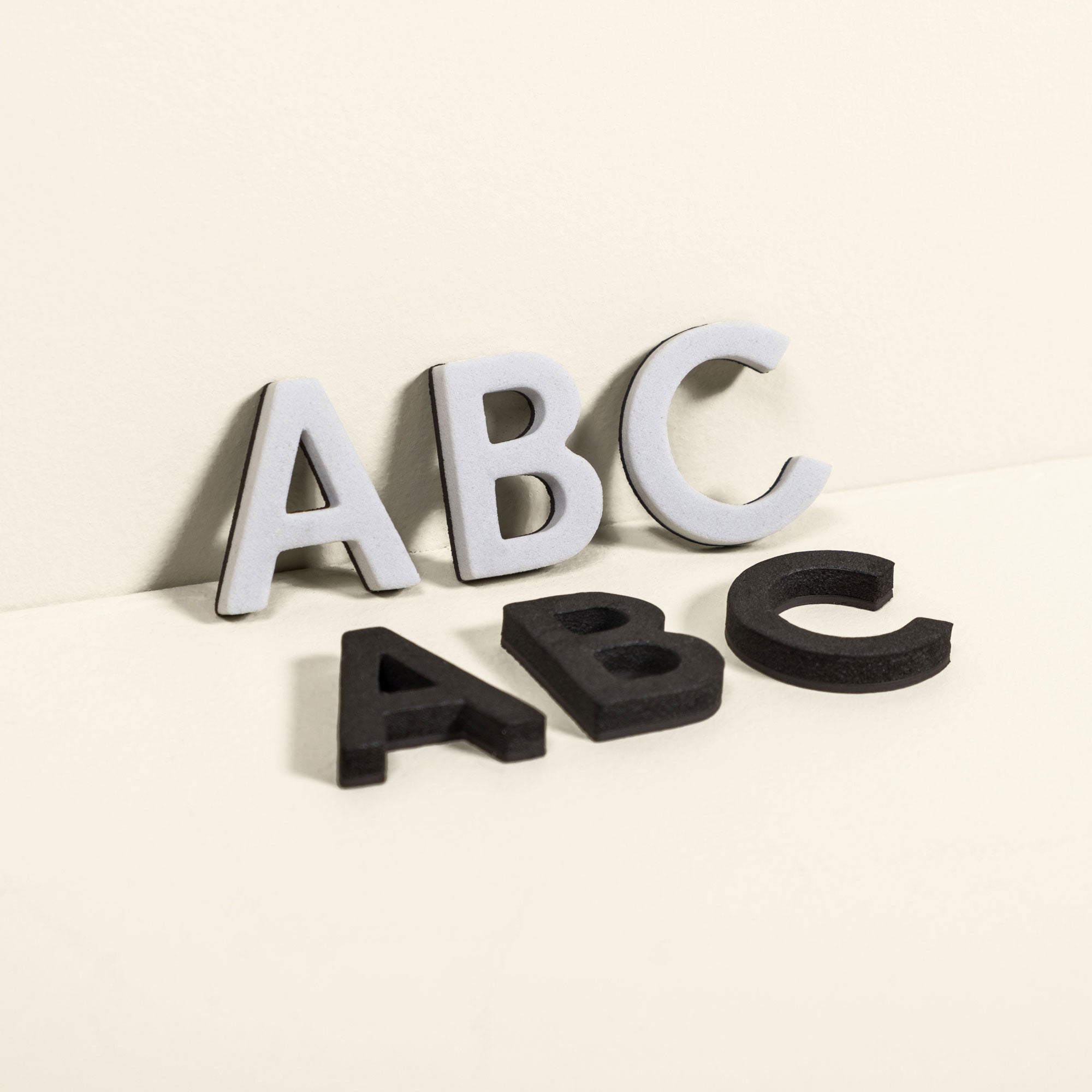
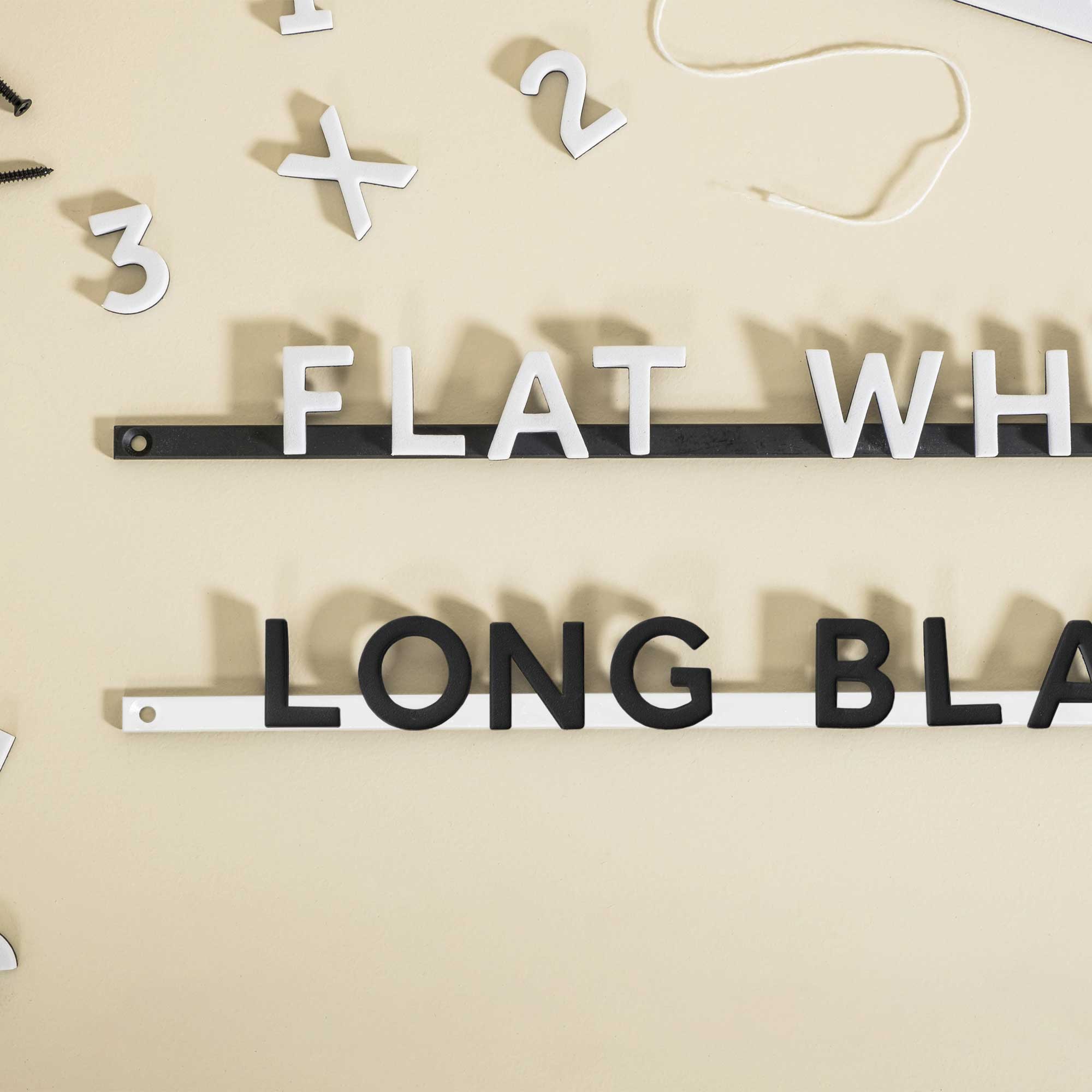
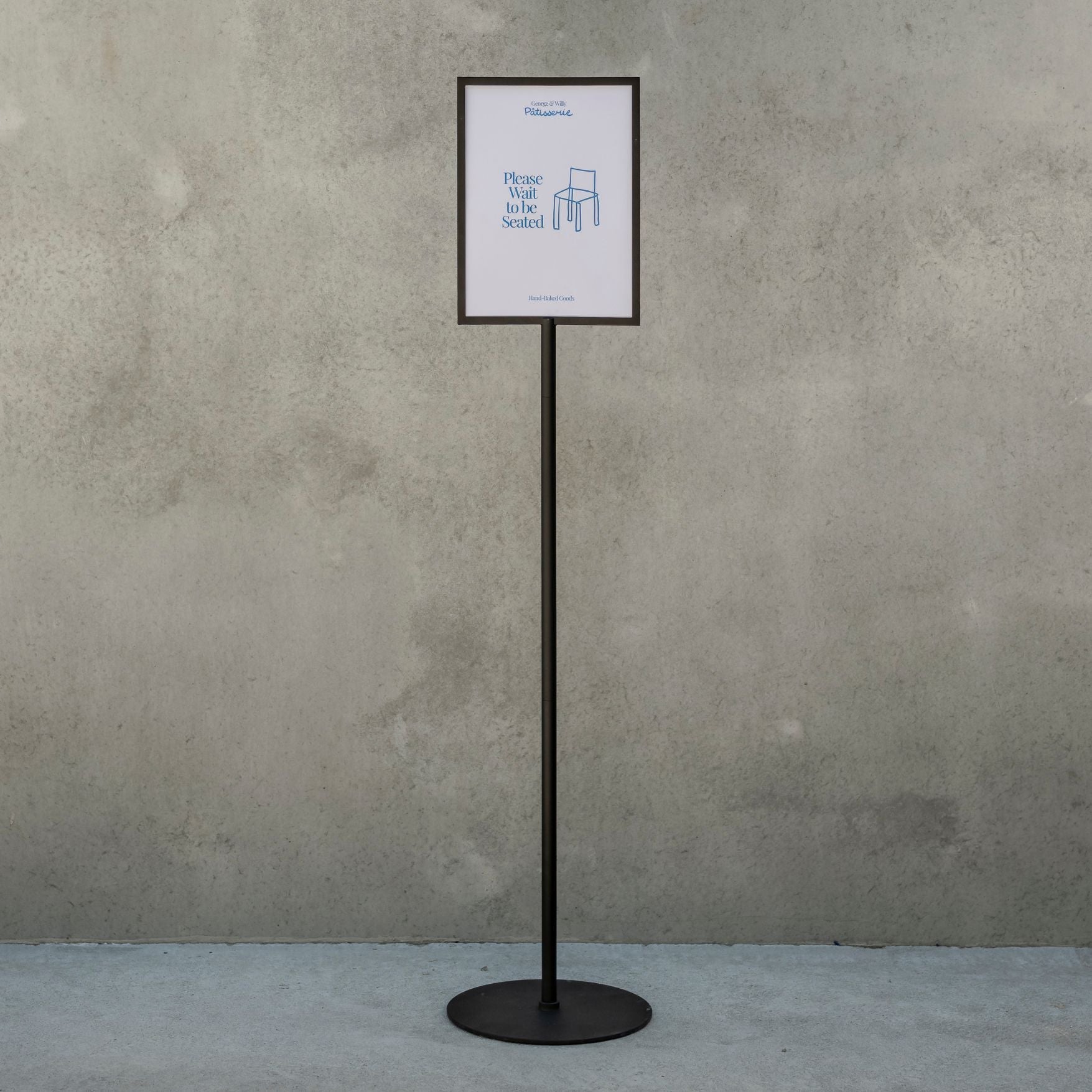
4. Overcomplicated Fonts
We love a good typeface, but if you have to squint to read it, it’s probably not the right choice for signage. Thin, curly, or overly decorative fonts can be hard to read from a distance.
Fix:
Go for clean, bold, and legible. There’s a reason we keep our sidewalk sign or menu board fonts nice and simple — they just work.

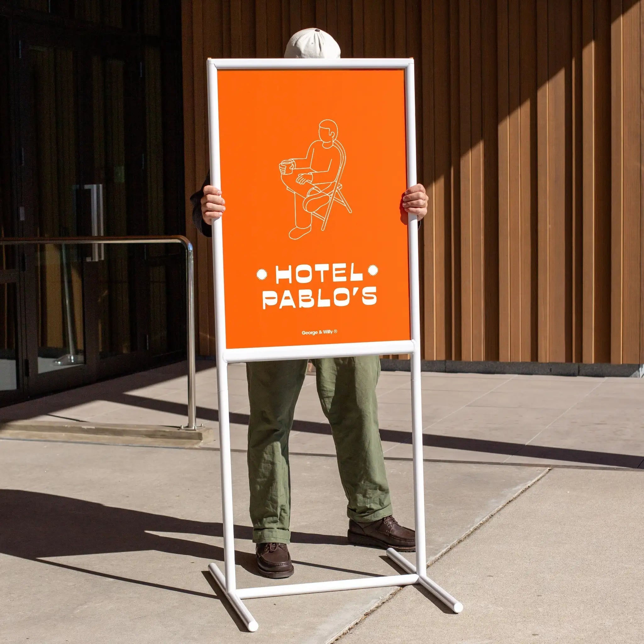
Our Poster Sidewalk Sign with a timeless font for an eye-catching sidewalk sign message.
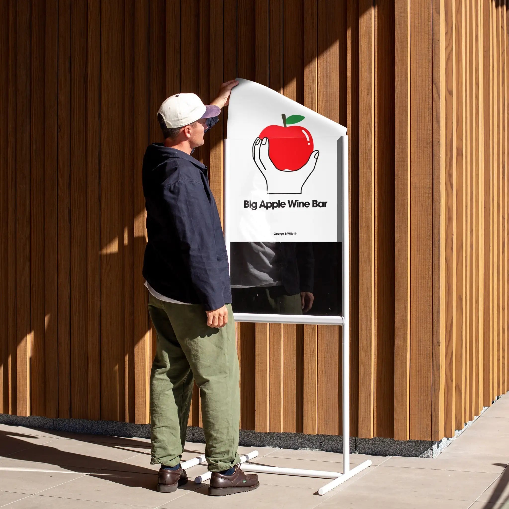
5. Inconsistent Branding
Your signage is often the first impression people get of your brand. If your signs don’t match your overall aesthetic—think colours, fonts, tone—it can feel a bit off.
Fix:
Keep your signage aligned with your brand look and feel. If your space is minimal and warm, lean into natural materials and soft tones. If it’s fun and quirky, play that up with bold lettering or changeable messages.

Holiday Records paints the town (and sidewalk sign) red with their bright and bold record label branding on a contrasting black Letter Swing Sign.
A Few Bonus Tips from the Workshop:
-
Add personality, but don’t overdo it. A clever quote or small detail can go a long way.
-
Less is more. White space is your friend.
-
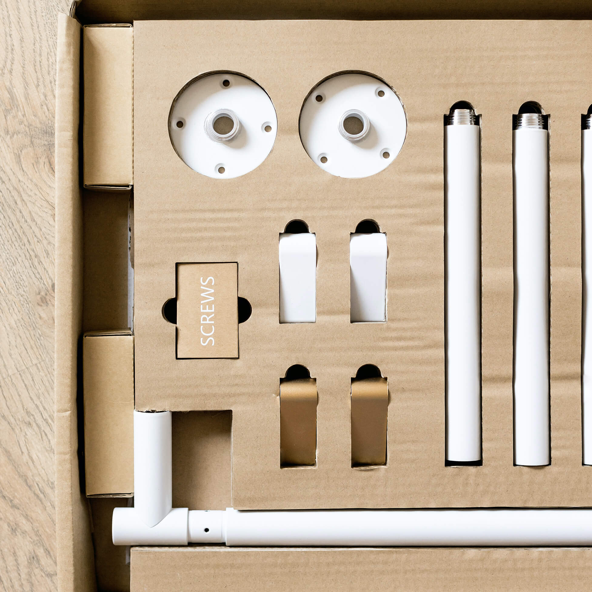
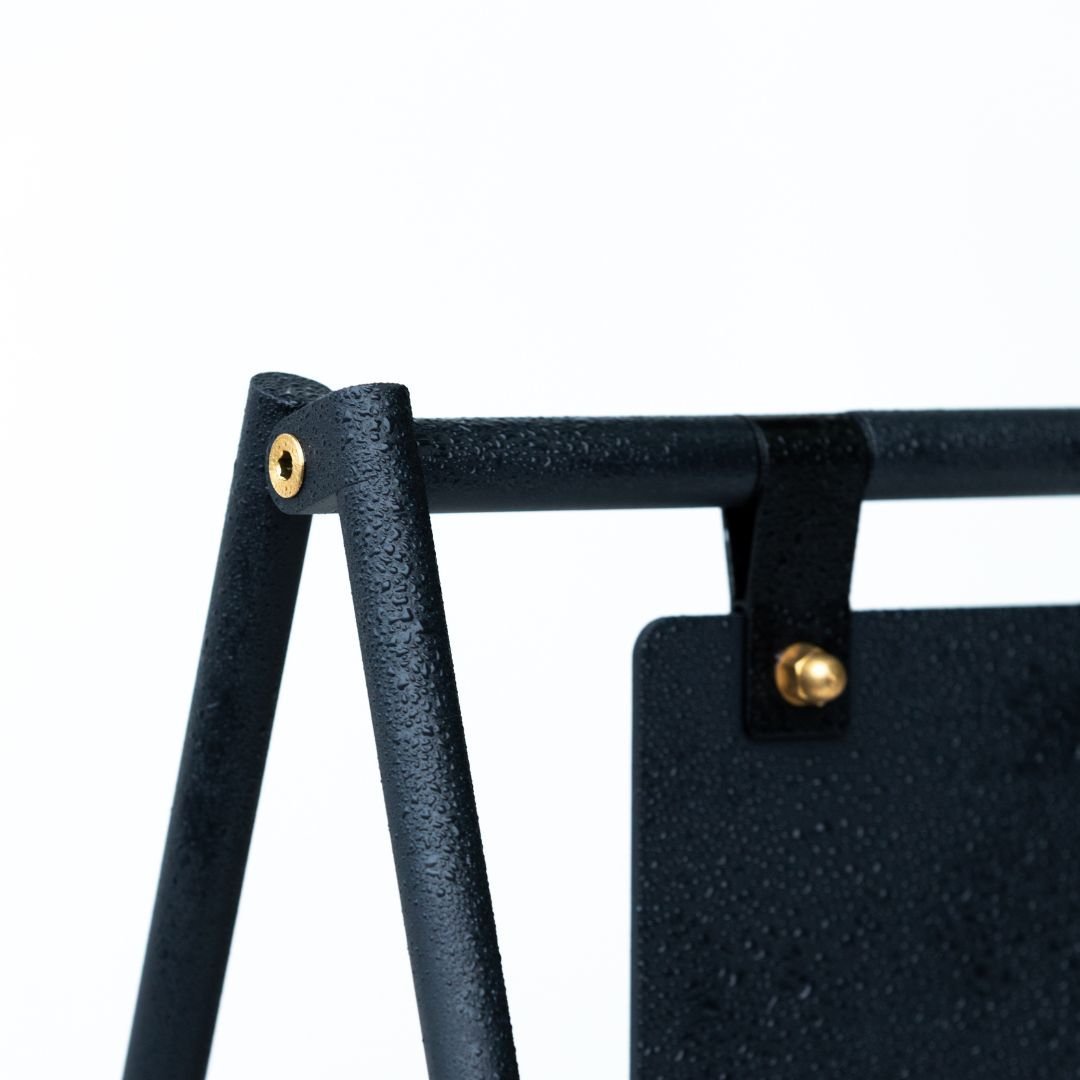
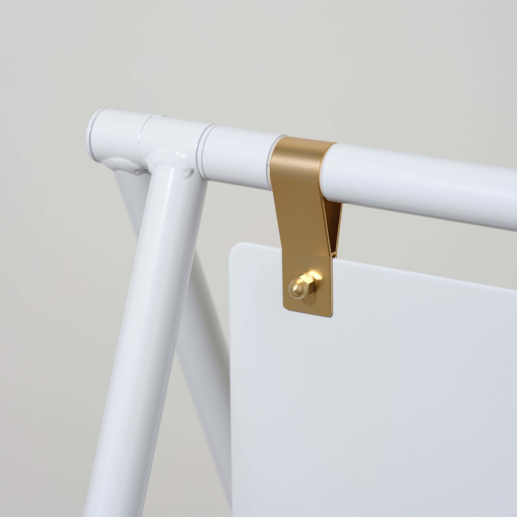
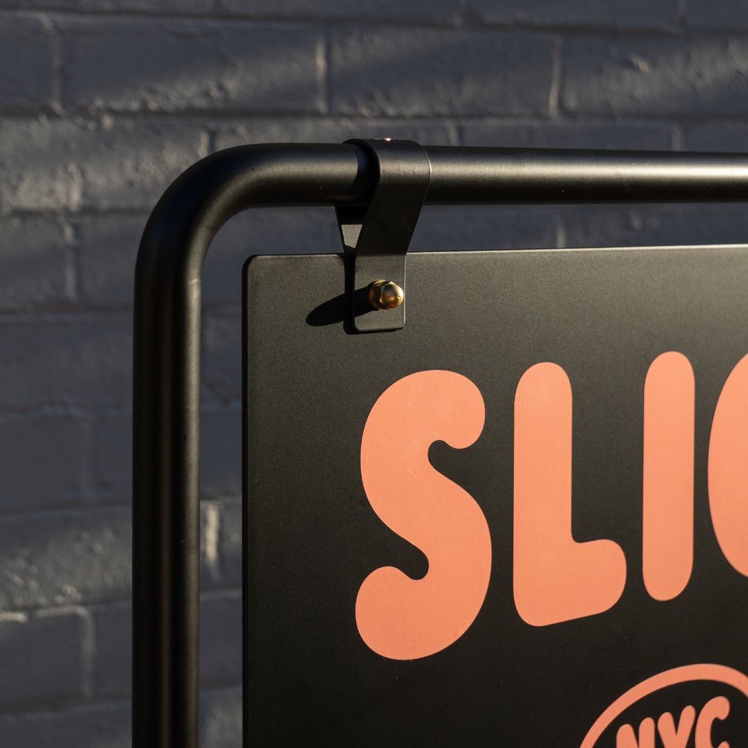
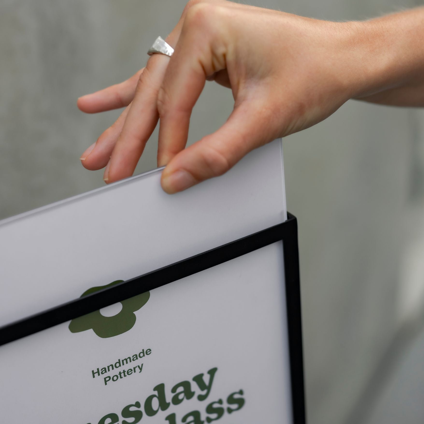
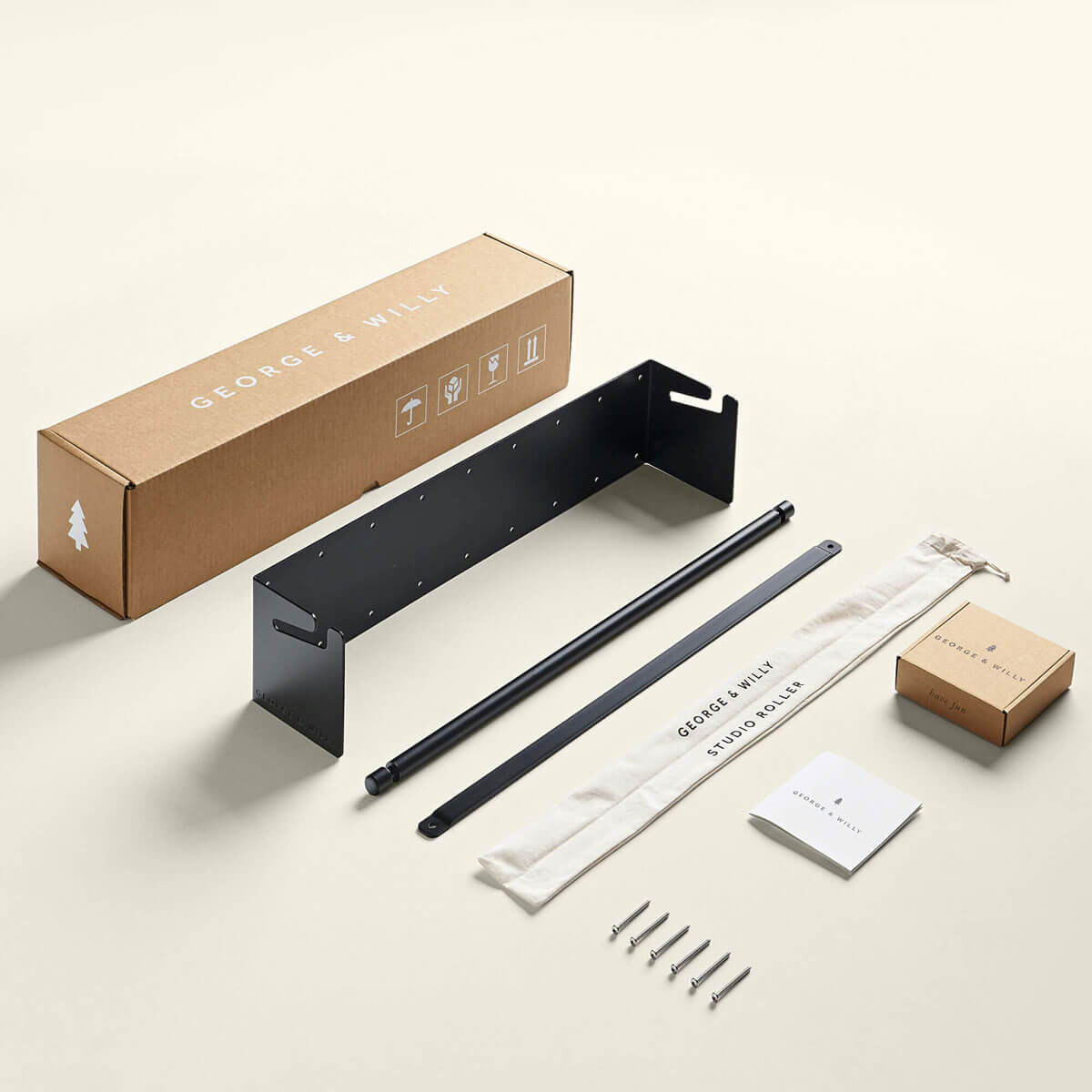
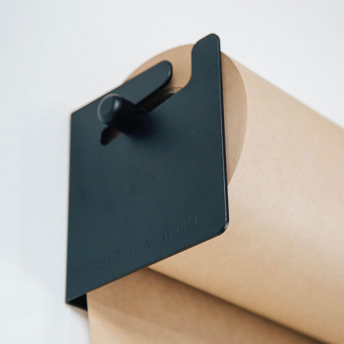
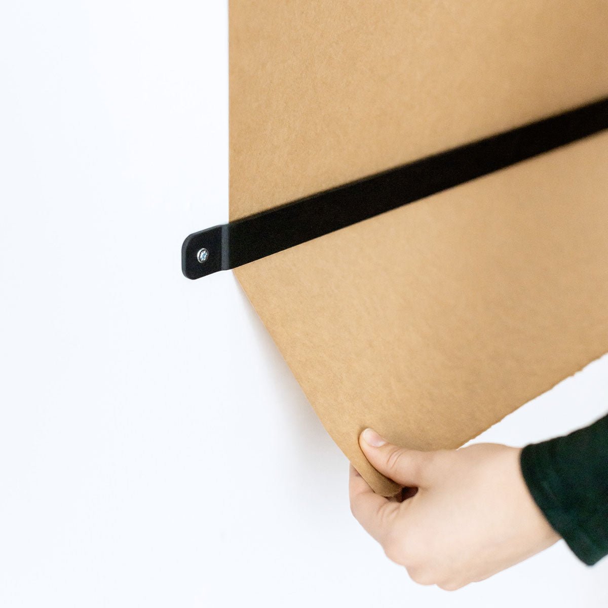
Don’t forget about the hardware — a good bracket or stand makes a sign feel polished.
At the end of the day, your signage should be clear, easy to read, and feel like you. And if you ever need help picking the right one, you know where to find us.