


Interior signage is a powerful tool for communication within any commercial space. It is much more than a simple direction pointer, it is a crucial element of your brand’s identity and the overall customer experience. Good interior signage guides visitors, conveys important information, and reinforces your brand’s aesthetic from the moment someone walks through the door. It silently communicates professionalism and attention to detail, making spaces easier to navigate and more memorable.
How Interior Signage Builds Your Brand Experience
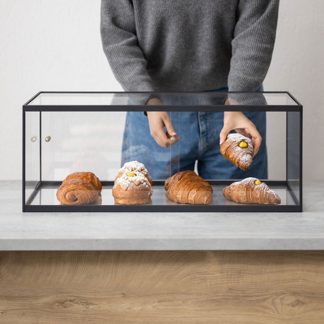
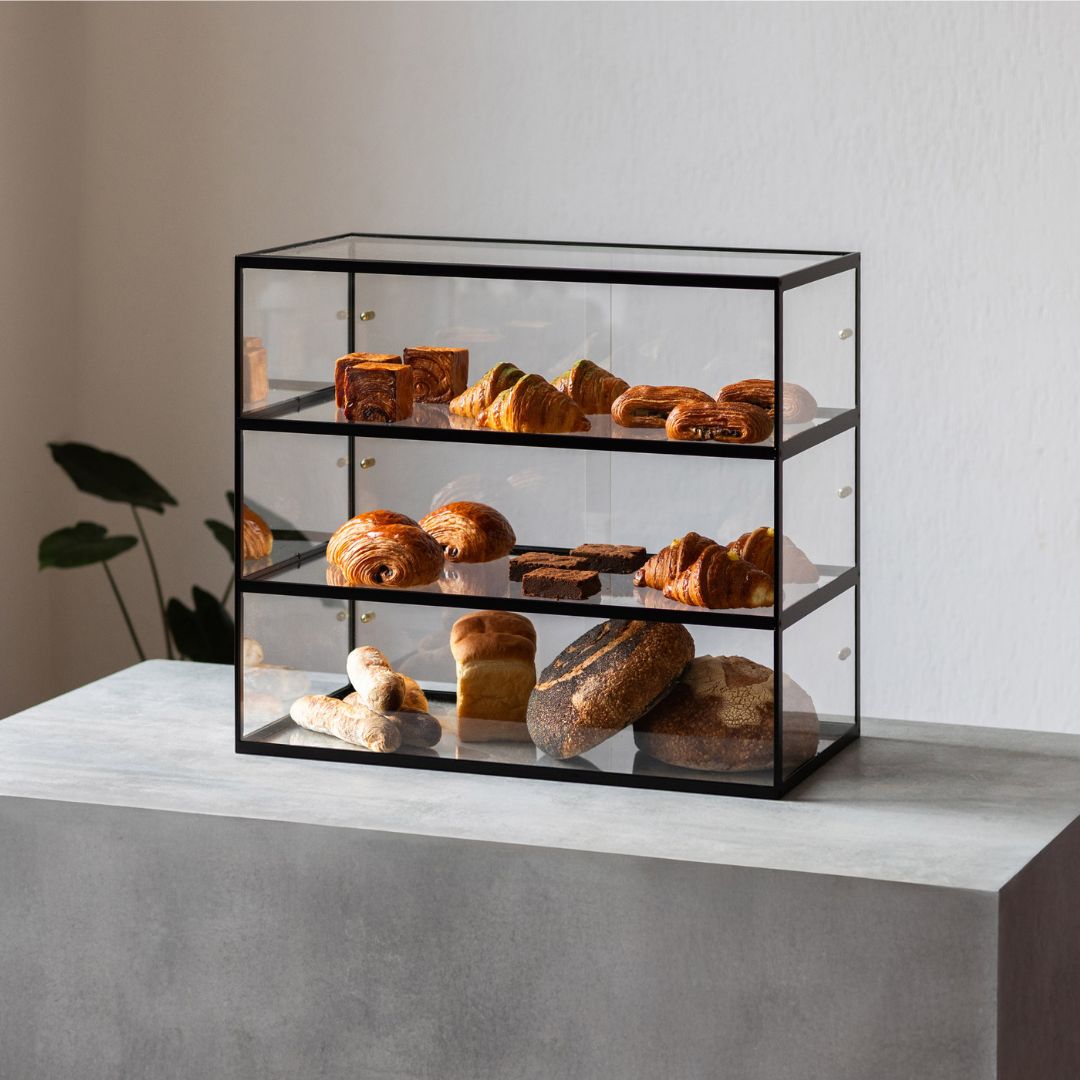
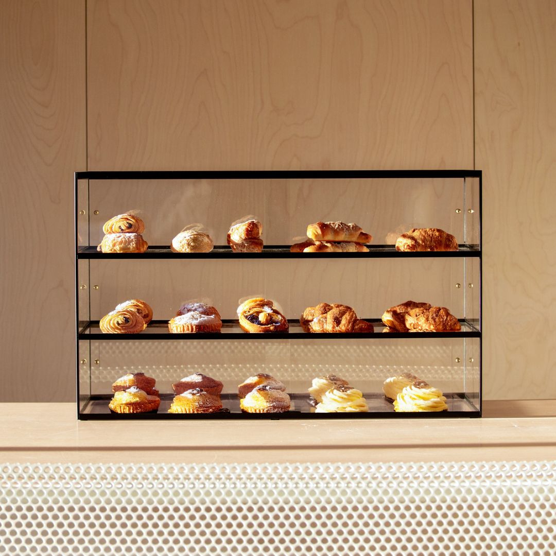
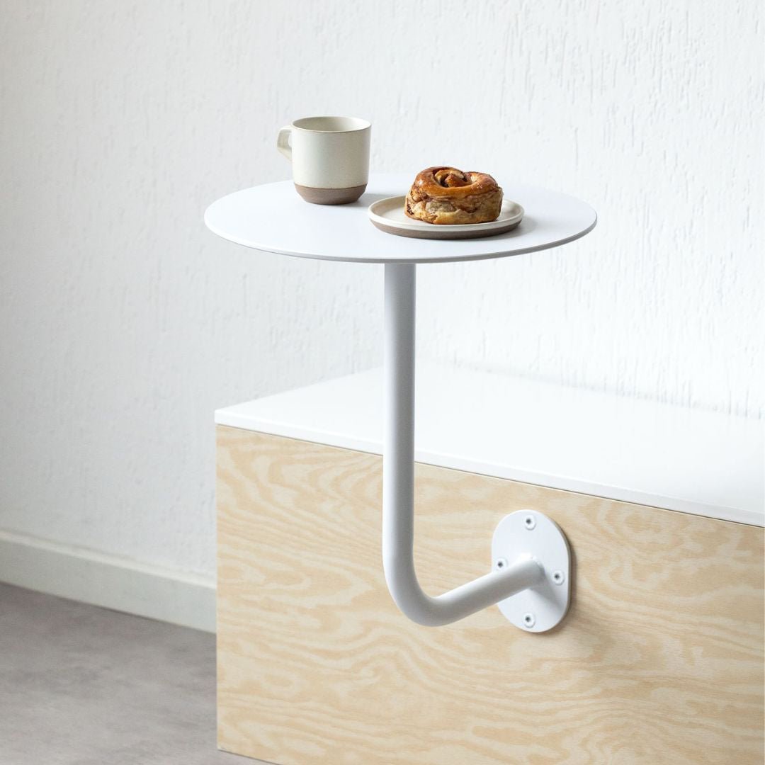
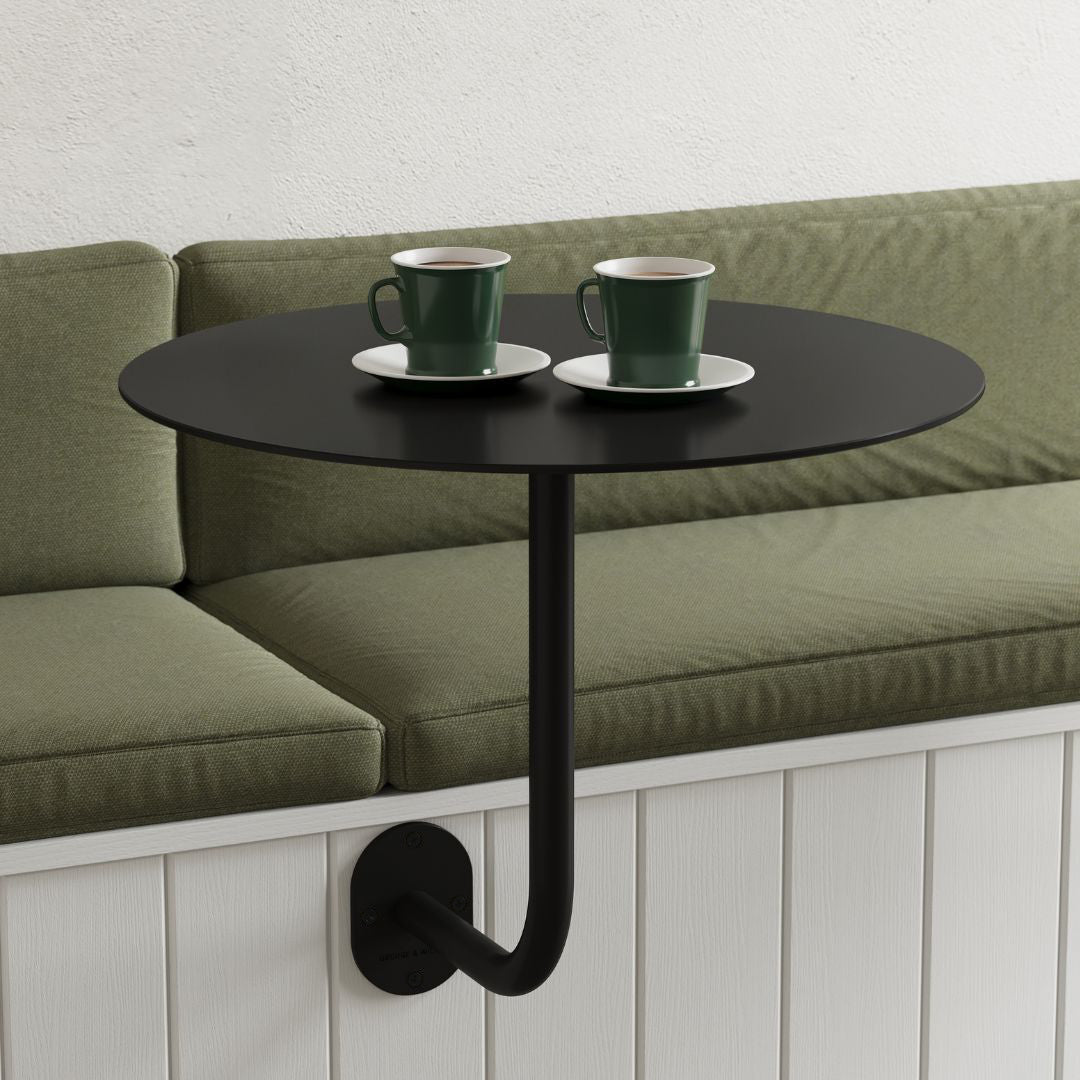
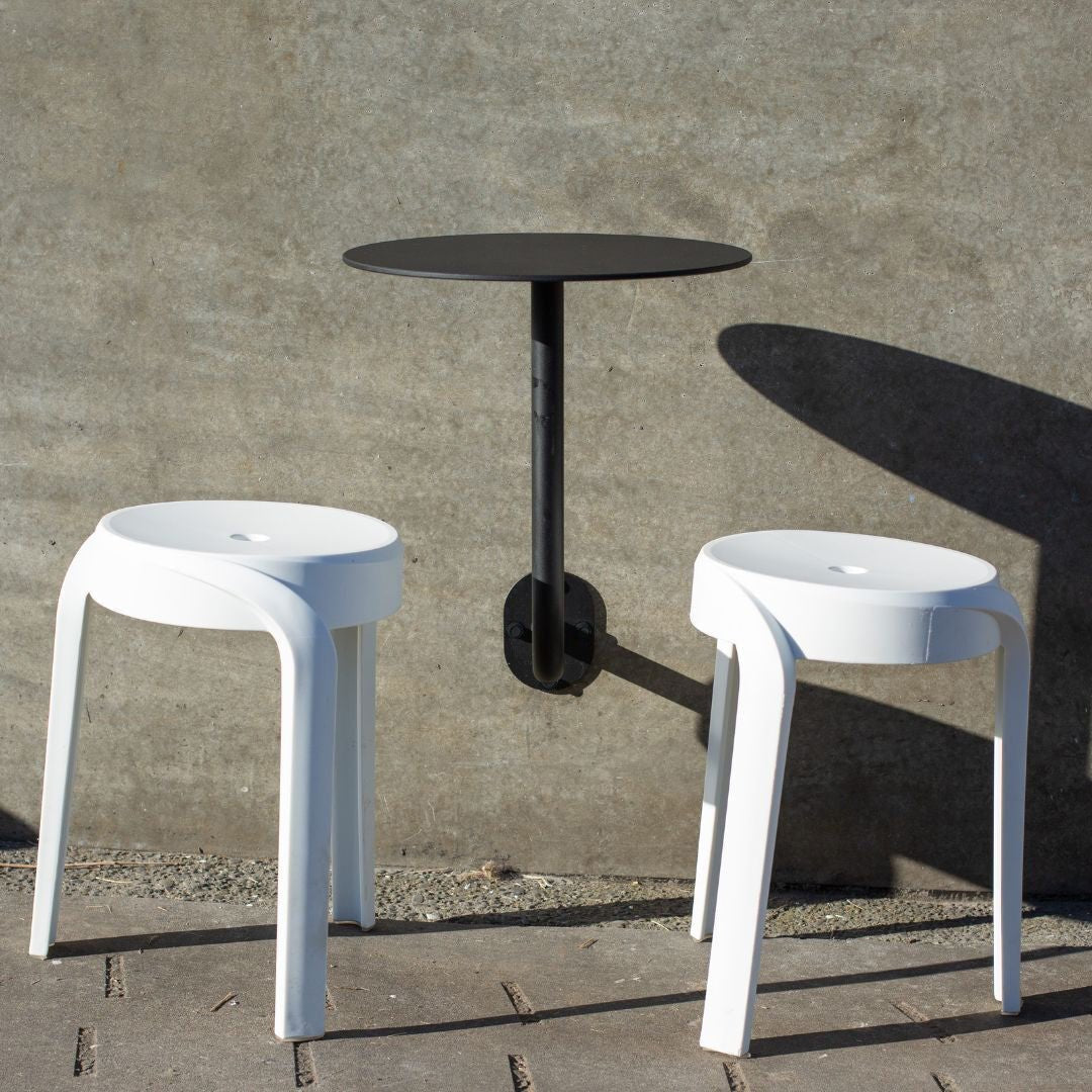
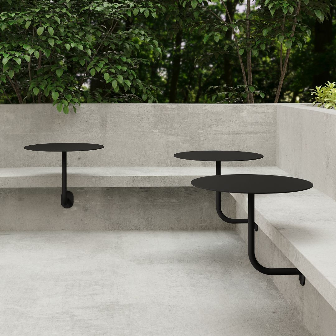
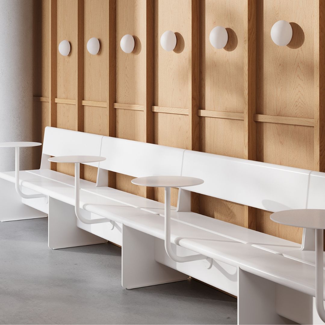
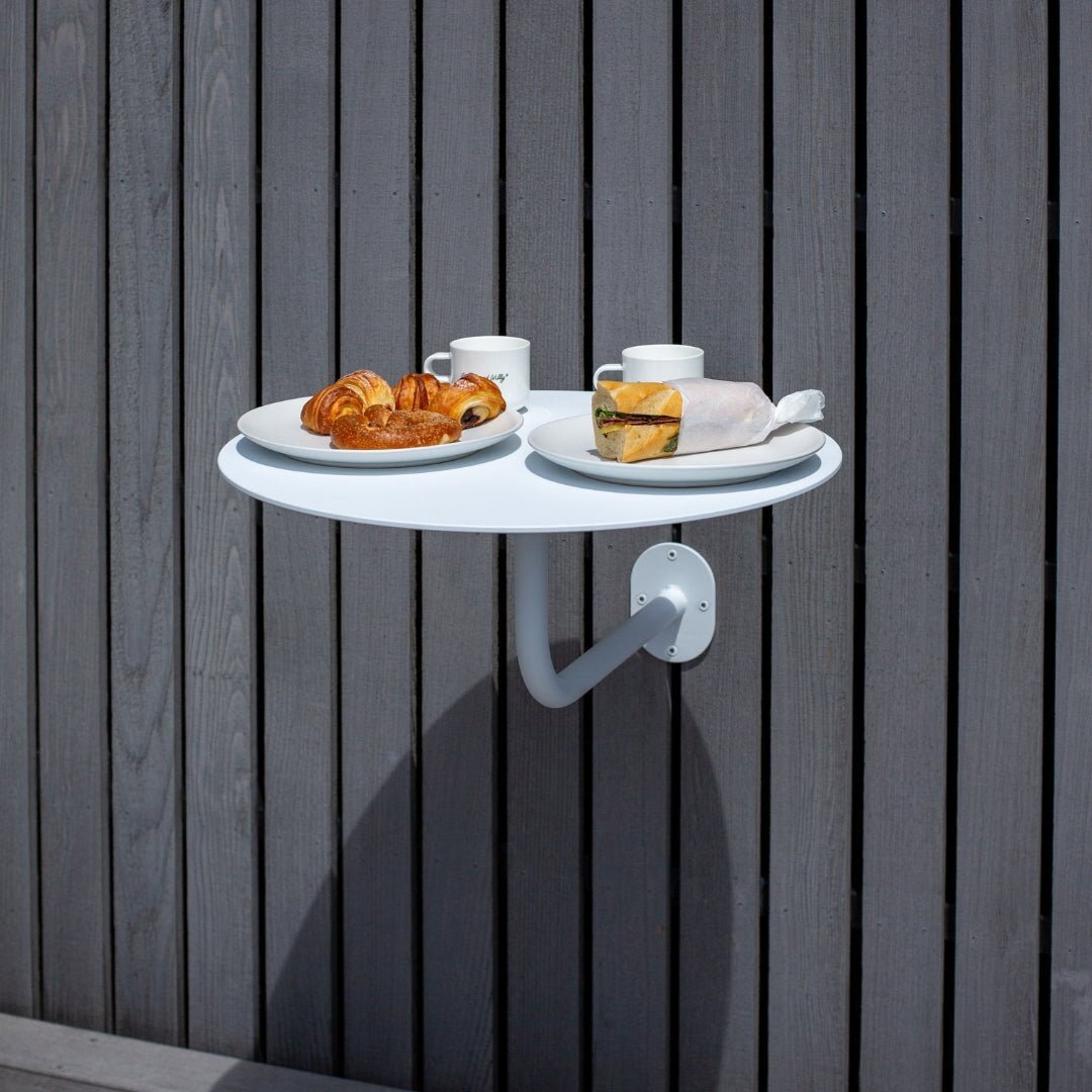
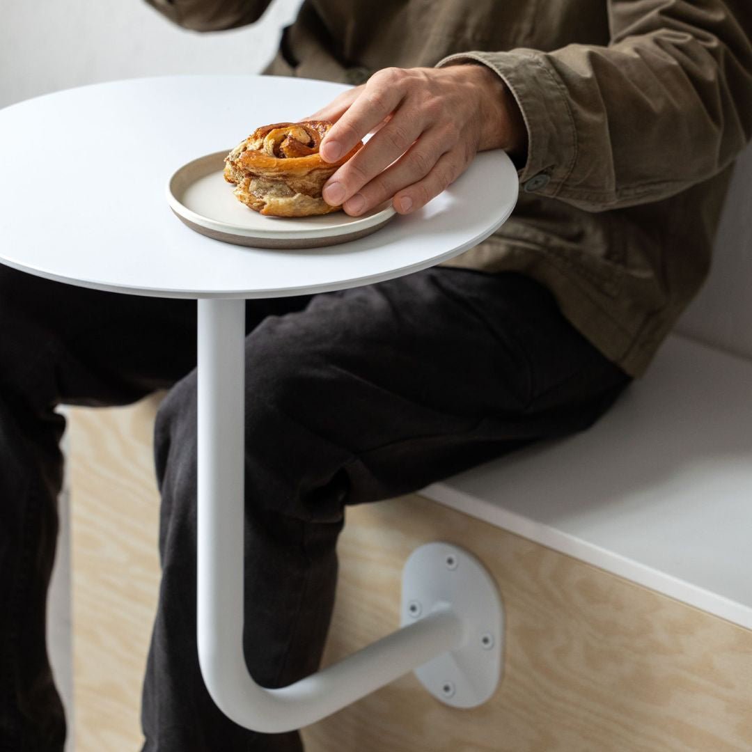
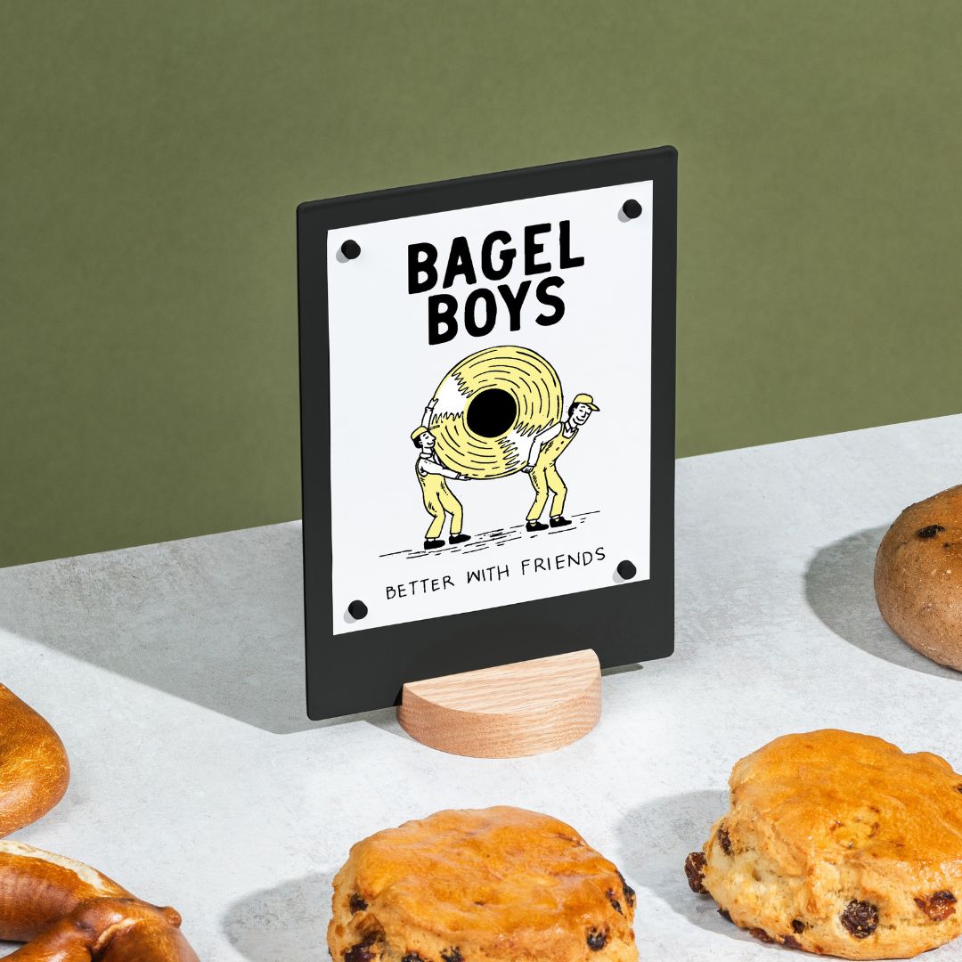
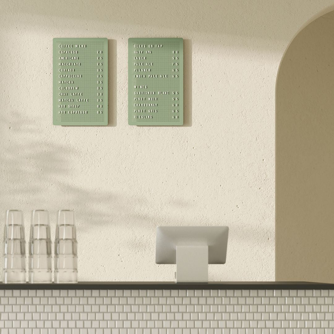
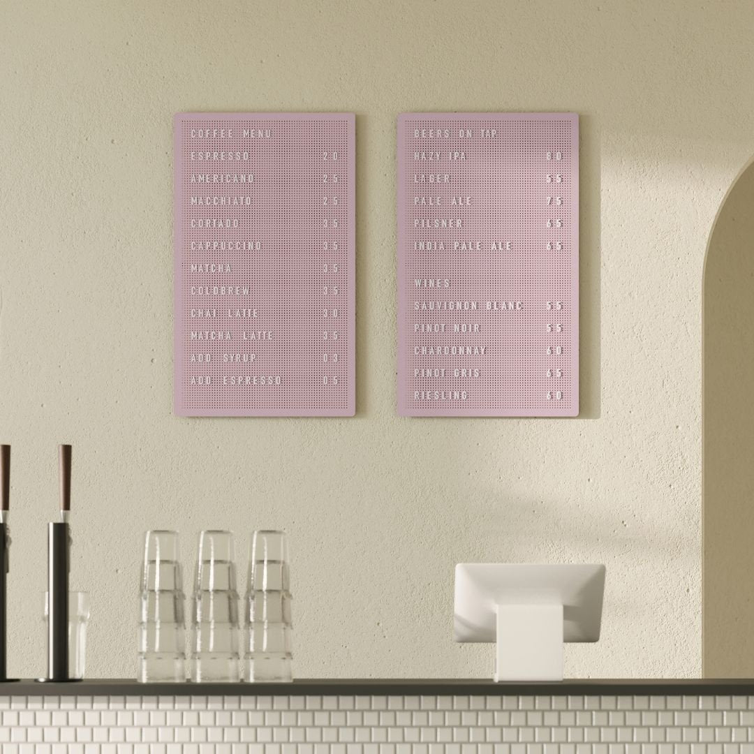
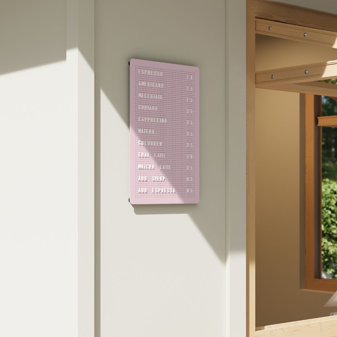
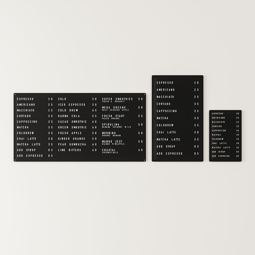
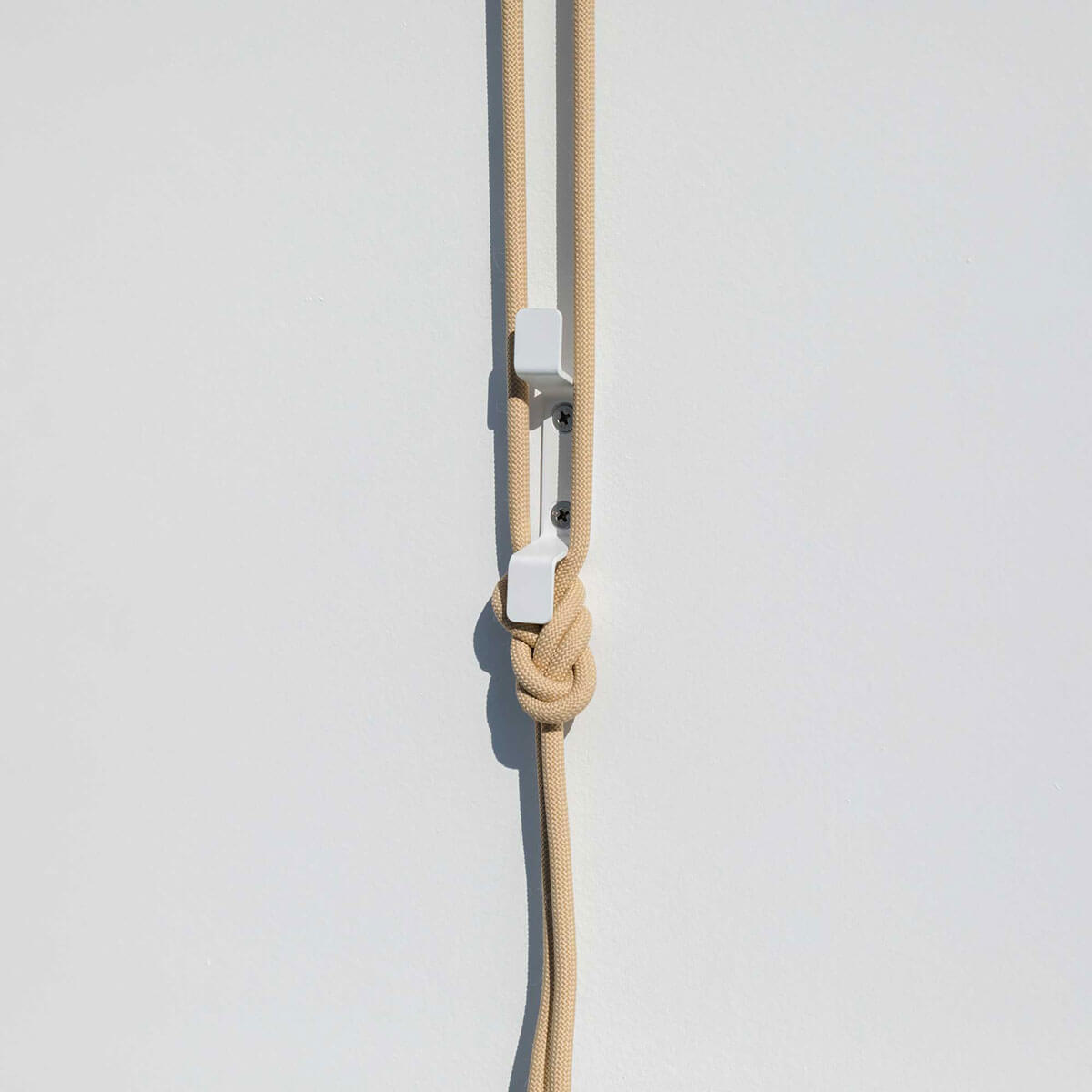
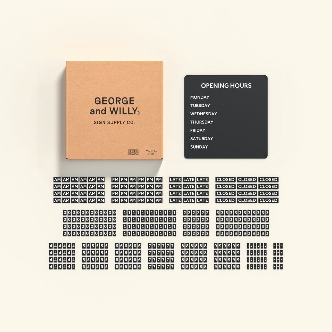
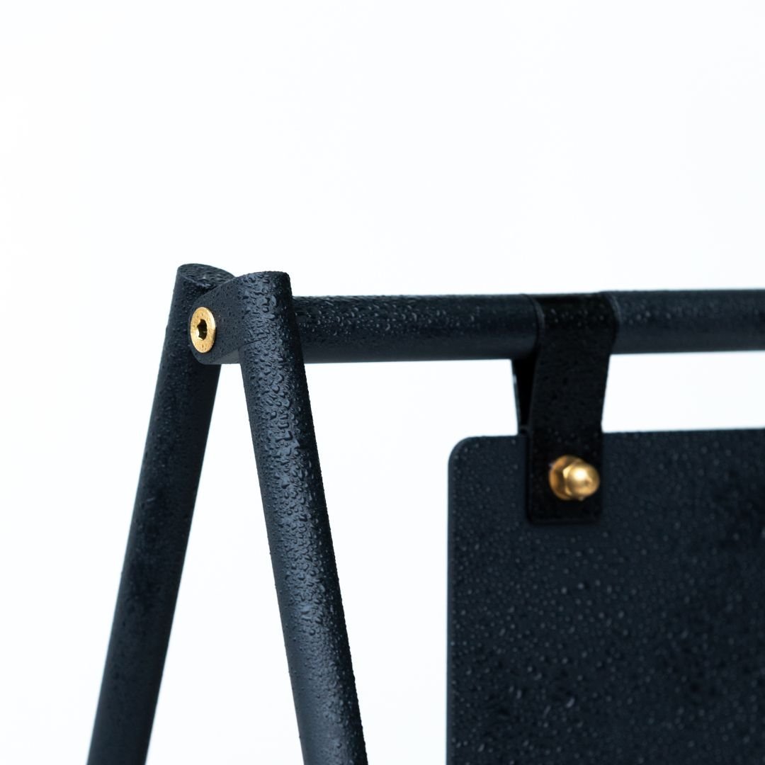
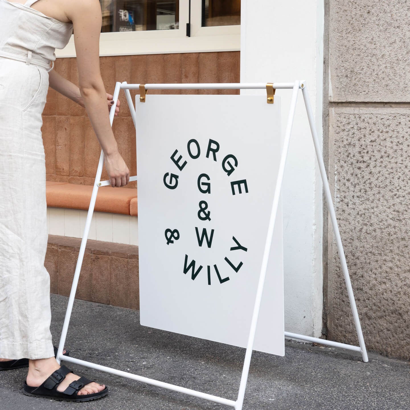
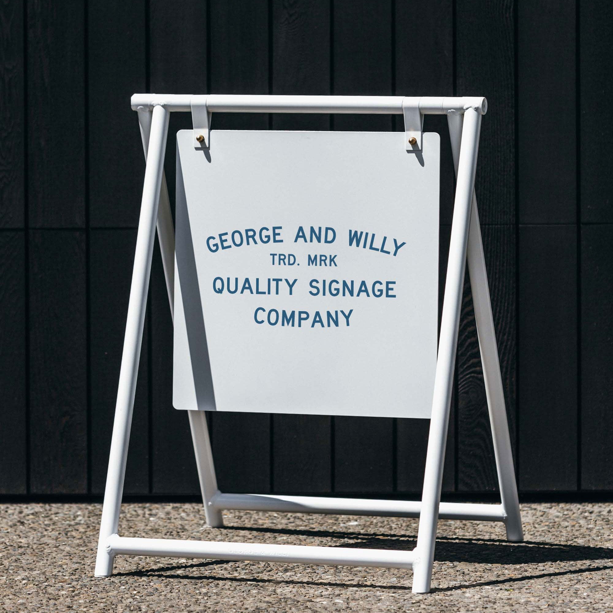
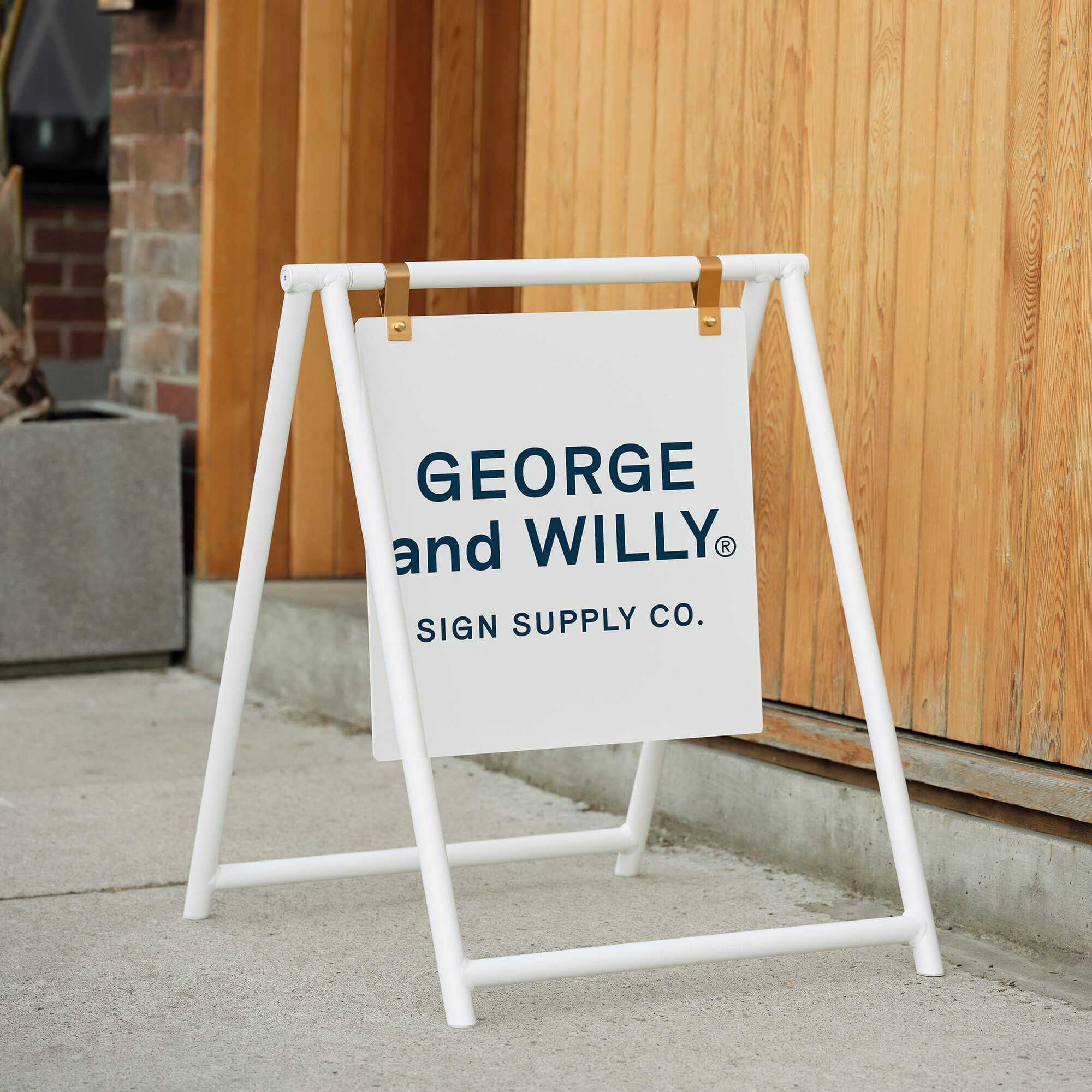
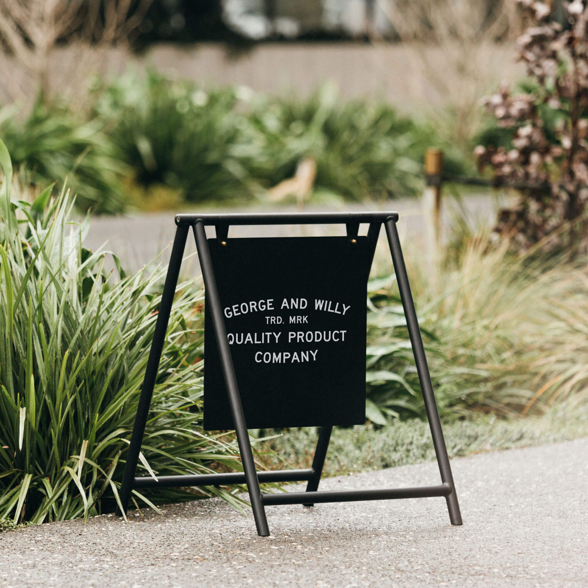
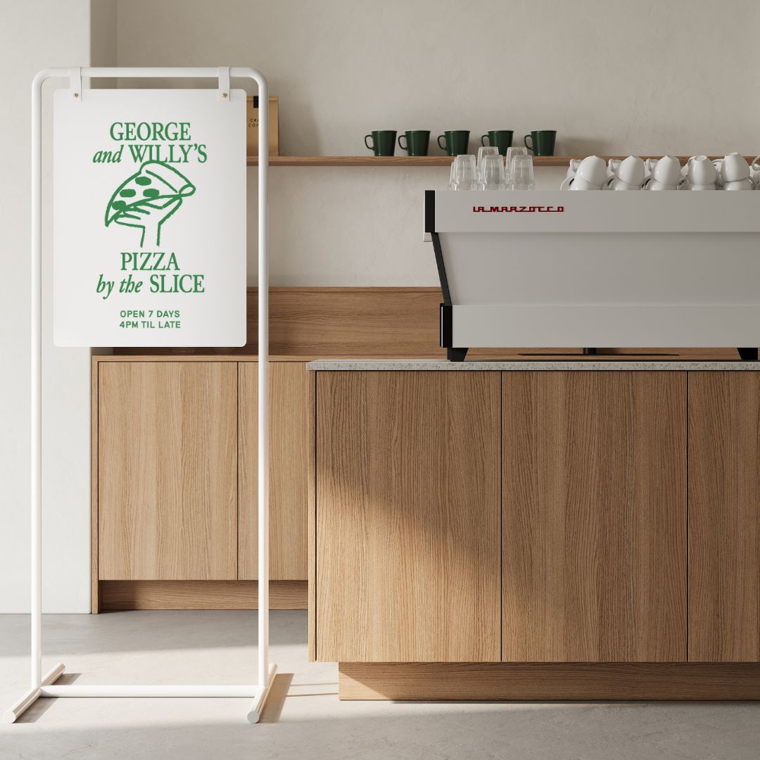
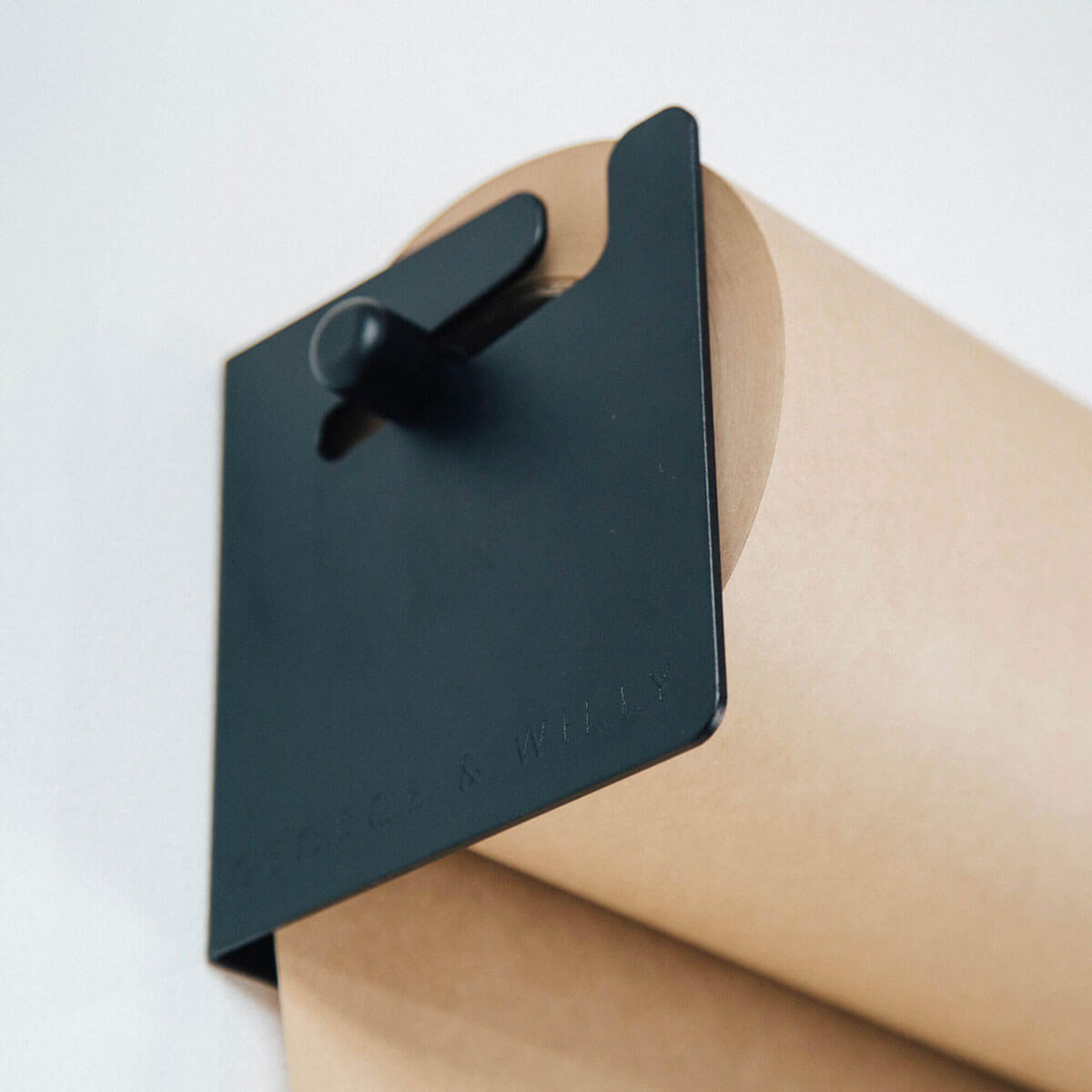
The right interior signage system creates a cohesive and intuitive environment that builds trust and enhances first impressions. When customers enter a space with clear, well designed signs, they feel more confident and comfortable. This is because effective signage reduces confusion and subtly guides their journey, whether they are looking for a specific department, a menu, or the restrooms. Using premium materials like powder coated aluminum and sustainably sourced timber, which are hallmarks of thoughtful design, further elevates this experience. These durable materials are ideal for high traffic hospitality settings, ensuring your investment looks great for years. All George & Willy products, for instance, are backed by a 2 year warranty covering faulty workmanship, providing peace of mind. A consistent visual language across all your interior signage, from wall mounted displays to countertop signs, is key to creating a memorable brand story.
Top 4 Interior Signage Ideas
Now that you understand the foundational elements of great signage, let’s explore the specific types that make the biggest impact inside your space. The following four categories are essential for any business, as they work together to create a seamless, safe, and on-brand experience for both visitors and employees. Each type serves a distinct purpose, from making a great first impression to communicating critical information.
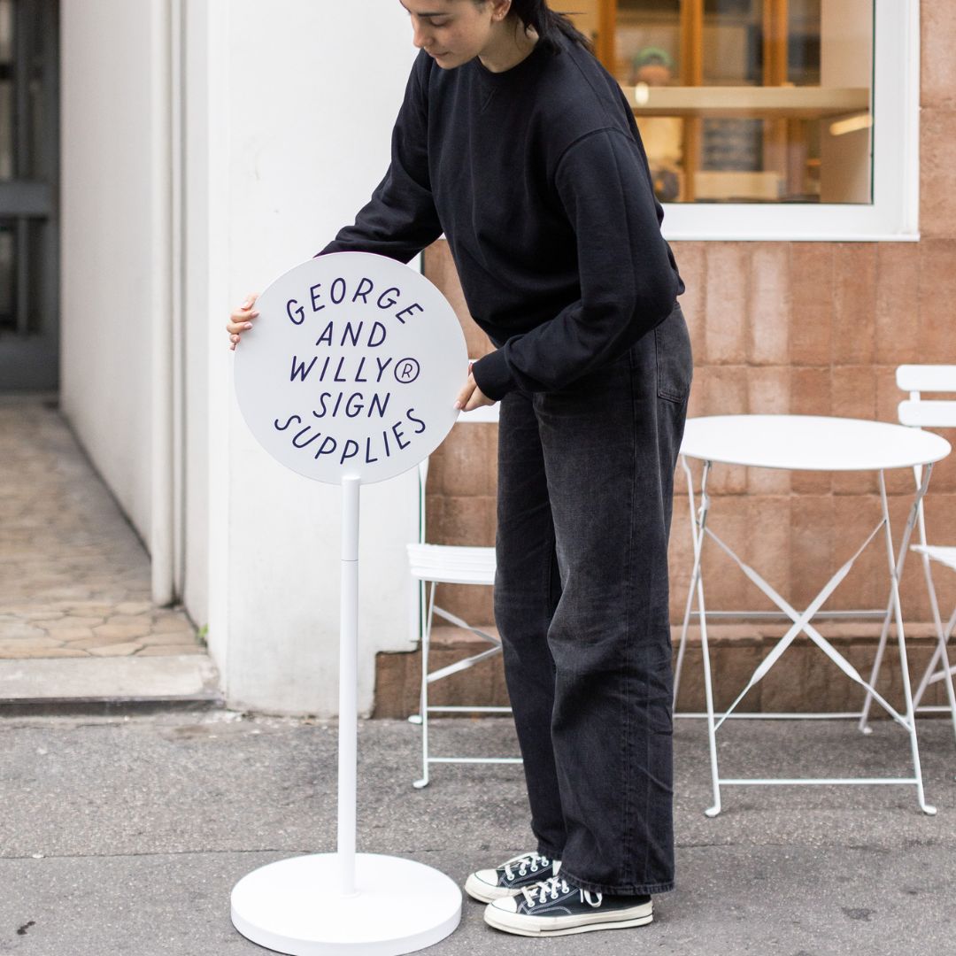
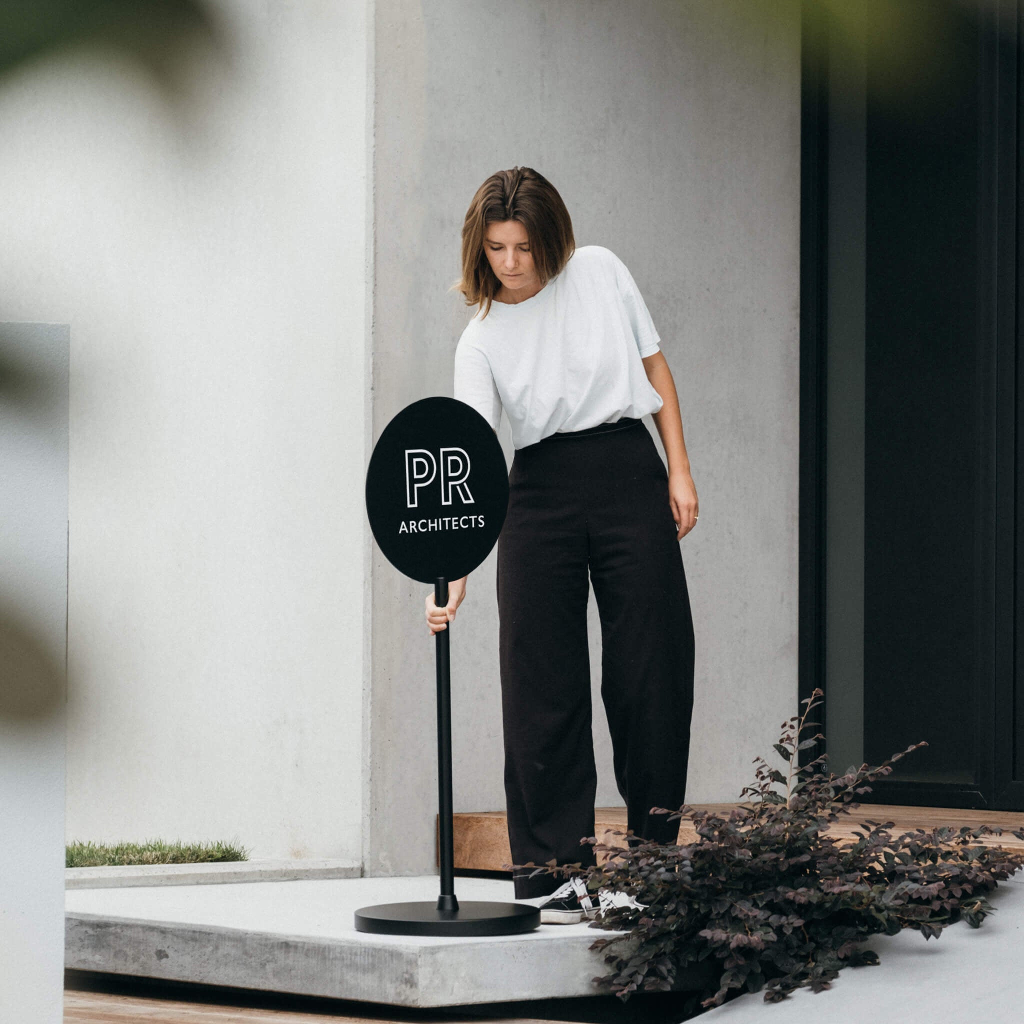
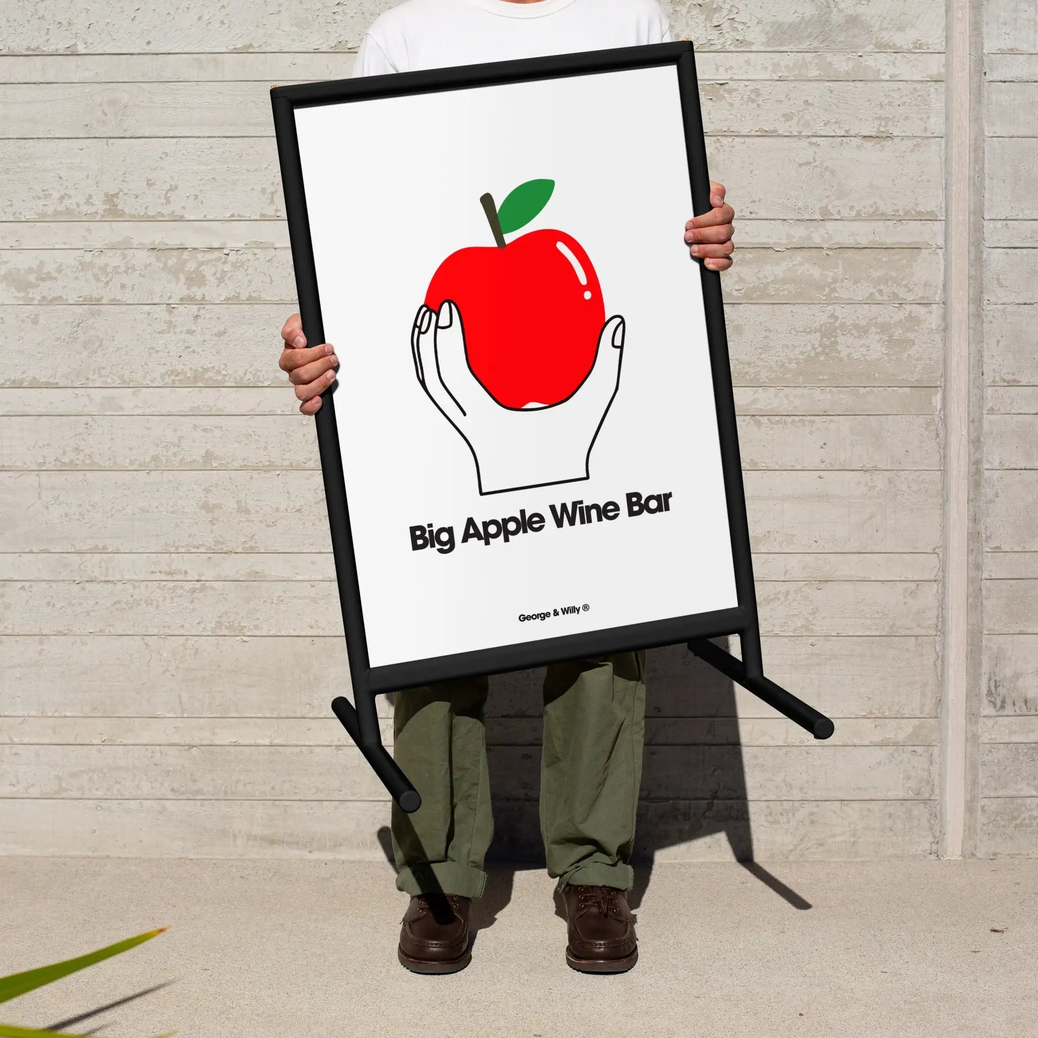
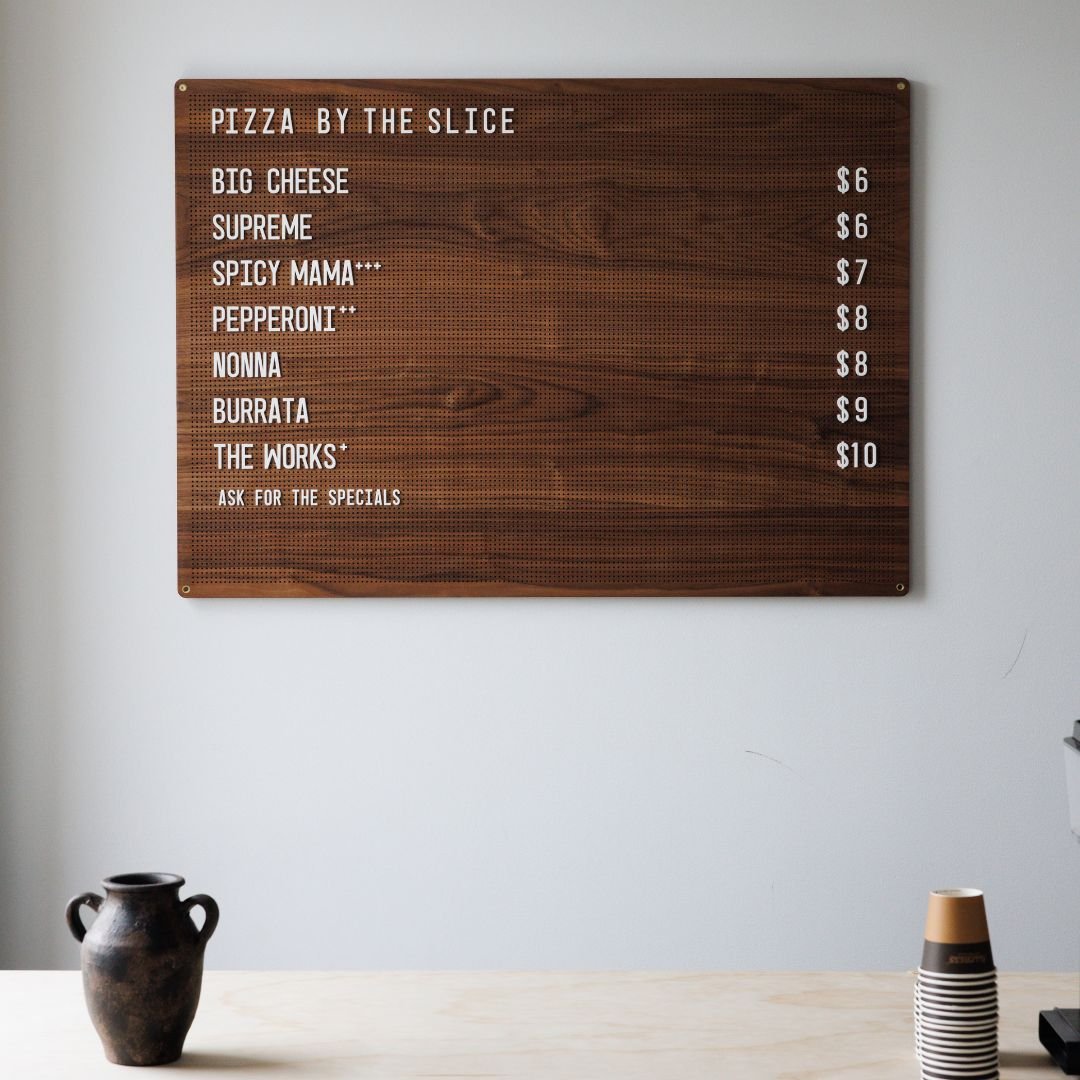
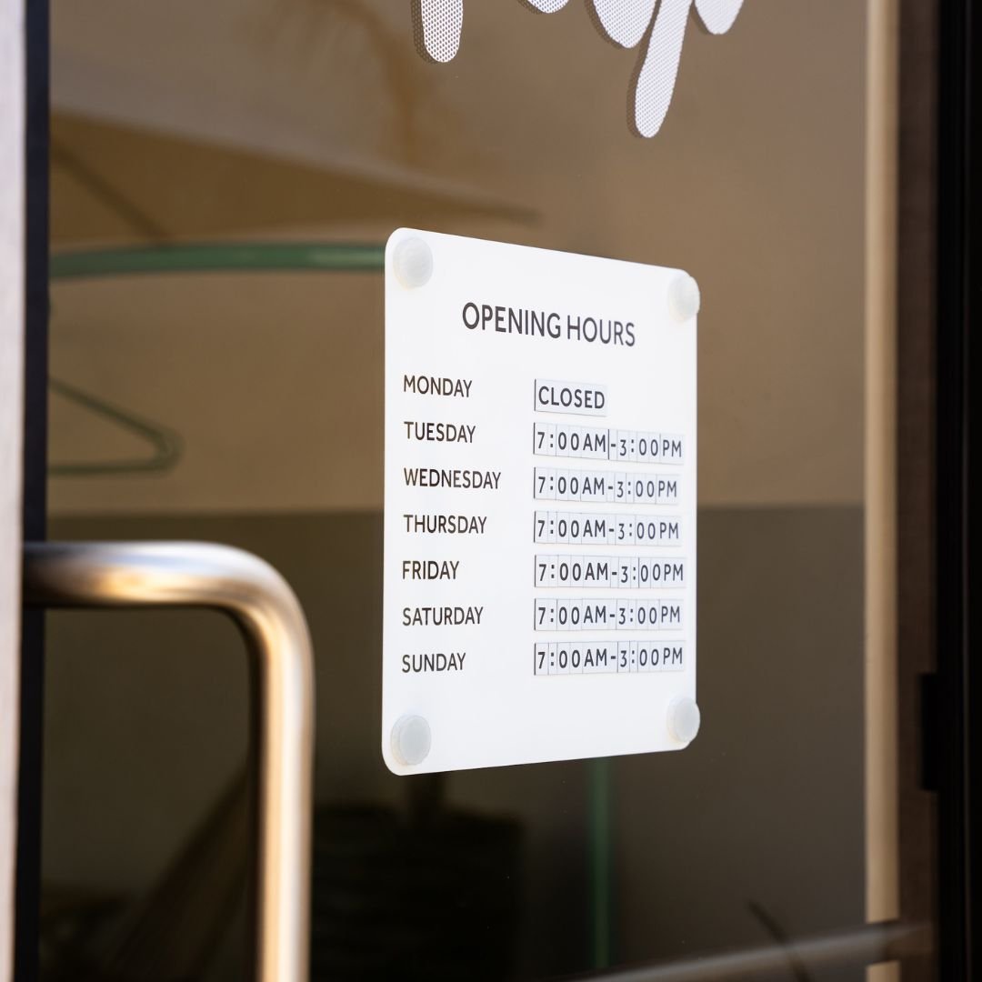
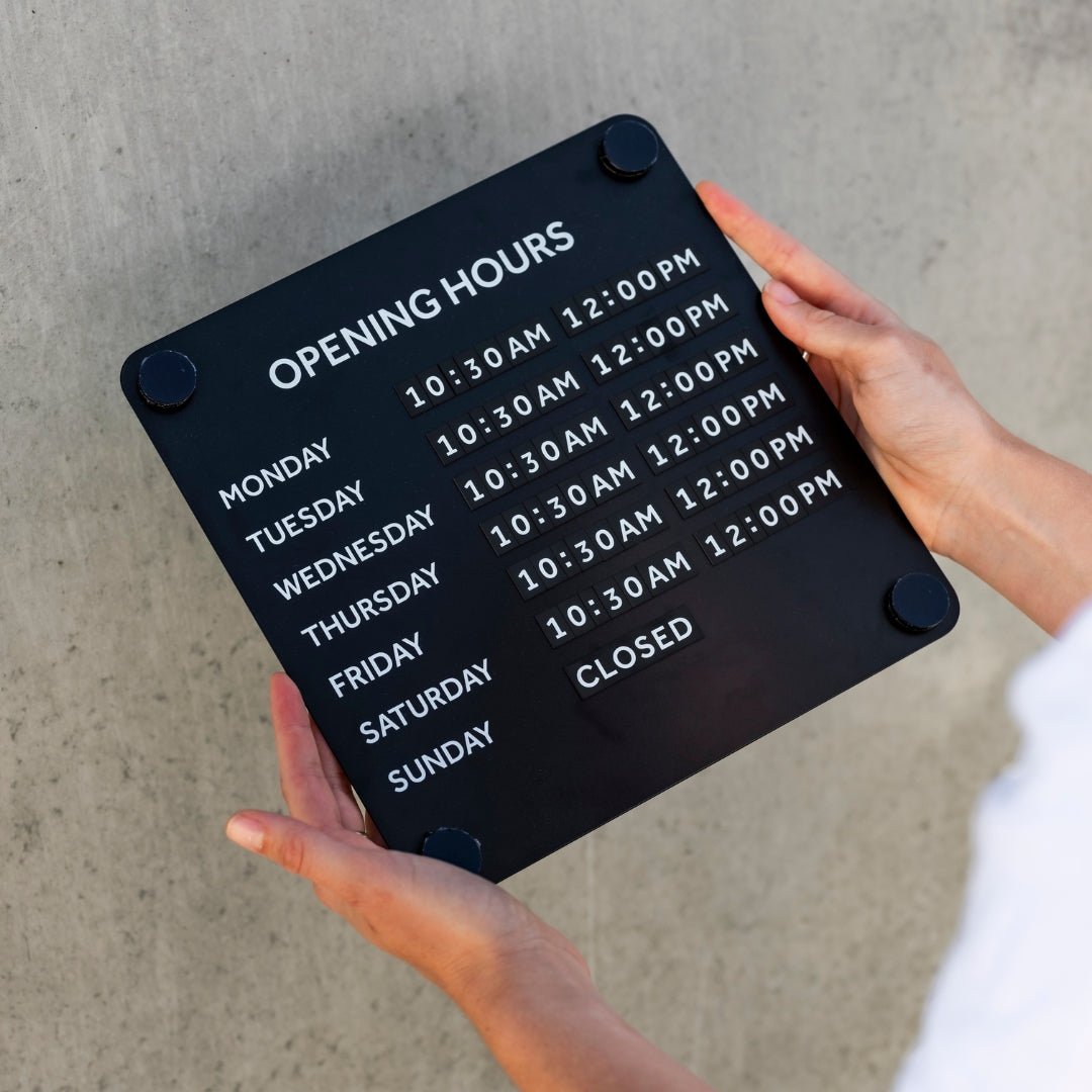
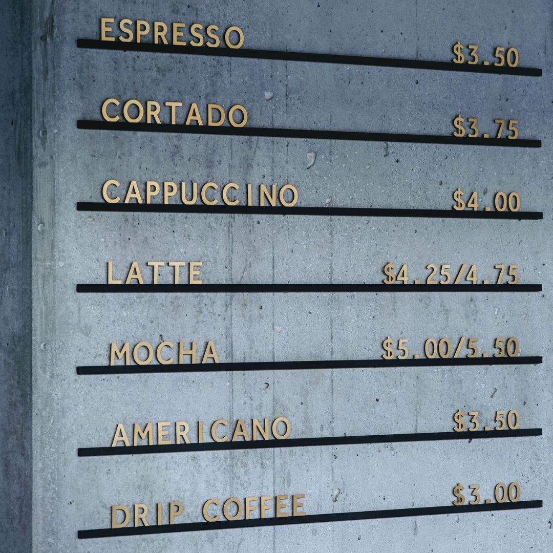
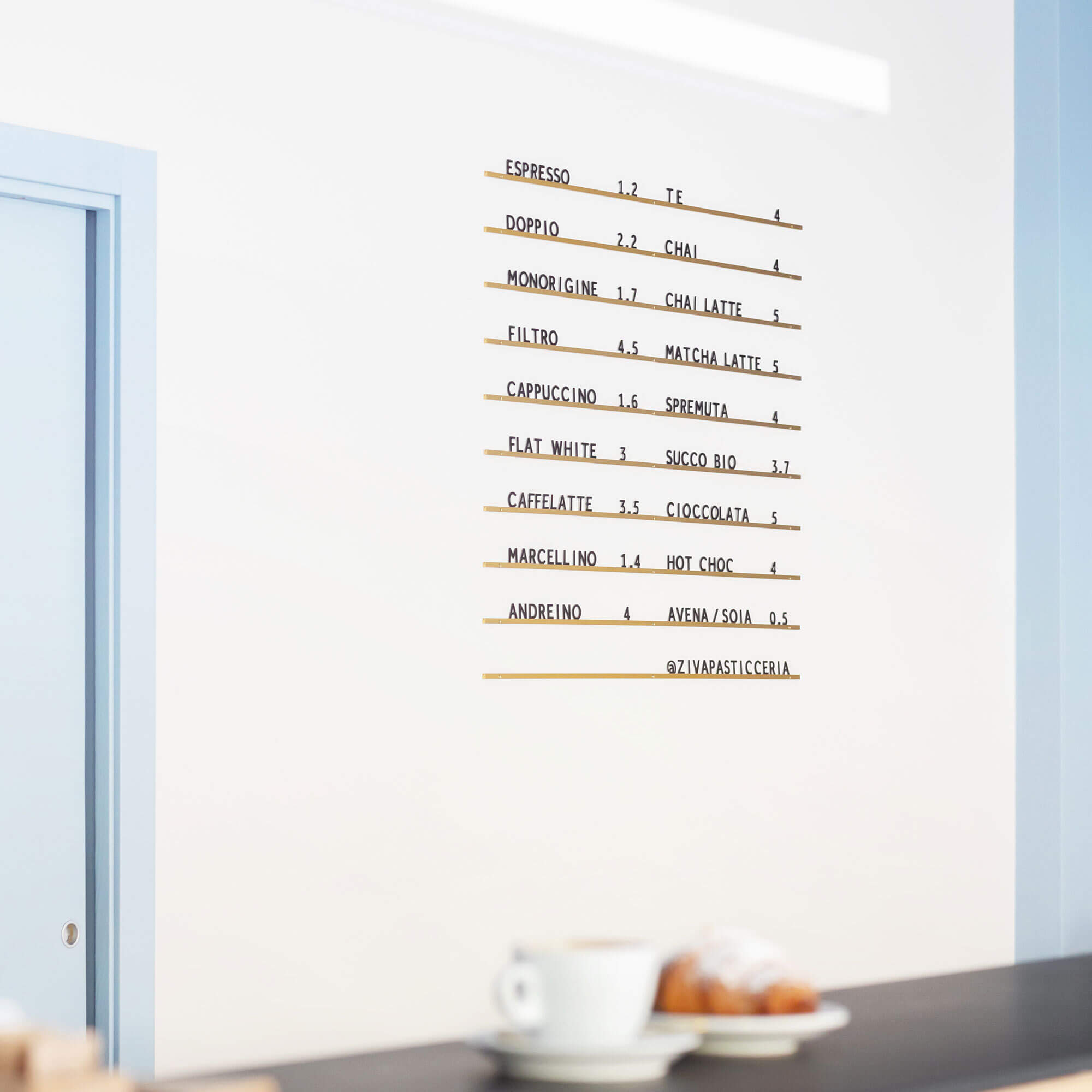
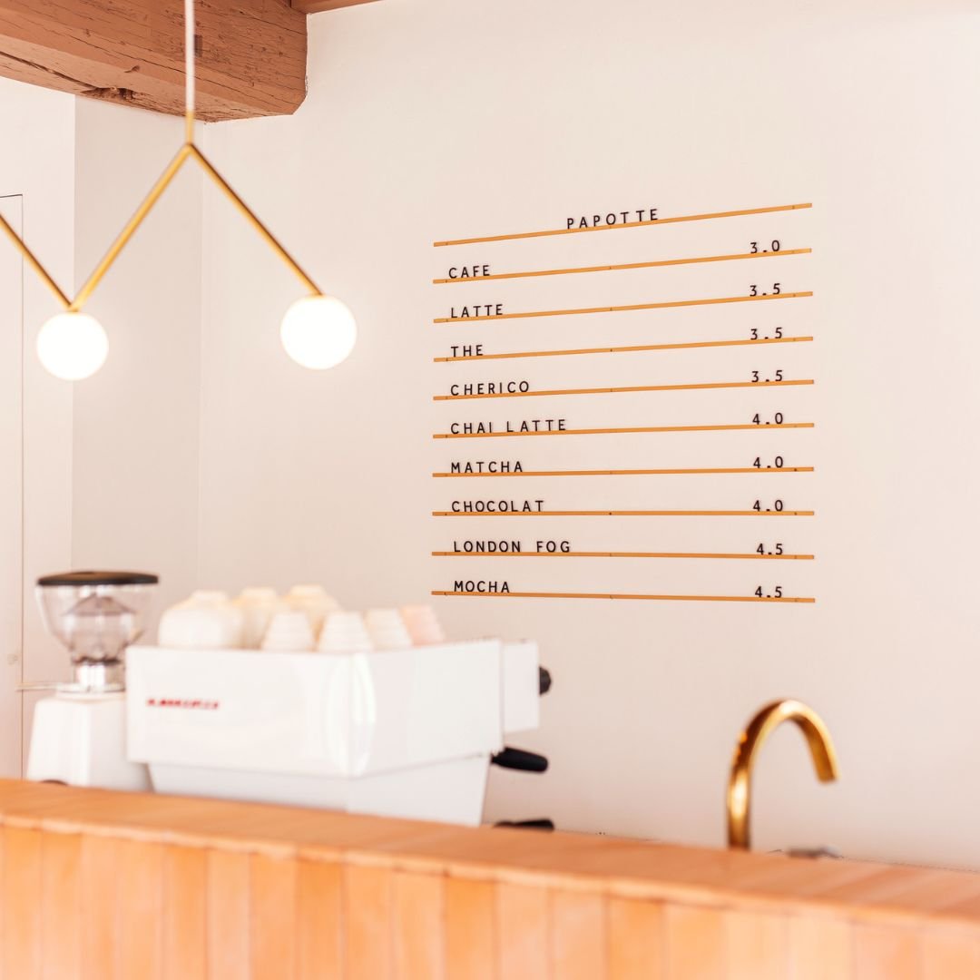
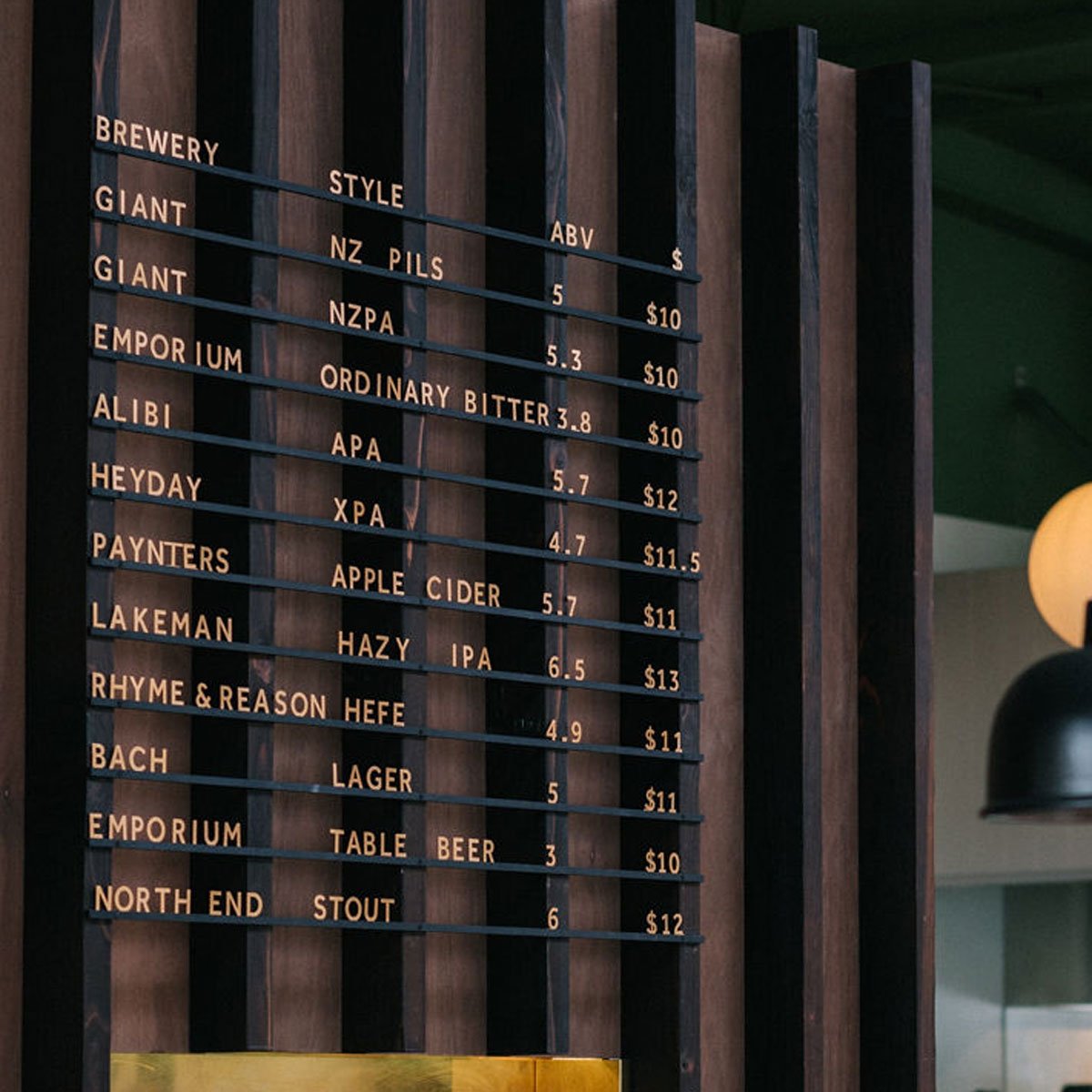
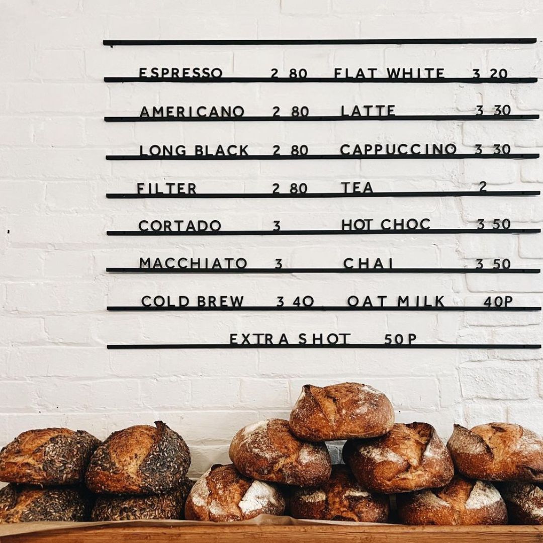
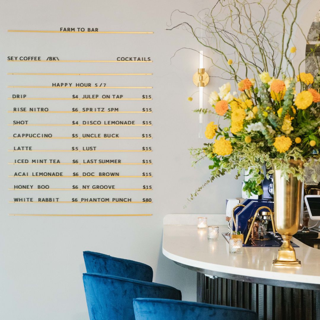
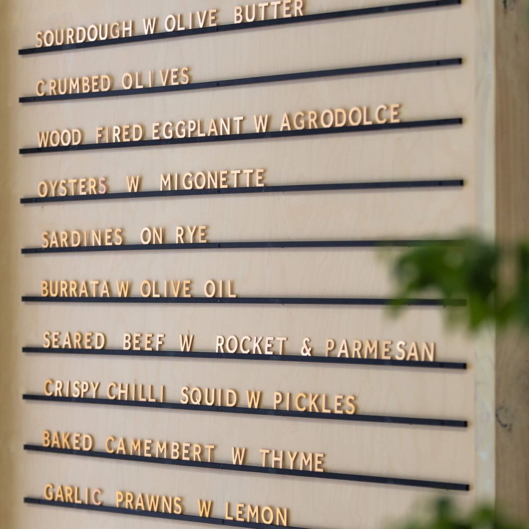
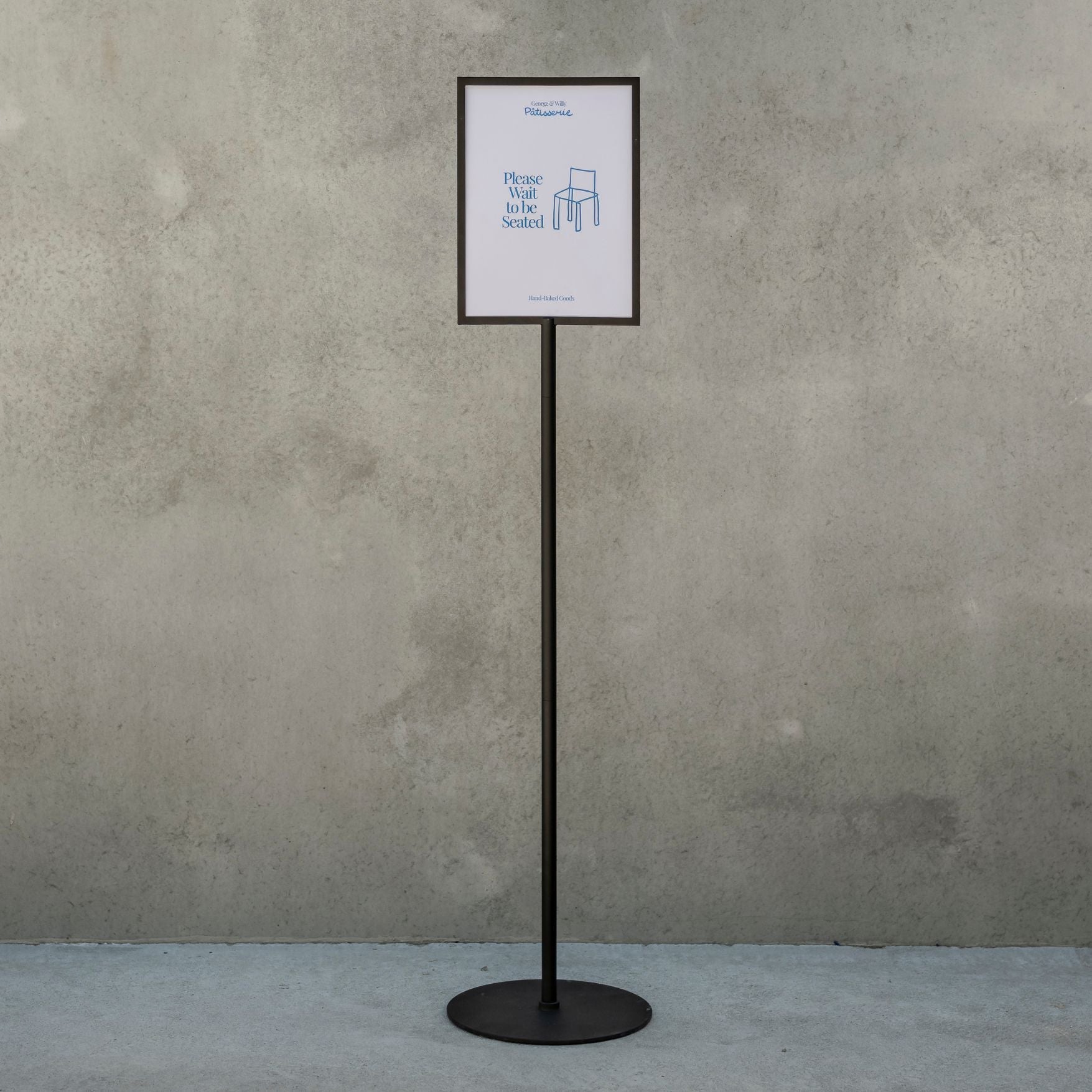
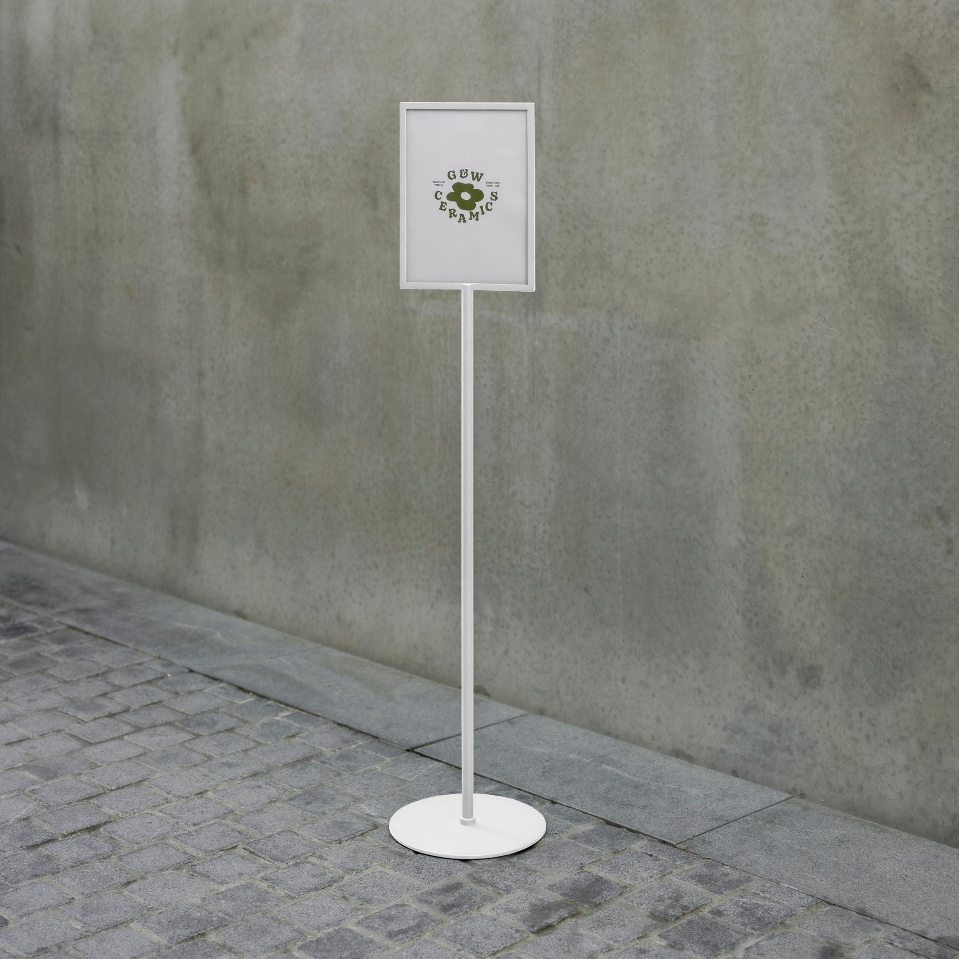
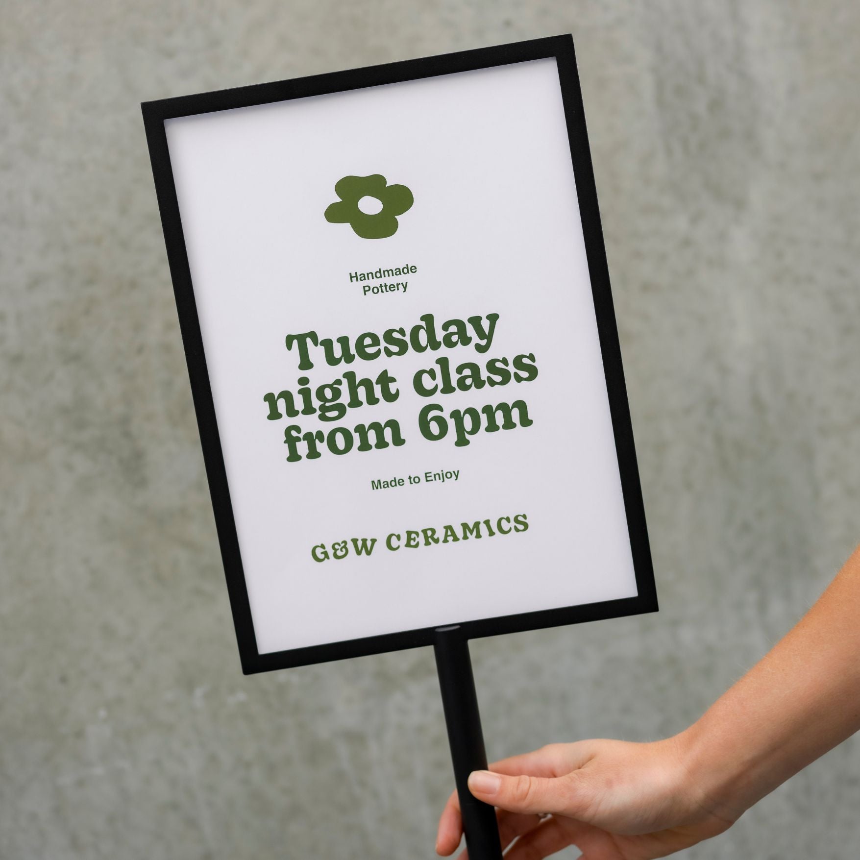
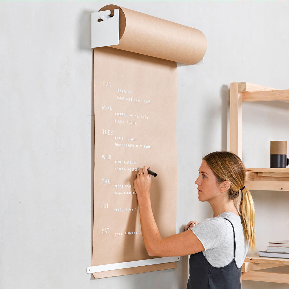
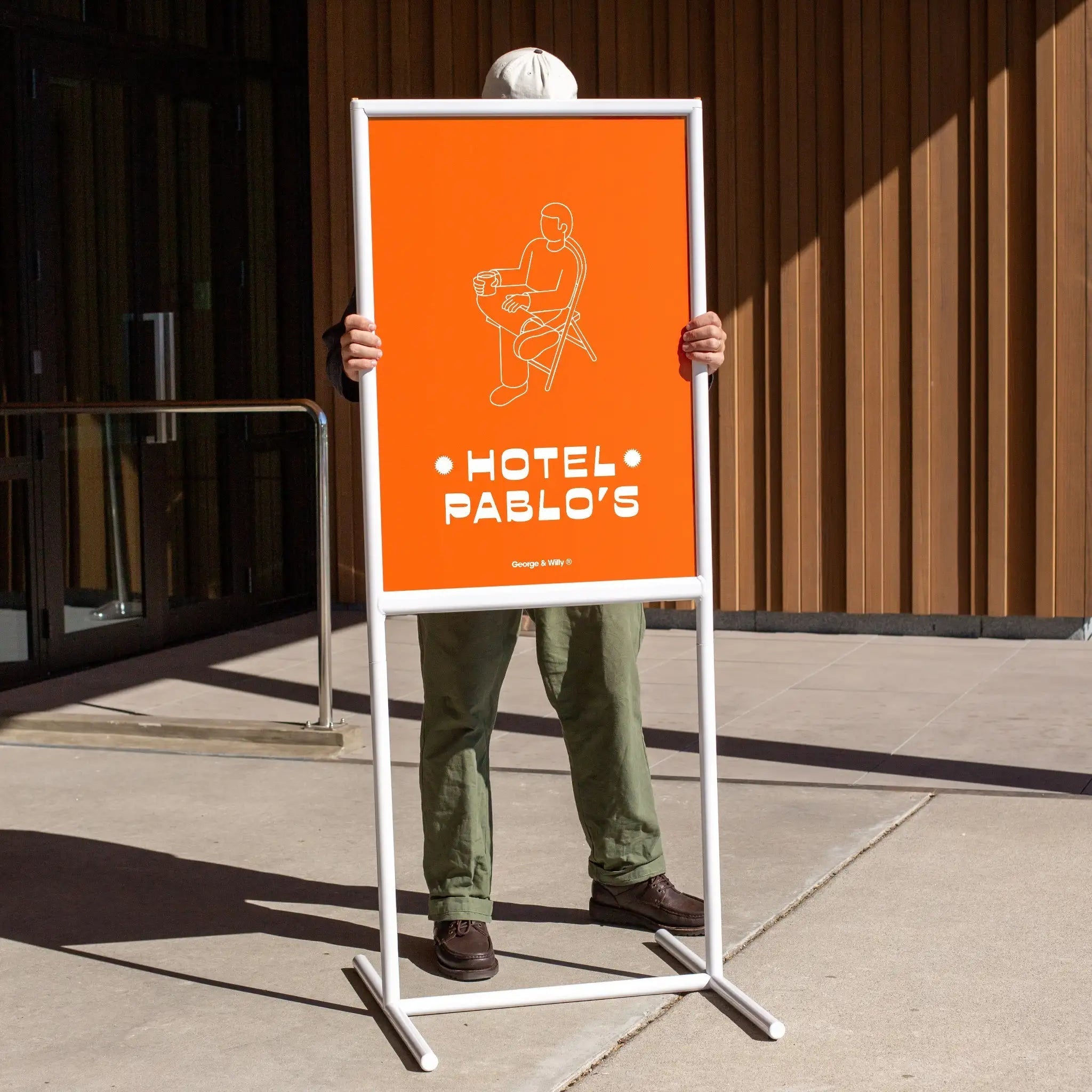
1. Lobby/Reception Signs
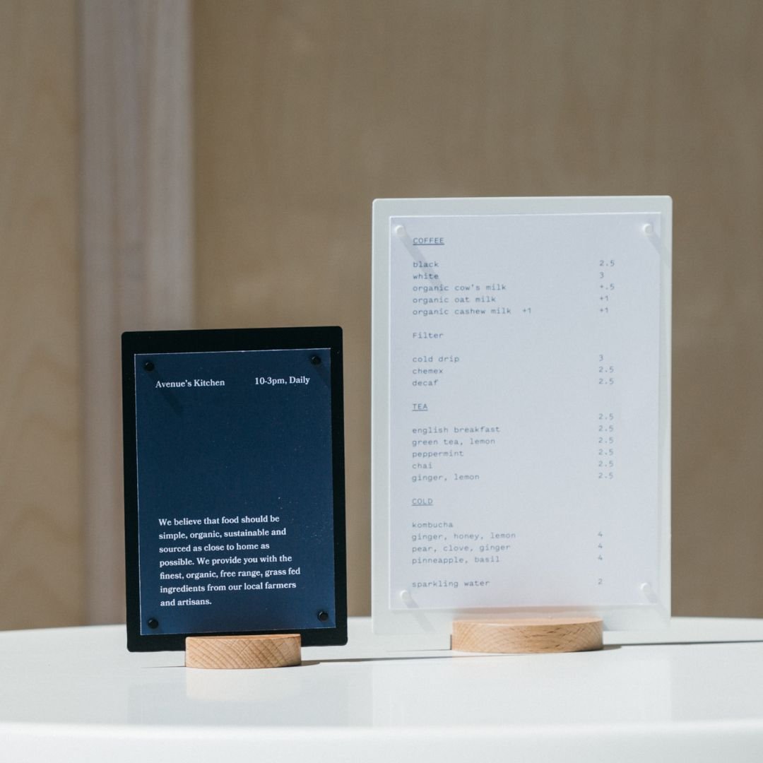
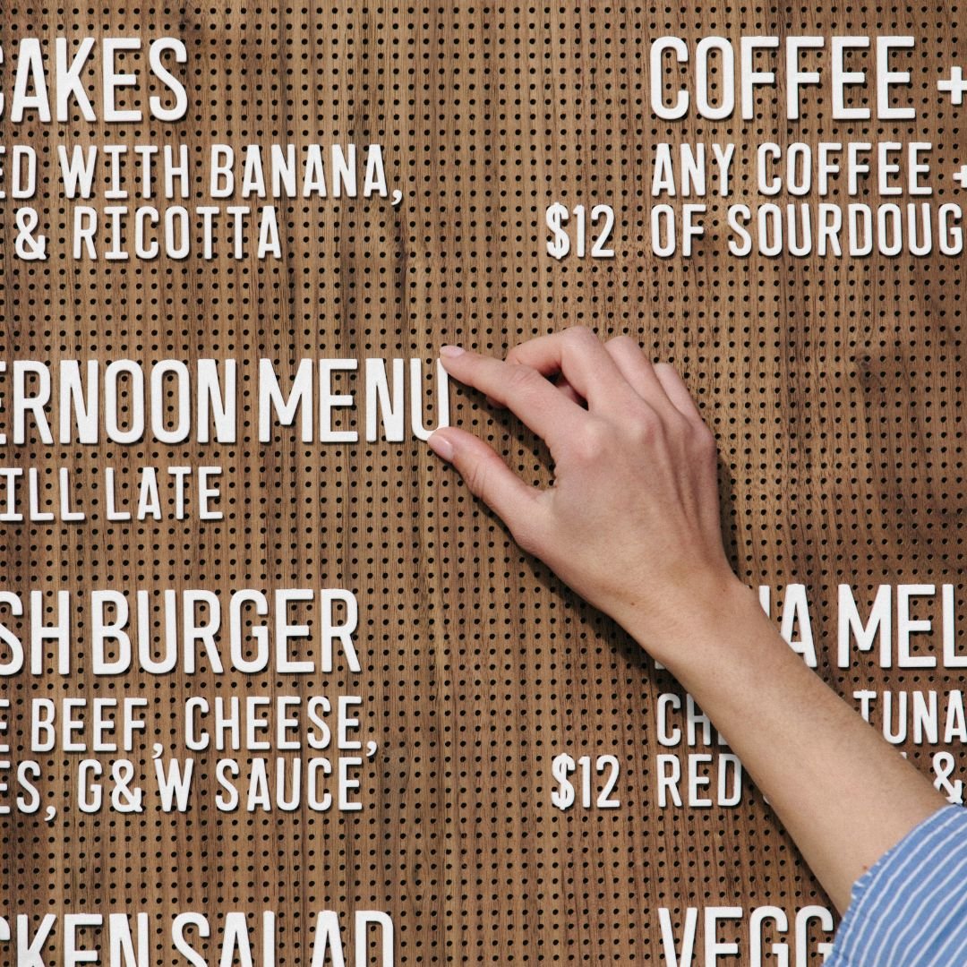
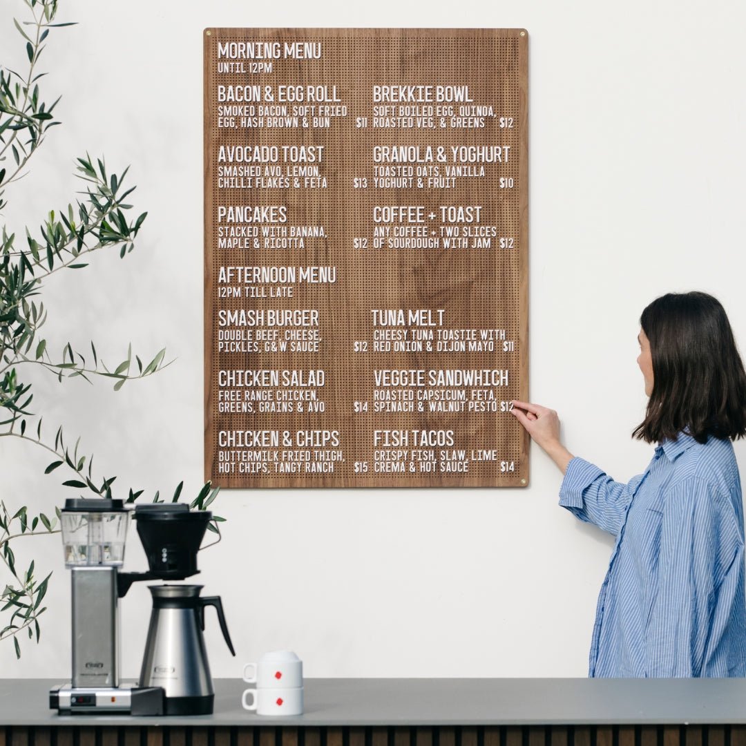
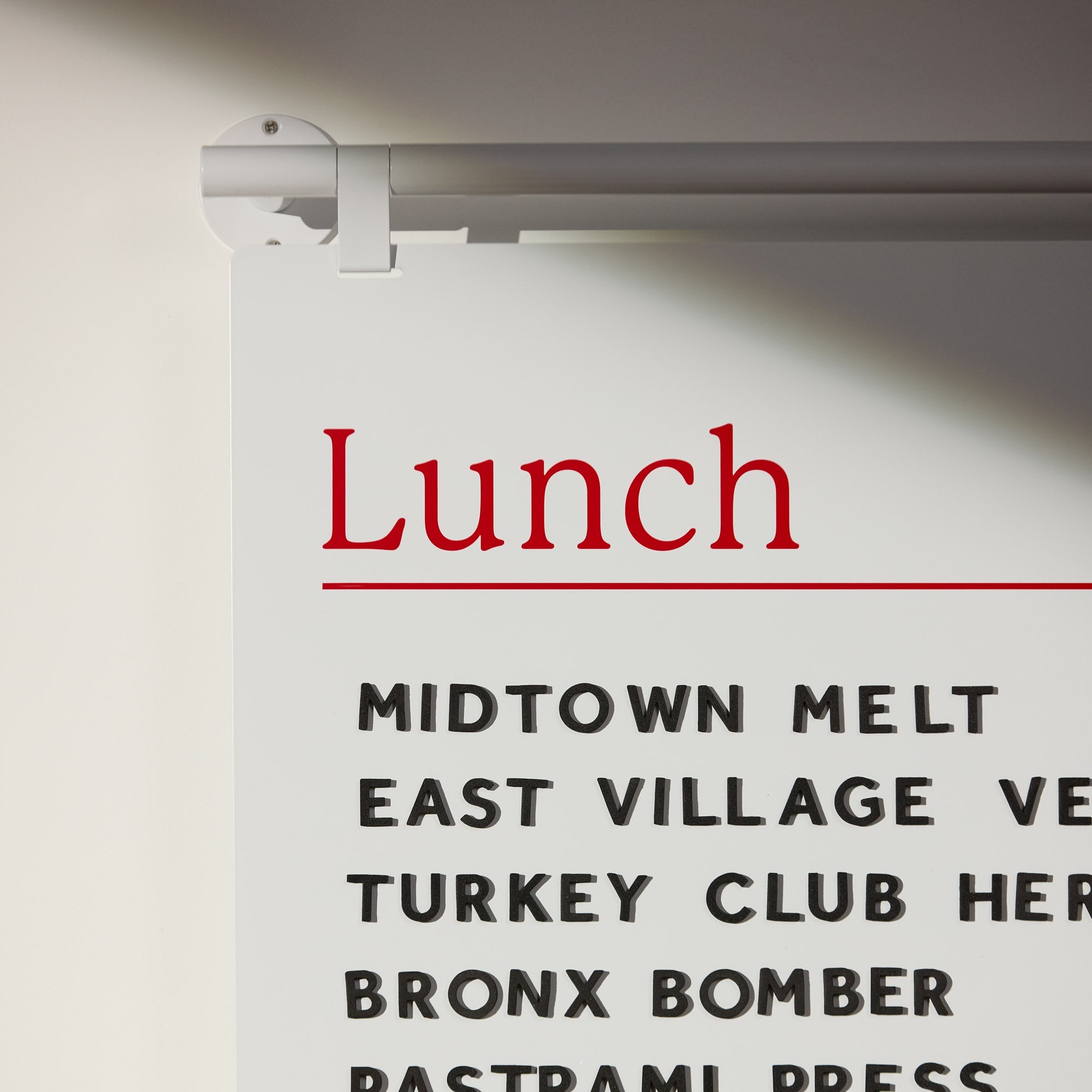
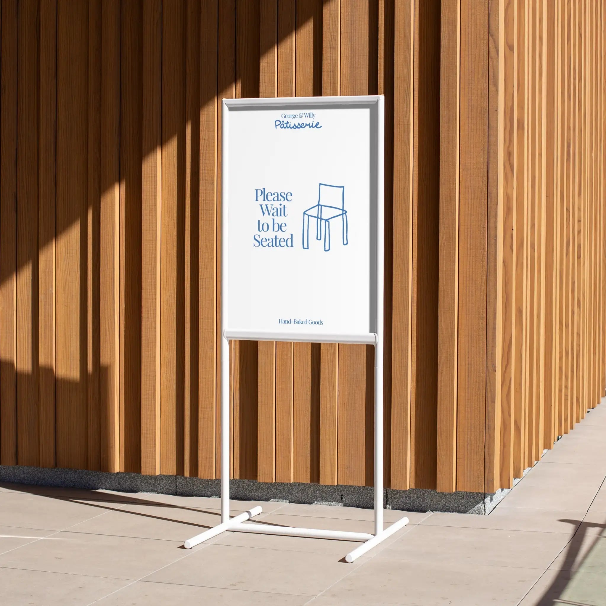
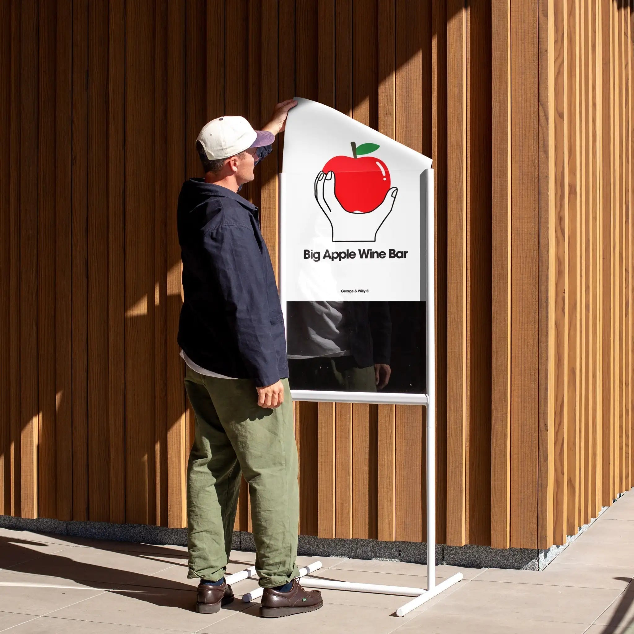
Your lobby sign is the moment of reassurance. Guests know they’ve arrived, and staff field fewer “Is this the right place?” questions. The right piece sets the tone, directs people to check-in or ordering, and keeps your front-of-house calm and efficient.
First impressions aren’t just visual; they’re operational.
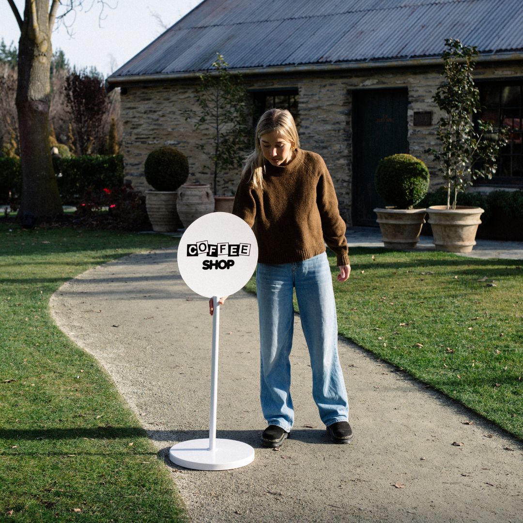
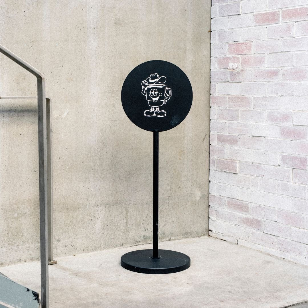
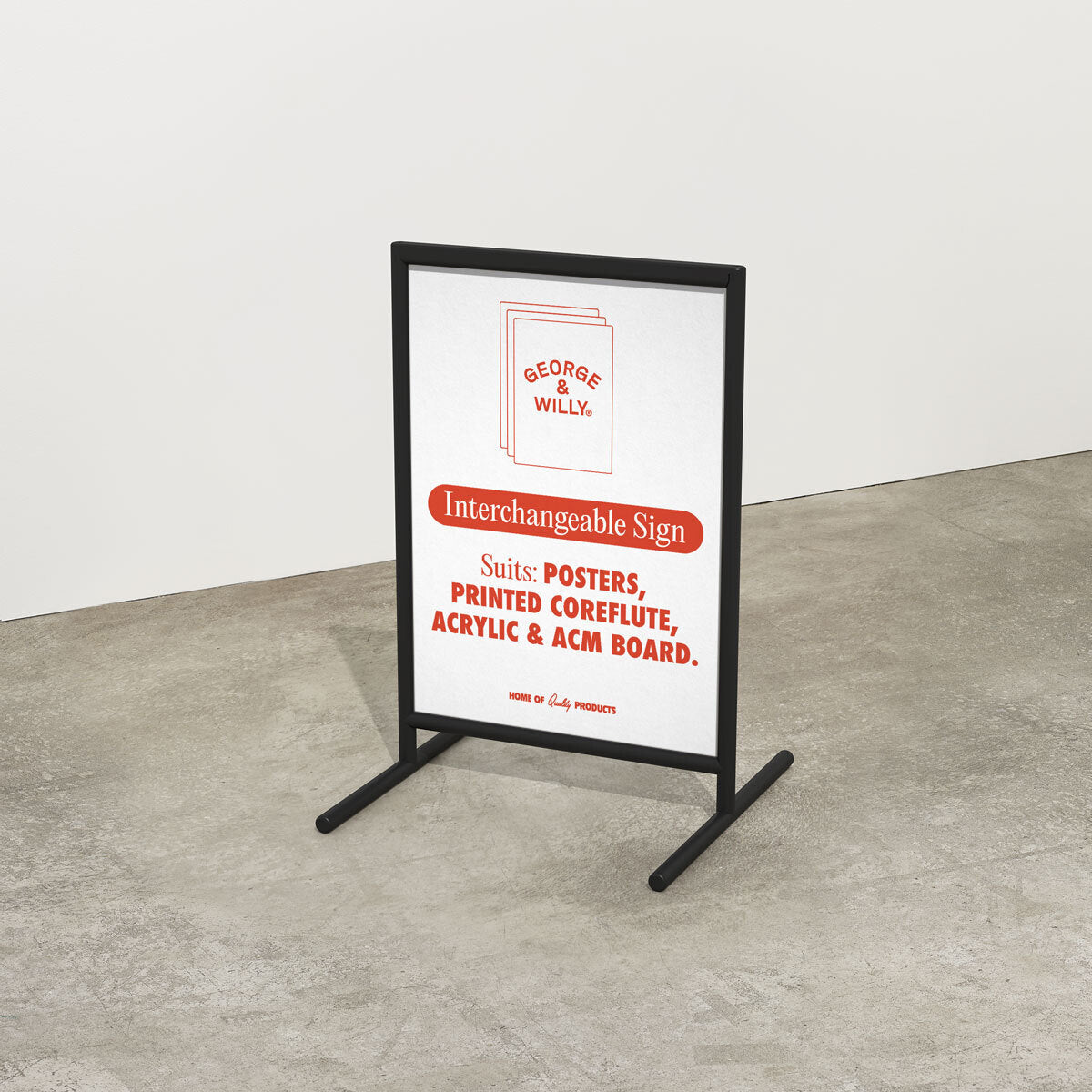
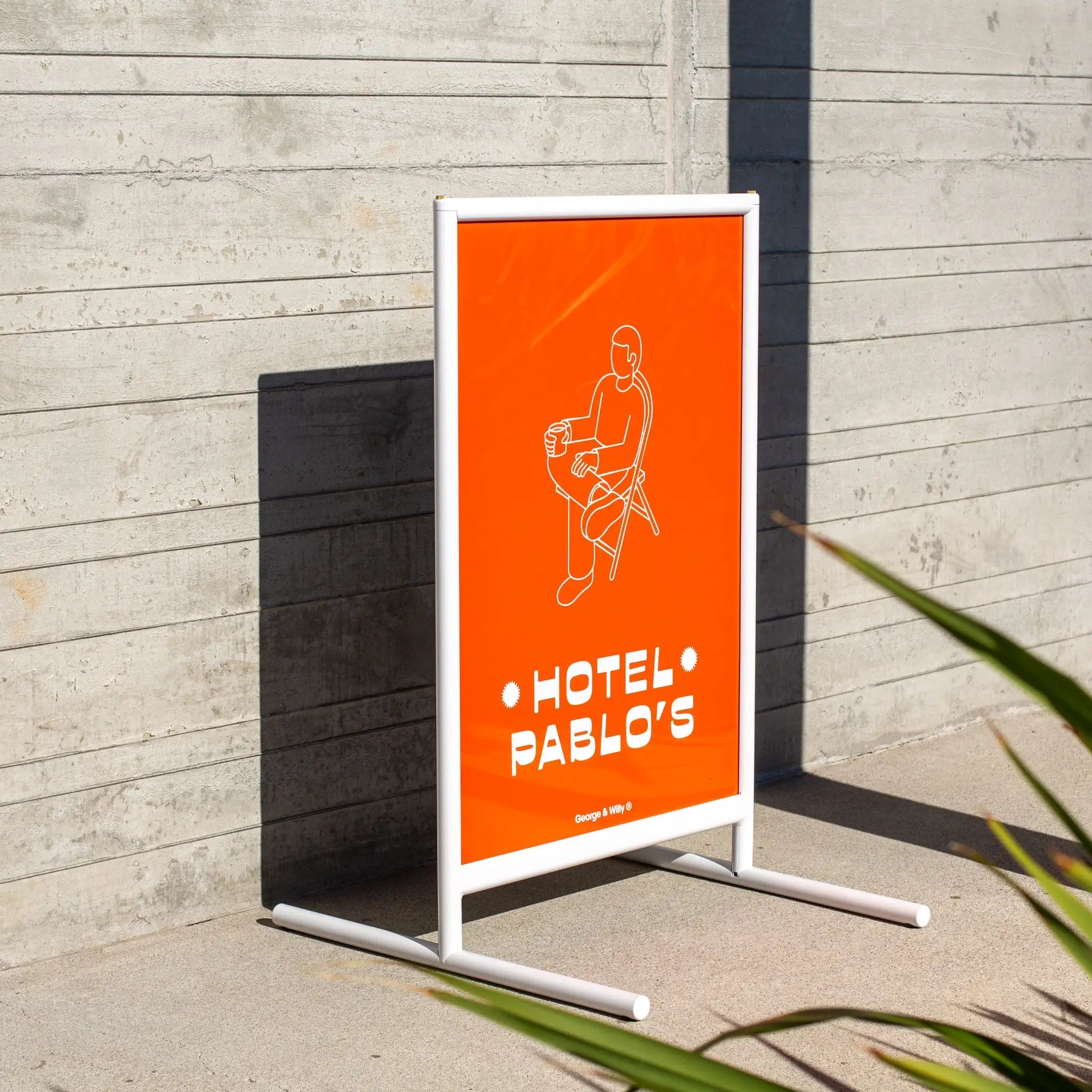
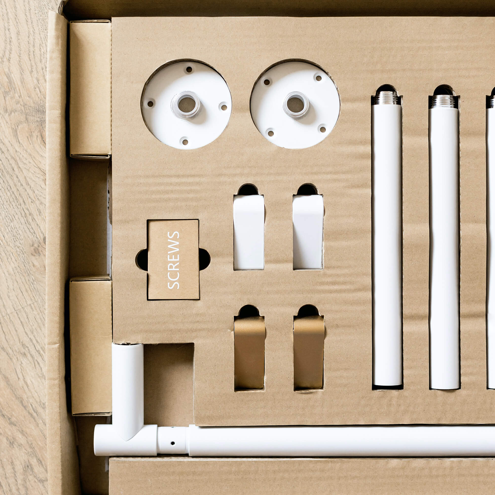
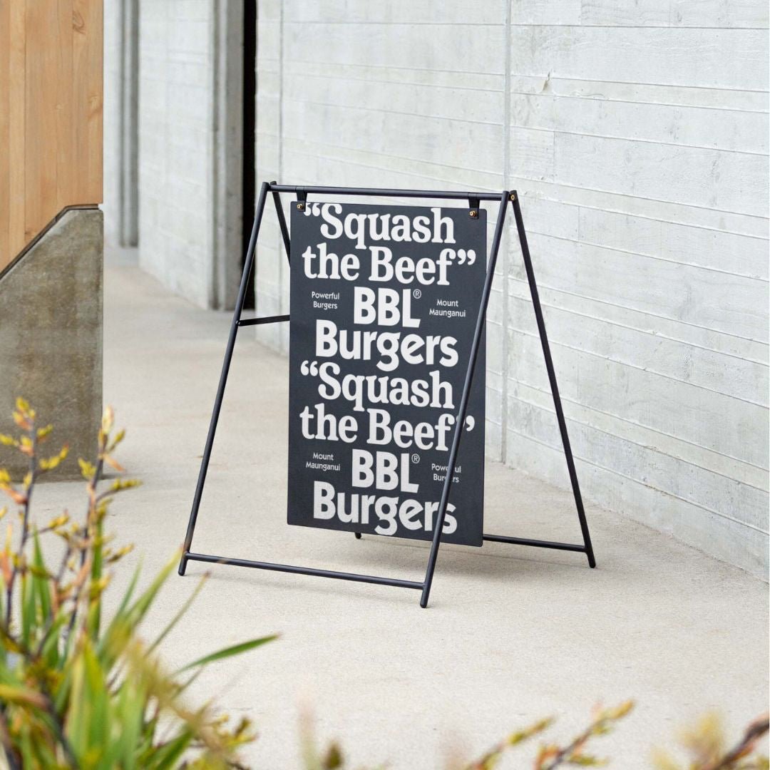
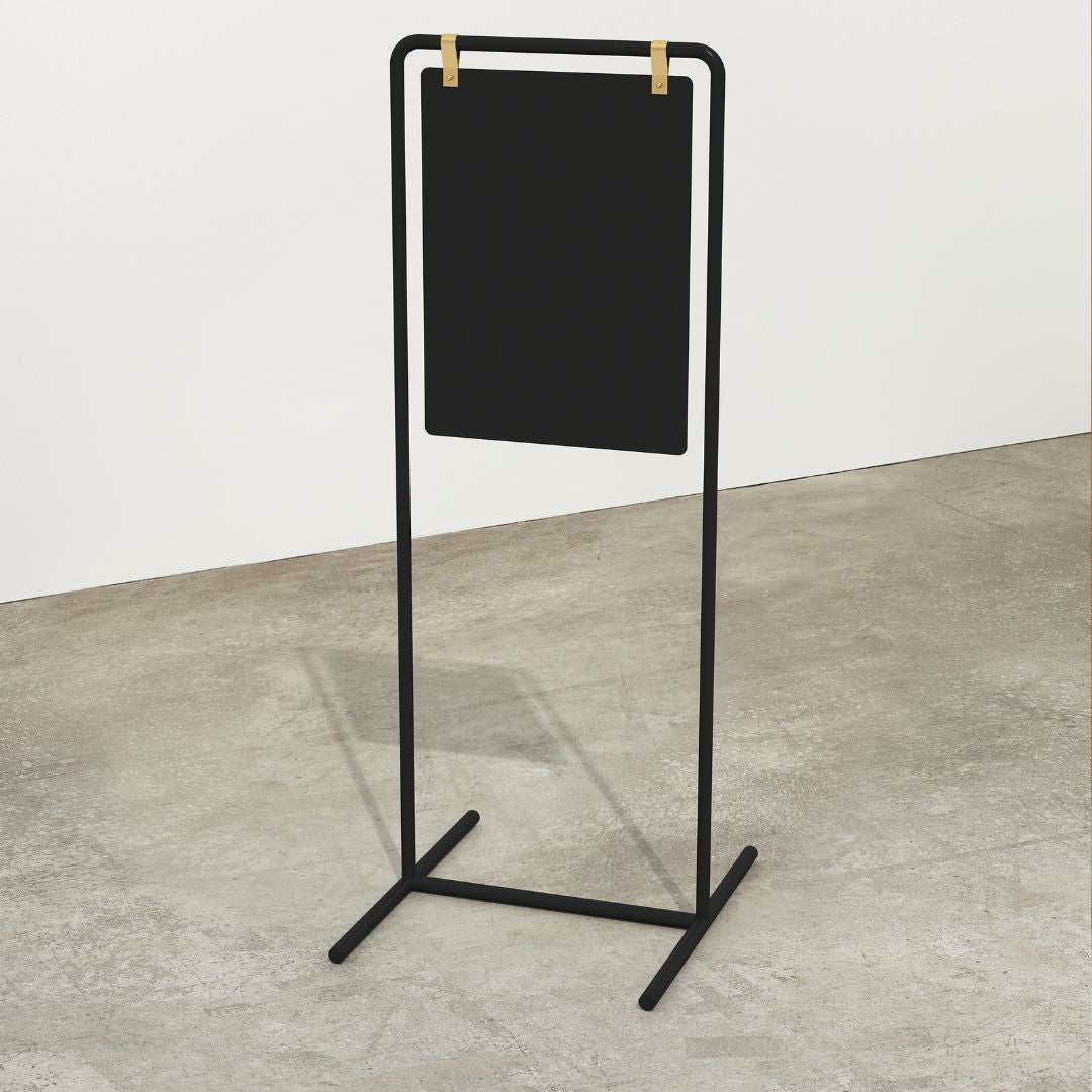
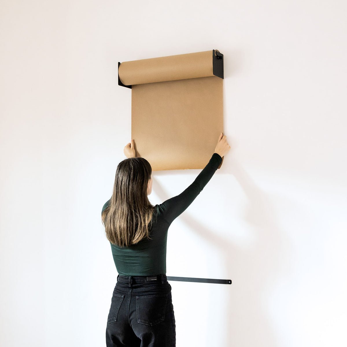
Placement playbook: Center the sign on the wall behind reception or the primary service counter with a 54 to 60 inch centerline for comfortable reading on approach. Light it evenly to avoid glare. Maintain ADA clearances and choose mounting that’s compatible with George & Willy kits for a tidy, secure install. If wall drilling isn’t an option, a Standing Round Sign offers a tidy, freestanding reception marker.
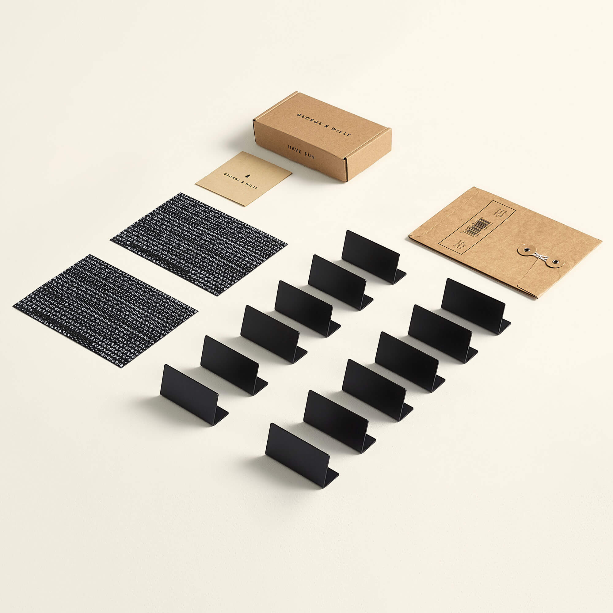
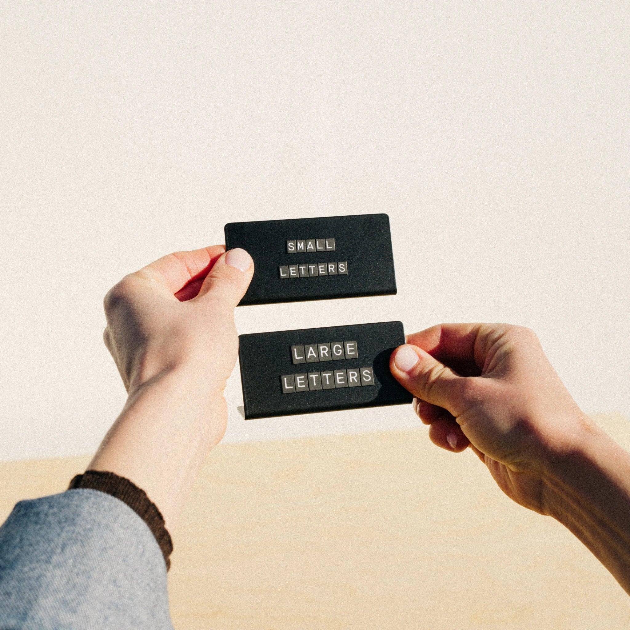
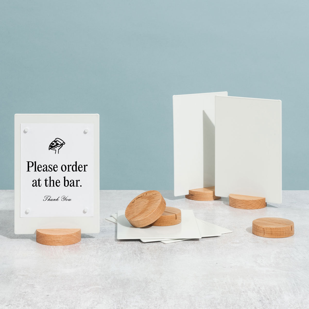
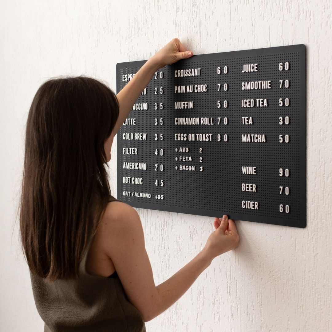
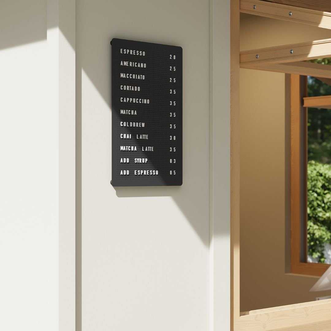
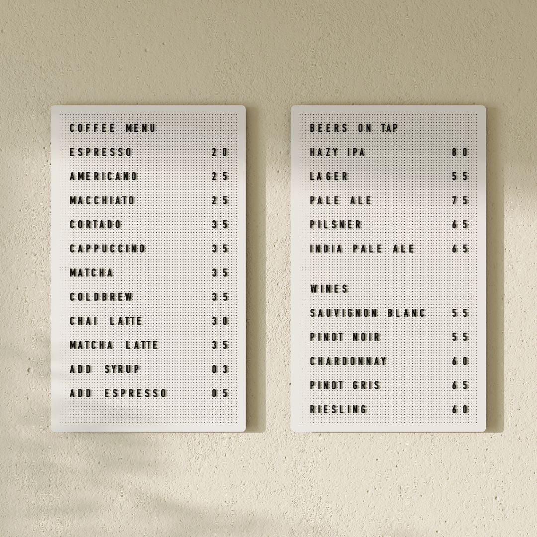
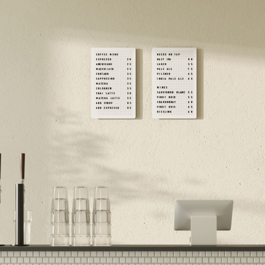
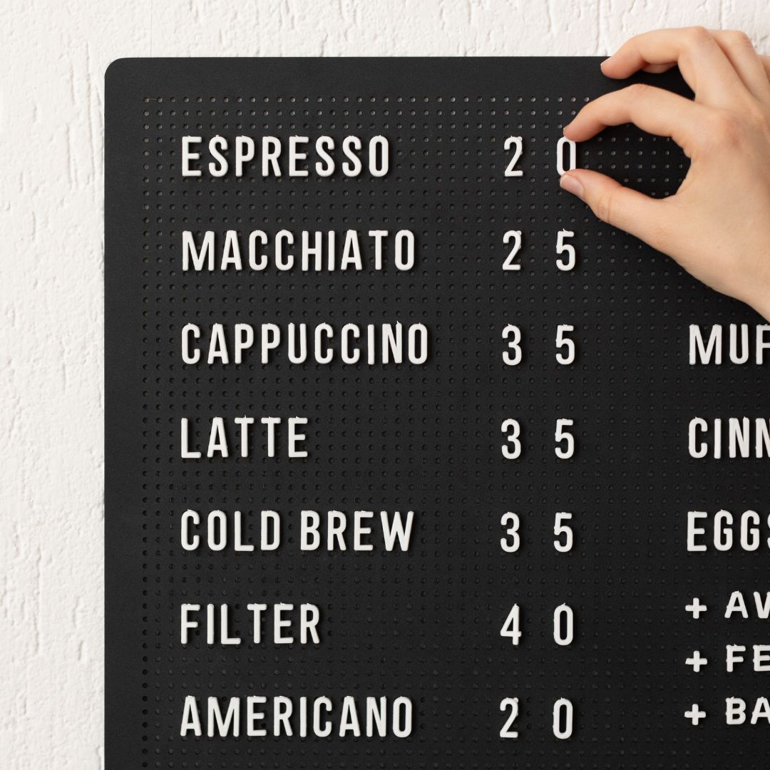
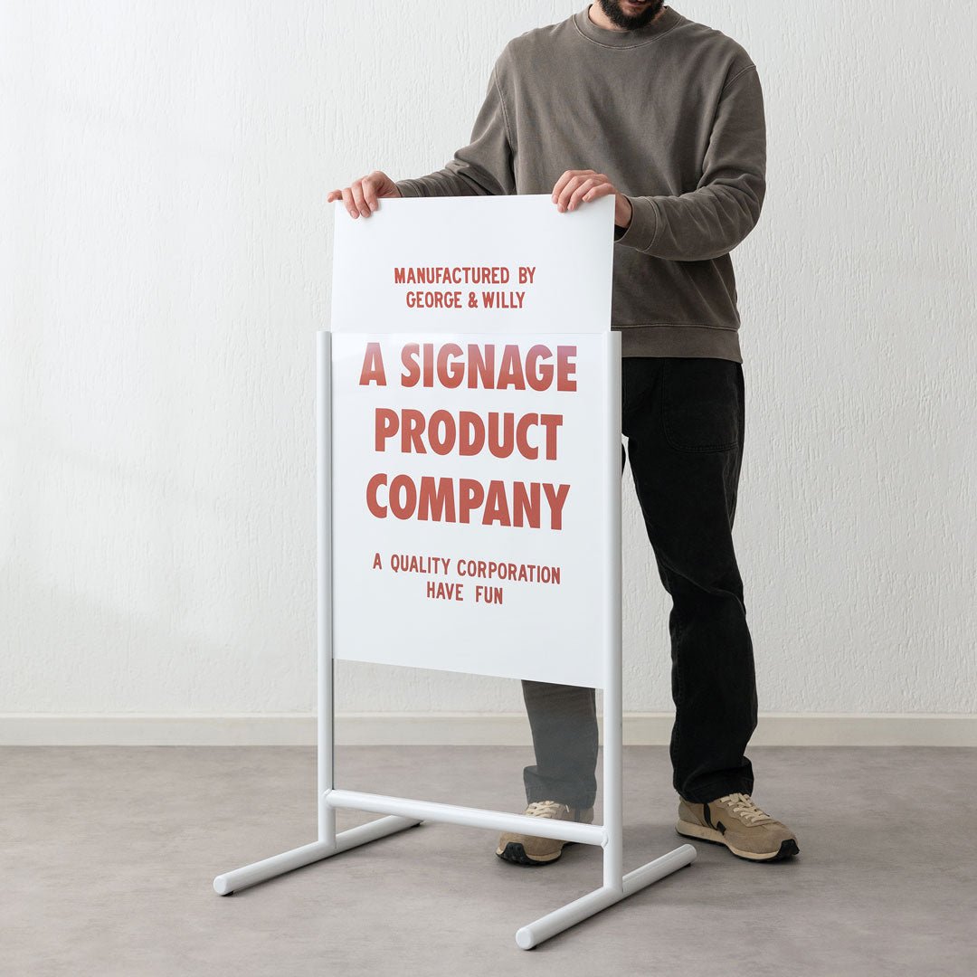
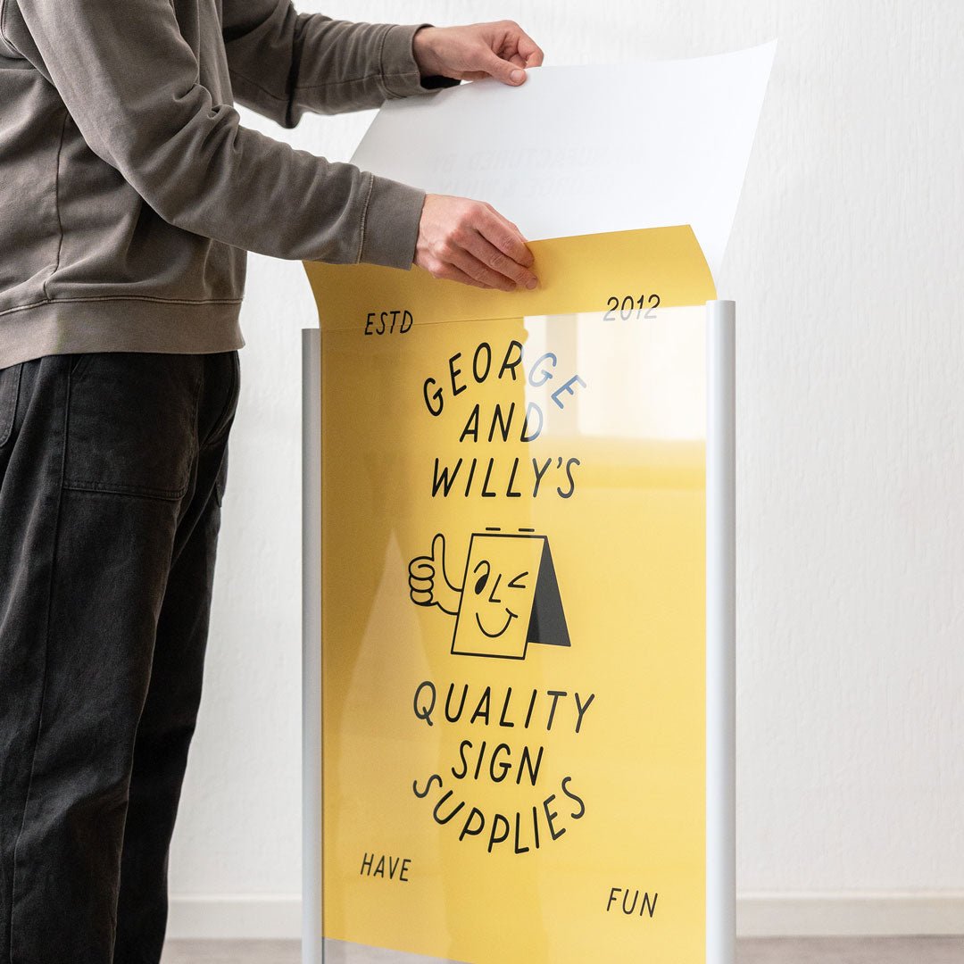
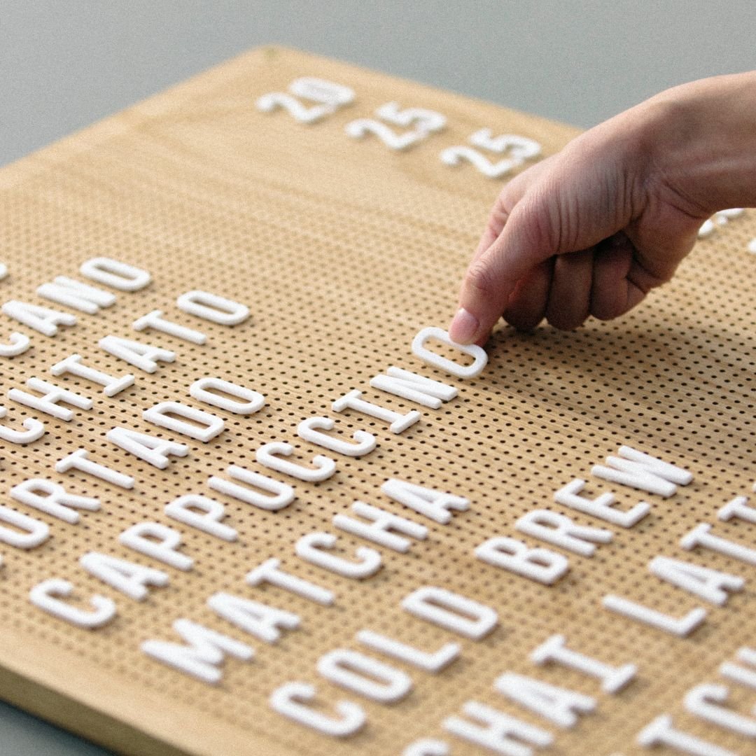
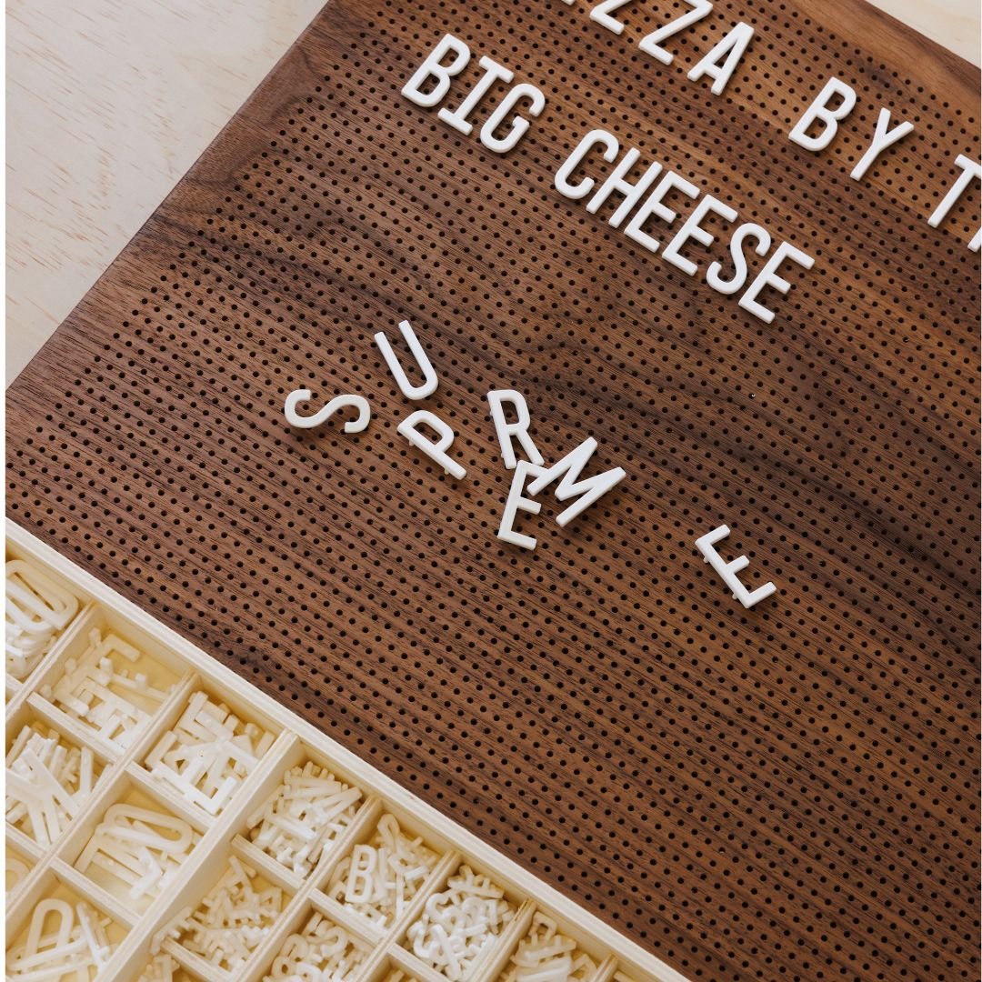
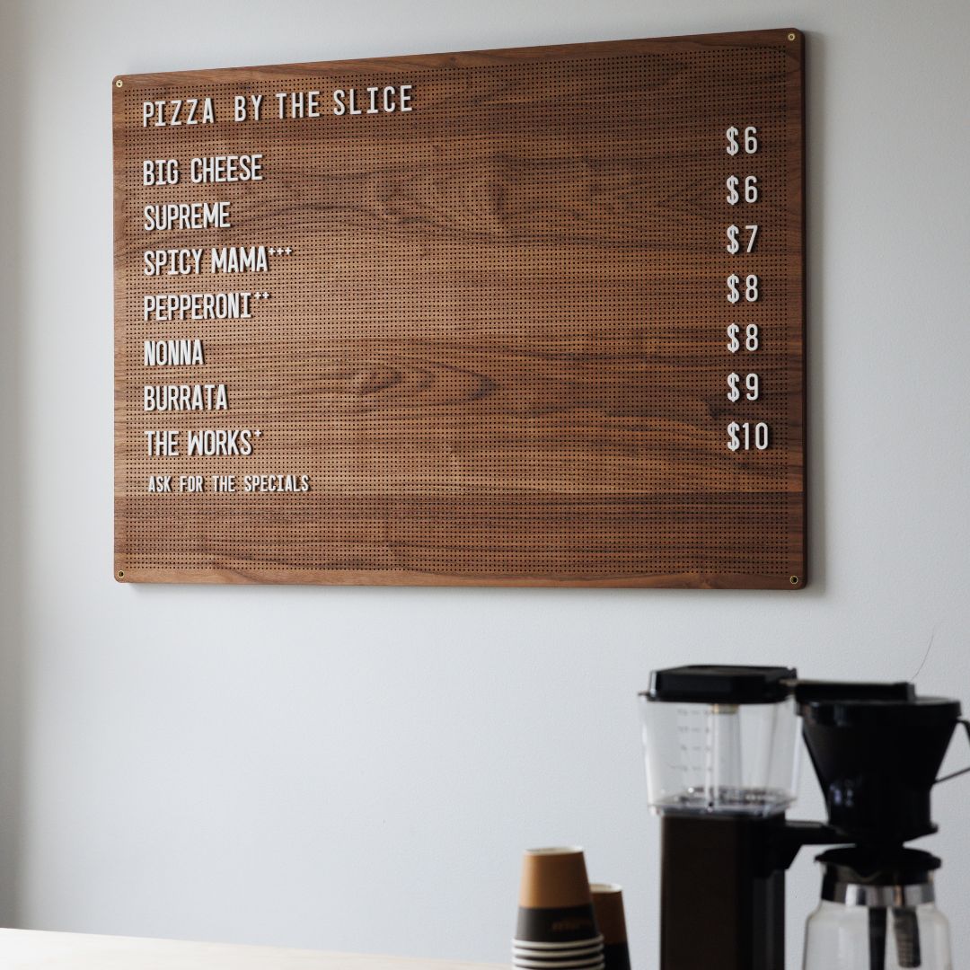
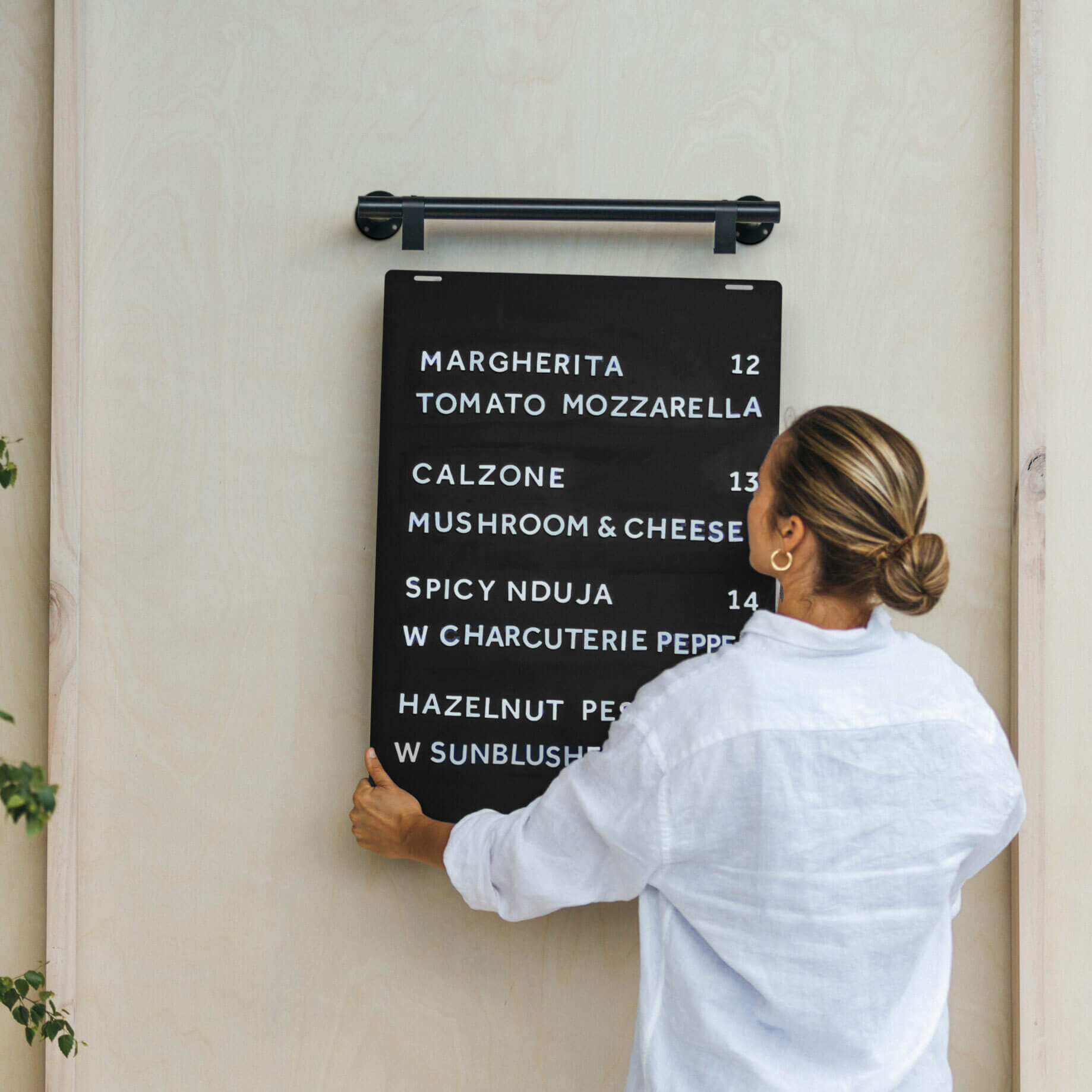
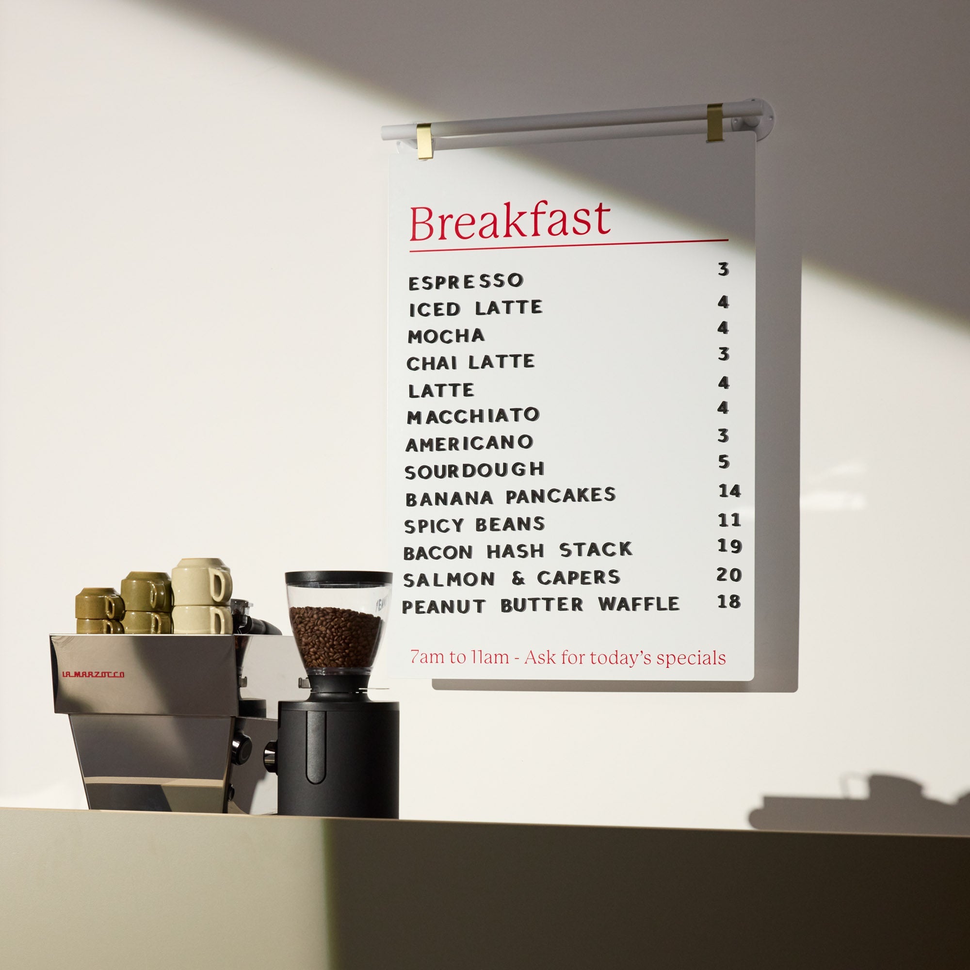
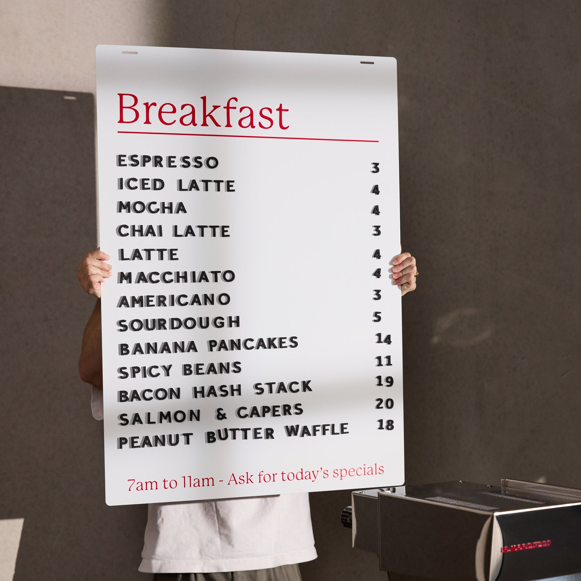
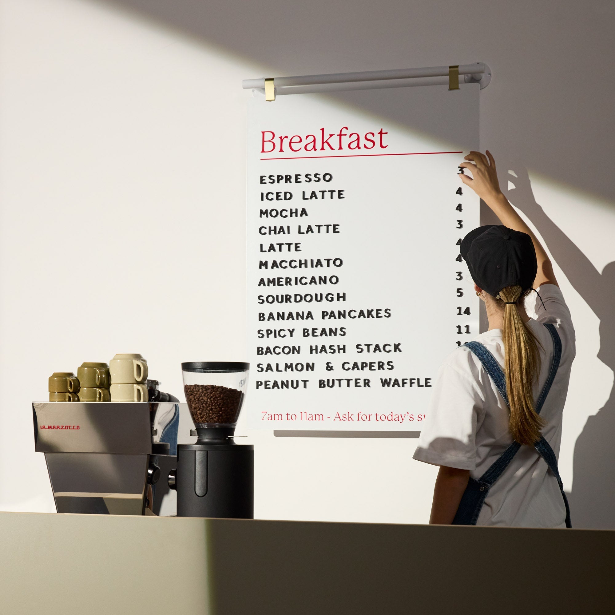
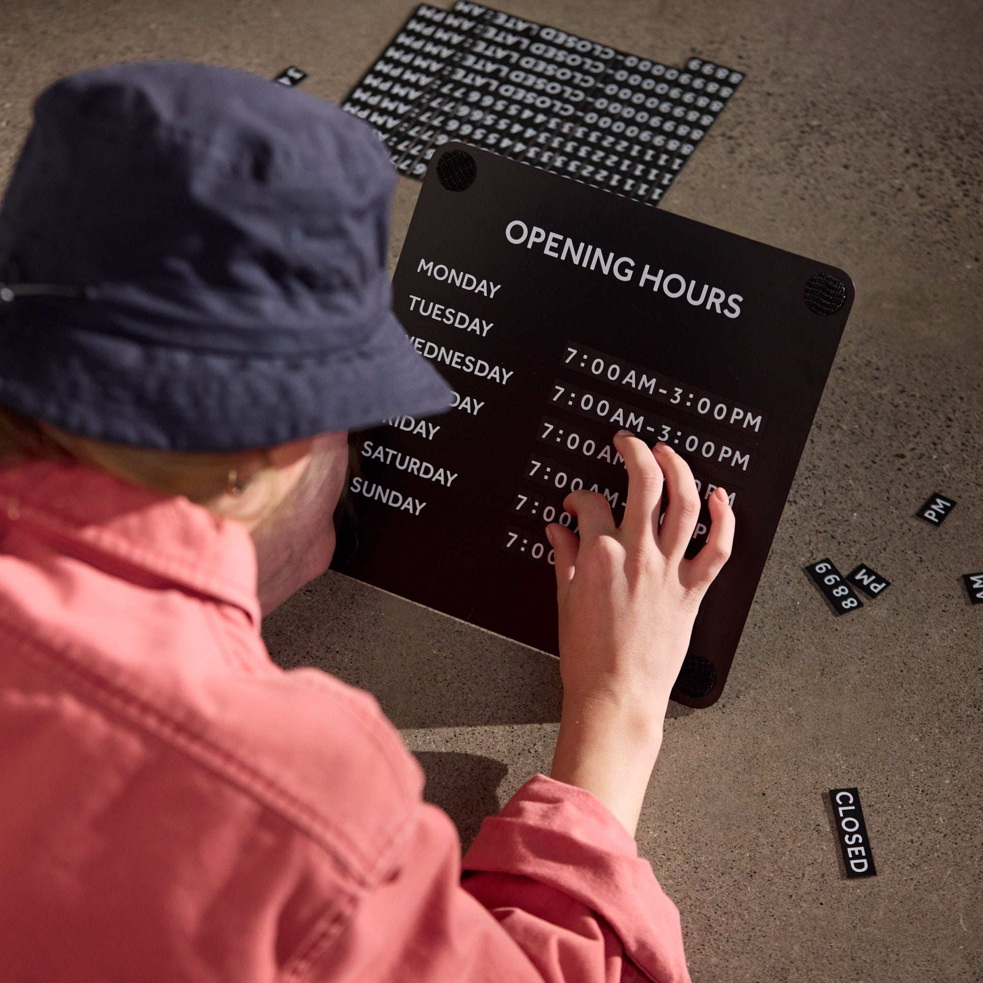
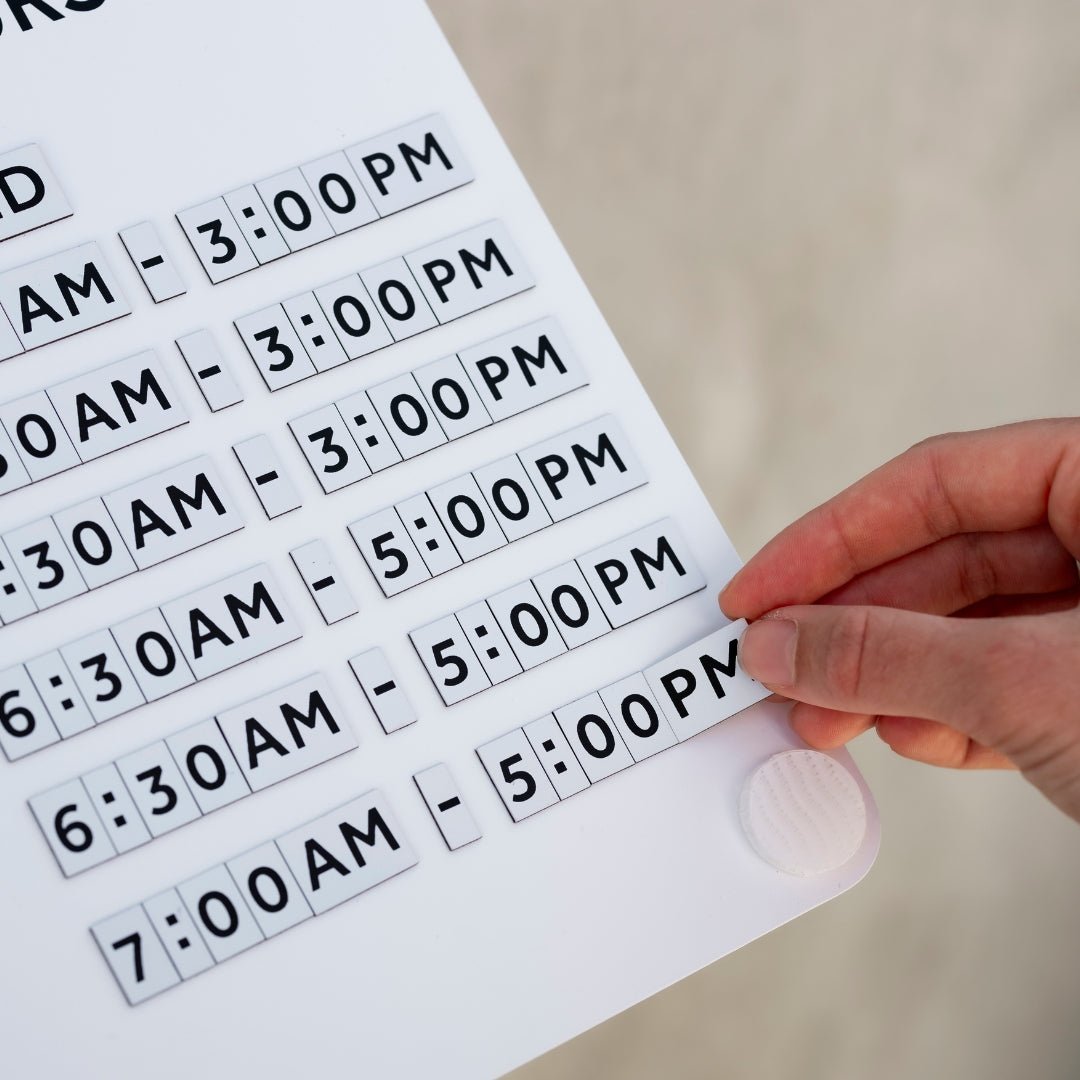
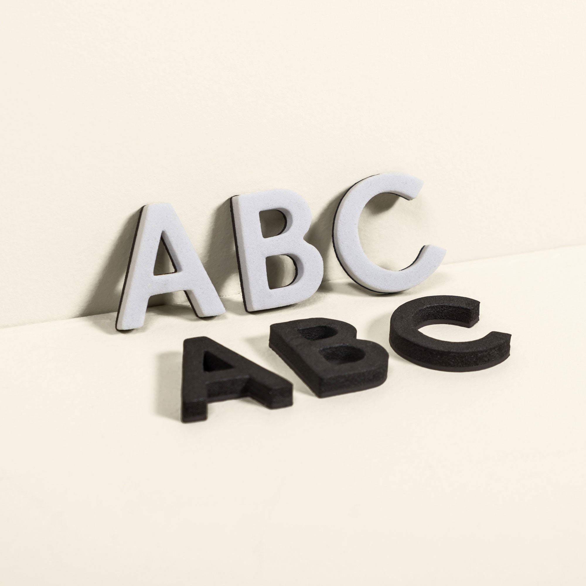
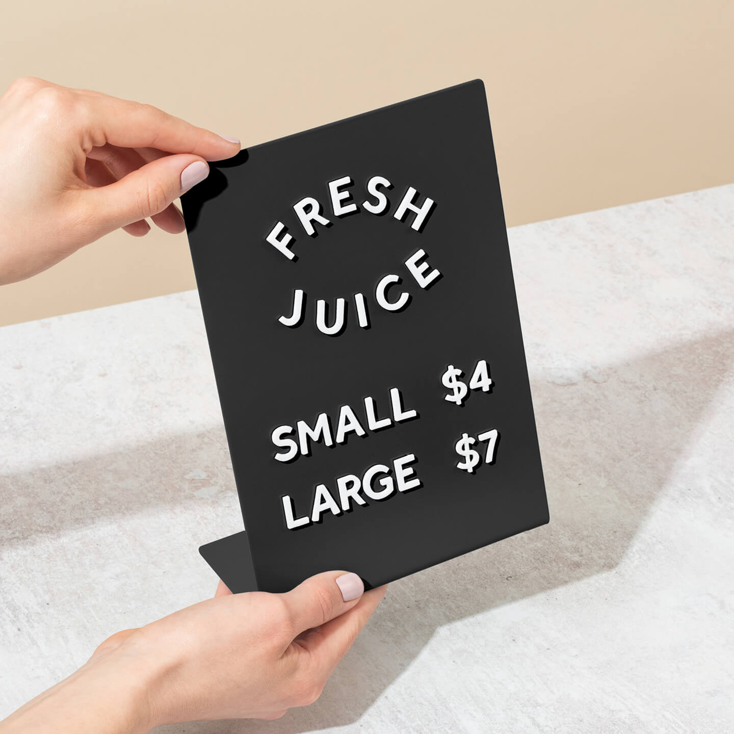
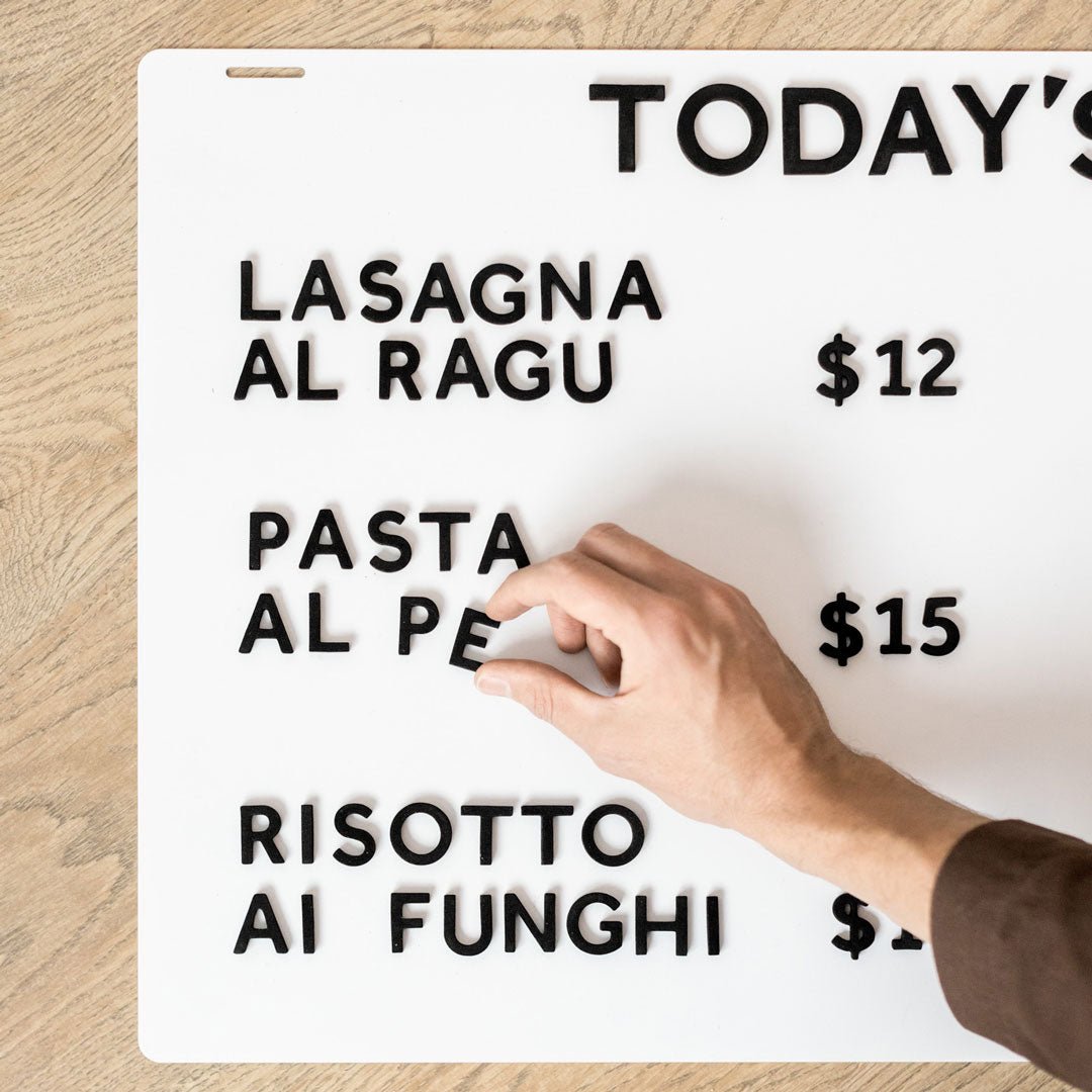
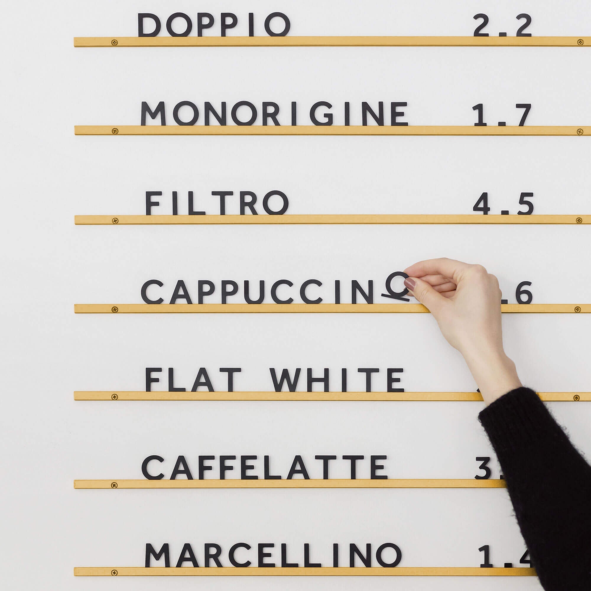
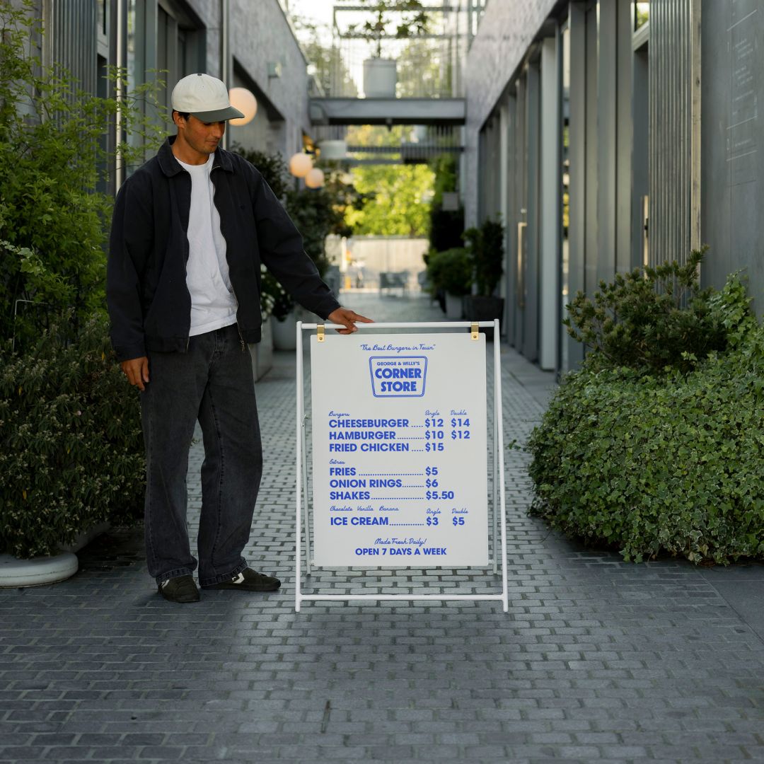
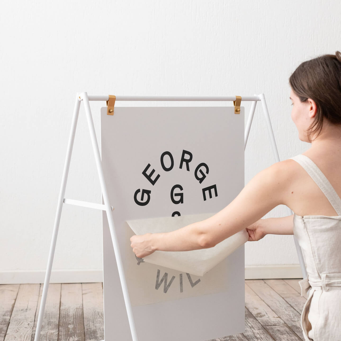
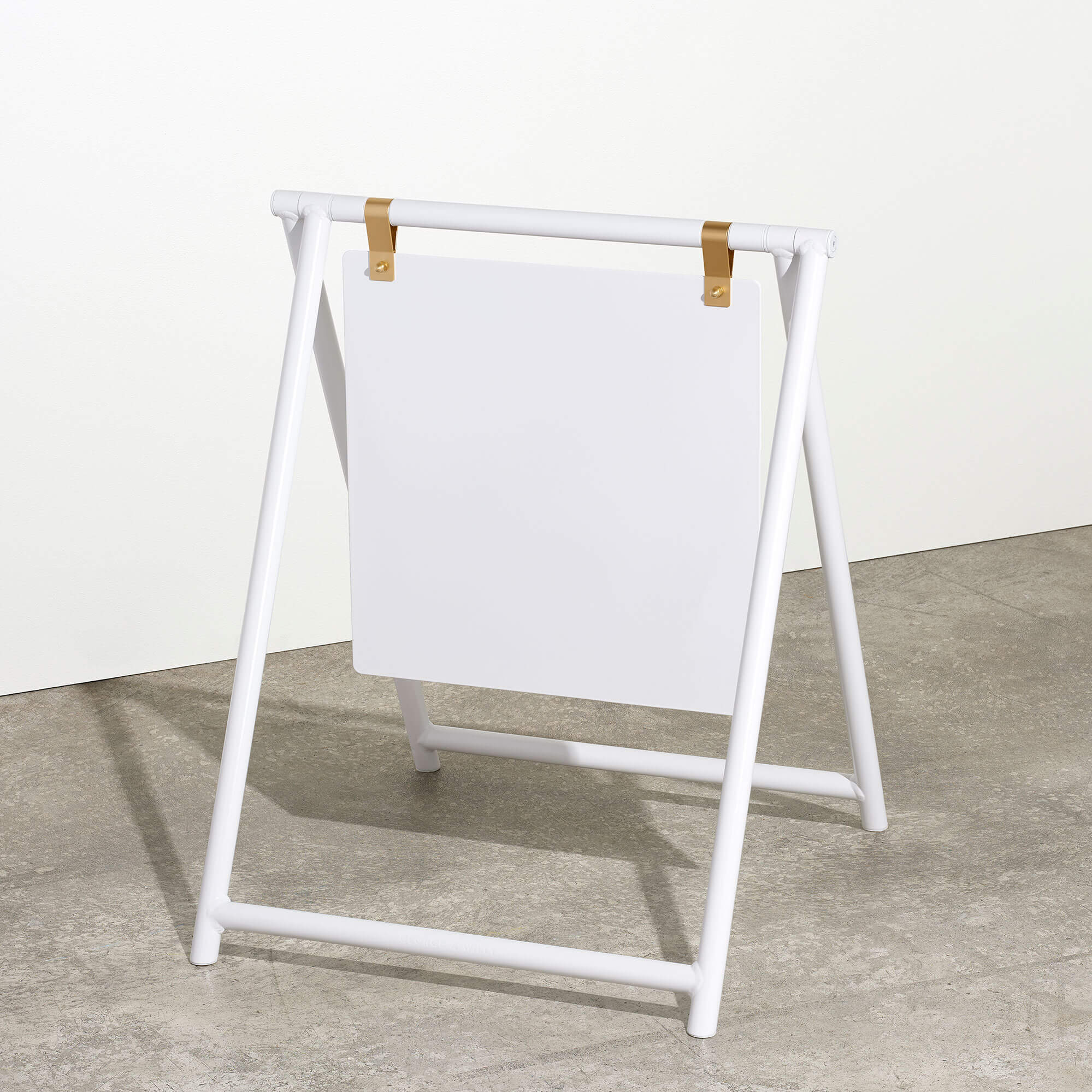
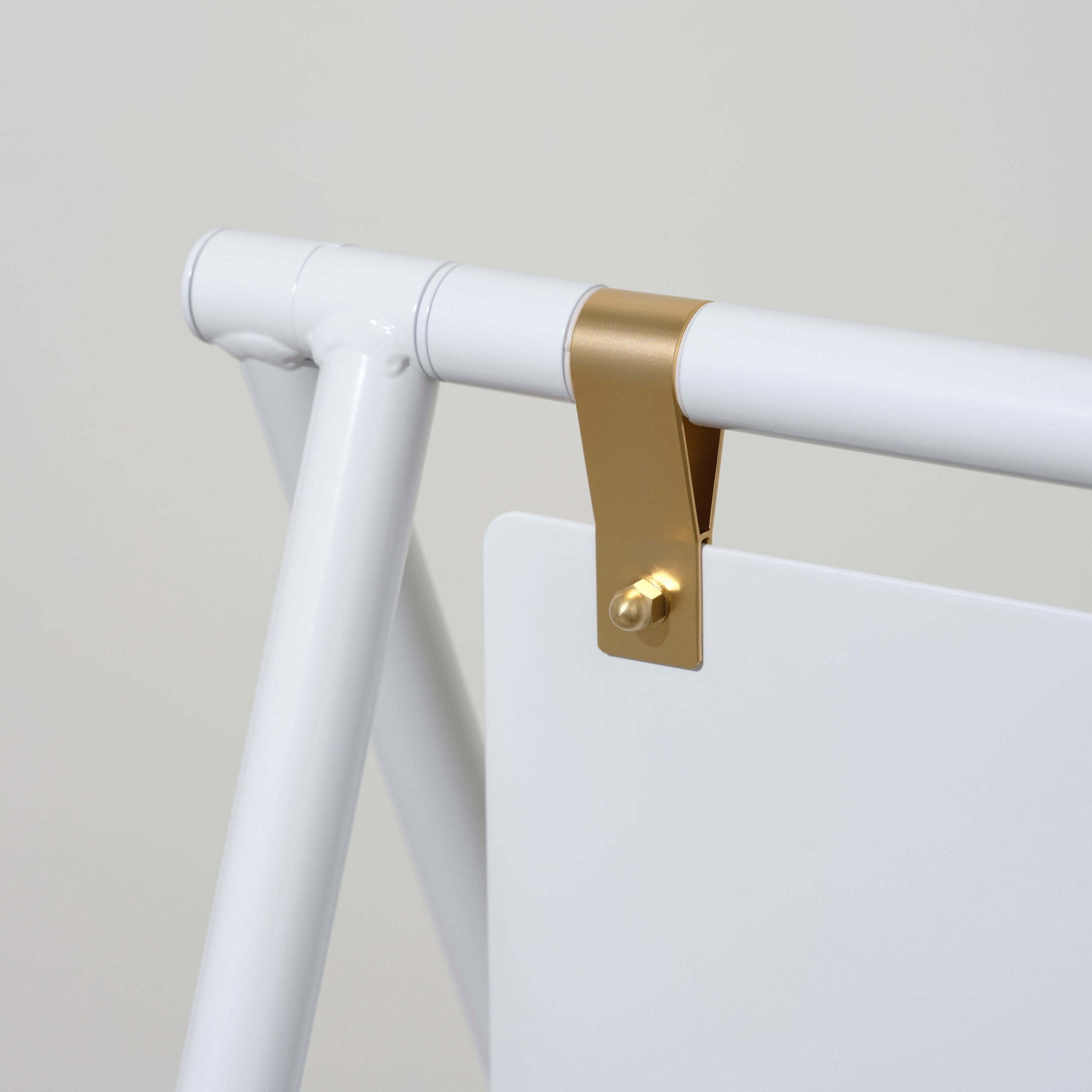
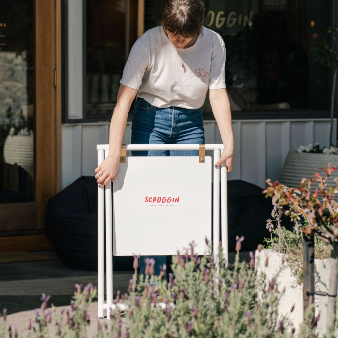
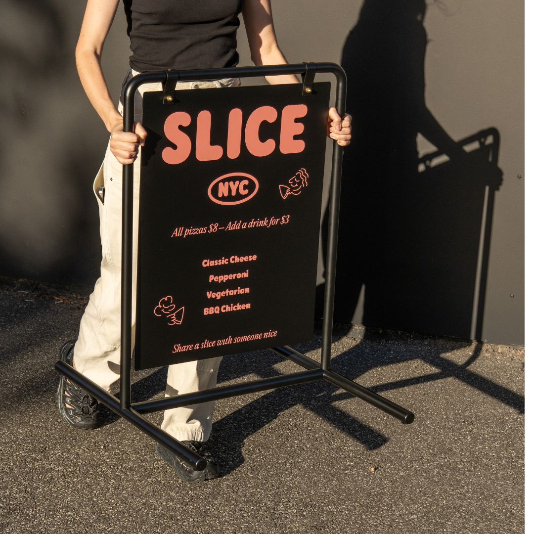
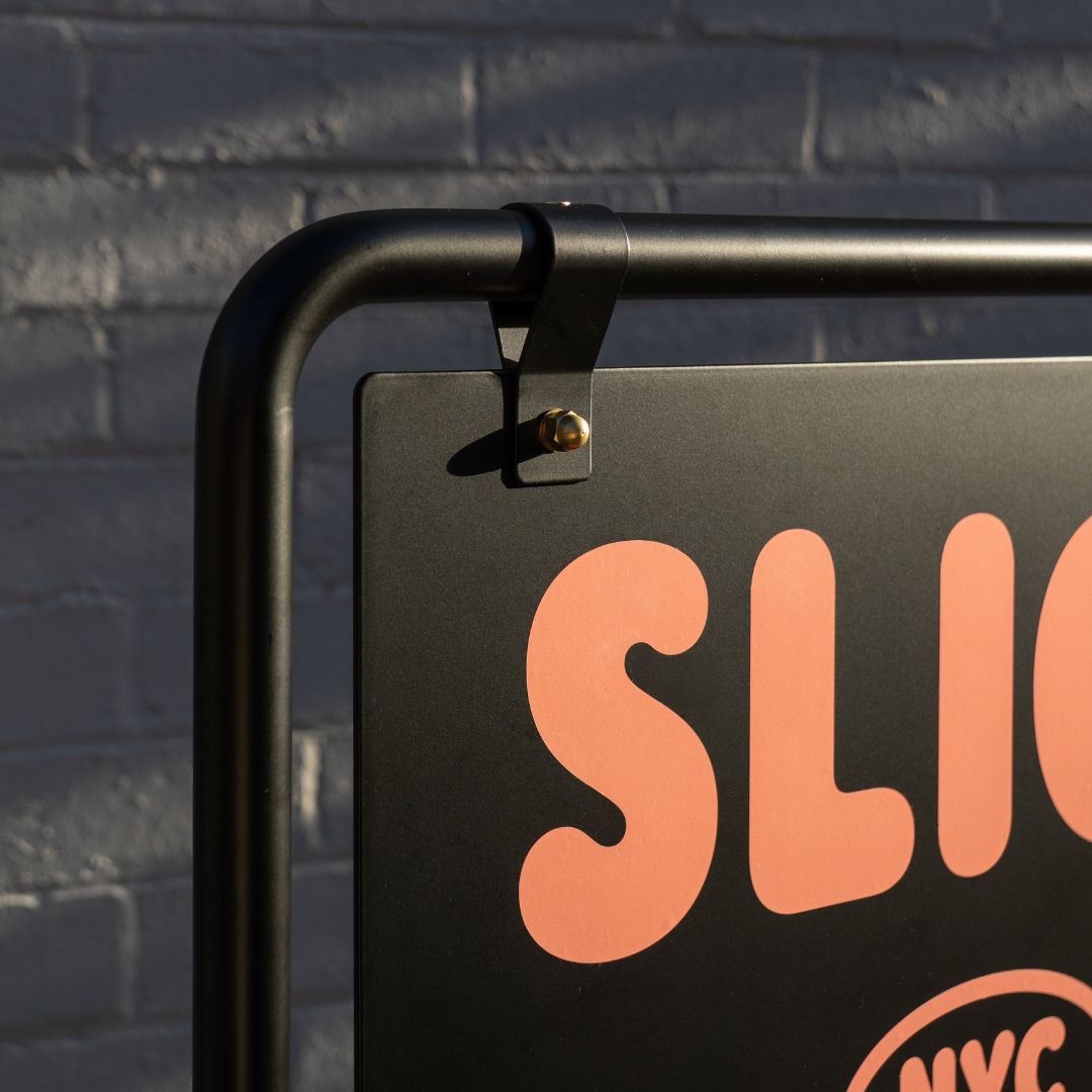
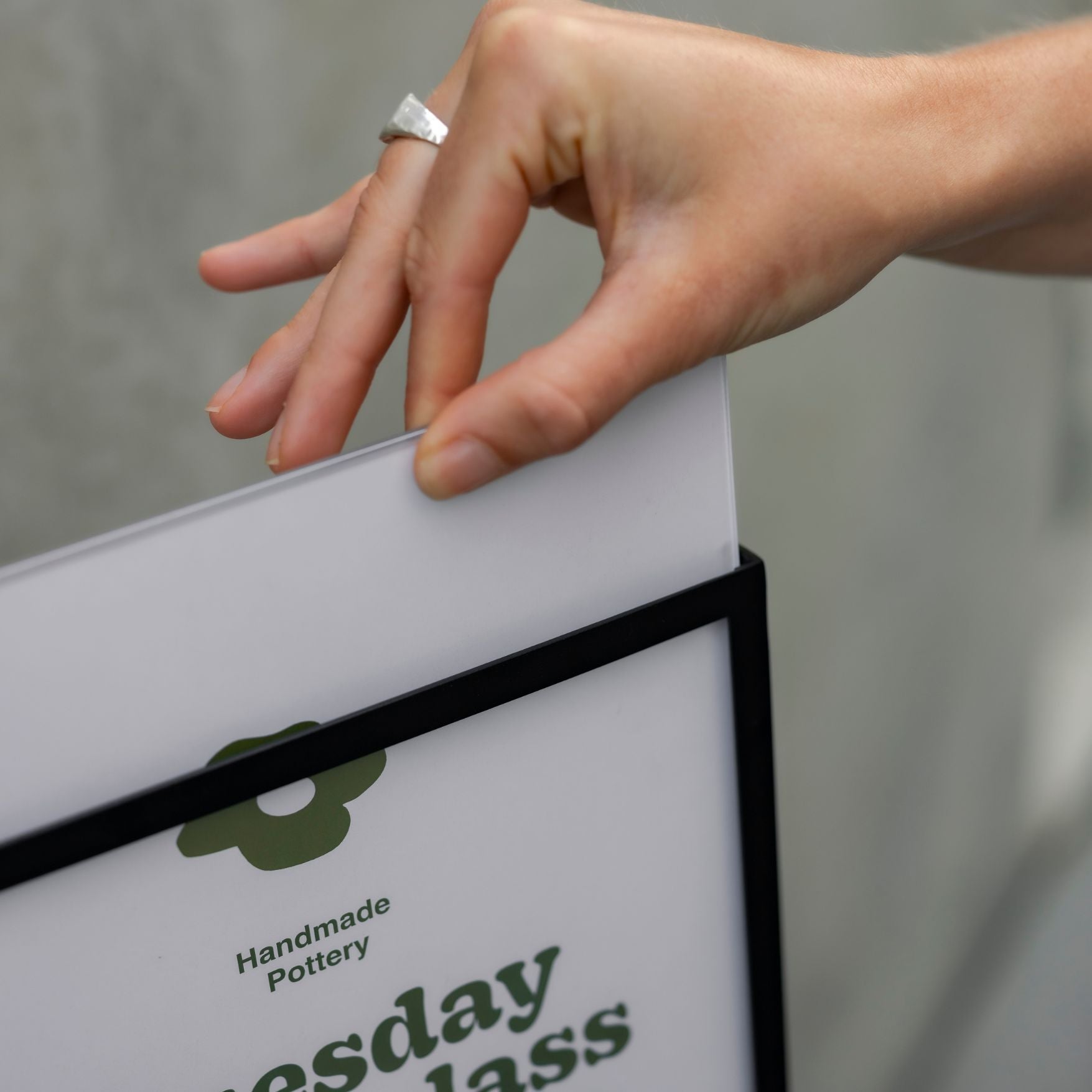
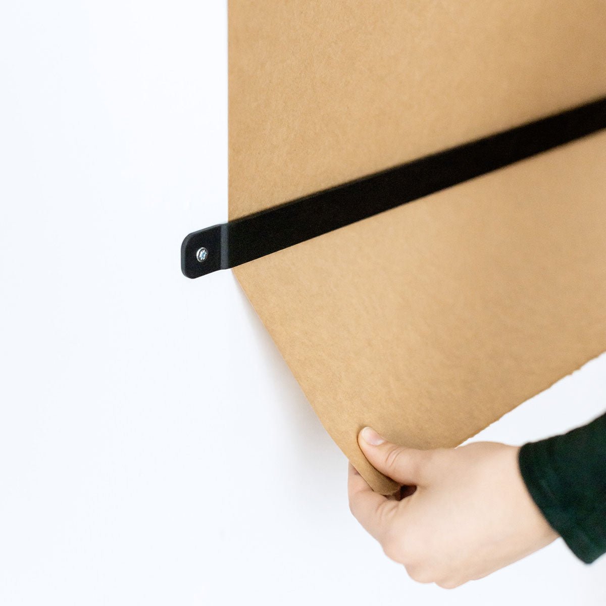
Design notes: Choose durable, minimalist materials like powder-coated aluminum or steel with optional warm wood accents. Use high-contrast typography on a matte finish for legibility. George & Willy hardware ships blank; have a local signwriter apply clean vinyl graphics. If messages change often, a magnetic letter system keeps updates fast and on-brand.
What to include:
Logo/wordmark
Area names or directional arrows
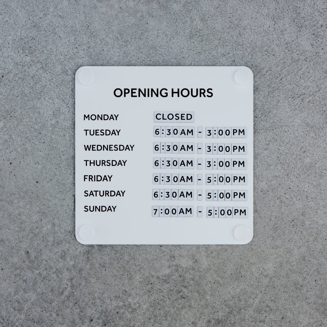
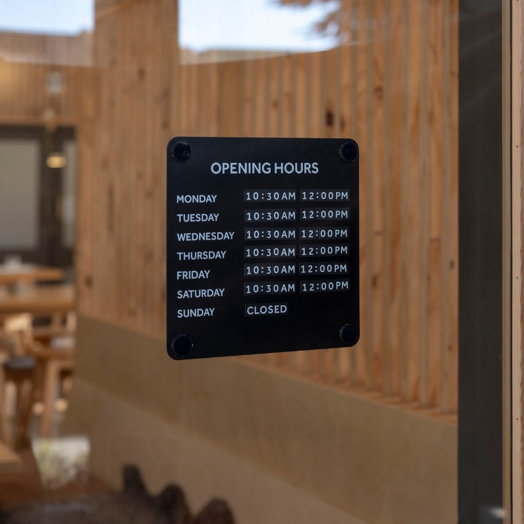
Hours and key policies
QR codes for menus/Wi‑Fi
Short promotions or safety notes
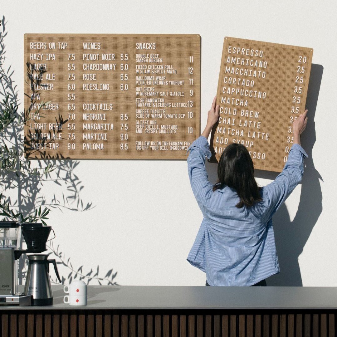
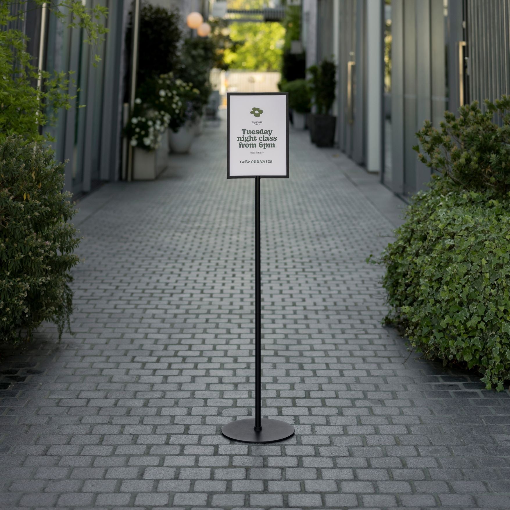
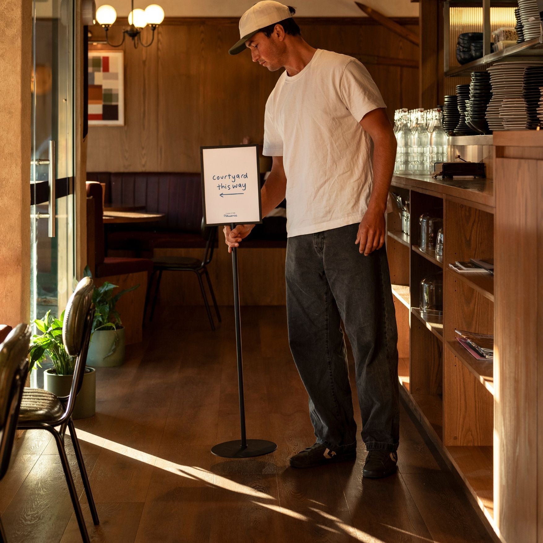
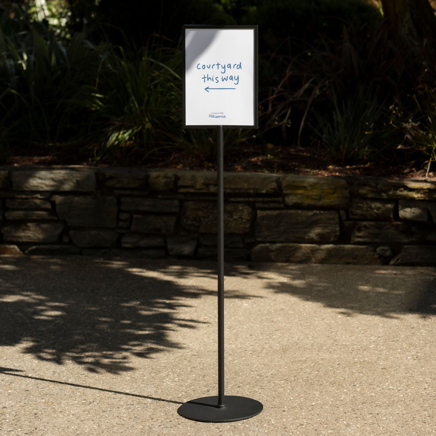
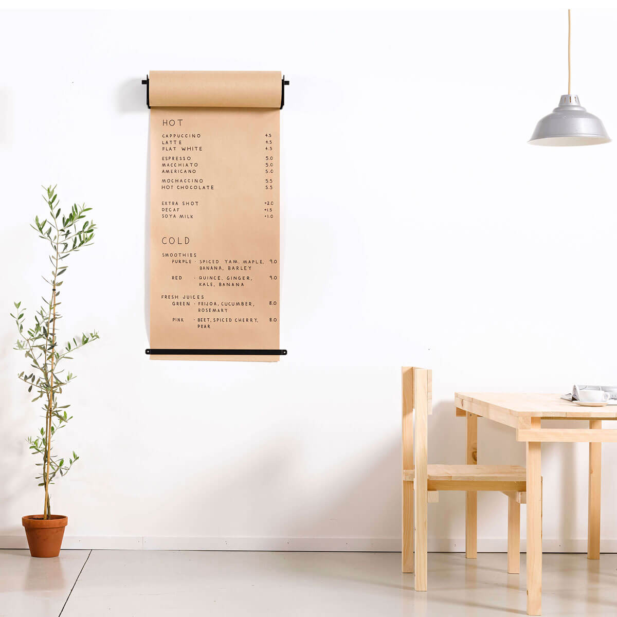
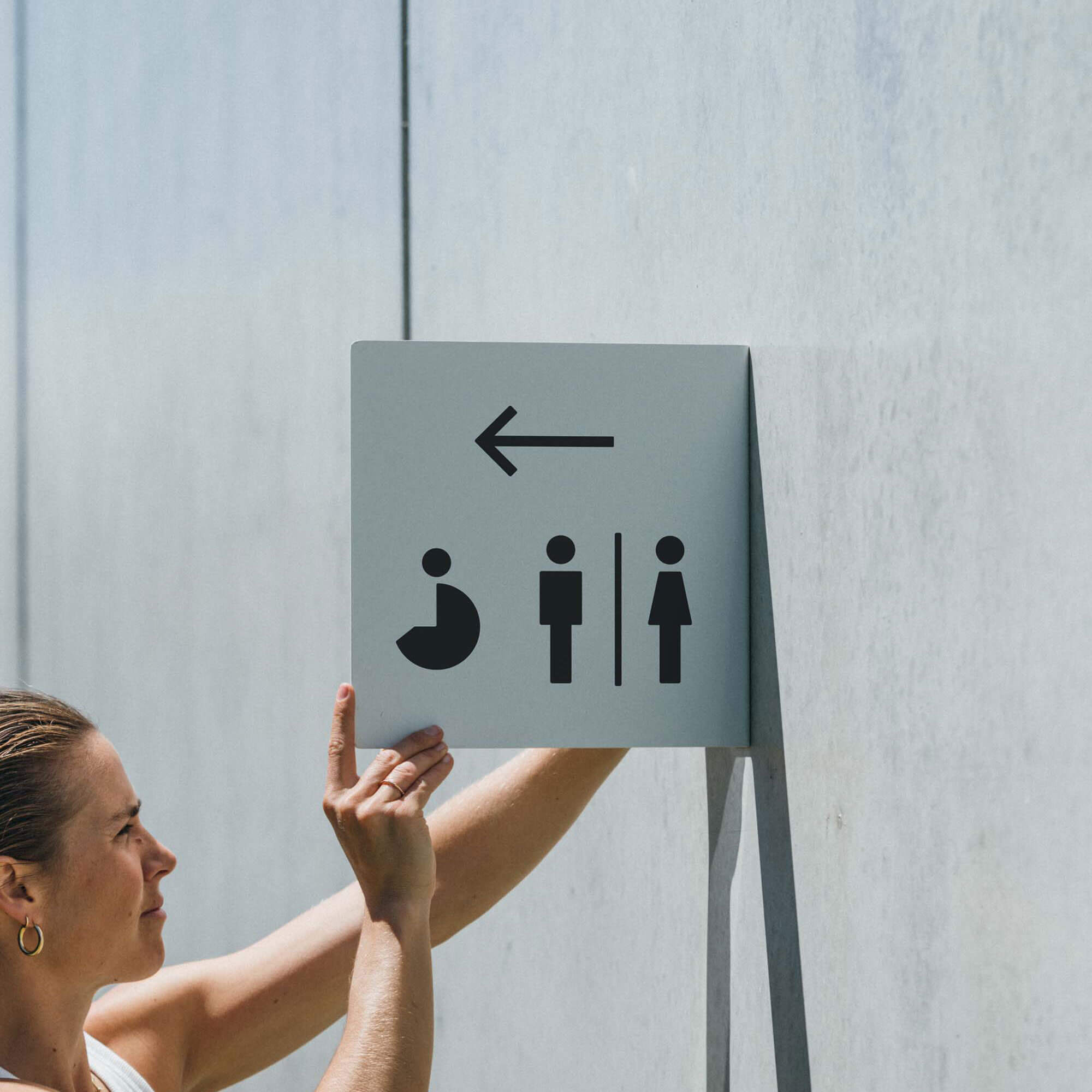
2. Directional Wayfinding Signs
When guests can navigate without asking, lines move, bottlenecks ease, and the experience feels effortless. Branded wayfinding nudges people toward check-in, pickup, restrooms, or retail zones while keeping the look cohesive and easy to update.
Good wayfinding is the quietest form of hospitality.
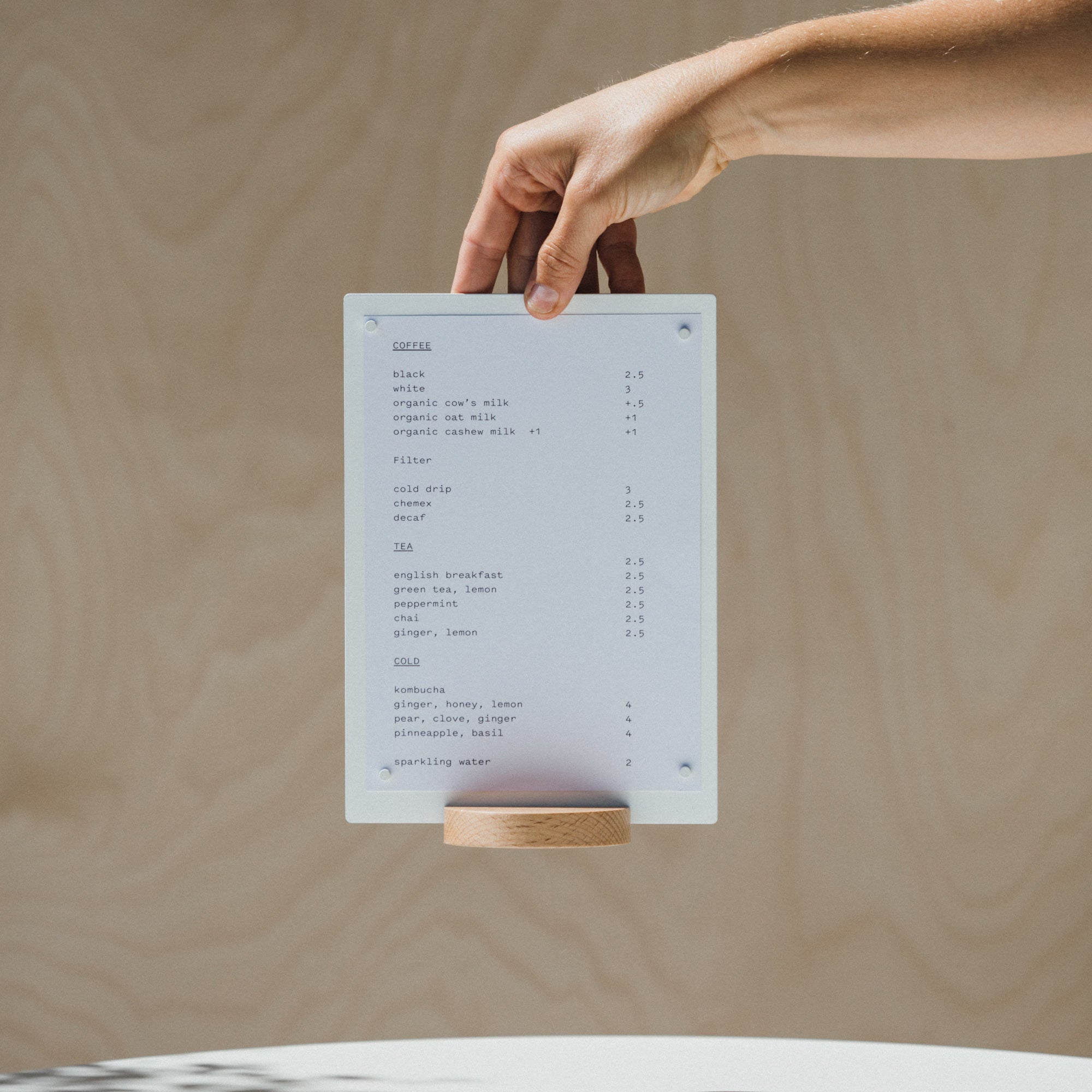
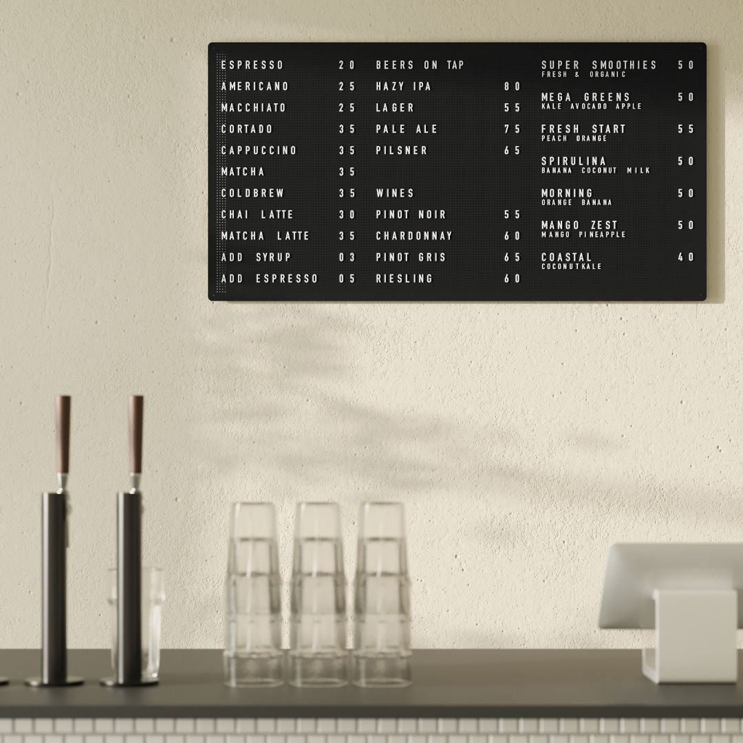
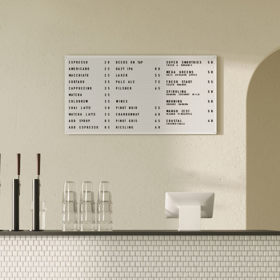
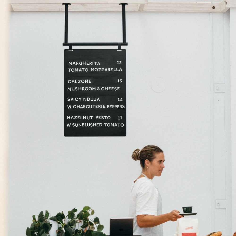
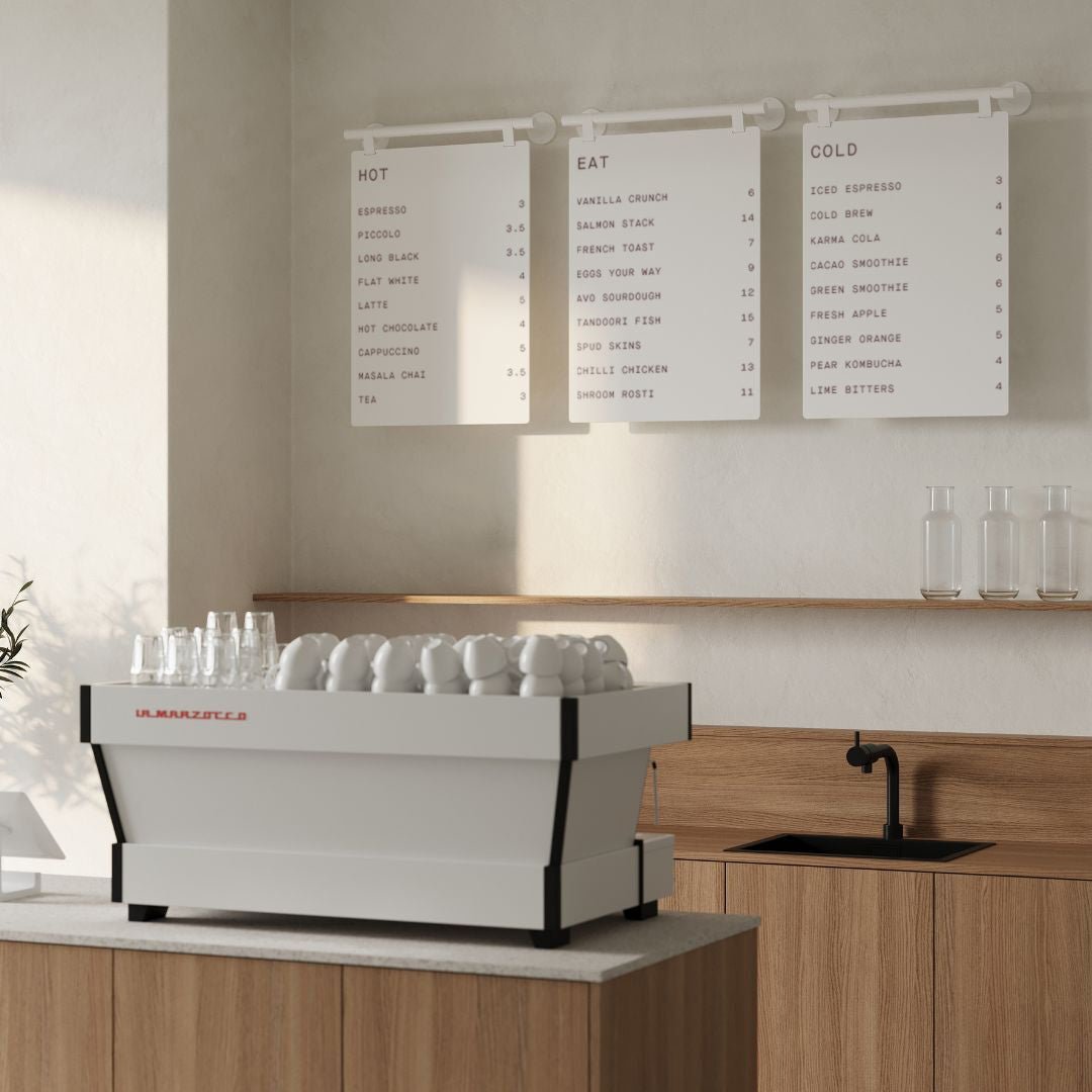
Placement playbook: Position at decision points like entrances, corridor intersections, and queue splits, visible from 10 to 20 feet. Mount at eye level for wall signs or overhead with at least 80" clearance. A Ceiling Menu Board keeps overhead wayfinding tidy and readable. Avoid glare and maintain ADA protrusion and path clearances. Use George & Willy‑compatible mounts for consistency across touchpoints.
Design notes: Opt for powder‑coated metal with optional timber details for warmth. Prioritize high-contrast, non‑glare finishes and generous type sizes. Apply graphics via local vinyl. For evolving layouts, consider quick‑change options like magnetic tiles or interchangeable inserts.
What to include:
Logo/wordmark
Clear area names or directional arrows
Hours or key policies where relevant
QR codes, safety notes, short promos
3. Safety Signs
Clear safety communication keeps guests confident and operations compliant. From allergen notices to “No smoking,” these signs reduce friction at the counter, guide behavior in busy zones, and help you meet code without cluttering the space.
Safety messaging should be unmistakable, not overwhelming.
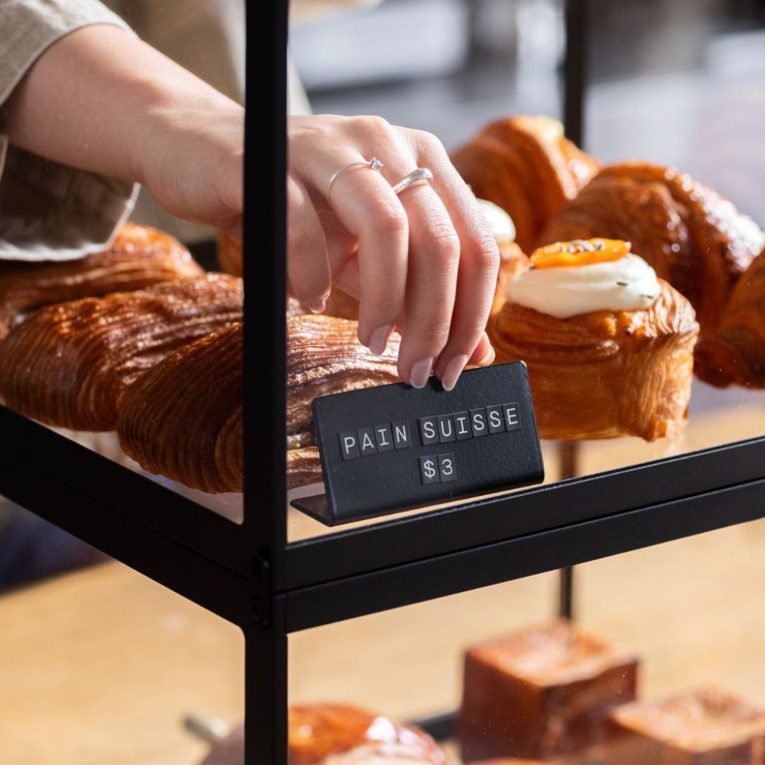
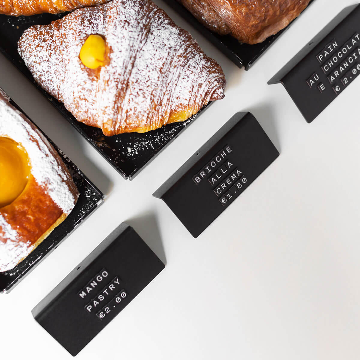
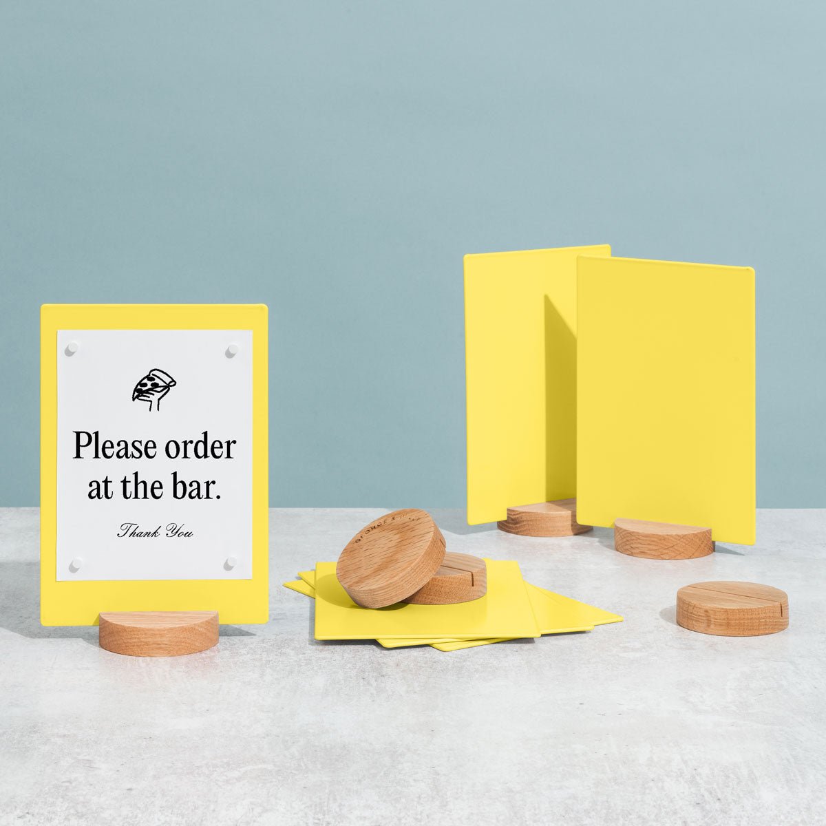
Placement playbook: Put policy and hazard signs where decisions happen, at entrances, counters, and circulation pinch points. Mount at eye level and control glare so messages are readable in changing light. Respect ADA clearances and select robust, secure mounting compatible with George & Willy kits. At the register, Card Counter Signs are ideal for concise policies like allergen notices or payment prompts.
Design notes: Use powder‑coated aluminum or steel for durability, with optional wood accents to soften the look. Keep contrast high and typography simple. Apply crisp vinyl via a local signwriter. For policies that change, quick‑swap boards (magnetic or tile) keep updates fast and consistent.
What to include:
Signal words/pictograms (e.g., Caution, Wet Floor)
Policy statements (e.g., Service Animals)
Allergen notices
Arrows to exits/first aid
Emergency contacts
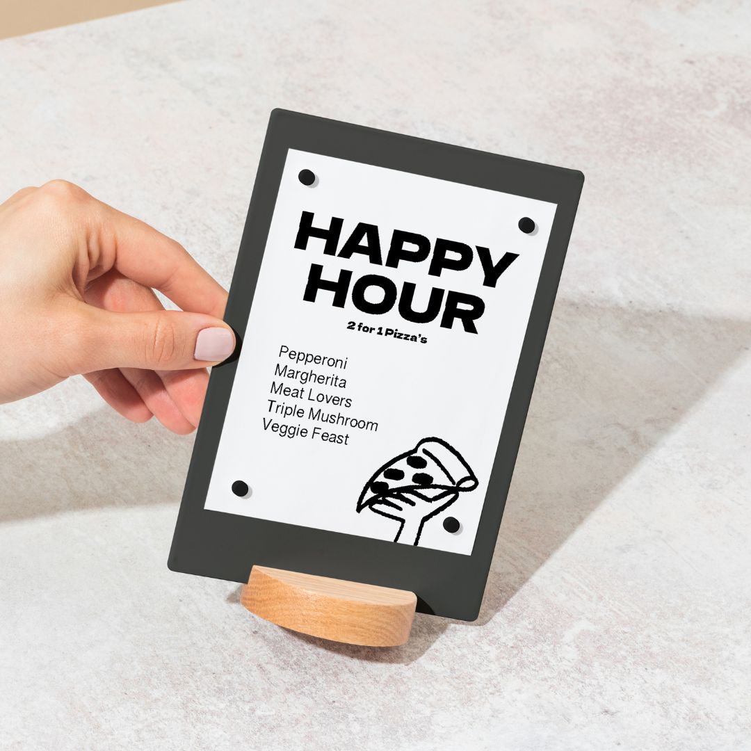
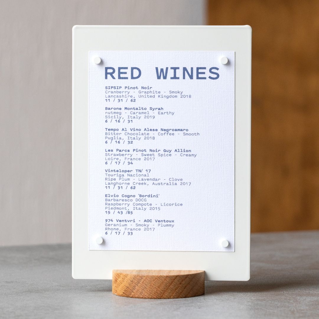
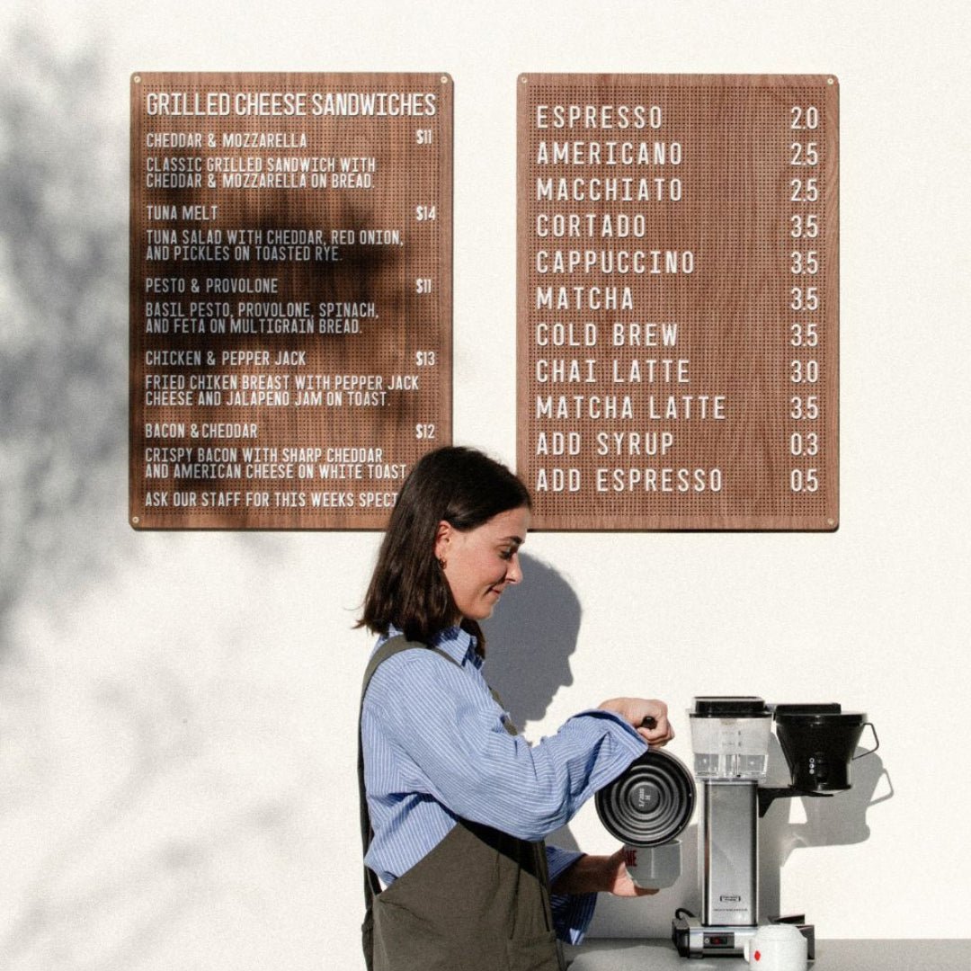
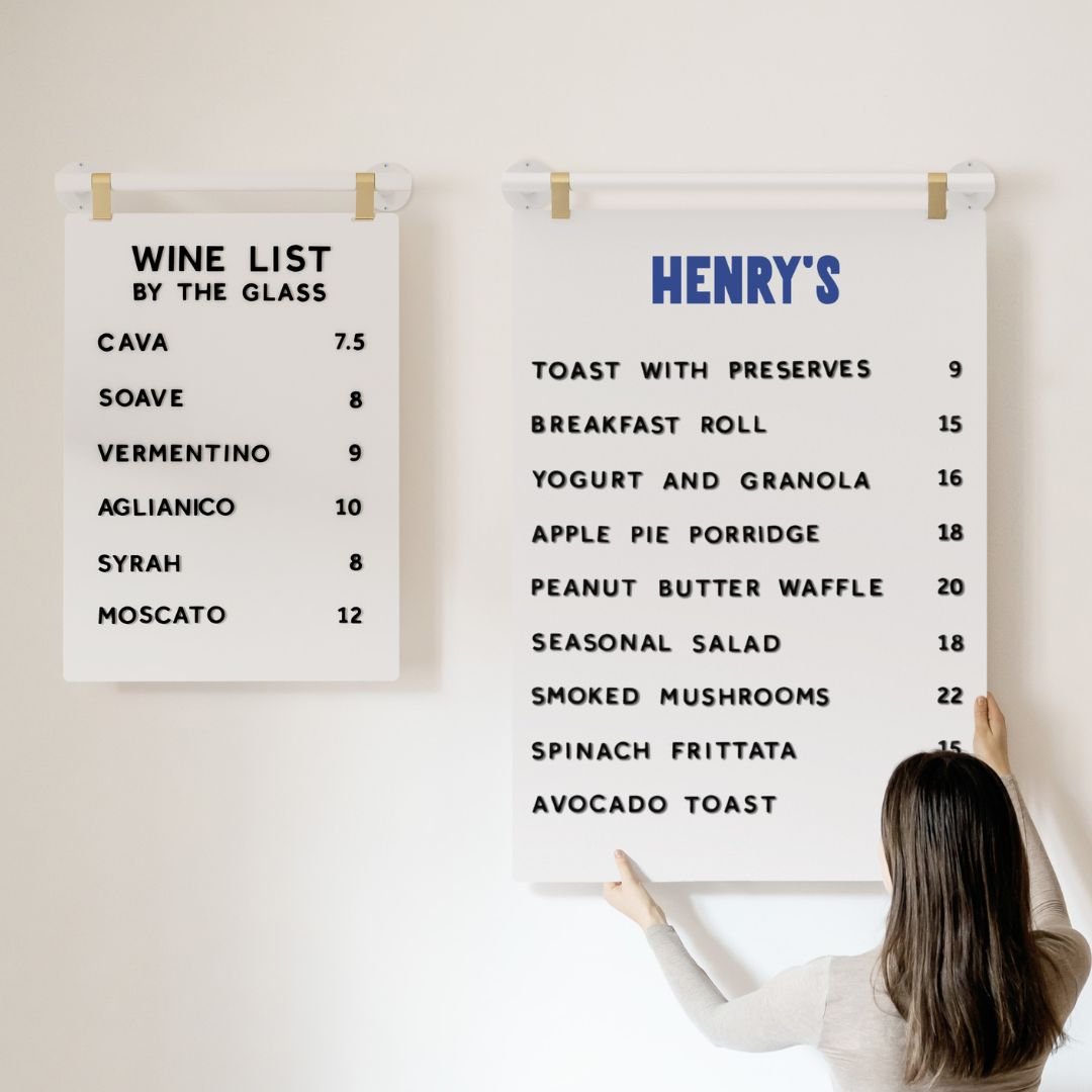
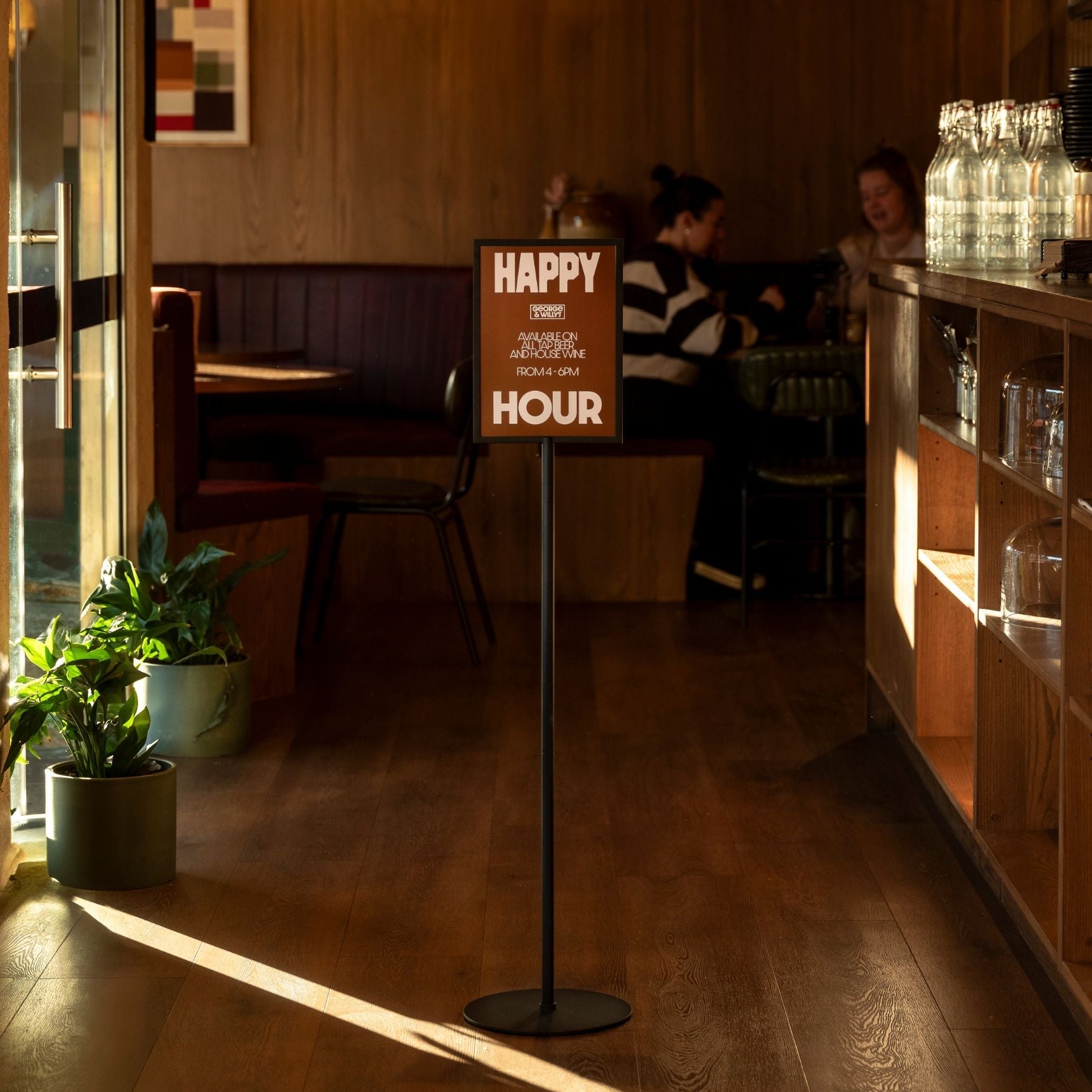
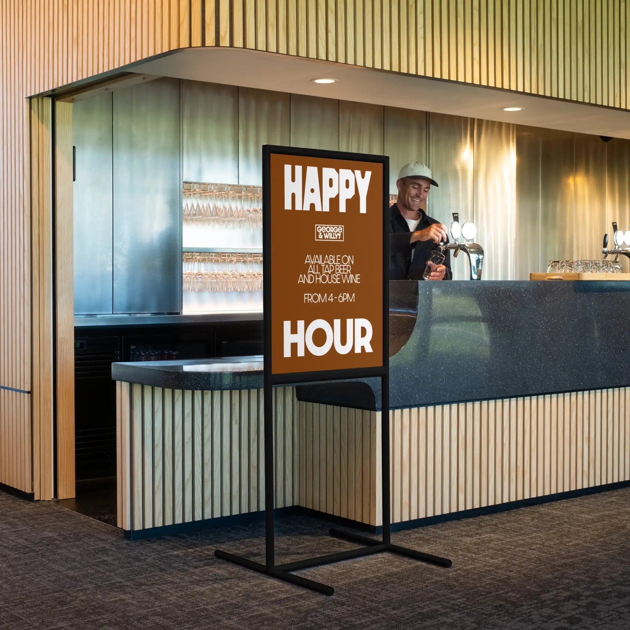
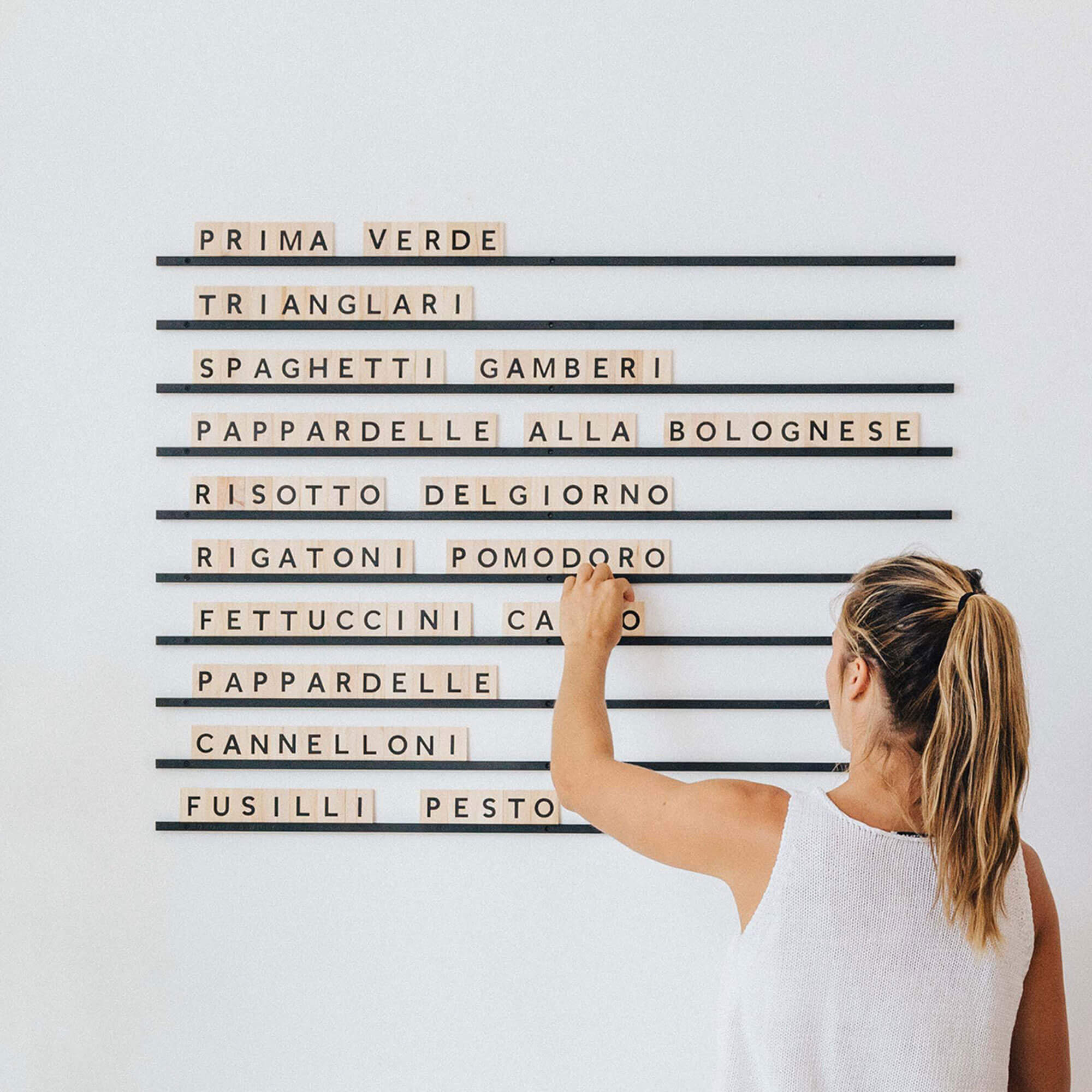
4. Company Policy Signs
Policies shouldn’t feel punitive; they should make visits smoother. Clear, friendly rules around returns, Wi‑Fi, payment, or class conduct reduce staff back‑and‑forth and help guests self‑serve with confidence.
State the rule once, beautifully, and keep it current.
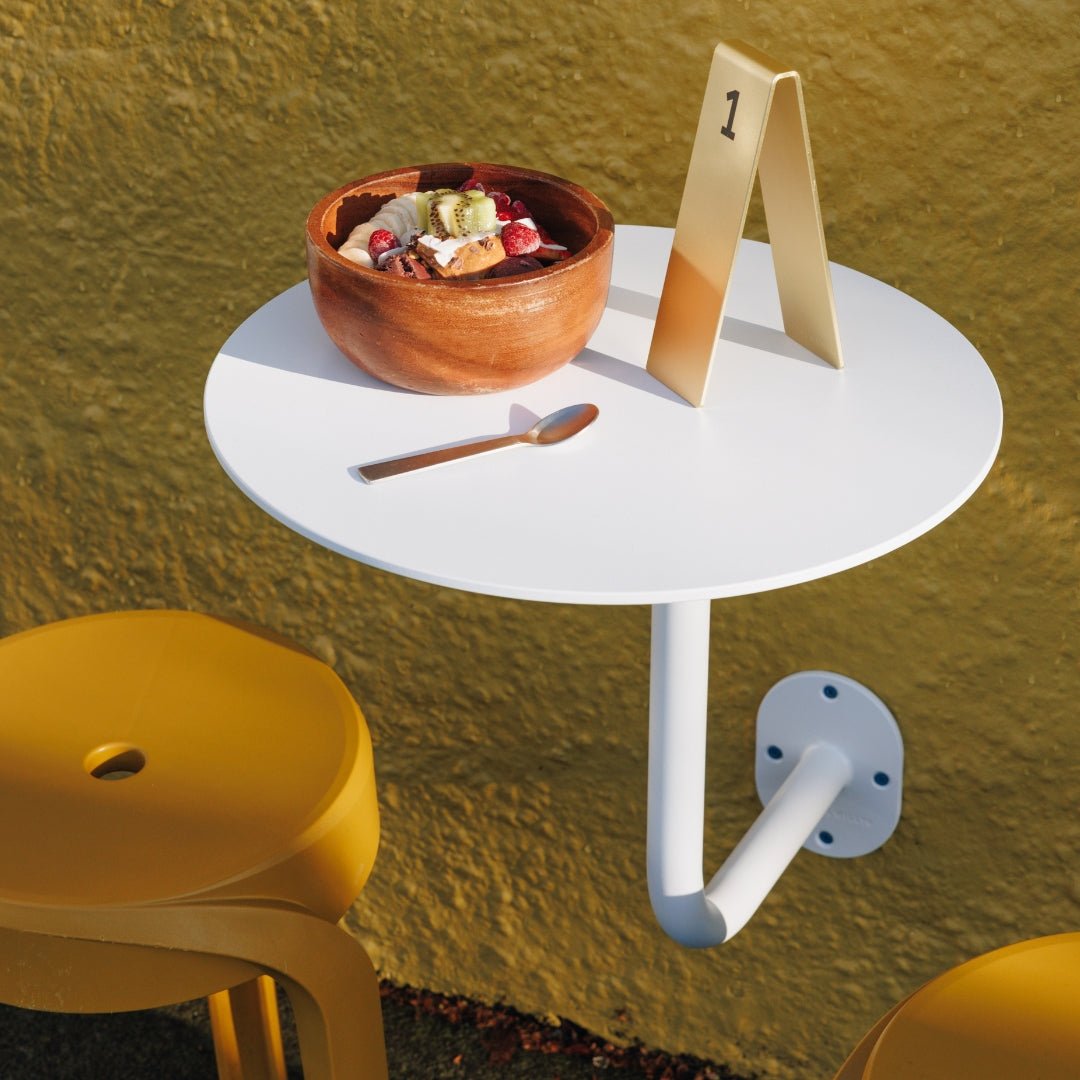
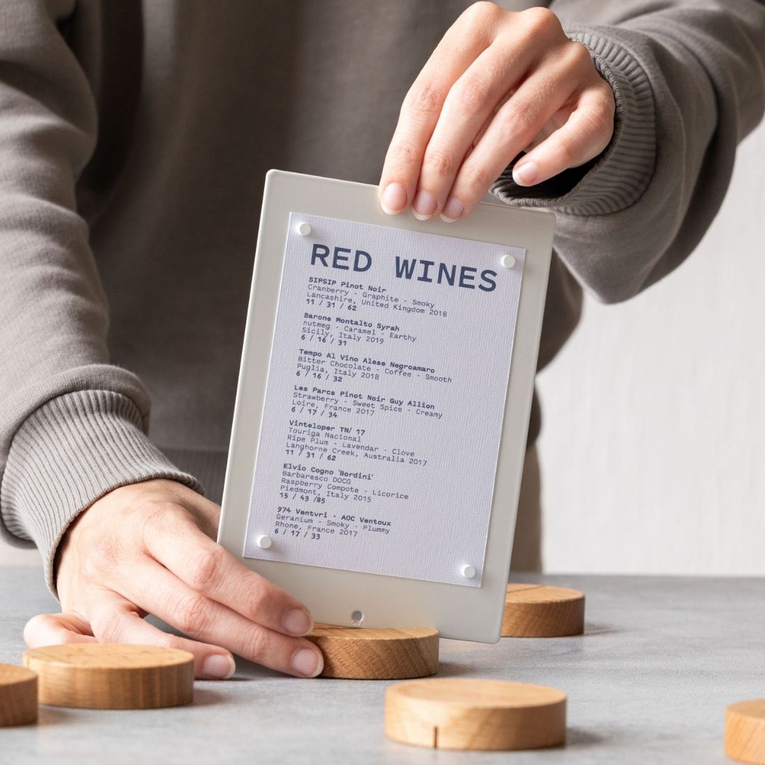
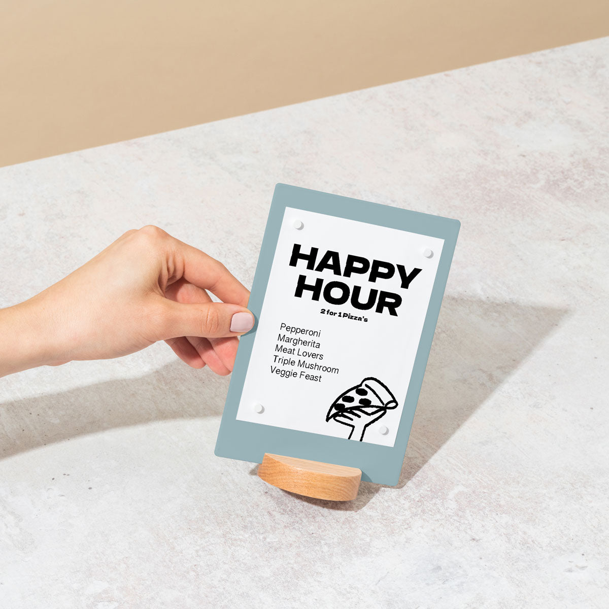
Placement playbook: Put primary house rules at entrances or the start of the queue so expectations are set early. Place task‑specific policies at counters. Aim for a 54 to 60 inch centerline, avoid glare, and maintain ADA paths. Choose George & Willy‑compatible hardware for a cohesive system. Use Table Talkers to rotate specials or house rules without reprinting.
Design notes: Stick to durable, minimalist powder‑coated metal with optional timber accents that match your palette. Use high‑contrast type for quick scanning. Hardware arrives blank; a local signwriter can apply vinyl. For evolving rules, lean on magnetic letters or tiles for fast updates.
What to include:
Friendly header and logo
Key rules (returns, Wi‑Fi)
Payment and pickup notes
Safety/allergen warnings; QR code to full policy
Invest in Cohesive Interior Signage for Lasting Impact
Ultimately, great interior signage improves the day to day function of your business while reinforcing your brand identity. It ensures important information is communicated clearly, which can contribute to a safer and more efficient environment for both customers and staff. By choosing well crafted, thoughtfully designed pieces, you turn functional necessities into key elements of your decor that enhance brand memorability. This investment in quality communication tools pays dividends by creating a seamless and positive experience that encourages customers to return.
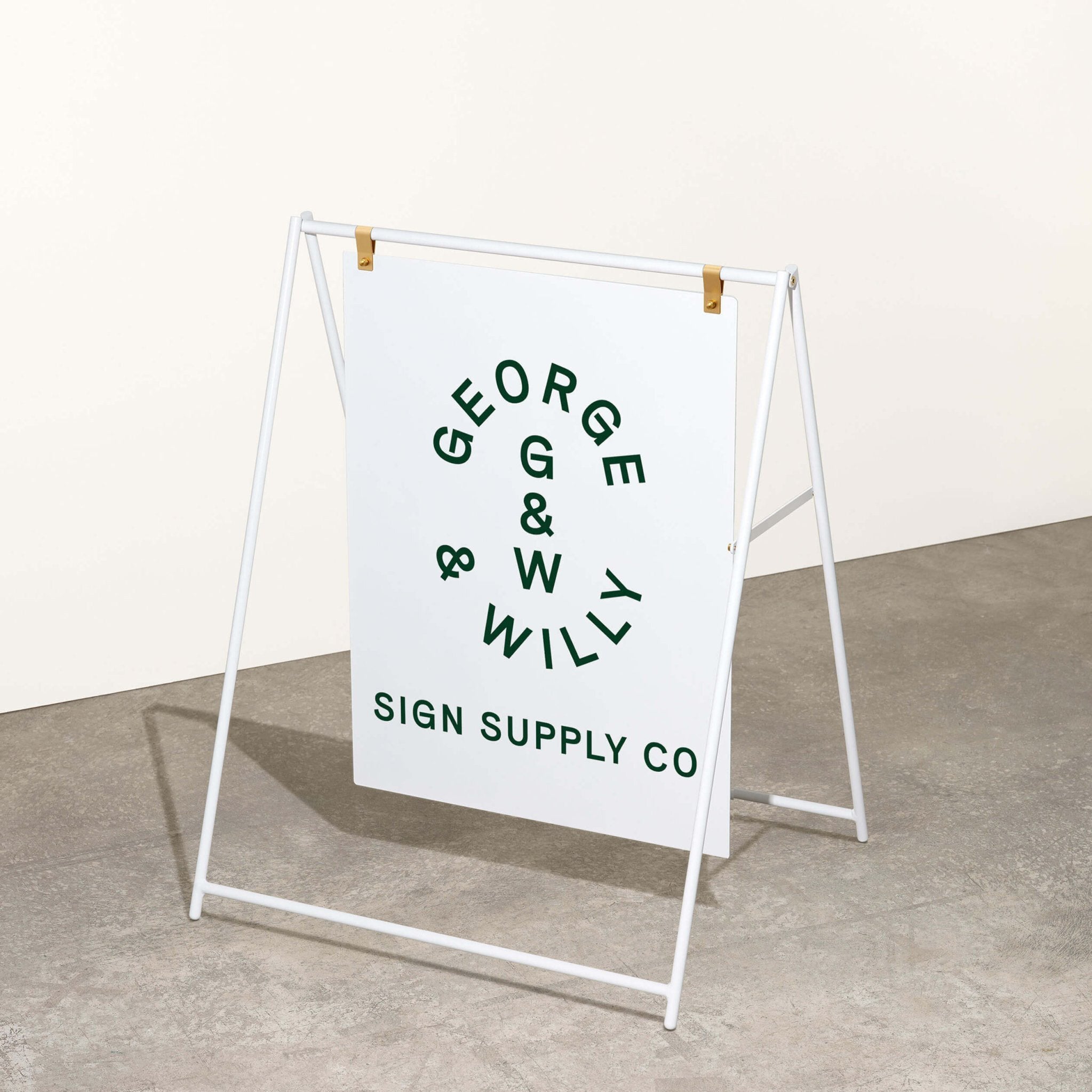
Ready to elevate your space? Explore the collection of thoughtfully designed display products at George & Willy.
Frequently Asked Questions About Interior Signage
What is the main purpose of interior signage?
The primary purposes of interior signage are communication, wayfinding, and branding. It helps people navigate a space, provides essential information like prices or hours, and reinforces a business’s visual identity and professionalism.
What materials are best for durable interior signs?
For durability, especially in busy commercial environments, materials like powder coated aluminum, steel, and quality timbers are excellent choices. They resist wear and tear while maintaining a premium appearance, making them a smart long term investment.
Can I customize off the shelf interior signage?
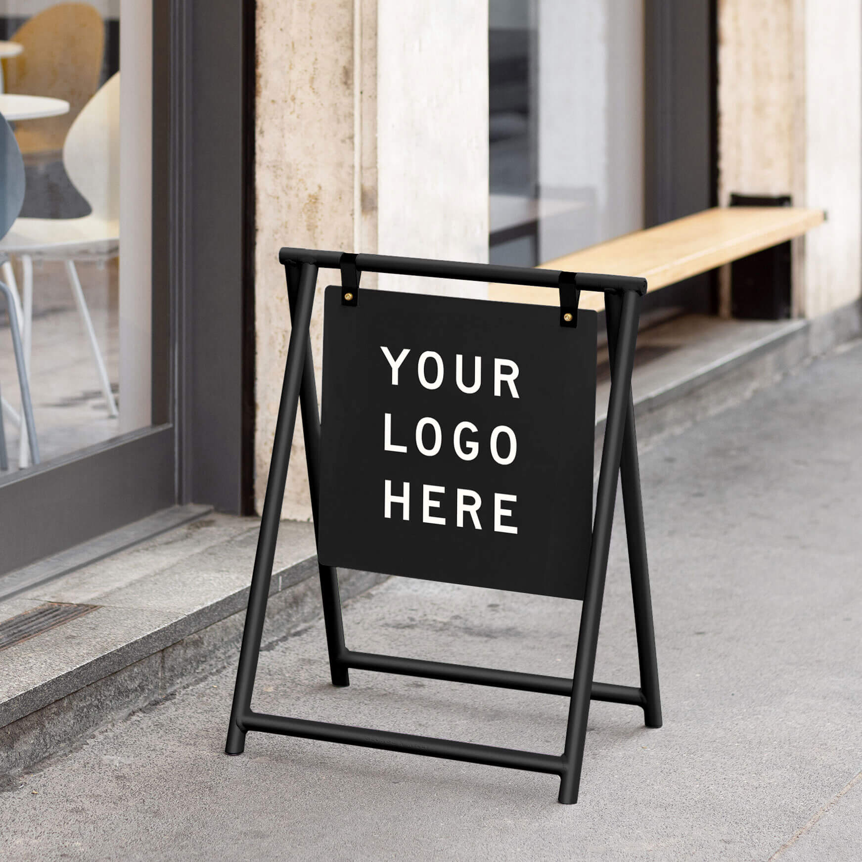
Absolutely. Many businesses opt for well designed, blank interior signage that they can customize locally. For example, you can apply vinyl decals with your logo or specific text to a blank A Frame or Blade Sign, giving you a custom look without the high cost and long wait times of full fabrication.
How do I create a cohesive look with my interior signage?
To create a cohesive look, it’s best to source your signs from a provider that offers a range of products with a consistent design aesthetic. This allows you to match your menu boards, wayfinding signs, and tabletop displays to create a unified and intentional brand experience throughout your entire space.
Is professional interior signage worth it for a small business?
Yes, professional interior signage is a valuable investment for any business, regardless of size. It makes a small cafe, boutique, or studio feel more established and trustworthy. Clear, attractive signage improves the customer experience, which is crucial for building loyalty and encouraging repeat business.