

A great retail display is your store’s silent salesperson. It’s the first handshake with a potential customer, a visual story that can stop them in their tracks, draw them inside, and guide them on a journey. Effective retail displays do more than just showcase products; they create an atmosphere, communicate your brand’s identity, and ultimately, drive sales. In a busy marketplace, curated displays transform a simple shopping trip into a memorable brand experience. They are a critical tool for turning foot traffic into loyal customers. This guide explores a wide range of retail display ideas, from captivating window installations and immersive in store experiences to seasonal themes and modular designs, giving you the inspiration to transform your space.
Core Principles of Effective Retail Displays
Creating a display that captivates and converts relies on a few timeless design principles. Think of these as the foundation for all your creative retail display ideas.
Create a Focal Point: Every great display has a single point that draws the eye first. This could be your hero product, a bold sign, or a pop of color. The goal is to grab attention and then guide the shopper’s gaze around the rest of the arrangement.
Balance and Composition: A well balanced display feels pleasing and professional. You can use symmetrical balance for a formal, orderly look, or asymmetrical balance for a more dynamic, modern feel. The key is to arrange elements so the visual weight is distributed evenly.
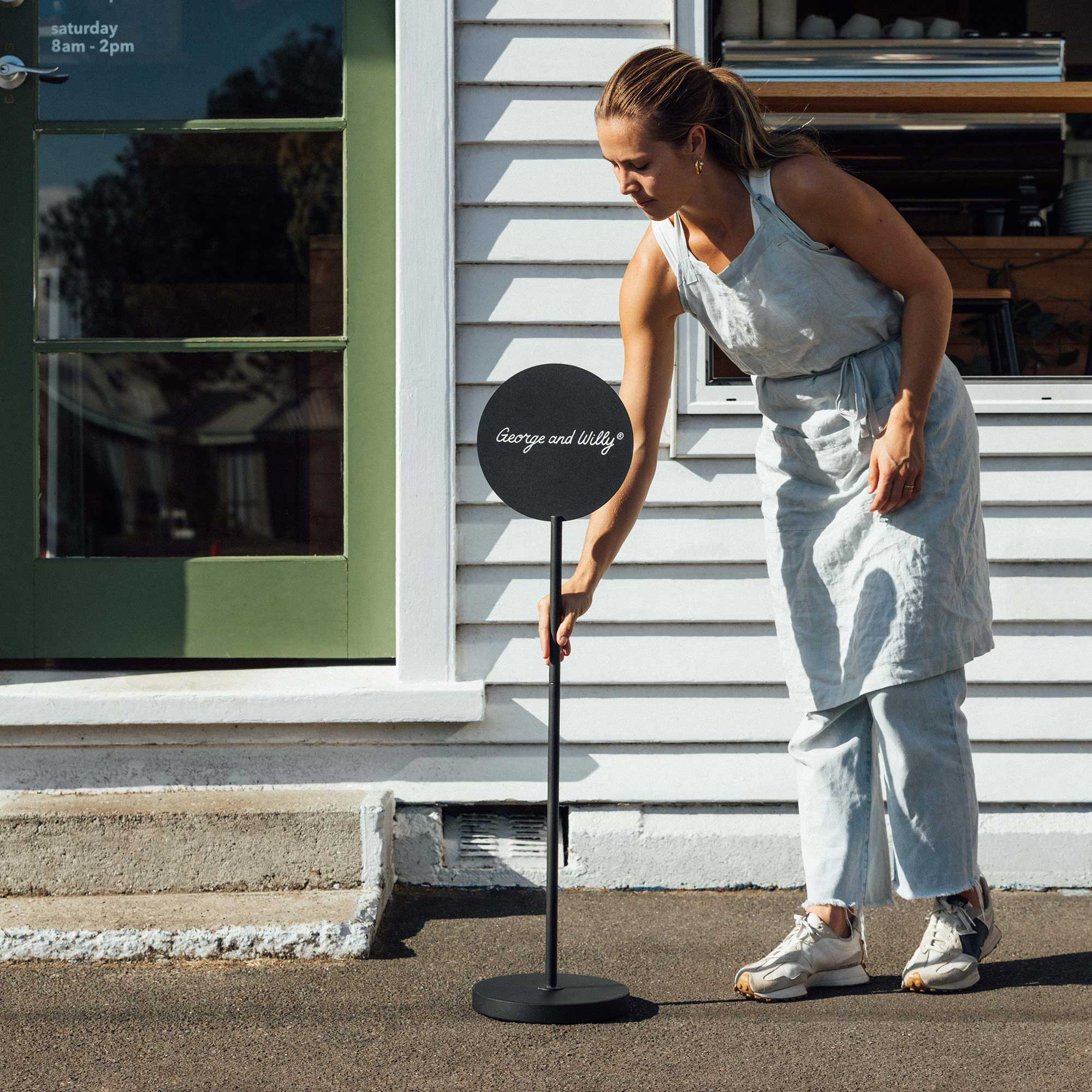
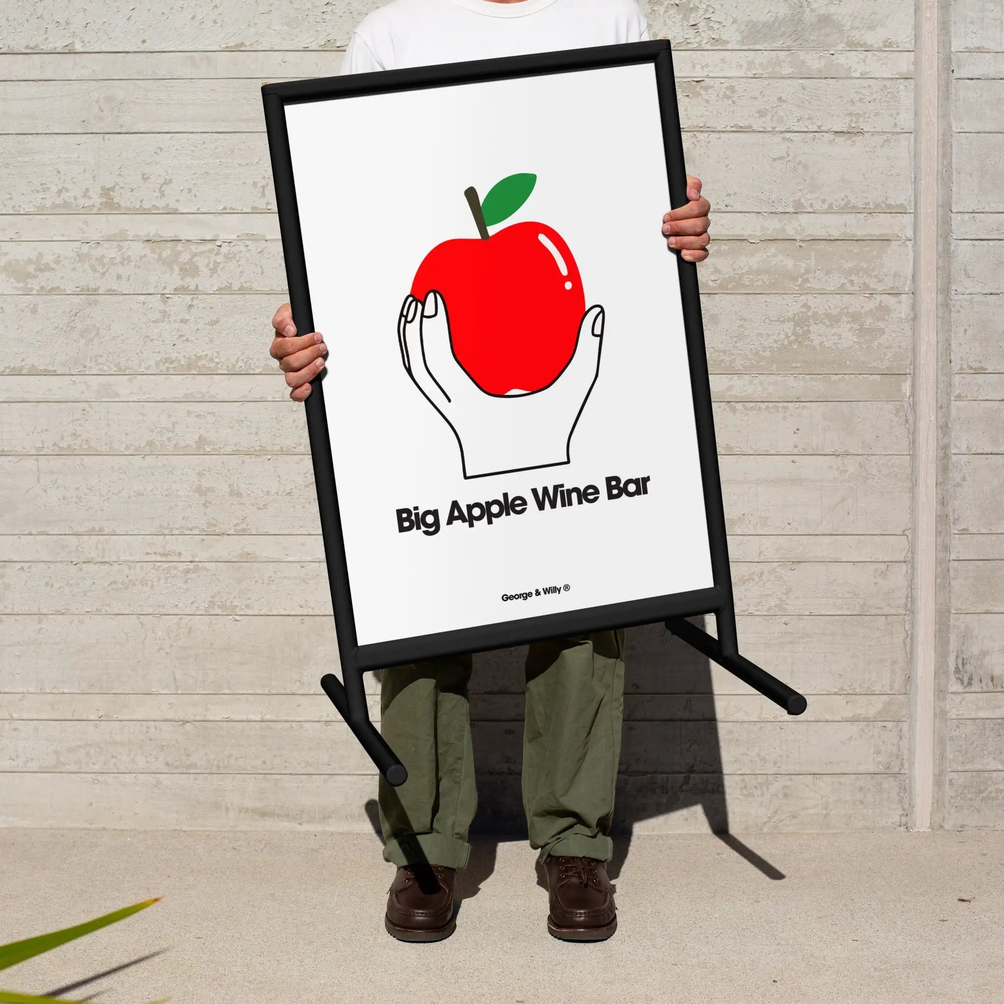
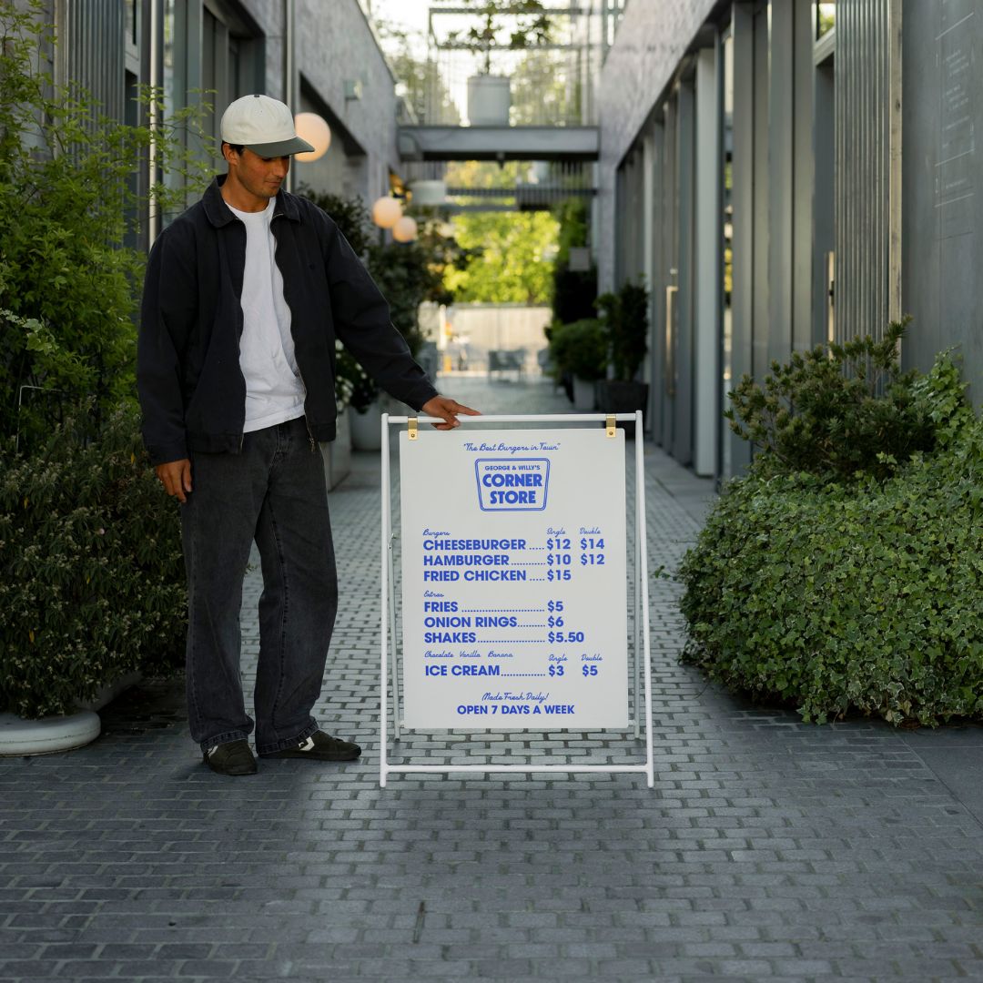
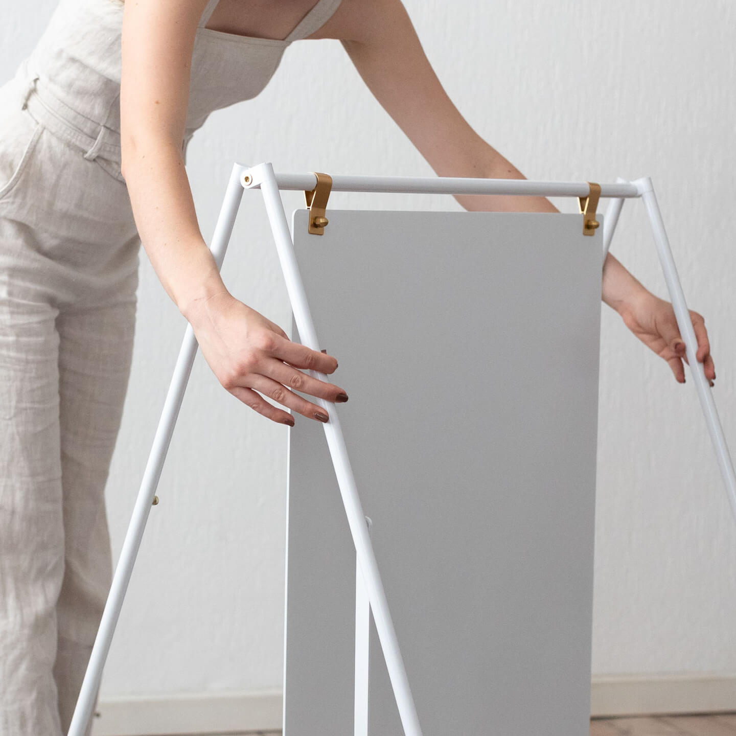
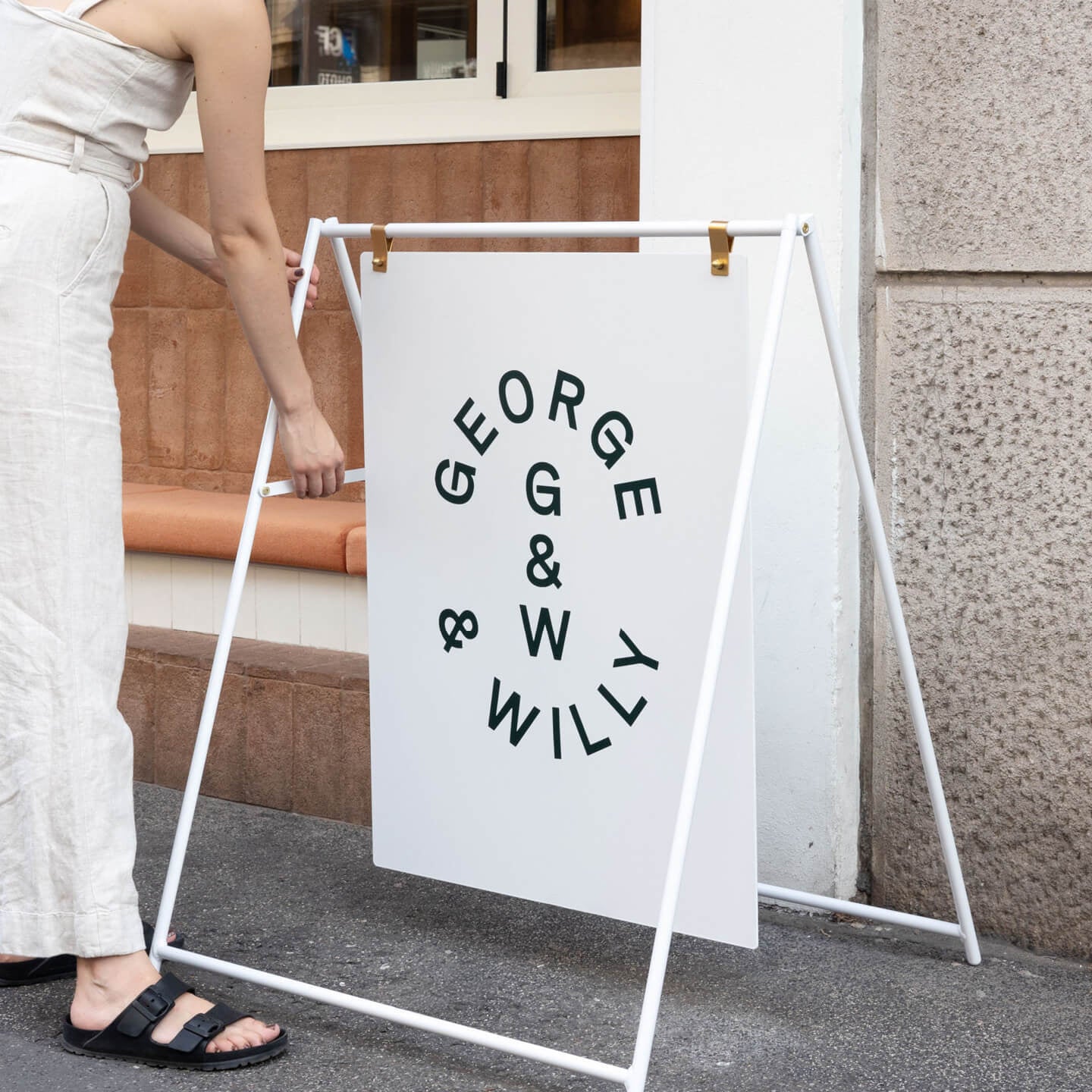
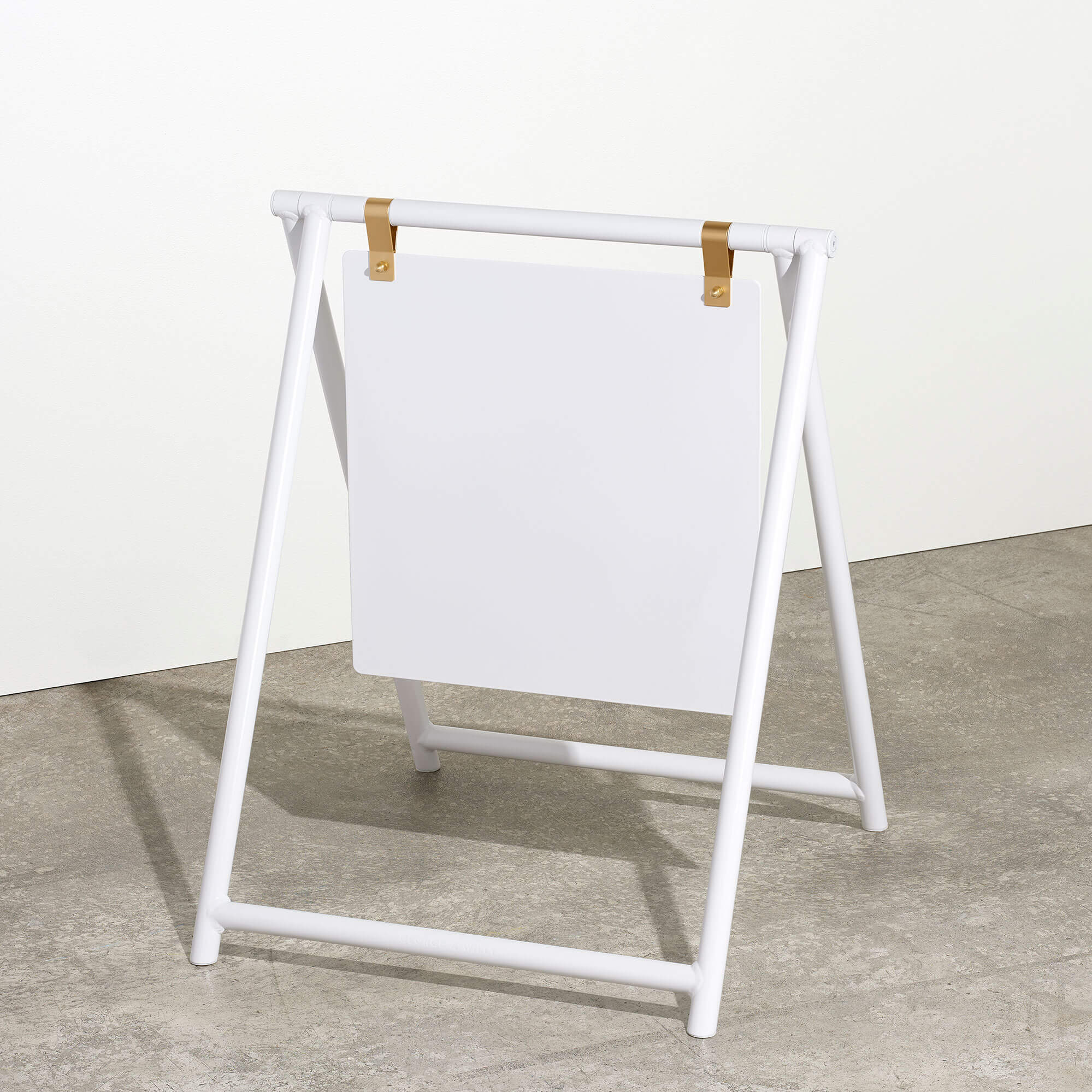
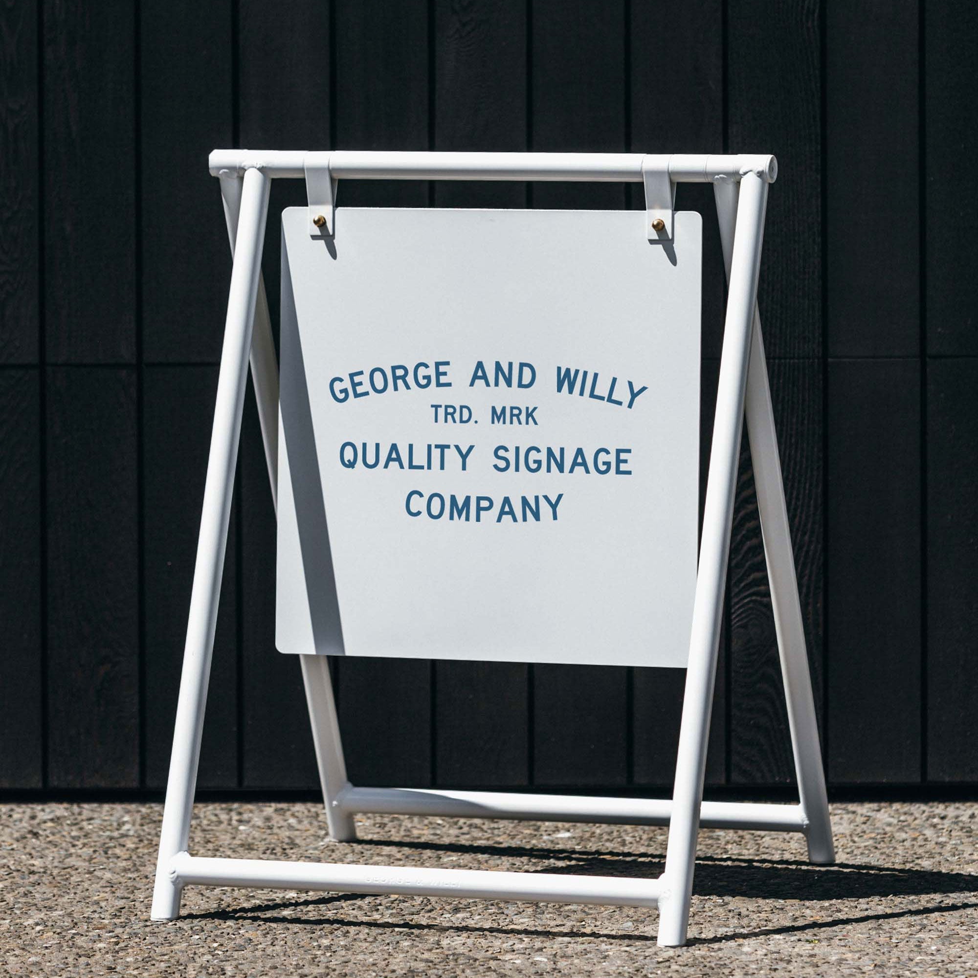
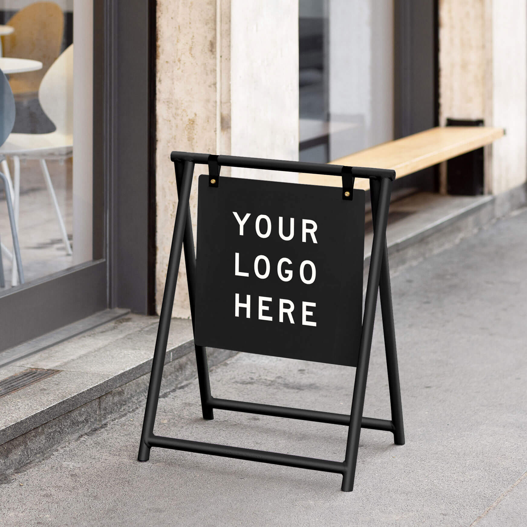
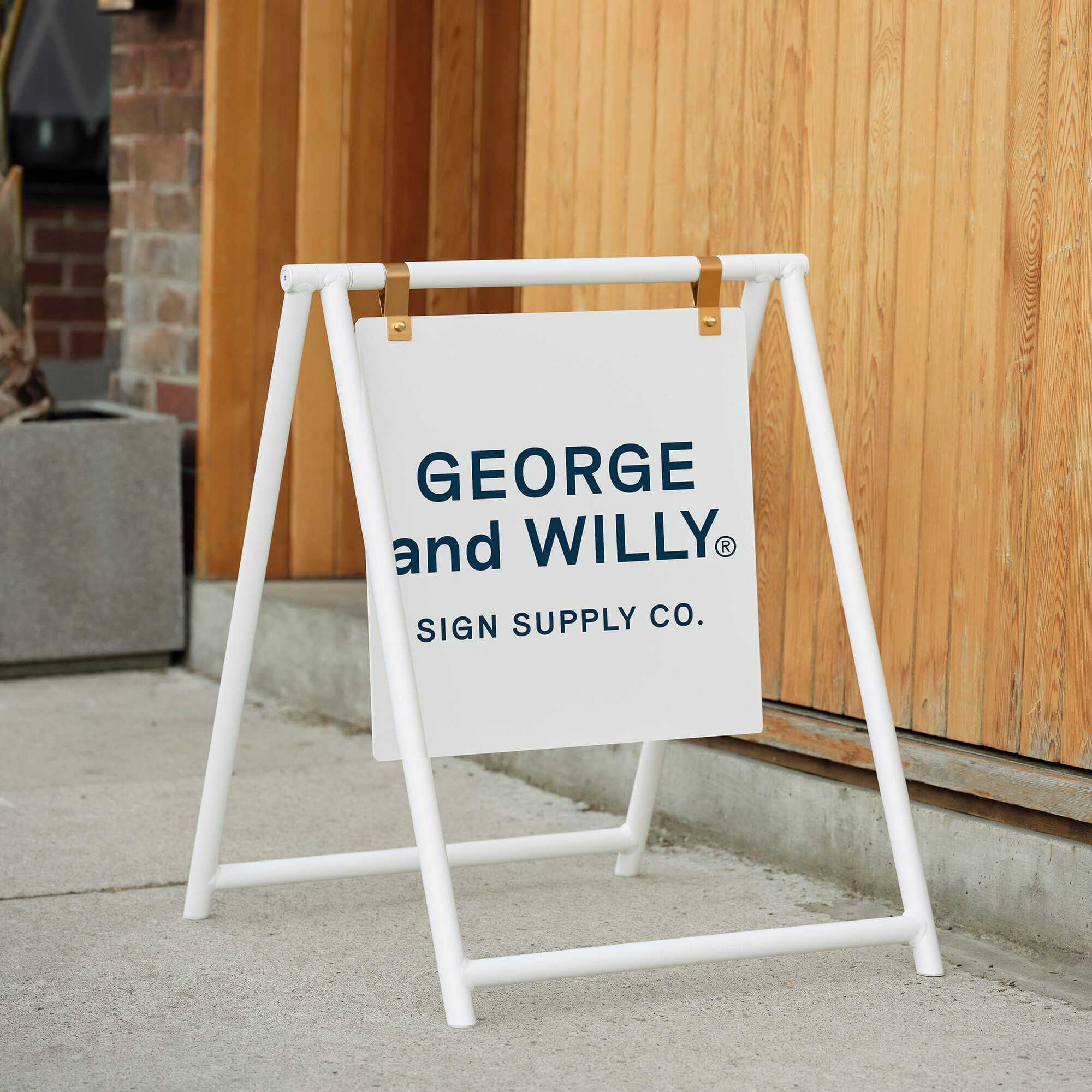
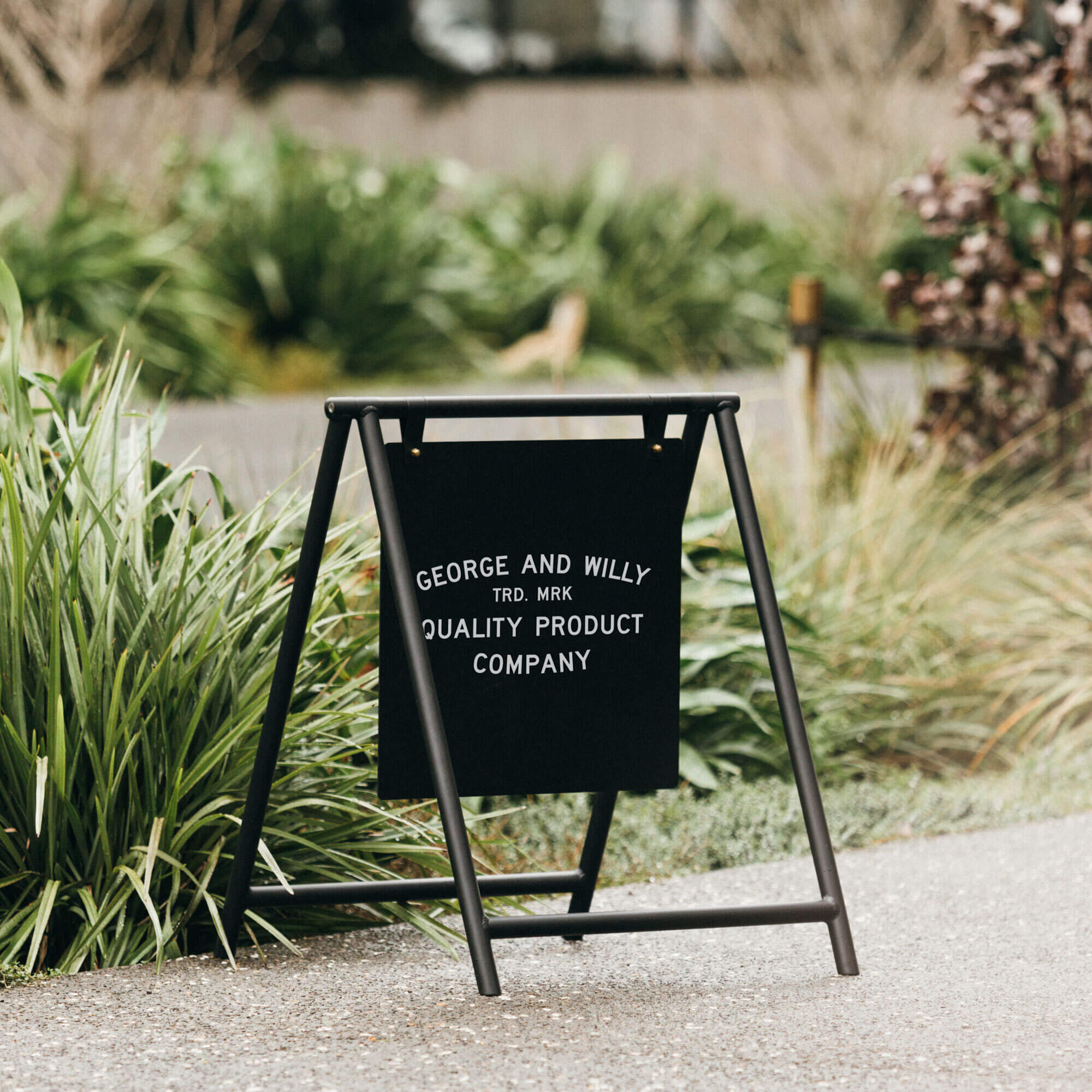
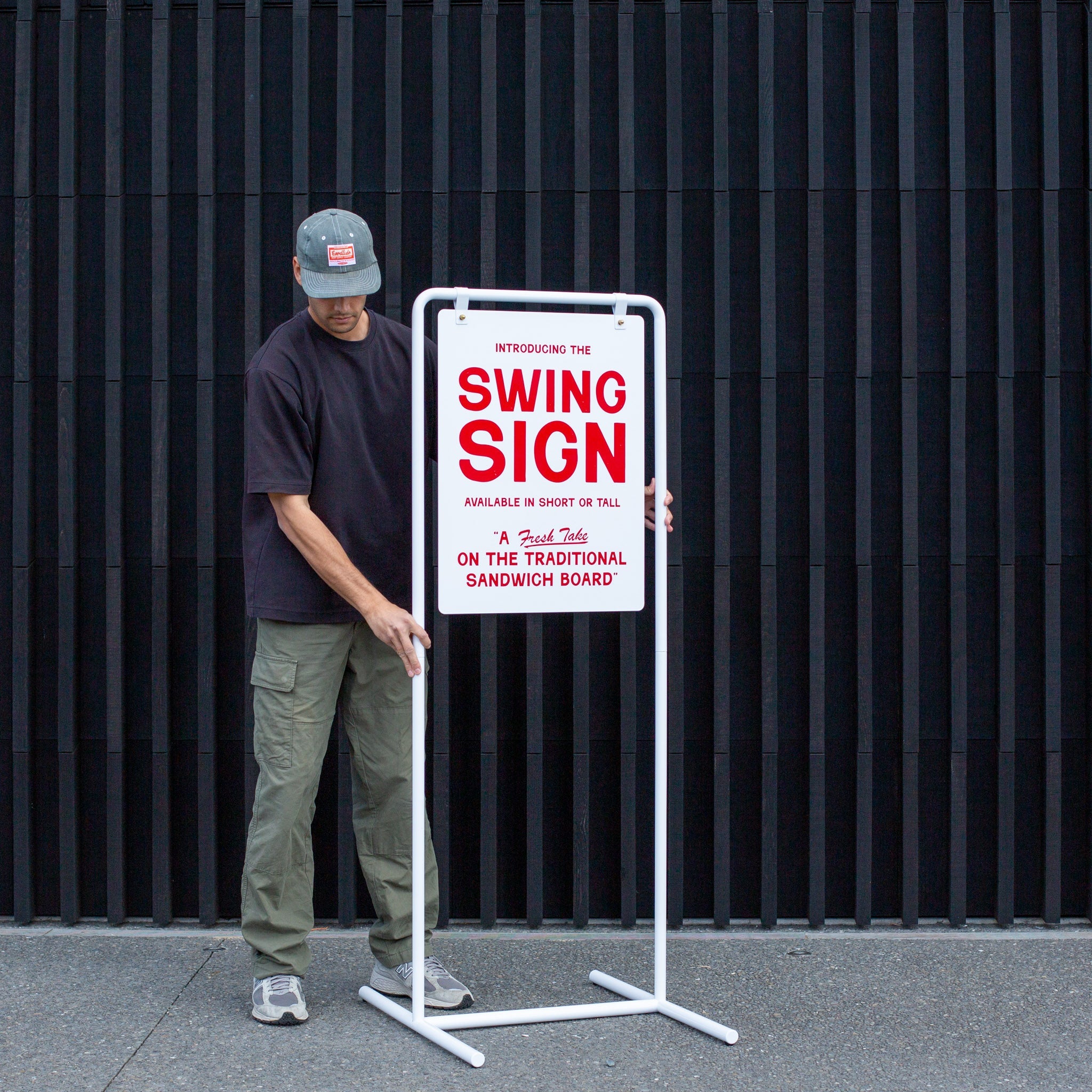
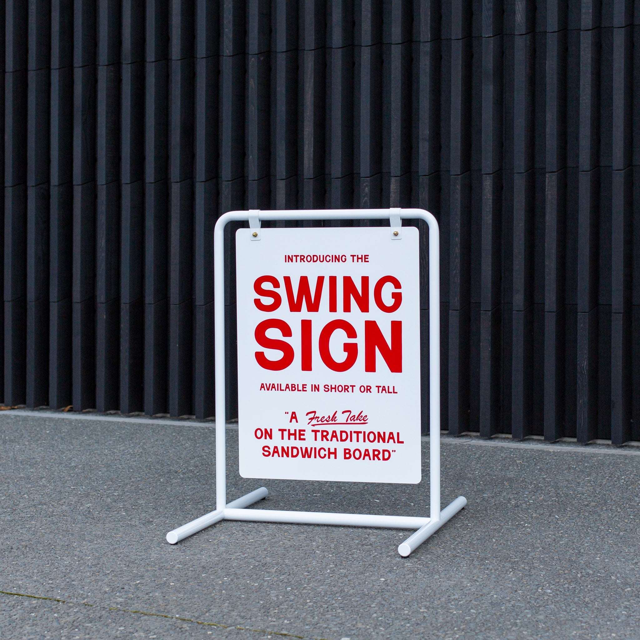
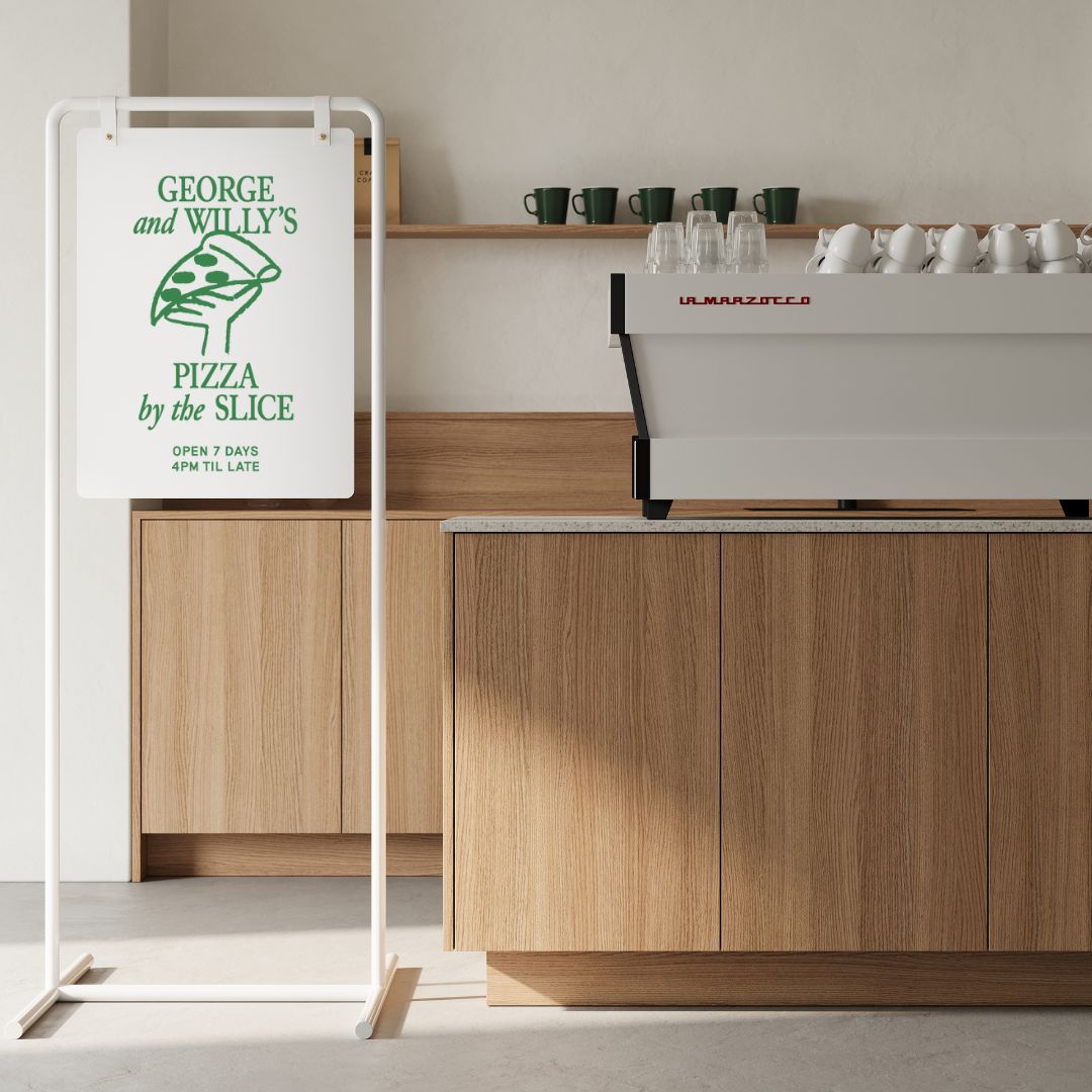
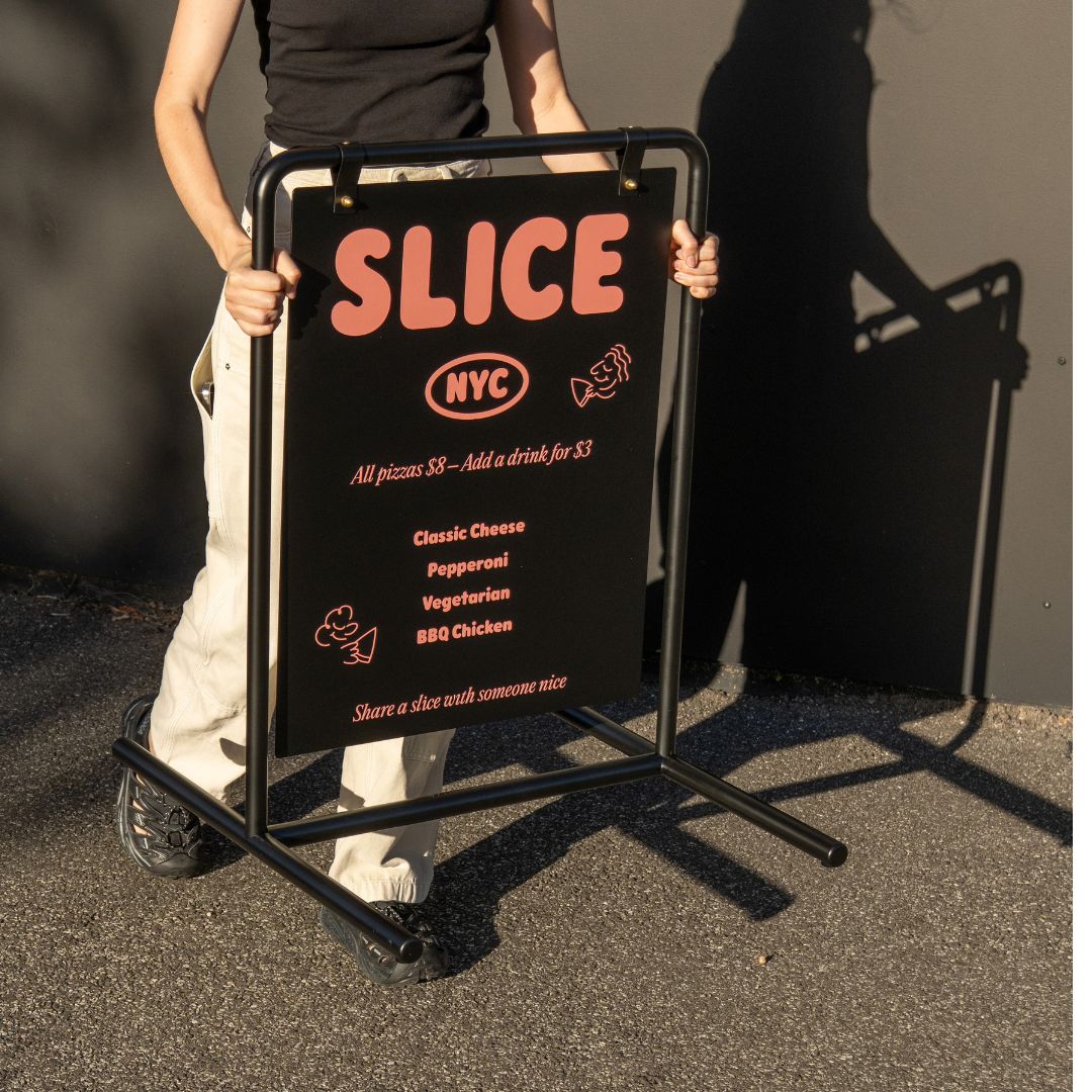
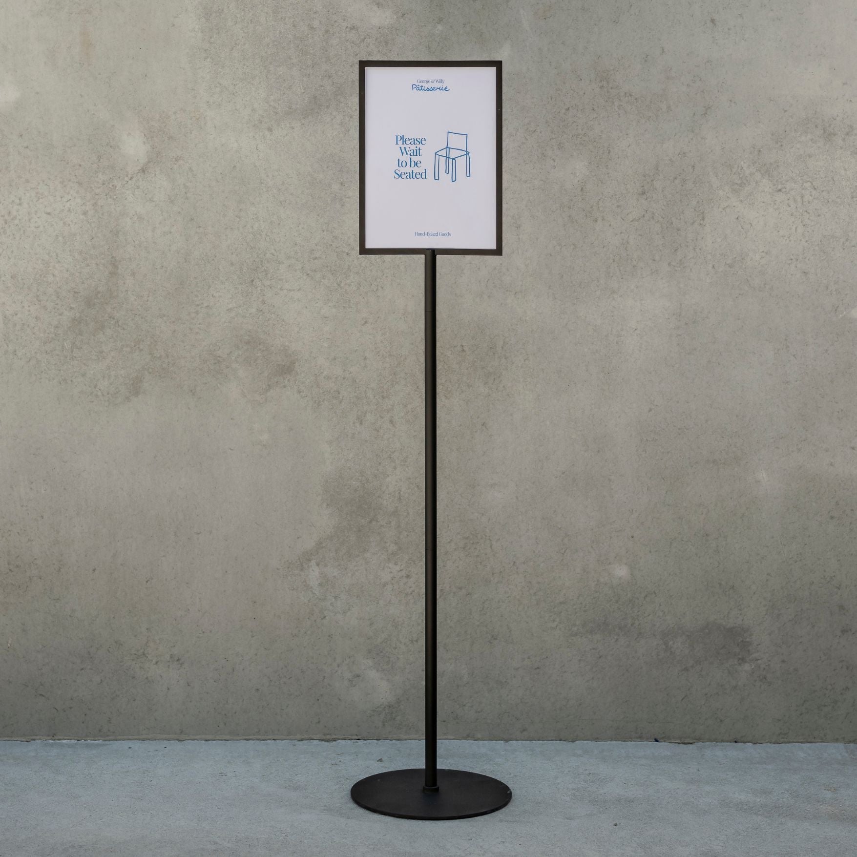
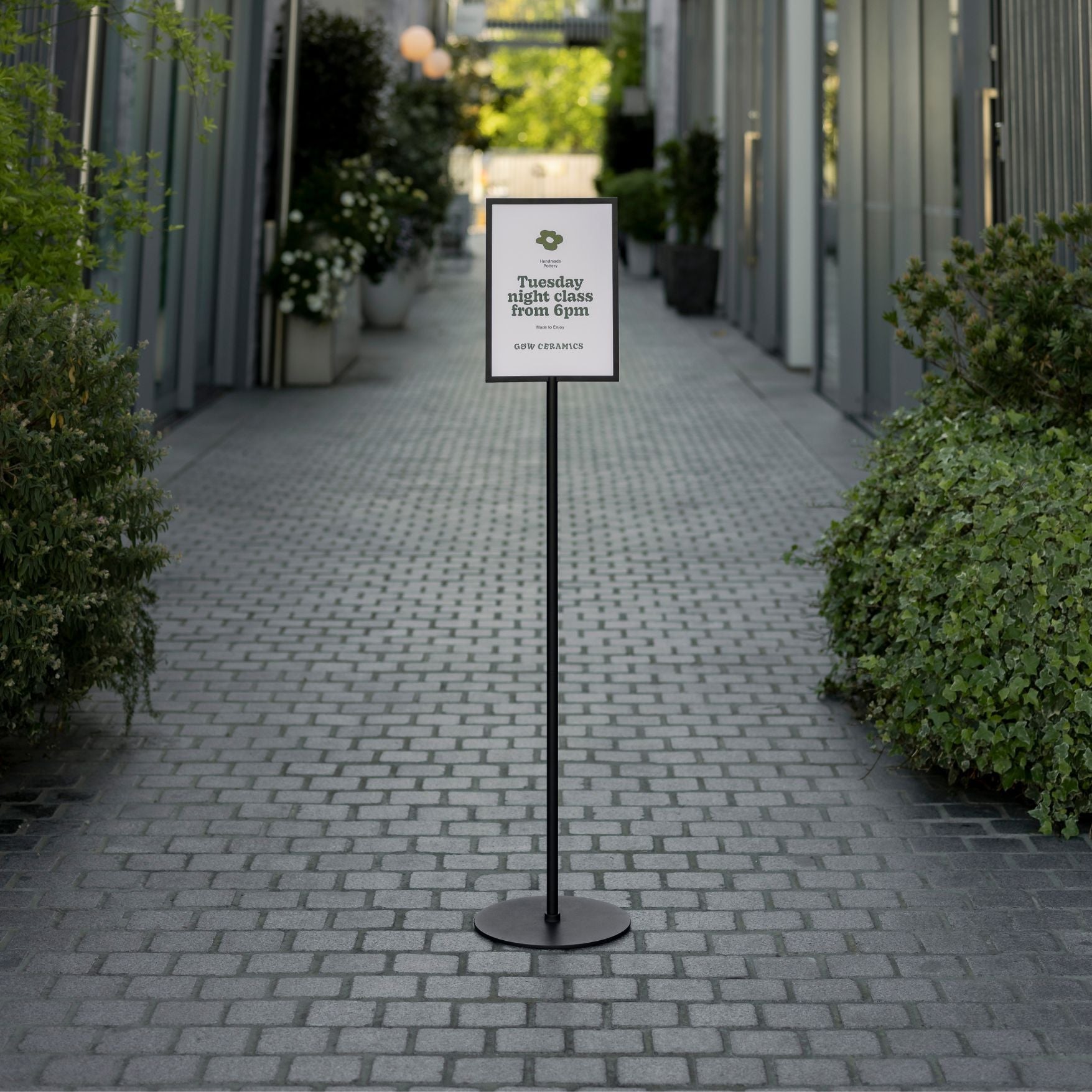
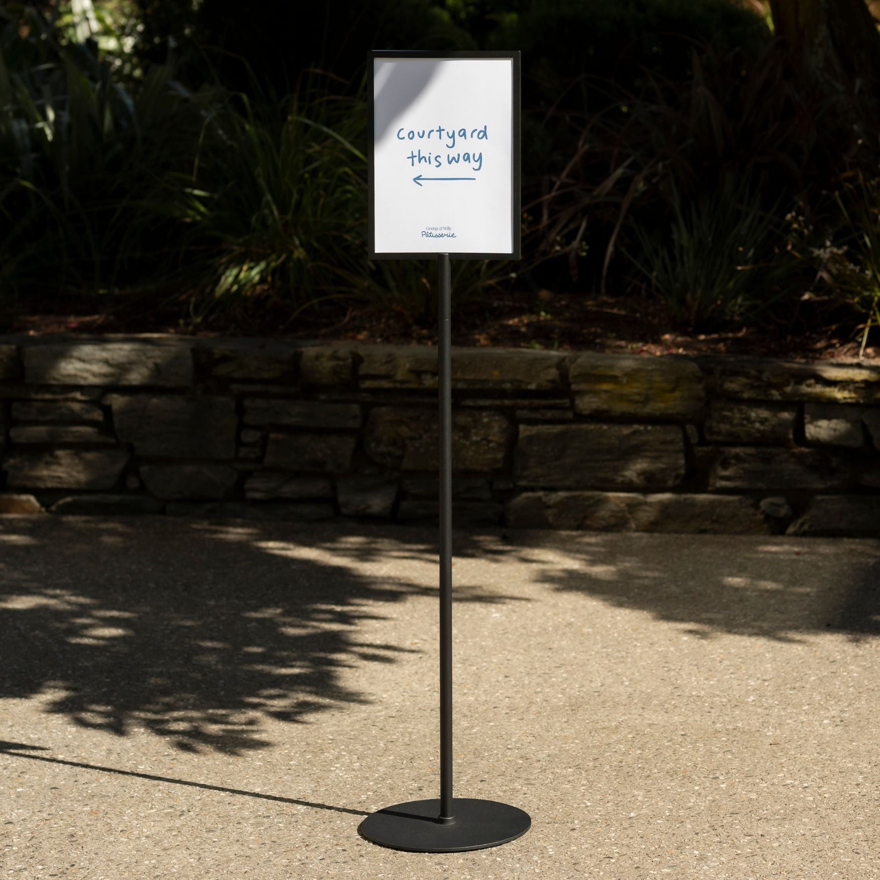
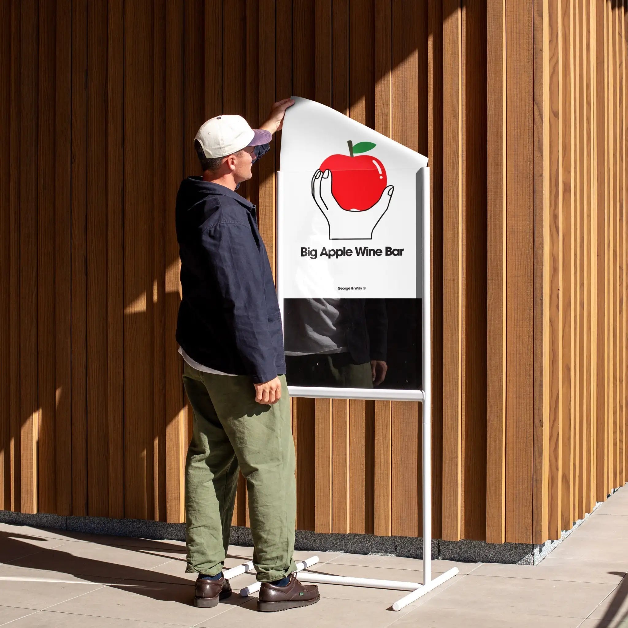
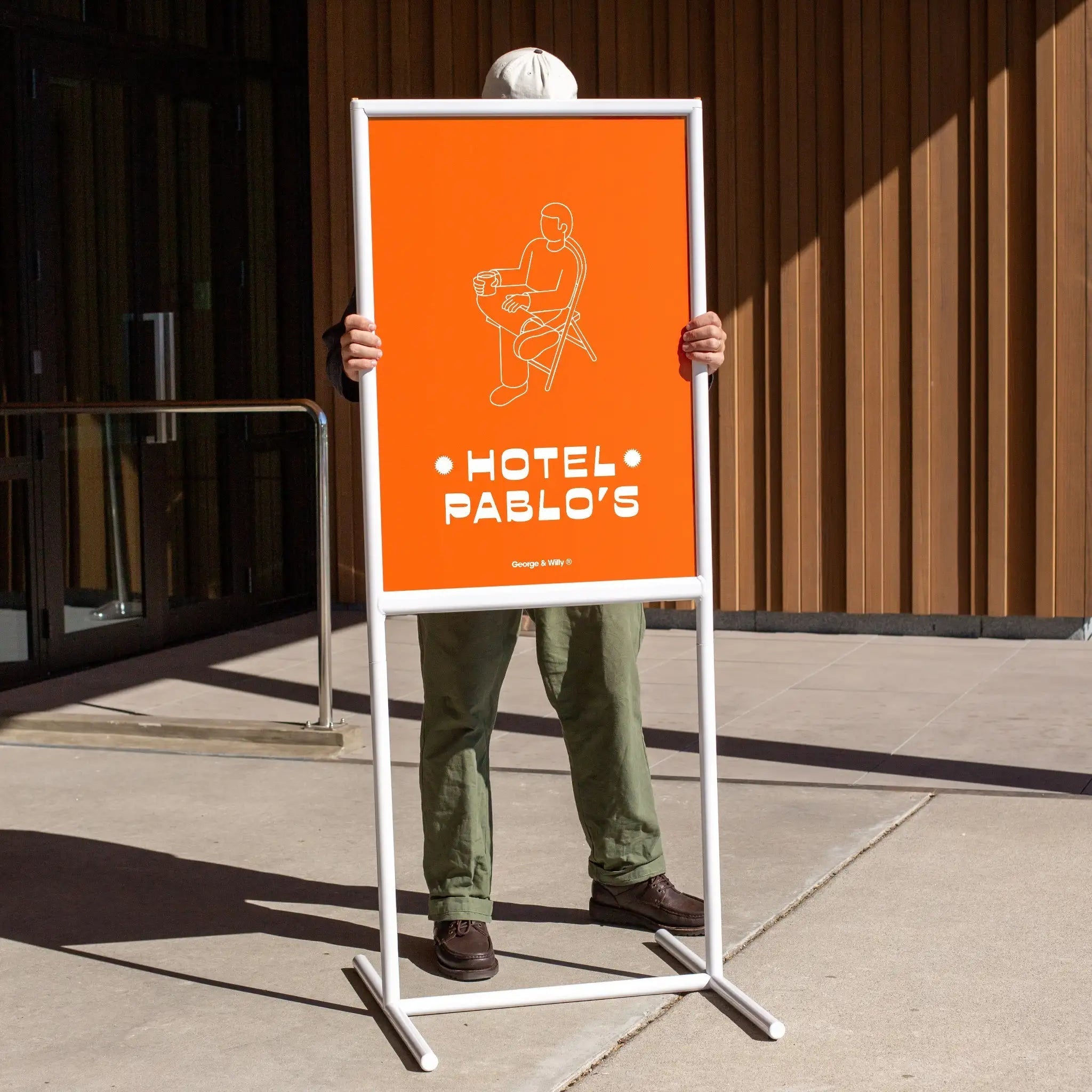
Tell a Story: The most powerful retail display ideas go beyond just showing items. They tell a story. Group products that are used together, create a scene, or build a theme around a season or a solution to a customer’s problem. A simple A‑Frame Sign on the sidewalk can begin this story before a customer even enters.
Use Color and Lighting: Color can evoke emotion and attract attention from a distance. Use a cohesive color palette that aligns with your brand. Lighting is equally crucial. Use spotlights to highlight key products and create an inviting ambiance that makes your merchandise shine.
Keep it Simple: A cluttered display is confusing. Less is often more. Give your products breathing room so customers can appreciate each item. Clean, minimalist signage and props ensure the focus remains on what you’re selling.
Shopper Psychology and the In Store Journey
Understanding how customers naturally move through a retail space is key to placing your displays for maximum impact. When a customer walks in, they enter what is known as the “decompression zone,” the first five to fifteen feet of the store. Many shoppers miss anything placed here as they adjust to the new environment.
From there, most people in Western countries tend to turn right. This makes the wall to the immediate right of the entrance a “power wall,” a prime location for your most compelling products and displays.
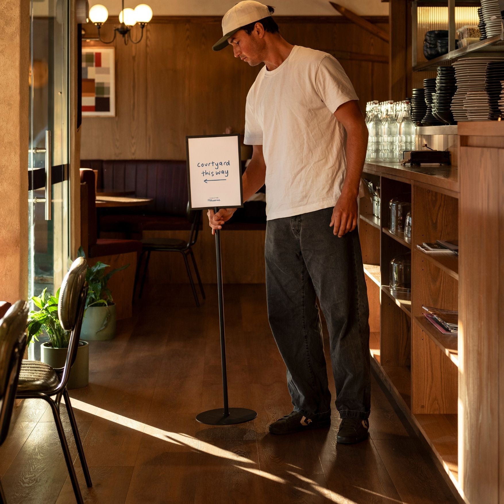
Your retail display ideas should guide customers along a clear path. Use displays as “speed bumps” to slow them down and encourage browsing in different departments. Eye level is buy level, so place your high margin, impulse buy items within the shopper’s direct line of sight. Clear, well placed signage, from wayfinding to tabletop signs, reduces friction and helps customers find what they need, making the entire experience more enjoyable.
Top 10 Retail Display Ideas
To truly make your products stand out and create a memorable shopping experience, it’s essential to move beyond basic shelving and embrace more dynamic strategies. We’ve curated a list of the top 10 retail display ideas, ranging from captivating window focal points to fully immersive and interactive experiences. These concepts are designed to inspire creativity and provide actionable tactics that can be adapted to any retail space or product type.
1. Window displays and focal points
A window display is your street-facing story, staged behind glass to stop passersby and pull them toward an interior focal point. By presenting one clear narrative and a visible destination inside, you reduce decision friction, spotlight priority items, and turn casual glances into purposeful visits. This approach is perfect for boutiques, studios, and cafés.
How to put it to work
Lead with a single hero theme (seasonal roast, capsule collection). Build a triangular composition 3–6 feet from the glass using risers or pedestals for depth, and pair it with a 5–7 word headline on decals plus an A-frame to catch foot traffic. Mirror the story on an interior power wall stocked to fulfill the promise. Keep prices legible and refresh every 3–4 weeks to maintain novelty.
Variation 1: “New This Week” window, mirrored by a replenished entry wall.
Variation 2: Minimal prop vignette with one hero, one benefit, one price.
Impact & where it shines
Measurable lift: More footfall, longer dwell, higher conversion and basket size.
Best for: Street-facing cafés/boutiques, pop-ups, and seasonal moments.
Pro tip: Preserve sightlines into the store to feel welcoming and safe.
2. Seasonal displays
Seasonal displays are time-bound spotlights that sync products and signage with cultural moments. They create immediacy and relevance, making it easy for shoppers to see what’s new now, which clears timely inventory and lifts conversion through curated, limited-time offers.
How to put it to work
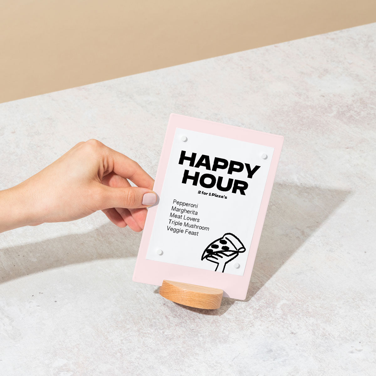
Stage in high-impact zones: windows, entrances, or near checkout. Use modular pieces and quick-change signage, such as an A-frame outside, tabletop holders at the counter, and a Magnetic Menu Board for menu shifts. Plan themes 6–8 weeks ahead; refresh every 4–6 weeks. Cross‑merch to simplify choices: bundle a café’s latte-and-pastry, or a studio’s mat-and-bottle “Reset Kit.” Keep copy tight with a value cue and clear pricing.
Variation 1: Holiday gifting wall with grab-and-go bundles and a price ladder.
Variation 2: Weather pivot table like “Rainy Day Warmers” rotating to “Iced & Bright.”
Impact & where it shines
Measurable lift: Attention, dwell, and average ticket via bundles and add-ons.
Best for: Boutiques, cafés, studios during holidays and season switches.
Pro tip: Edit hard; clutter kills sightlines and slows flow.
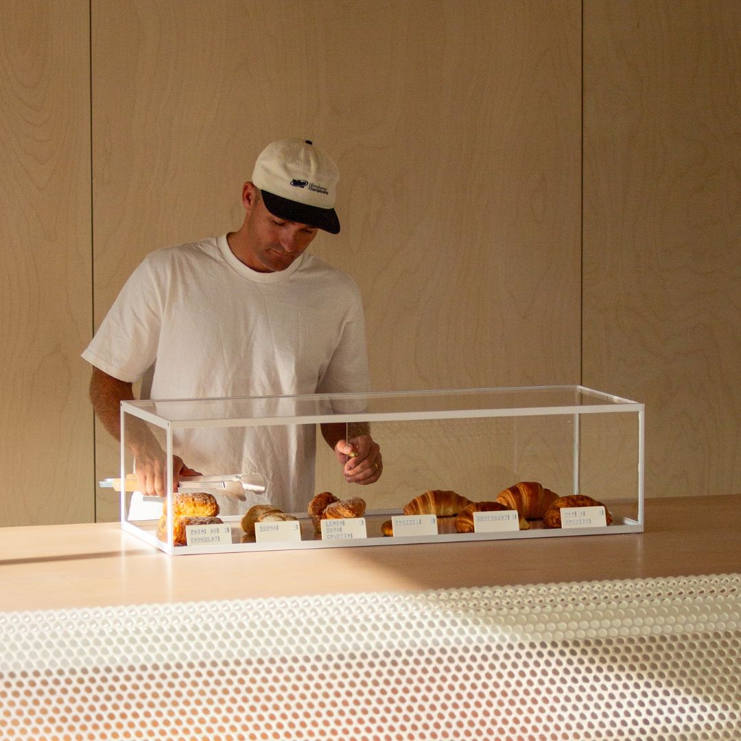
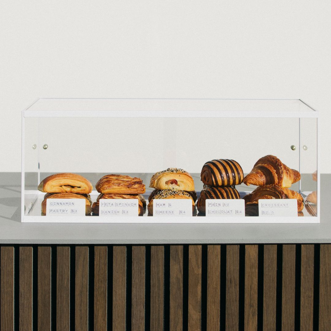
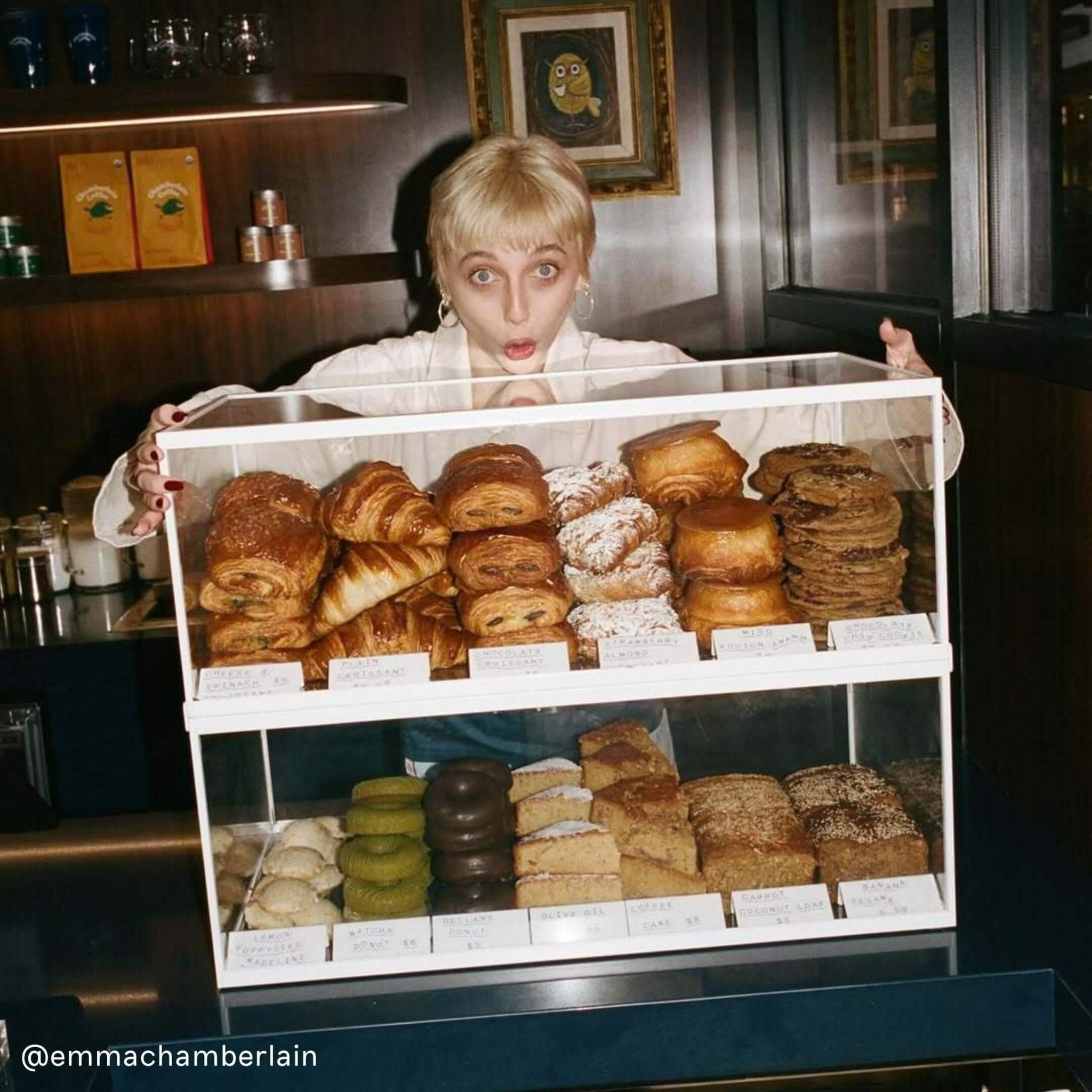
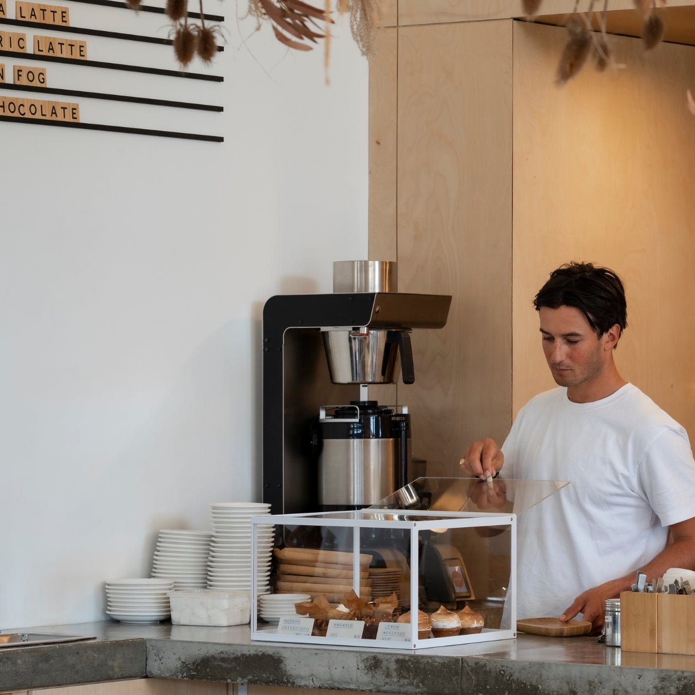
3. Tiered wall display
Tiered wall displays stack product vertically to meet the eye at multiple heights. By lifting inventory into the sightline and grouping it logically, they sharpen wayfinding, reduce choice overload, and turn underused walls into high-conversion real estate.
How to put it to work
Install along a power wall or POS-adjacent area. Use floating ledges or slatwall with stepped brackets, but keep higher tiers shallower to preserve sightlines. Put best-sellers at 54–60"; heavier items live low. Add shelf-edge labels for price clarity and small talkers for benefits. In a café, place hero beans at eye level with filters below; in a boutique, stack skincare kits with bulk or refills on bottom tiers.
Variation 1: “Top 10” eye-level edit with accessories within arm’s reach.
Variation 2: Tiered “Good / Better / Best” to guide trade-ups.
Impact & where it shines
Measurable lift: Visibility without floor space, add-on sales, faster decisions.
Best for: Small formats, pop-ups, seasonal shifts.
Pro tip: Maintain a 36-inch aisle; keep weight low to protect stability.
4. Thematic backdrop
A thematic backdrop frames a product zone with a changeable scene (like a season, mood, or story) so shoppers instantly “read” the offer. It builds a strong focal point, boosts perceived value, and makes decisions simpler by showing items in context.
How to put it to work
Place it on a power wall or behind the counter so it’s visible on entry. Pull hero items forward on risers or mannequins. Use a tight 3–7 word headline and a price anchor (“Sets from $99”). Tease the theme outdoors with an A-frame; swap details quickly on a magnetic/tile menu inside. Example: a café’s “Winter Warmers” with a cozy fabric backdrop, wood risers, and a tabletop sign for a “Latte Flight.”
Variation 1: Fabric or paper rolls for fast color/story changes.
Variation 2: Photo mural with a minimal prop kit for high impact.
Impact & where it shines
Measurable lift: Stopping power, dwell time, and basket size.
Best for: Seasonal launches, capsule drops, pop-ups.
Pro tip: Choose matte finishes to avoid glare; guard sightlines and access.
5. Elevate merchandise (height/pedestals)
Using risers, pedestals, and tiered stands creates a vertical hierarchy that spotlights a hero. Elevation boosts visibility across the room, clarifies what matters, and speeds decisions. This makes it ideal for introducing seasonal items or nudging high-margin add-ons.
How to put it to work
Build a visual pyramid with 3–5 levels; keep the tallest shoppable item around 42–48". Use modular cubes, acrylic nesting tables, or cake stands that accept decals for branding. Add a tabletop sign with crisp pricing and a benefit cue; pair with a small A-frame when needed. Example: a café elevates a seasonal pastry; a boutique puts a hero handbag on a plinth with complementary wallets below.
Variation 1: Single tall plinth as a gallery moment.
Variation 2: Nested risers for quick “new arrival” tables.
Impact & where it shines
Measurable lift: Attention, faster decisions, bigger baskets.
Best for: Small footprints, windows, entry tables, pop-ups.
Pro tip: Keep materials cohesive so props don’t steal the show.
6. Storytelling visual merchandising
Storytelling VM presents products as a narrative with a hook, a build, and a resolution, so shoppers grasp value quickly and see how items work together. It engages emotions, reduces friction, and increases basket size by leading customers through a planned arc.
How to put it to work
Define a simple plot. Hook in the window (e.g., mannequin or hero drink). Build inside with coordinated items on nesting tables. Resolve at a focal zone with a bundle offer and clear pricing on a tabletop sign. Use an A-frame to attract street traffic and magnetic signage for rapid price updates. Refresh themes every 4–6 weeks and light the hero for emphasis.
Variation 1: “Problem → Solution” bay with labeled steps.
Variation 2: “Before/After” vignette to dramatize benefits.
Impact & where it shines
Measurable lift: Attention, dwell, conversion; stronger brand affinity.
Best for: Seasonal drops, launches, limited editions.
Pro tip: Make the story scannable in seconds; keep pathways clear.
7. Theme-based displays
Theme-based displays group complementary products under one idea (such as a season, occasion, or need) using unified color, props, and copy. Shoppers scan for patterns; a clear theme improves wayfinding, simplifies picks, and encourages cross-category purchases.
How to put it to work
Place in high-visibility zones: entry, window, or checkout. Use quick-change signage like an A-frame and a Menu Board to keep themes current. Write a headline, value promise, and price cue. Prep prop/sign kits so resets take minutes; recycle the framework while the theme evolves every 4–6 weeks.
Variation 1: Café “Chai Season” with syrups, mugs, concentrate, and a bundle price.
Variation 2: Boutique “Back-to-Work” rolling rack with accessory add-ons.
Impact & where it shines
Measurable lift: Attention and average order value via logical bundles.
Best for: Seasonal promotions, gift guides, product launches.
Pro tip: Maintain clear sightlines and ADA clearance around the zone.
8. Interactive displays
Interactive displays invite action, such as tapping, scanning, or pushing, to unlock recommendations or richer info. They increase dwell and confidence at key decision points, guiding style choices, surfacing add-ons, and making the experience memorable.
How to put it to work
Start lightweight with QR codes or push-button demos; scale to tablets or small shelf screens as you learn. Place just past the entrance, in the queue, or on endcaps. Use secure countertop enclosures and decal-friendly frames for seasonal swaps. Examples: a café’s “Find Your Roast” quiz near pickup; a boutique’s “Look Builder” beside fitting rooms to suggest complements.
Variation 1: Scan-to-recipe or brew guide with a take-home card.
Variation 2: Tap-for-bundle discount revealed at checkout.
Impact & where it shines
Measurable lift: Stopping power, dwell time, add-on conversion.
Best for: Launches, seasonal menus, guided selling in tight spaces.
Pro tip: Keep interactions fast and reachable; ensure clear sightlines to staff.
9. Immersive retail displays
Immersive displays build a mini world around the product, inviting exploration and trial. By staging context and cues, they heighten relevance, stretch dwell time, and make complex choices feel simple. This is great for discovering a new roast, building an outfit, or curating class essentials.
How to put it to work
Claim a power wall or mid-store alcove. Layer elements: removable scenic backdrop, focal zone with elevated product, and concise story cues plus pricing. Use modular gridwall and brandable, off-the-shelf signage. For example, use an A-frame outside and a magnetic menu inside for rapid updates.
Variation 1: Sensory bar (touch, smell, sample) with staffed demos.
Variation 2: Self-guided trail with numbered stops and QR stories.
Impact & where it shines
Measurable lift: Attention, dwell, and bigger baskets via add-on bundles.
Best for: Seasonal stories, launches, memberships or class packs.
Pro tip: Preserve a 36-inch clear path and avoid blocking key views.
10. Modular and flexible displays
Modular displays are reconfigurable kits of shelves, pegs, and sign holders that pivot with promotions in minutes. They keep small footprints fresh, group items into clear stories, and drive repeat visits without constant new fixture spend.
How to put it to work
Anchor a core module (slatwall, rolling pegboard, or cart) near the entrance to signal what’s new. Adjust shelves and hooks on the fly; clamp sign holders for price clarity. Shift the narrative by daypart: a café cart flips from “Breakfast Bundles” to “Quick Lunch” via magnetic tiles; tabletop signs at checkout push add-ons. Use an A-frame to broadcast the day’s headliner to the sidewalk.
Variation 1: Capsule rack that toggles between drop colors each week.
Variation 2: Peg-and-shelf “build-your-kit” bay with bundle pricing.
Impact & where it shines
Measurable lift: Freshness, dwell time, larger baskets through agility.
Best for: Small-format boutiques, pop-ups, studios pacing seasonal drops.
Pro tip: Lock casters and maintain a 36-inch clear path for accessibility.
Small Space Merchandising: Big Impact in Compact Stores
Limited square footage doesn’t mean you have to limit your creativity. For small boutiques, cafes, and studios, smart merchandising is about making every inch count. These retail display ideas are perfect for compact spaces.
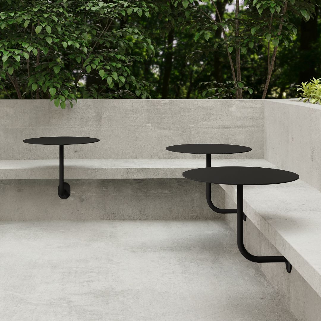
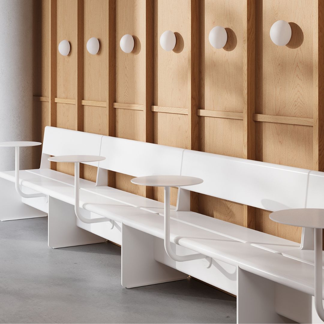
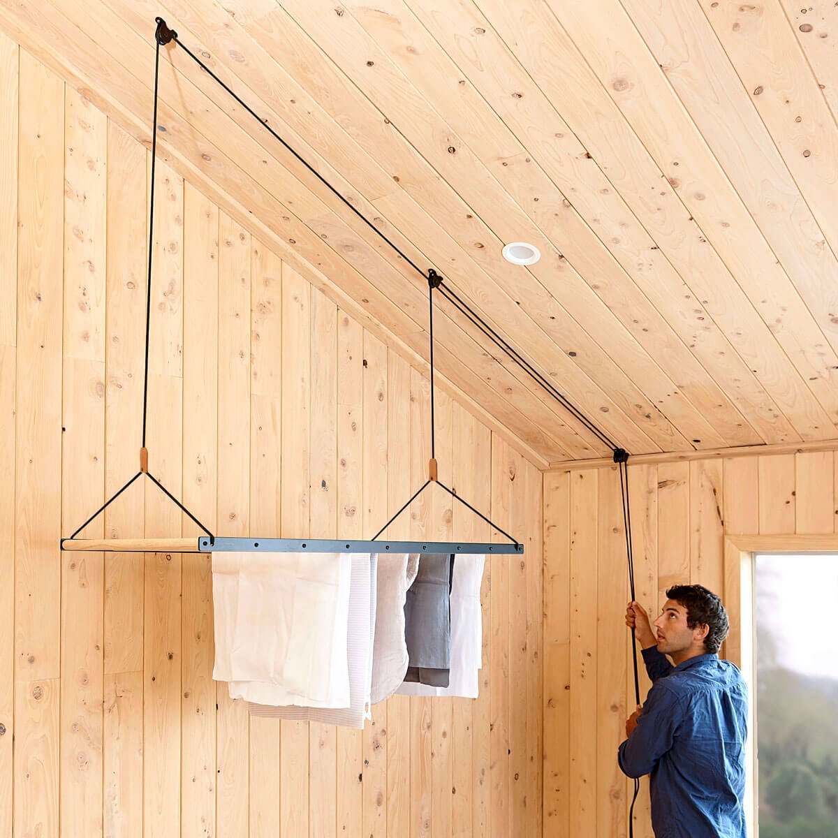
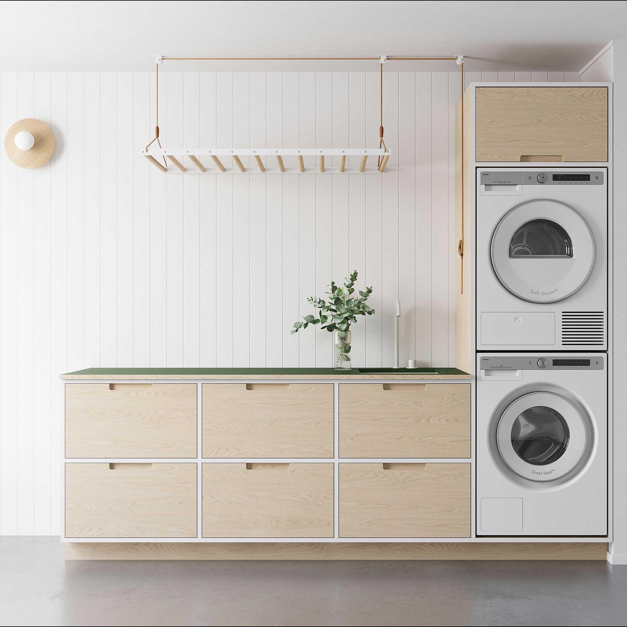
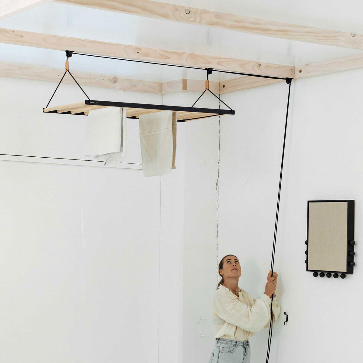
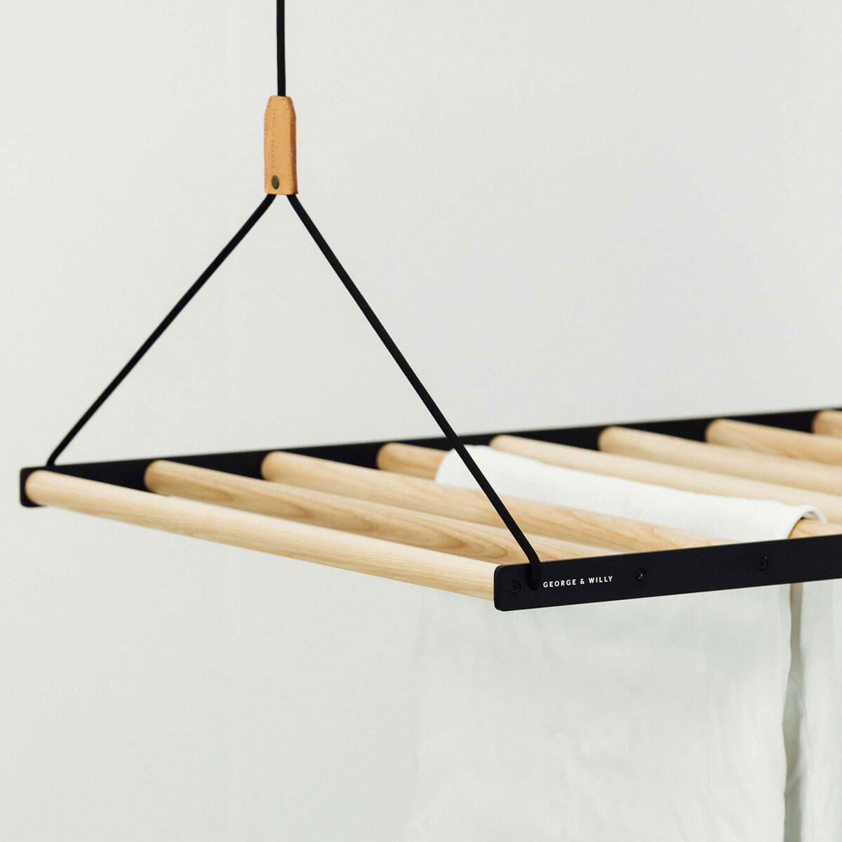
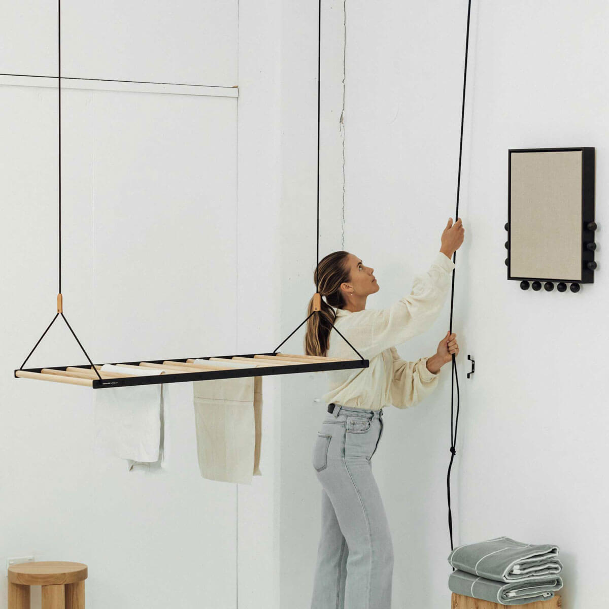
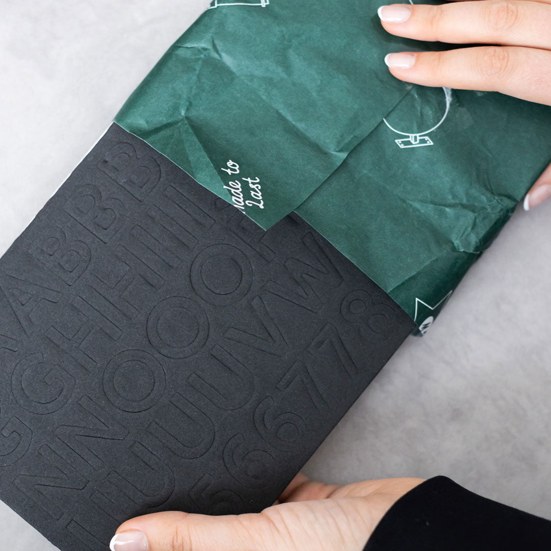
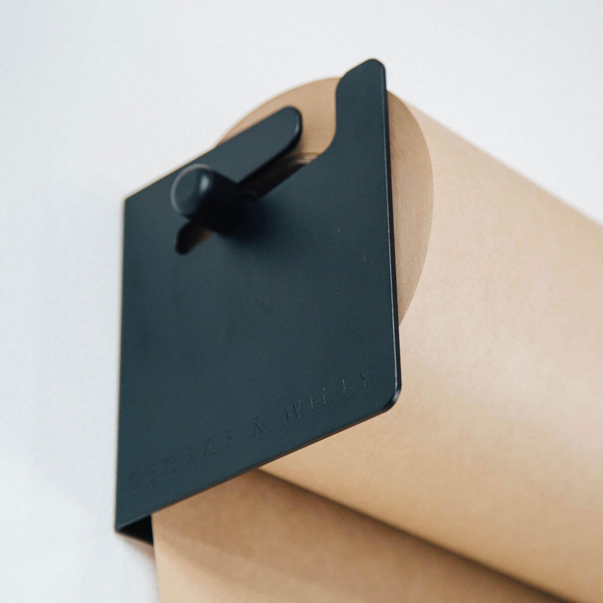
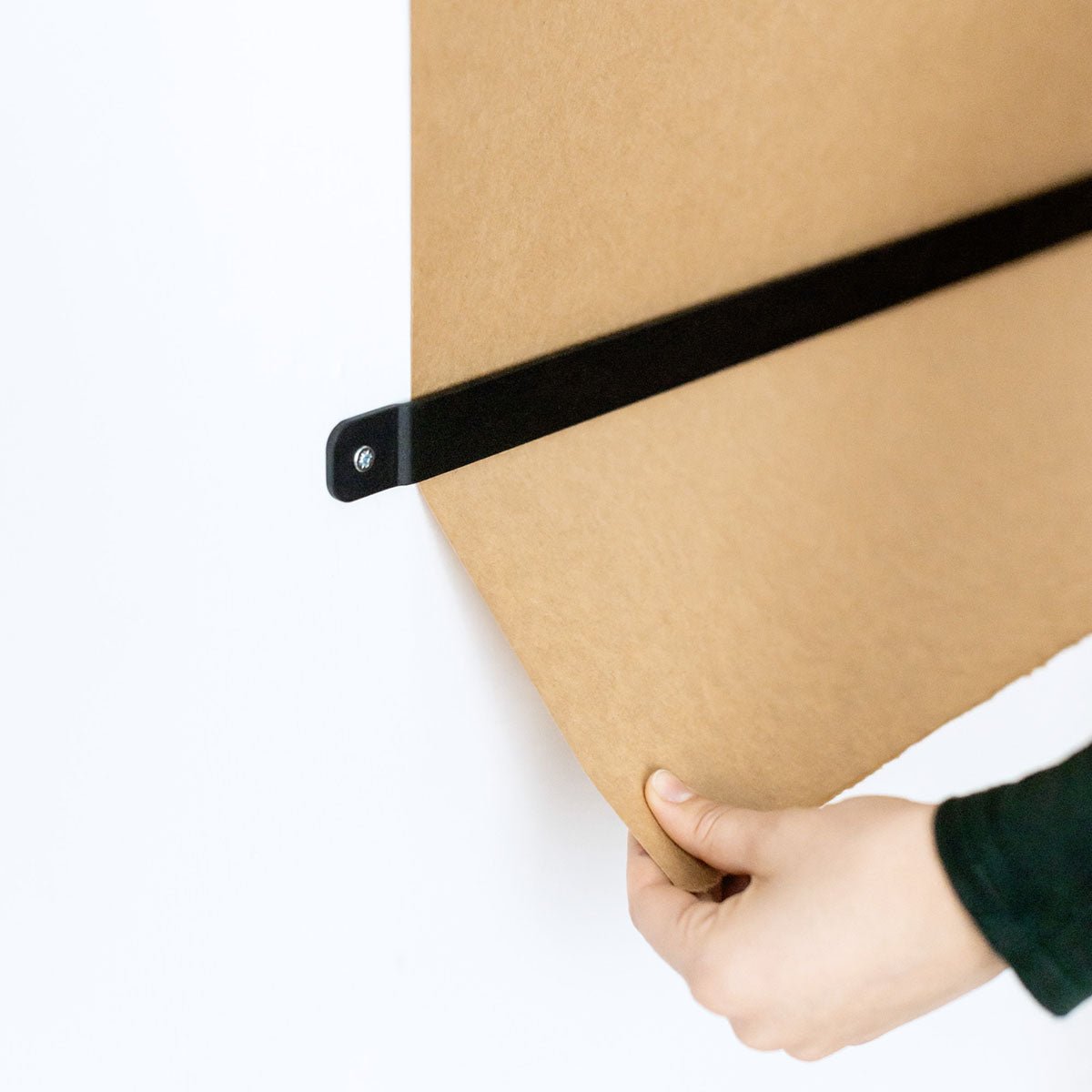
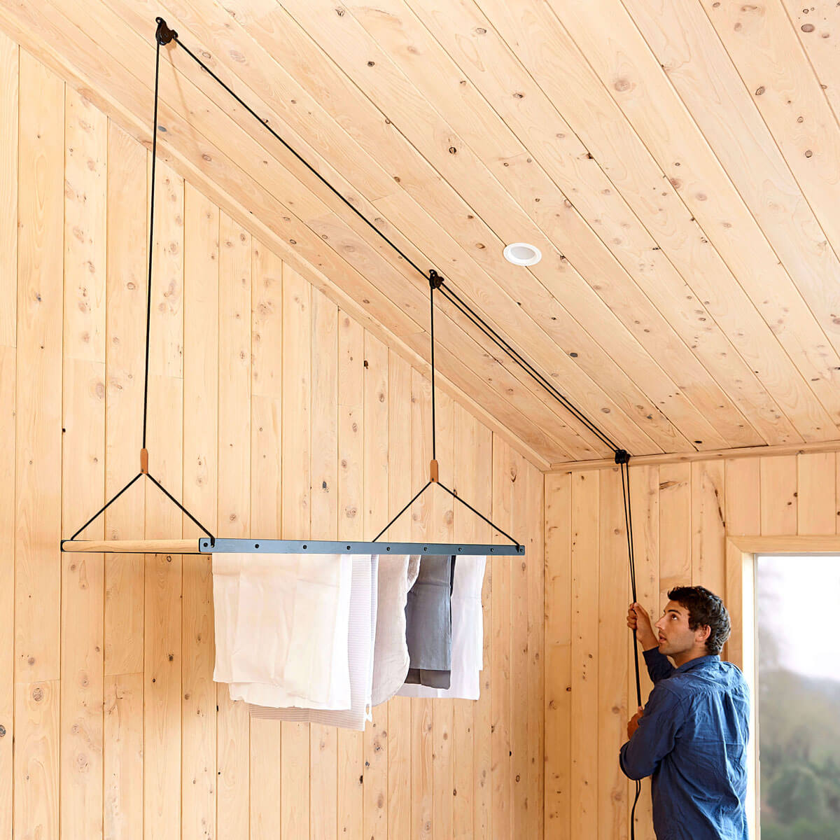
Go Vertical: Draw the eye upward with wall mounted displays. Products like the Wooden Pegboard or their Ceiling Mounted Shelves utilize vertical space, freeing up valuable floor area while creating an interesting visual element.
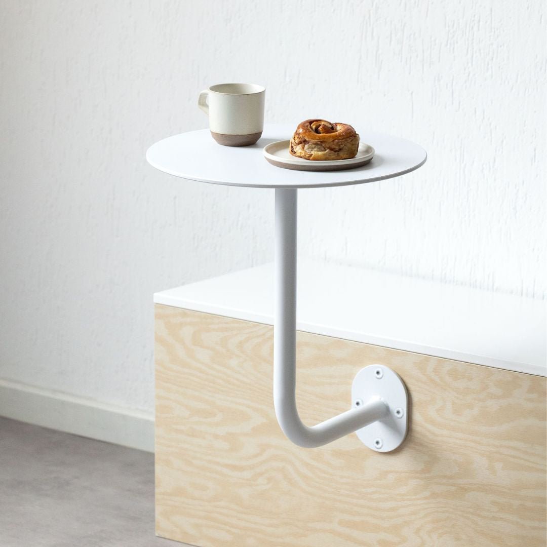
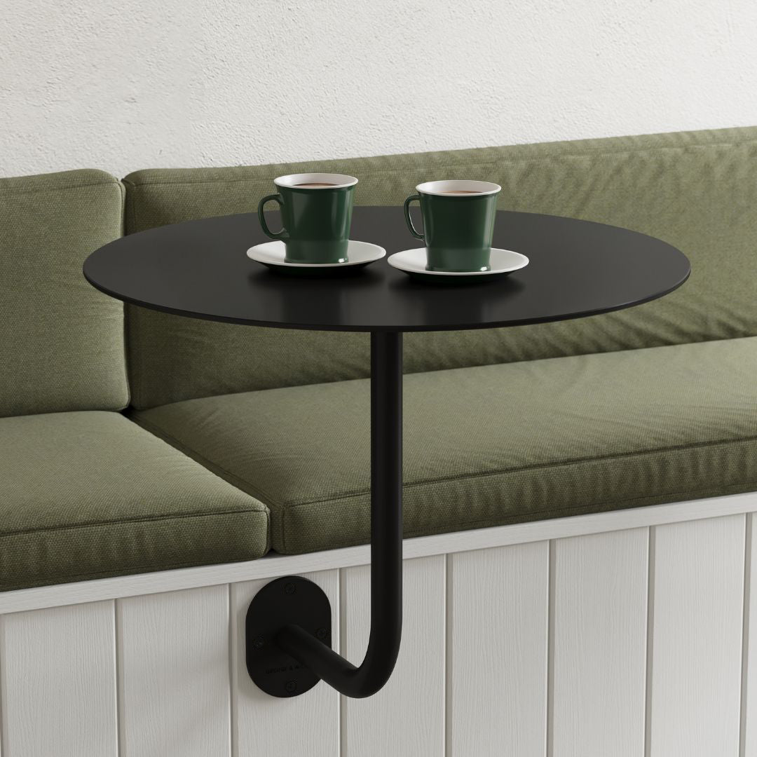
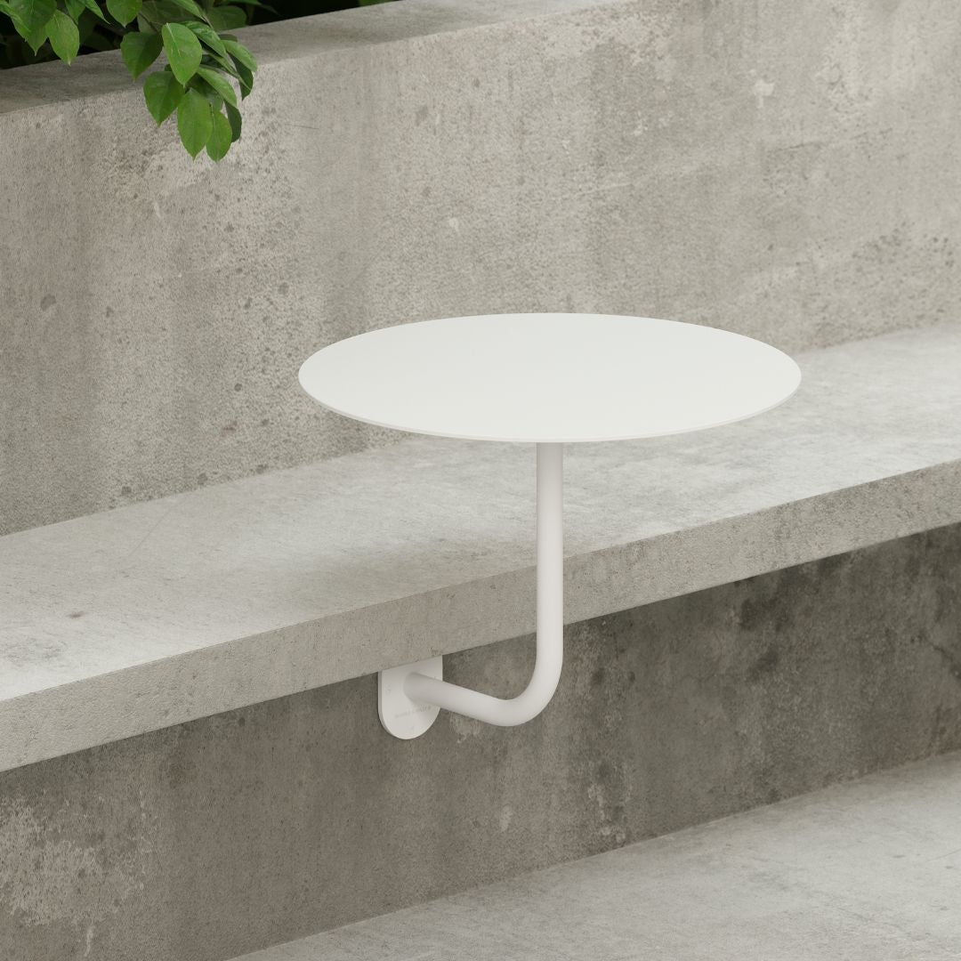
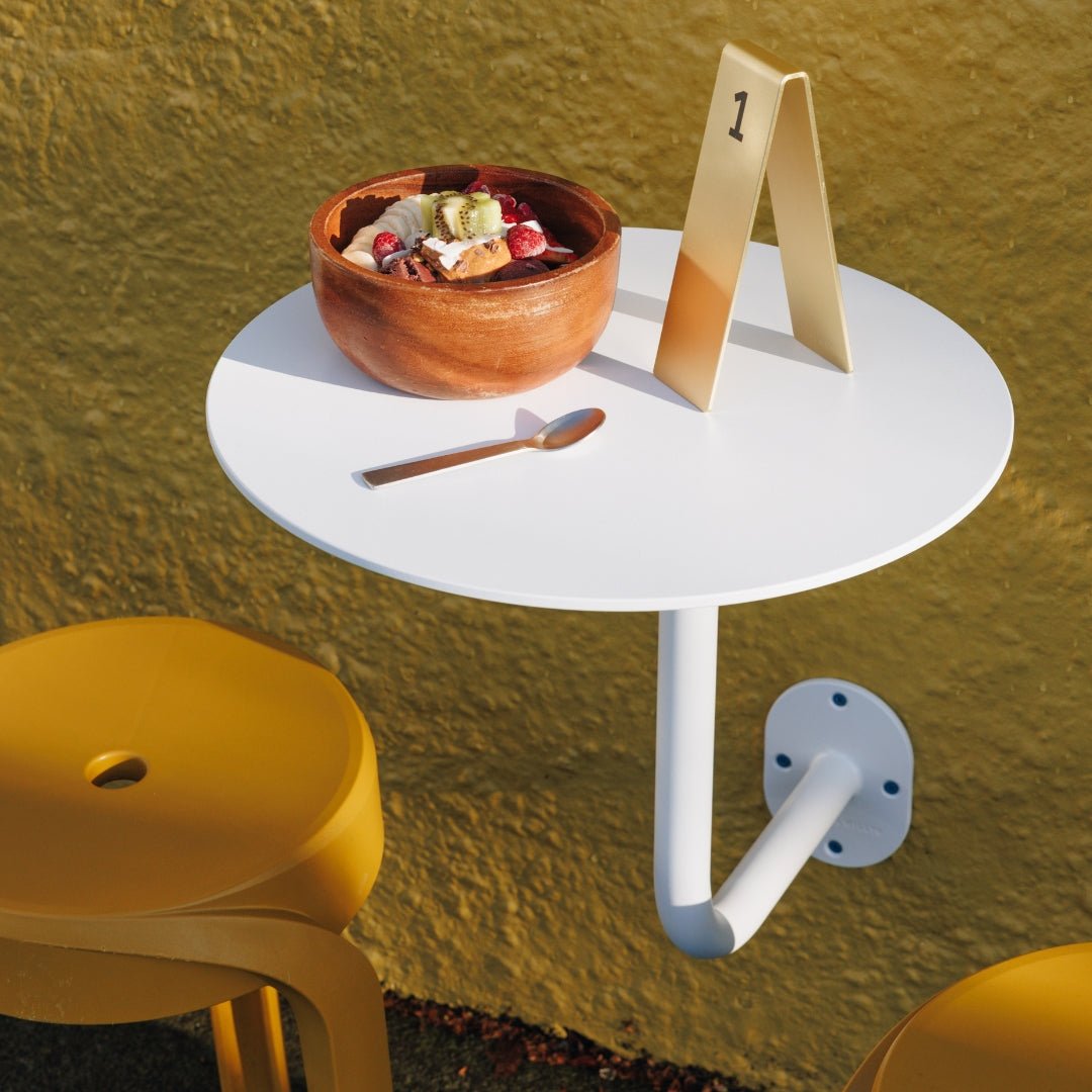
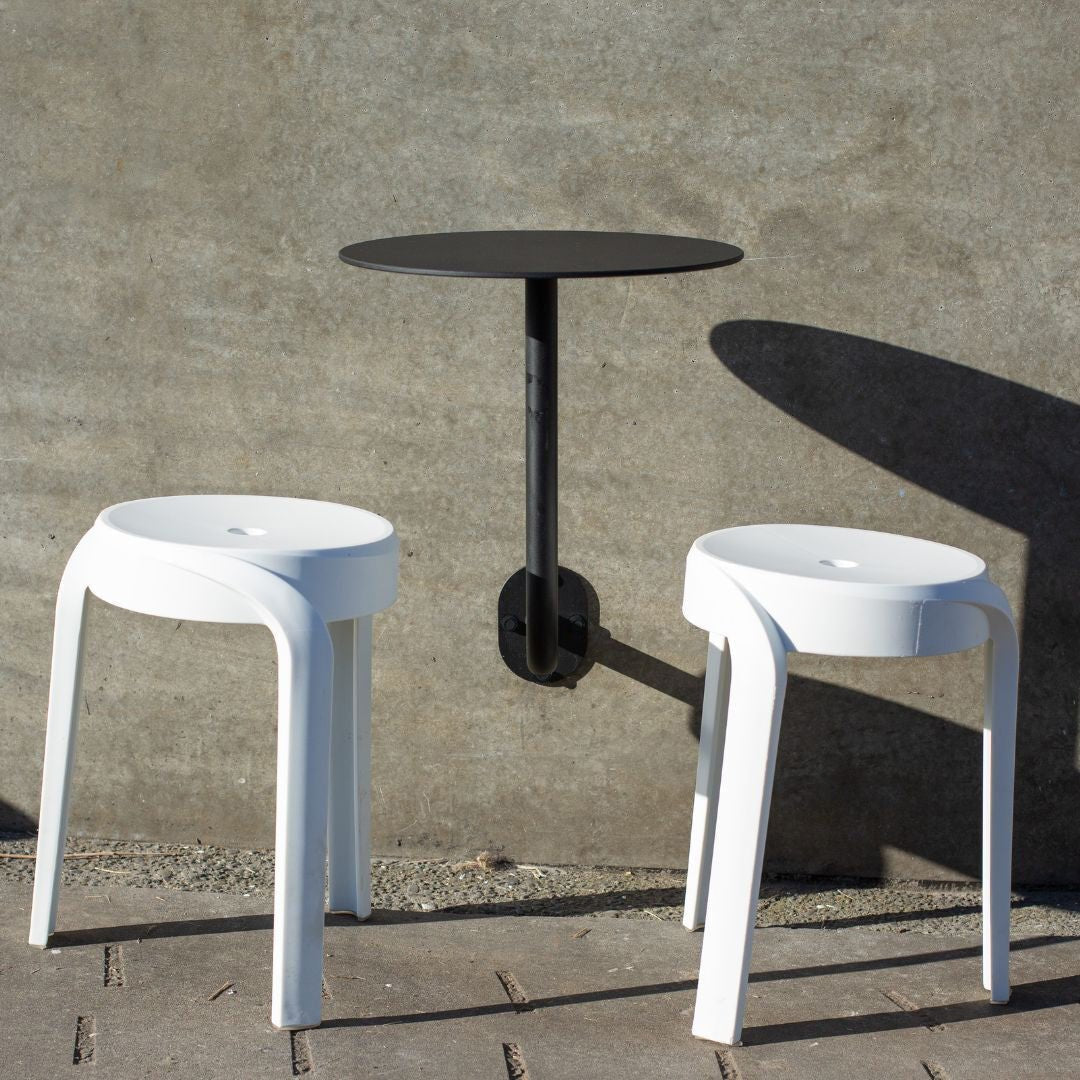
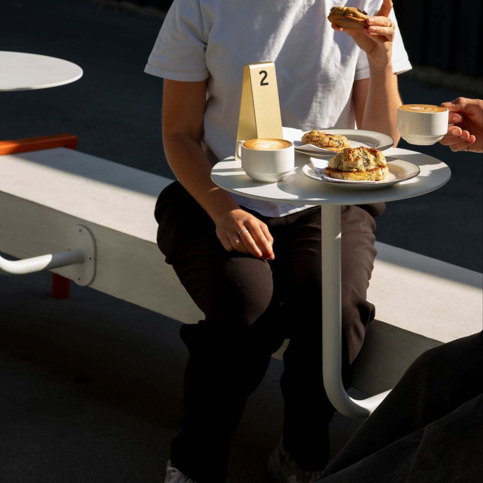
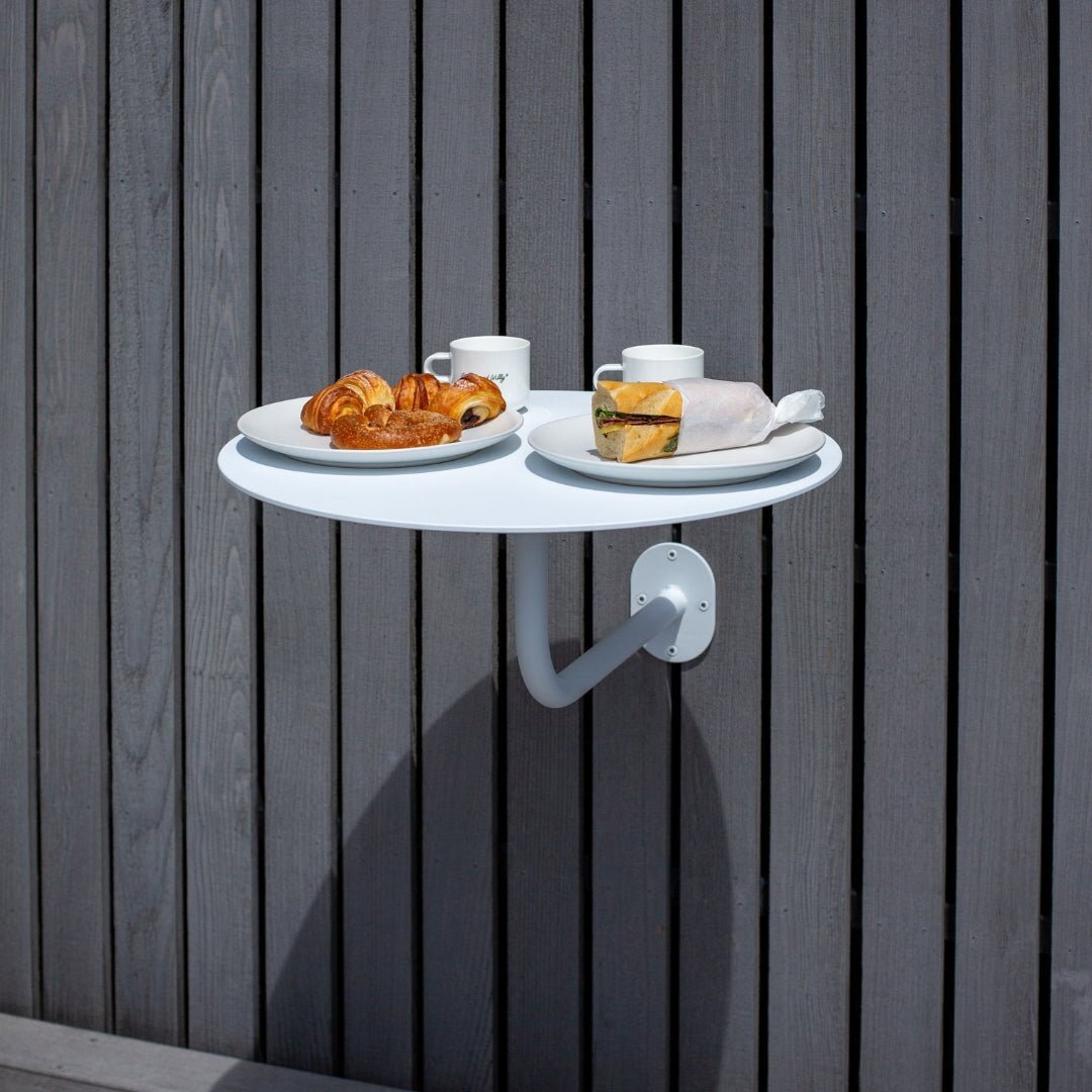
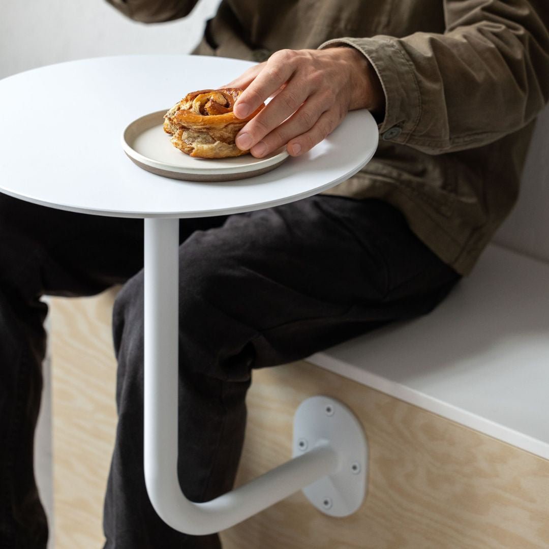
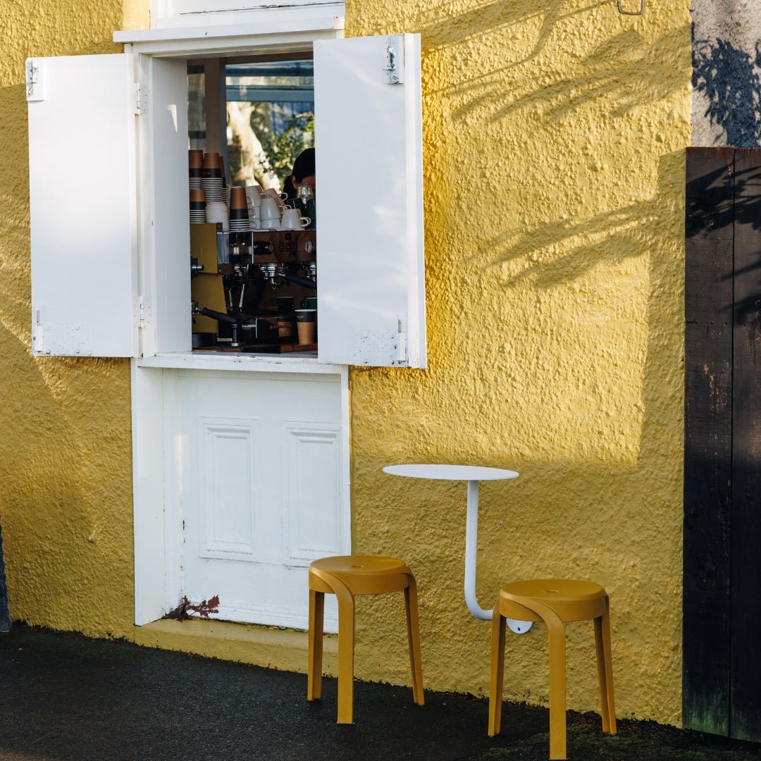
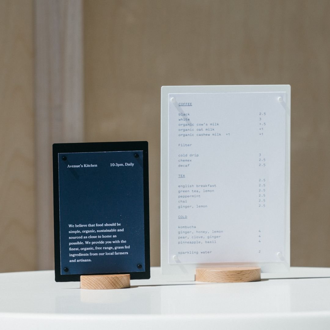
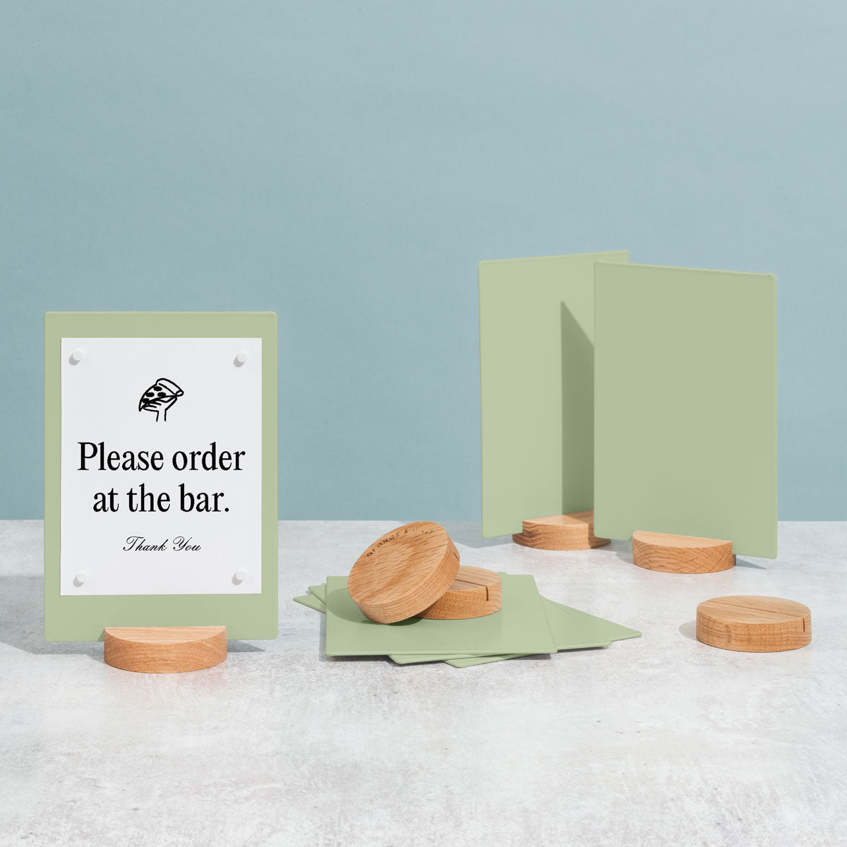
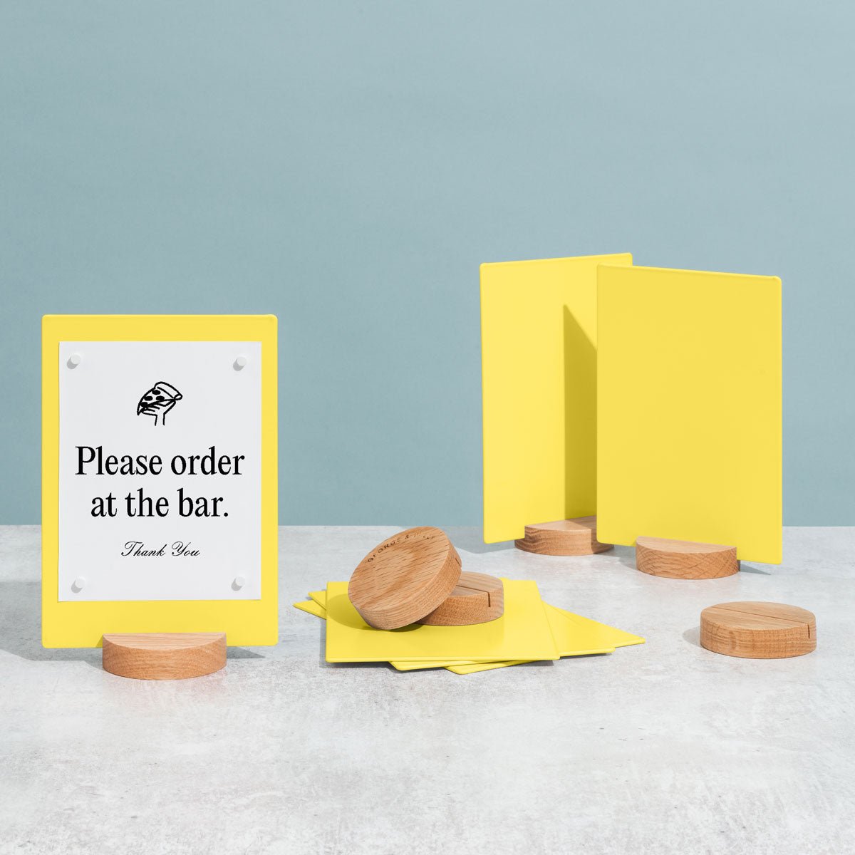
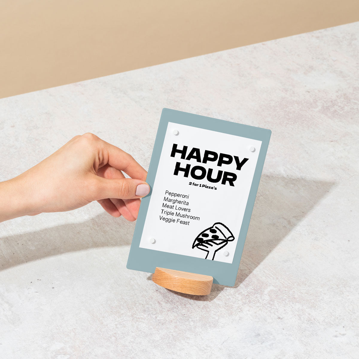
Use Compact, Multi Use Fixtures: Choose furniture and displays that work hard. A Wall Mounted Café Table can serve as a display surface during off peak hours. Small Counter Signs can communicate messages without cluttering your cash wrap.
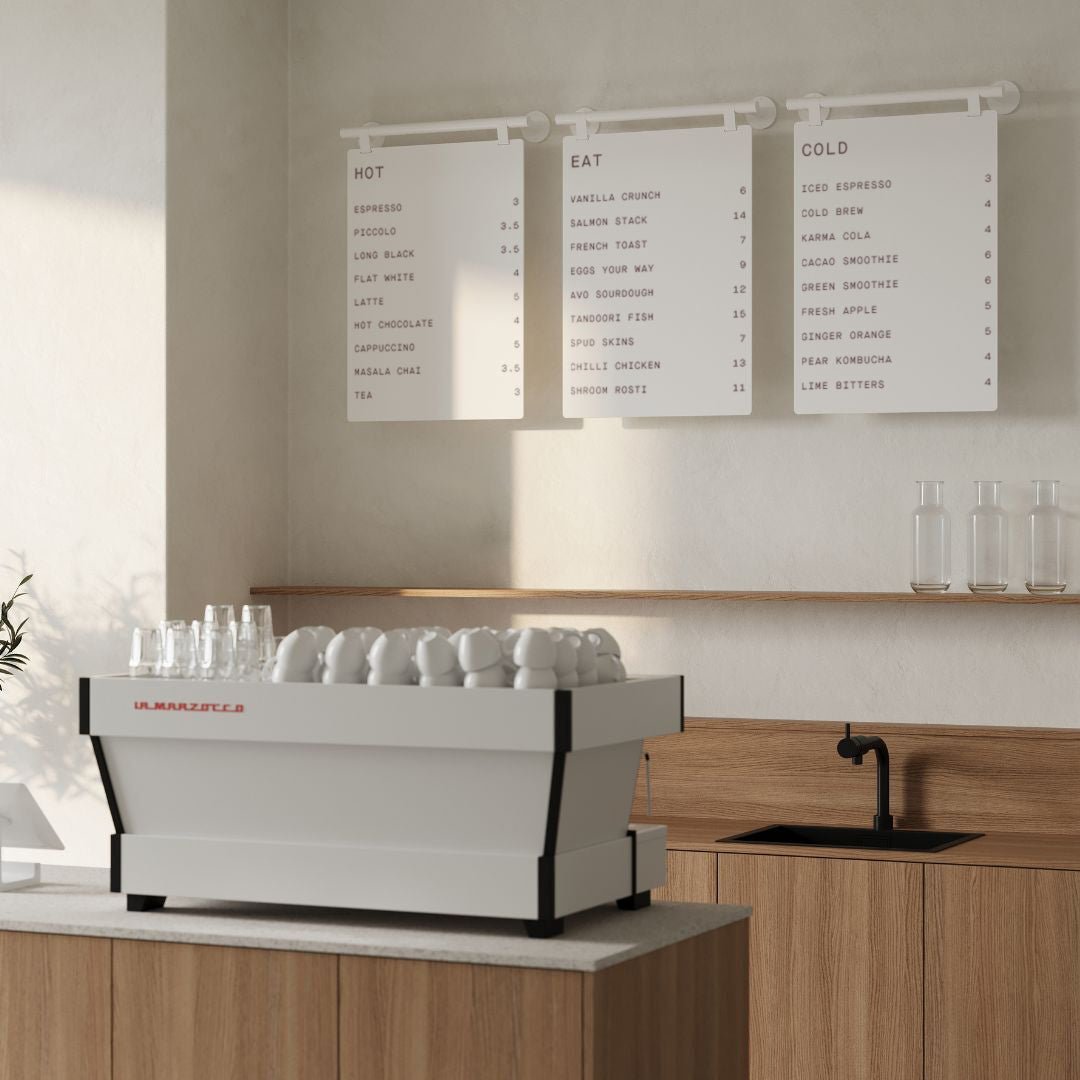
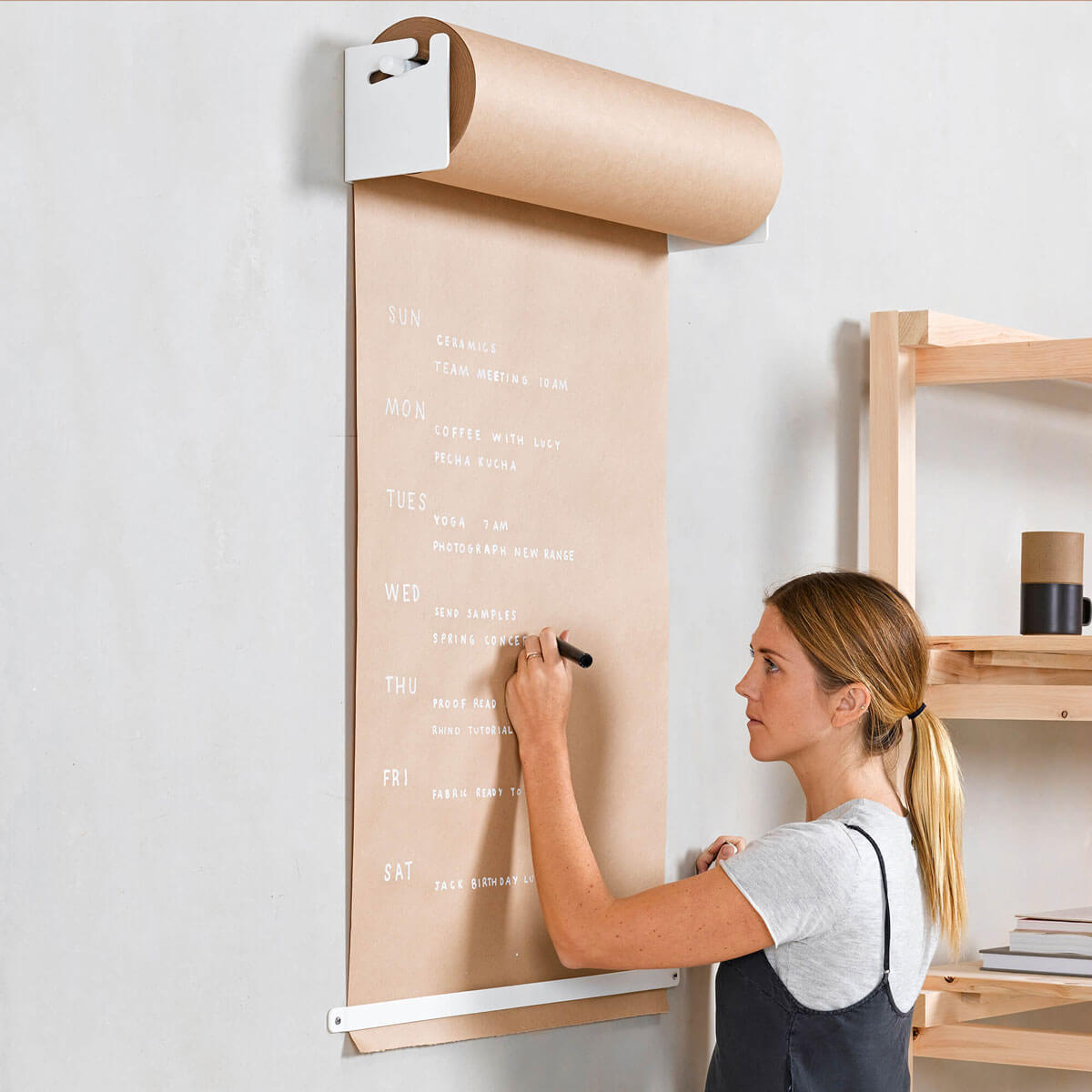
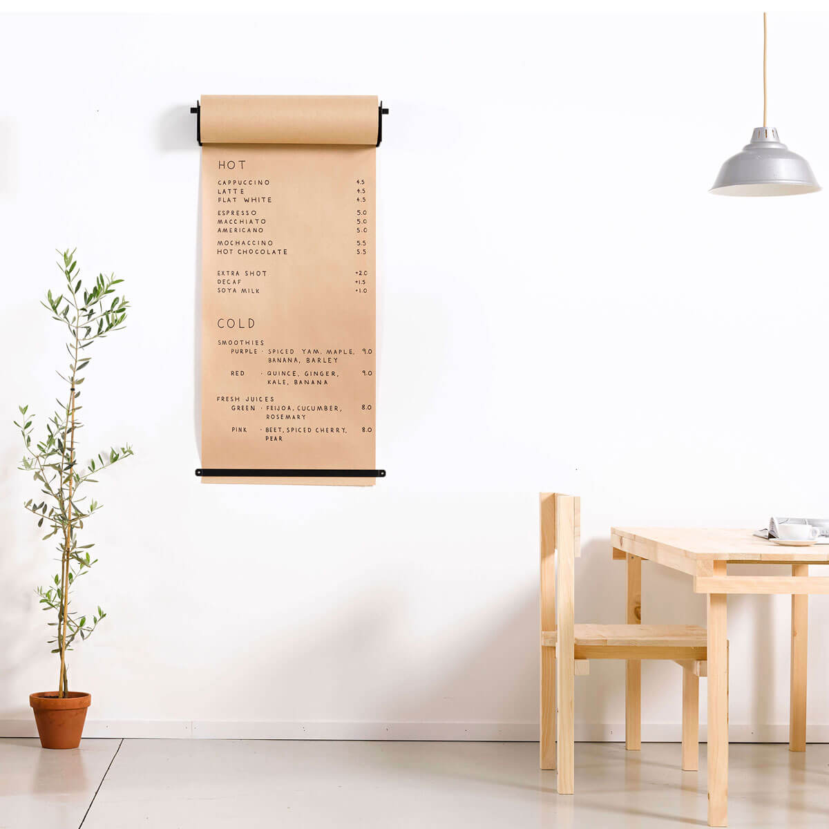
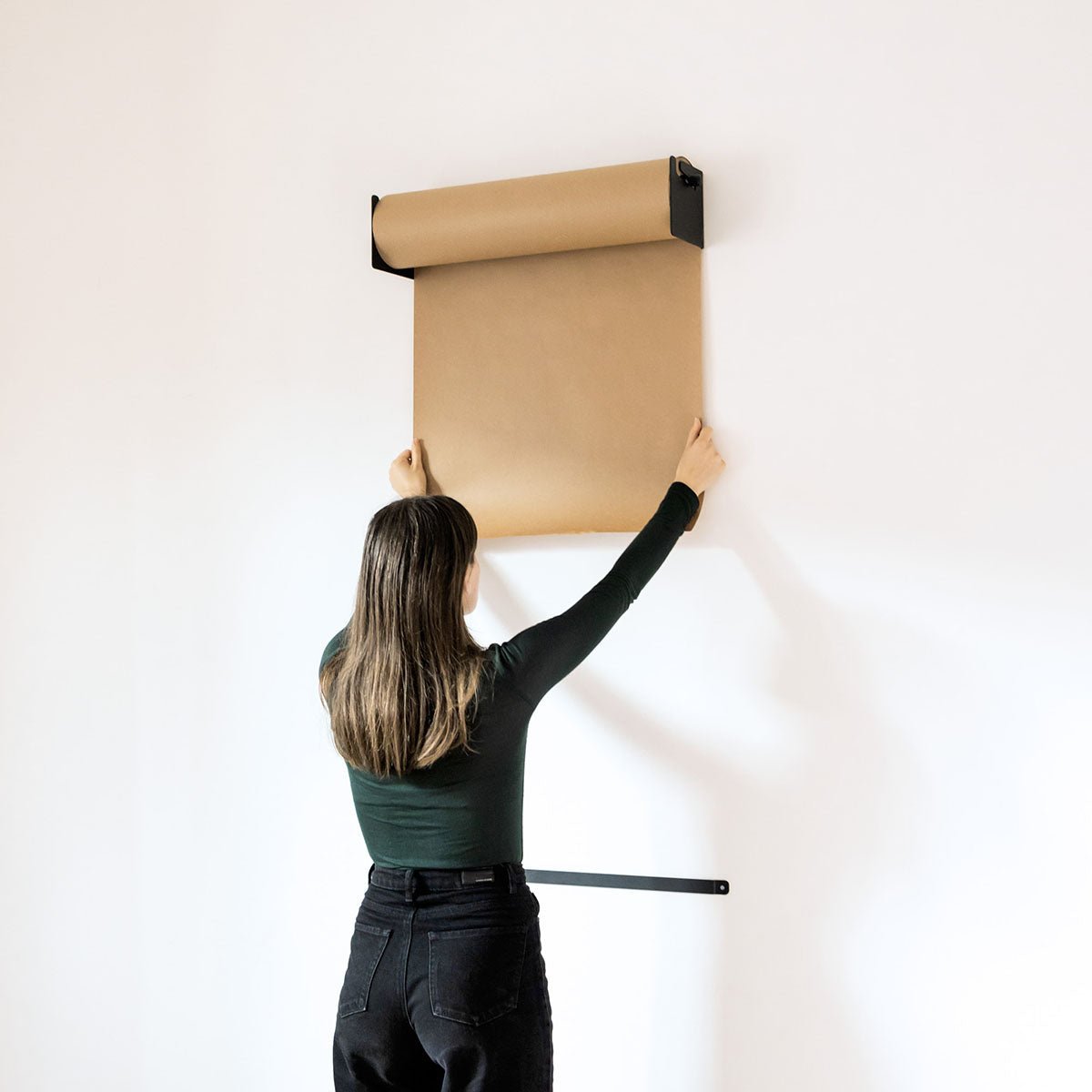
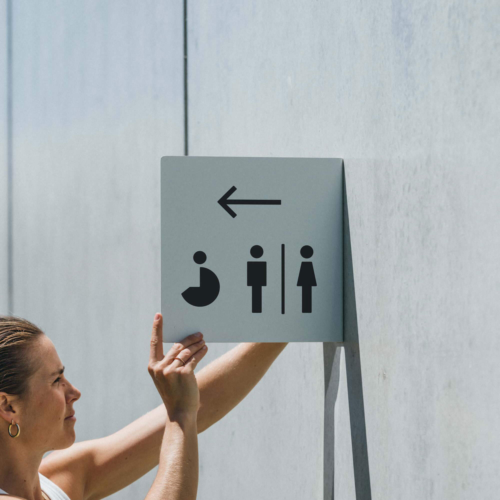
Create Zones with Signage: Clearly define different areas of your small store. A simple menu board can anchor a coffee bar, while a Studio Roller displaying a branded message can create a feature wall that separates retail from a service area.
Keep it Light and Airy: In a small space, use a light color palette and reflective surfaces to create a feeling of openness. Minimalist aluminum signage and fixtures blend in seamlessly, making the space feel larger and more intentional.
Industry Specific Considerations
The best retail display ideas are not one size fits all. They should be tailored to your industry and the specific needs of your customers.
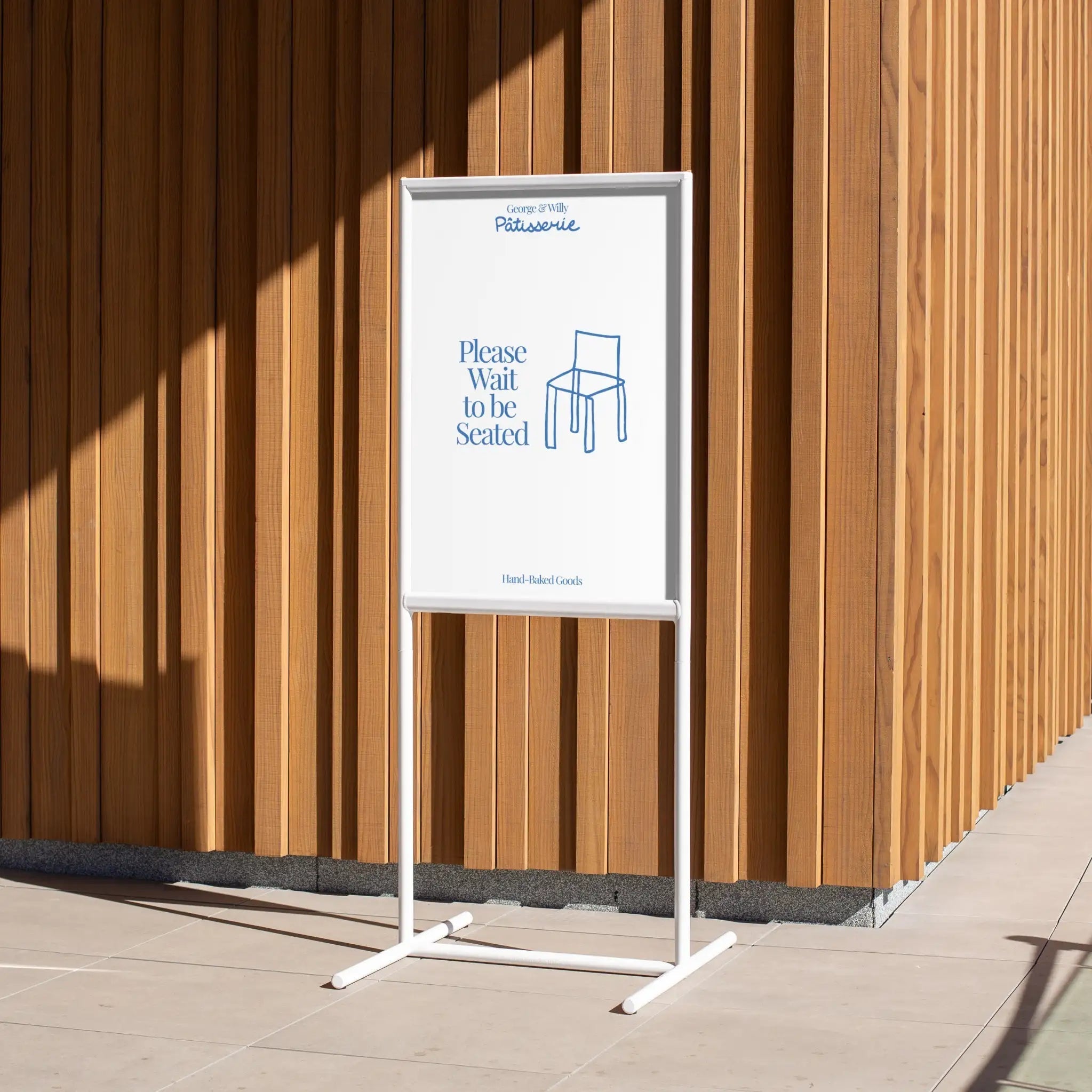
For Cafés and Bakeries
Hospitality is all about atmosphere and efficiency. Your displays need to be beautiful, durable, and easy to update.
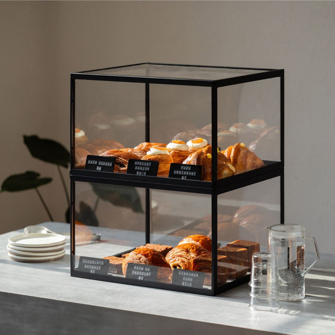
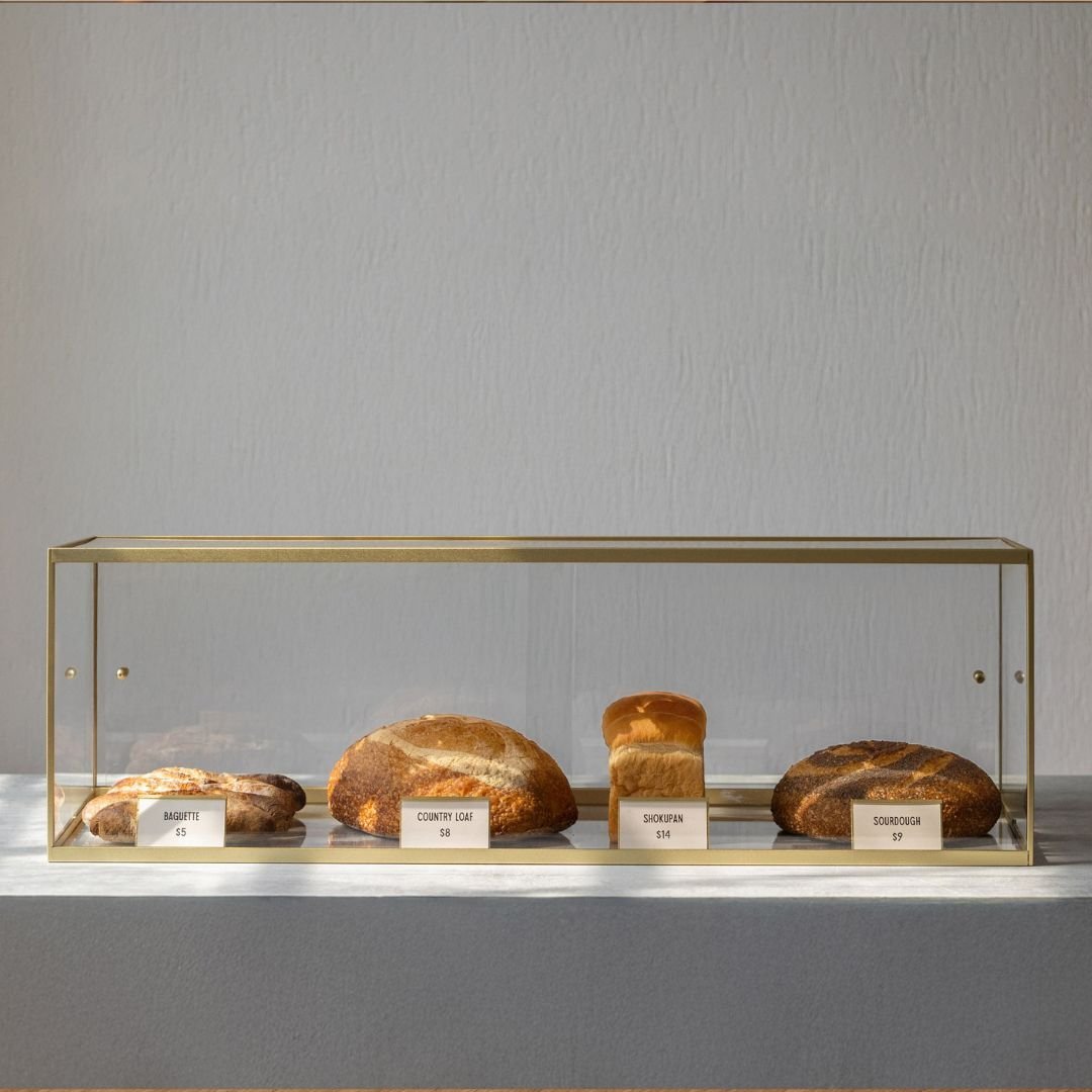
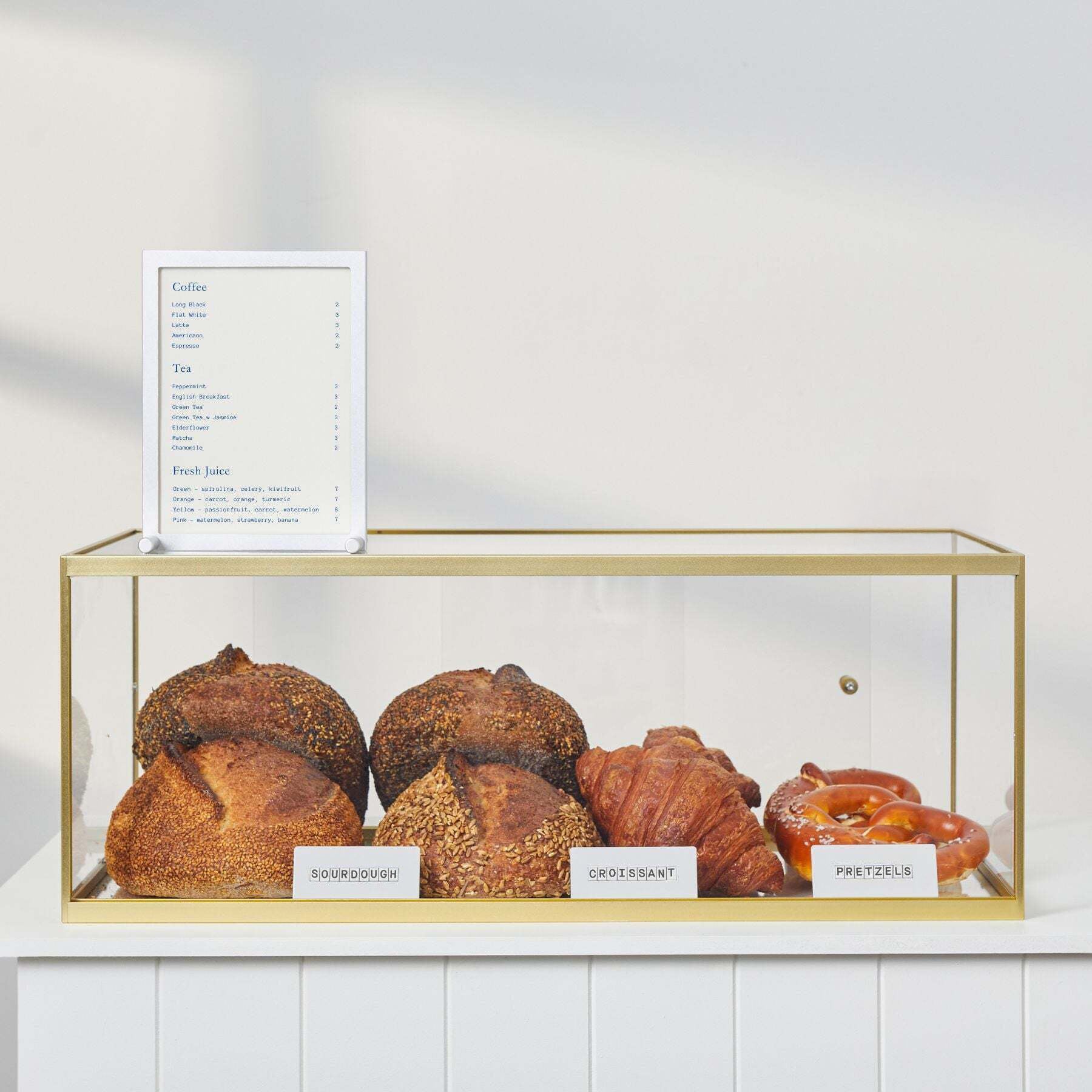
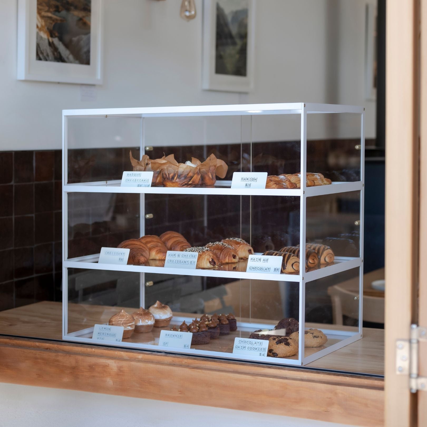
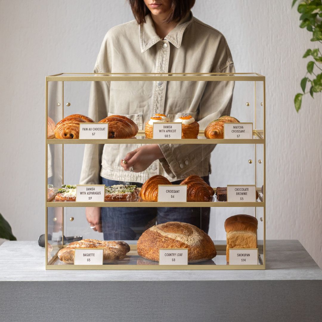
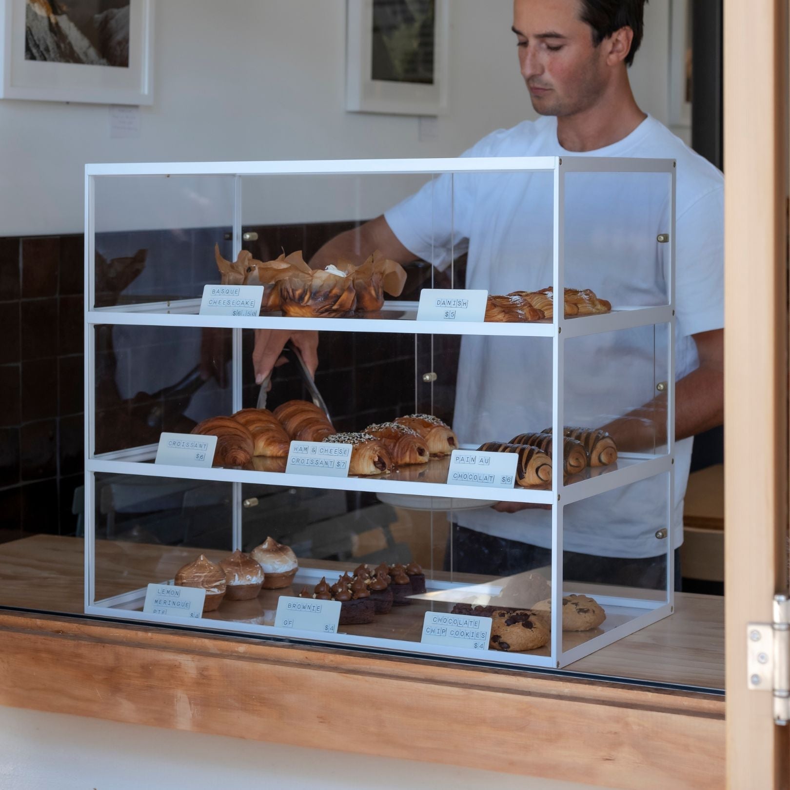
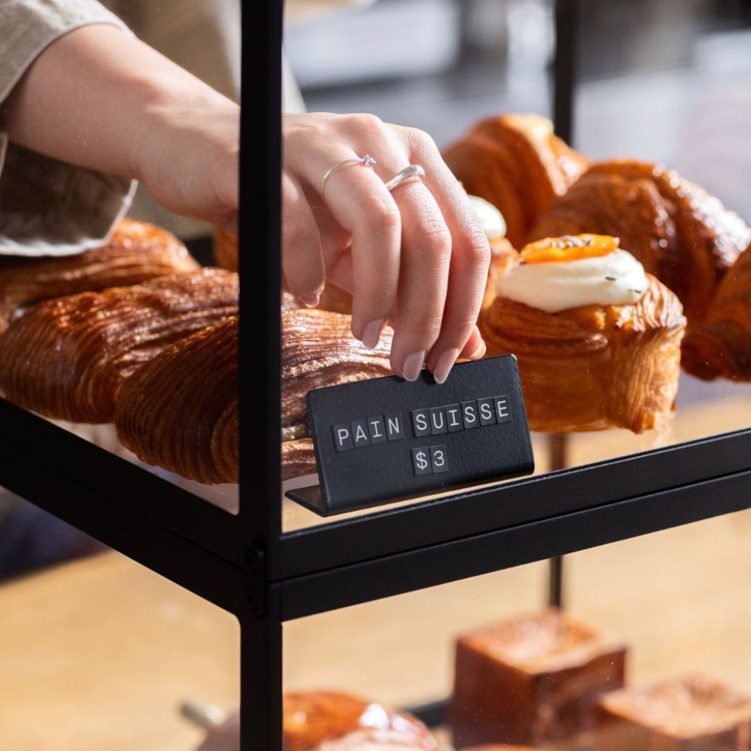
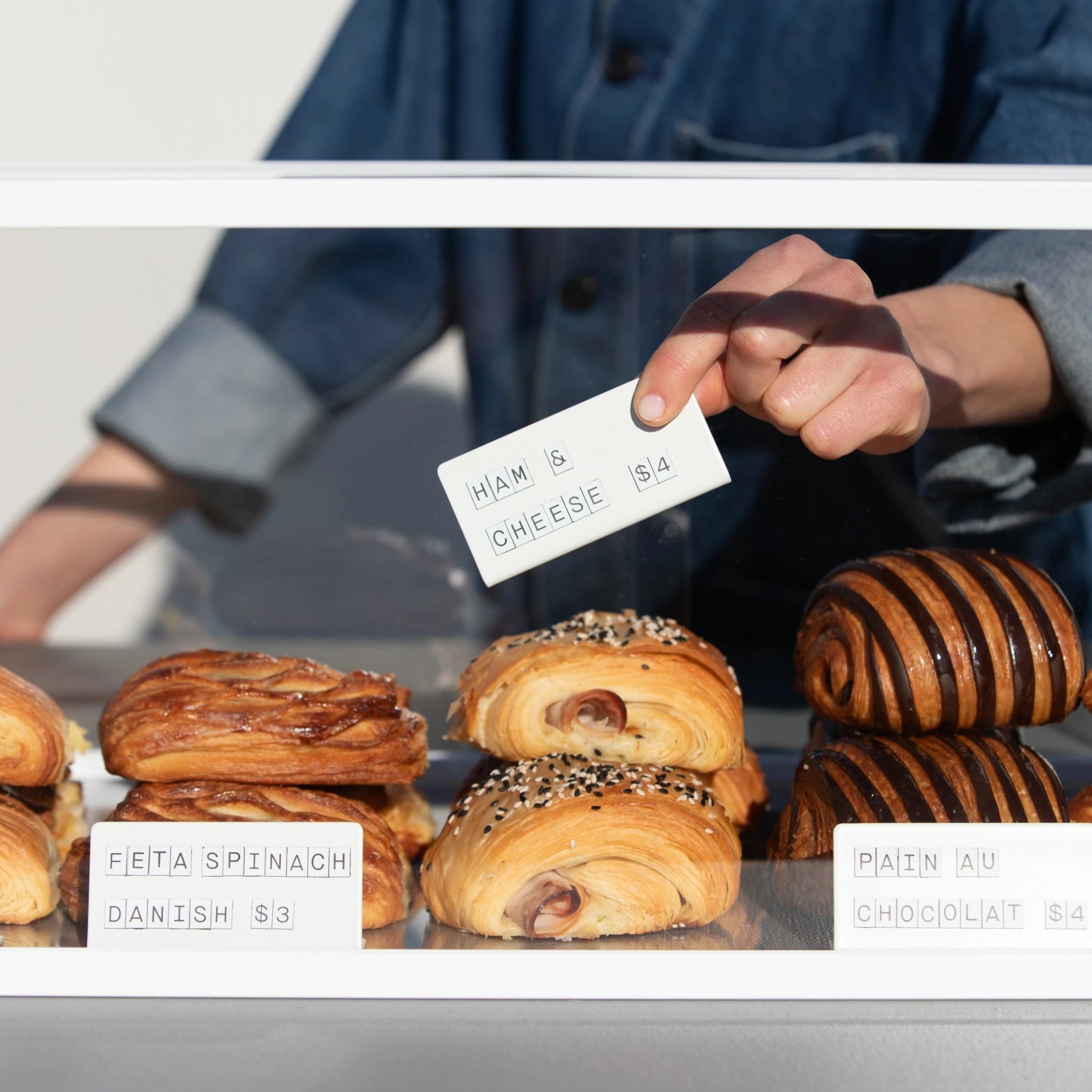
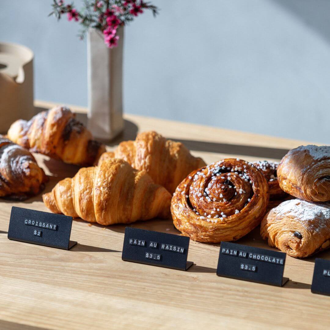
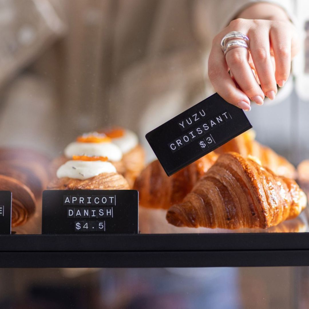
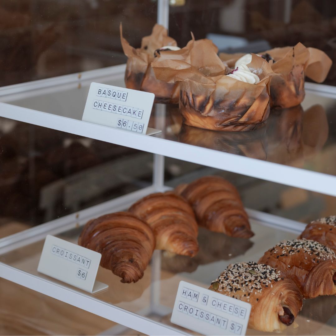
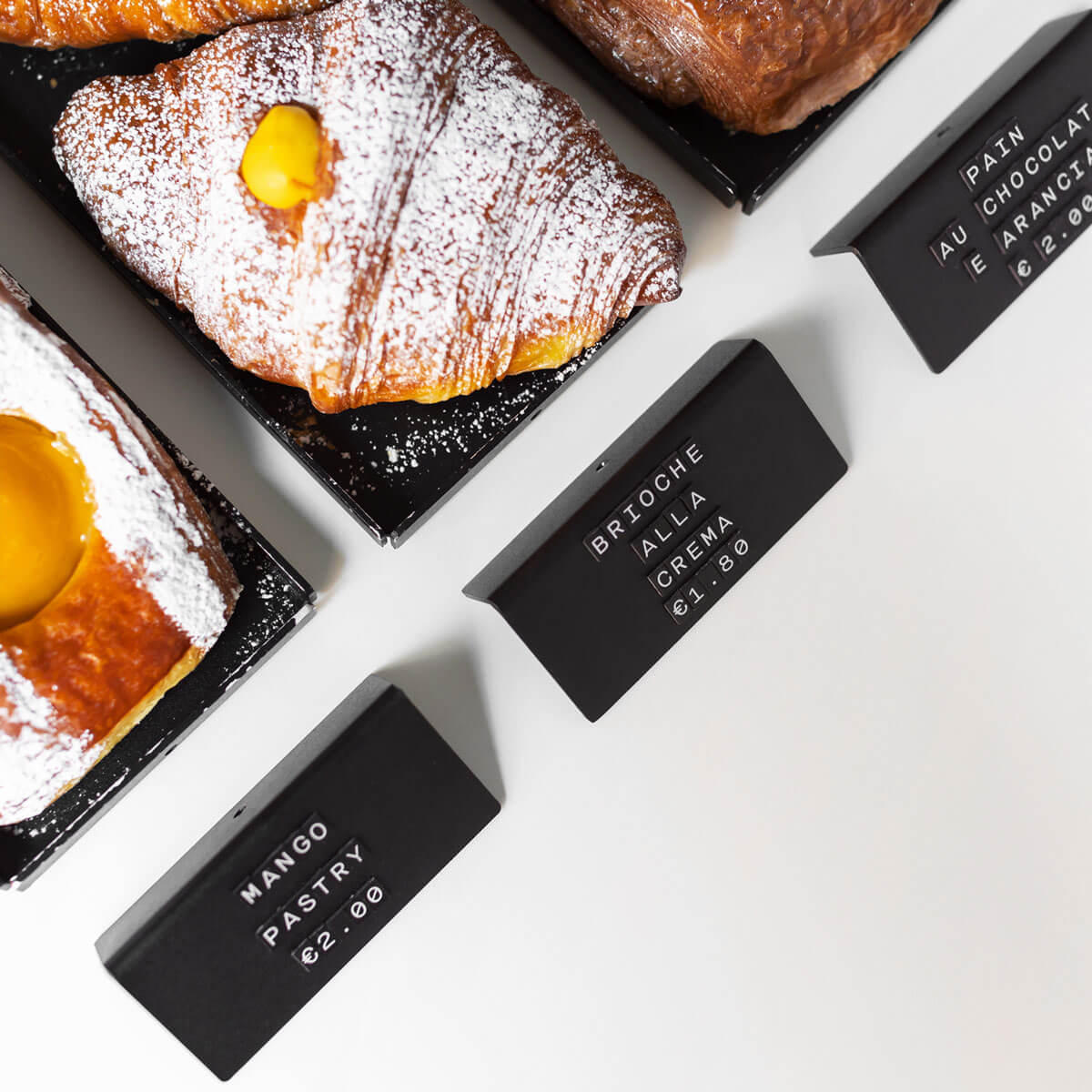
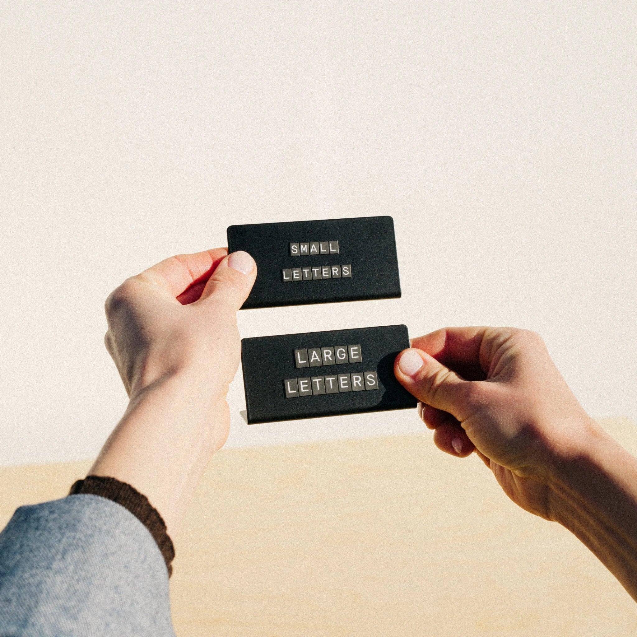
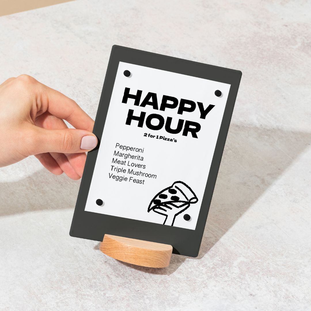
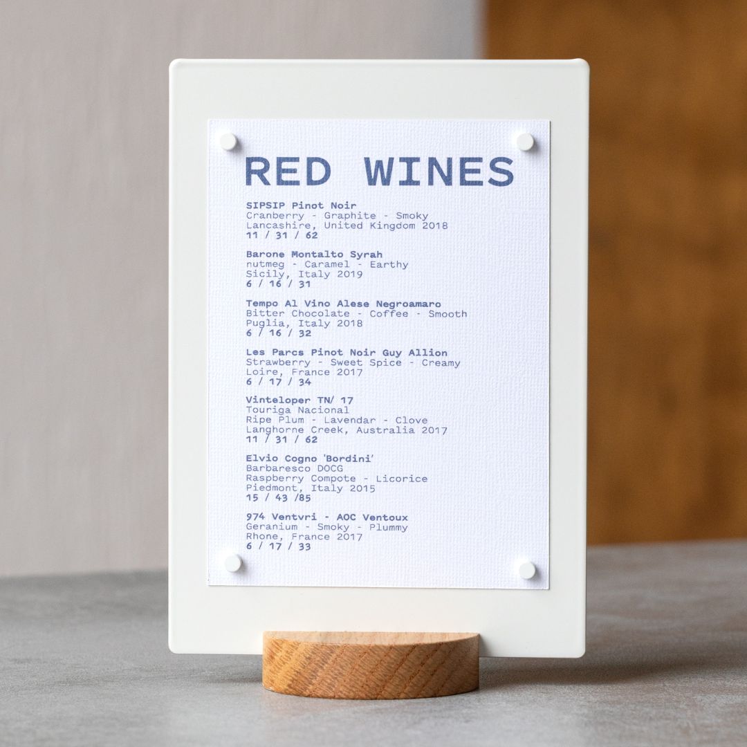
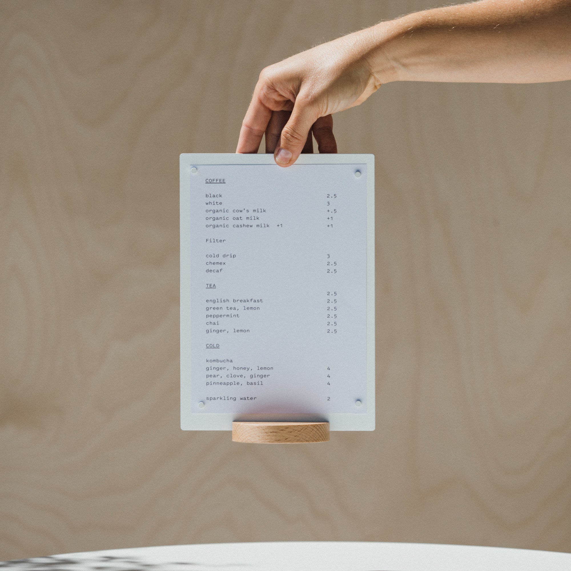
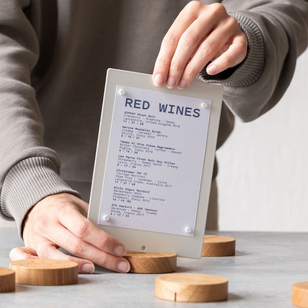
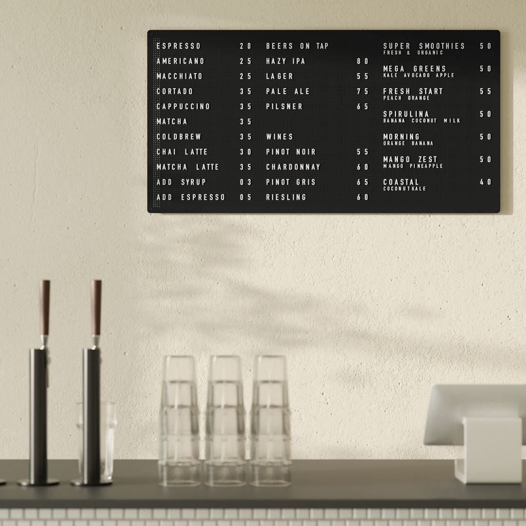
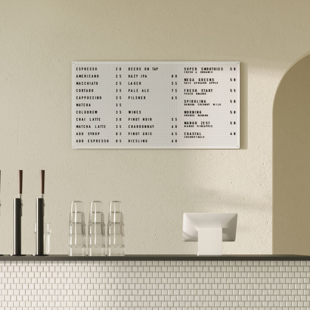
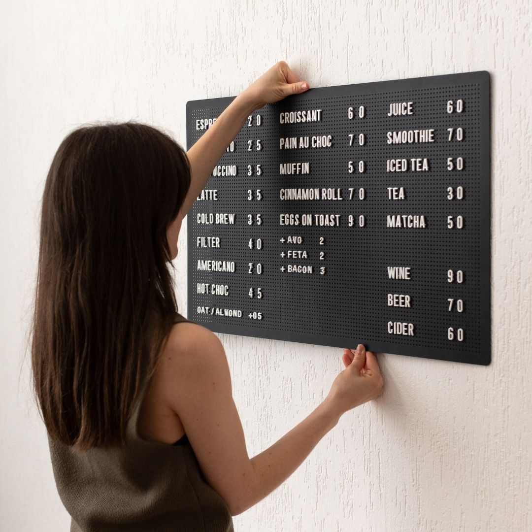
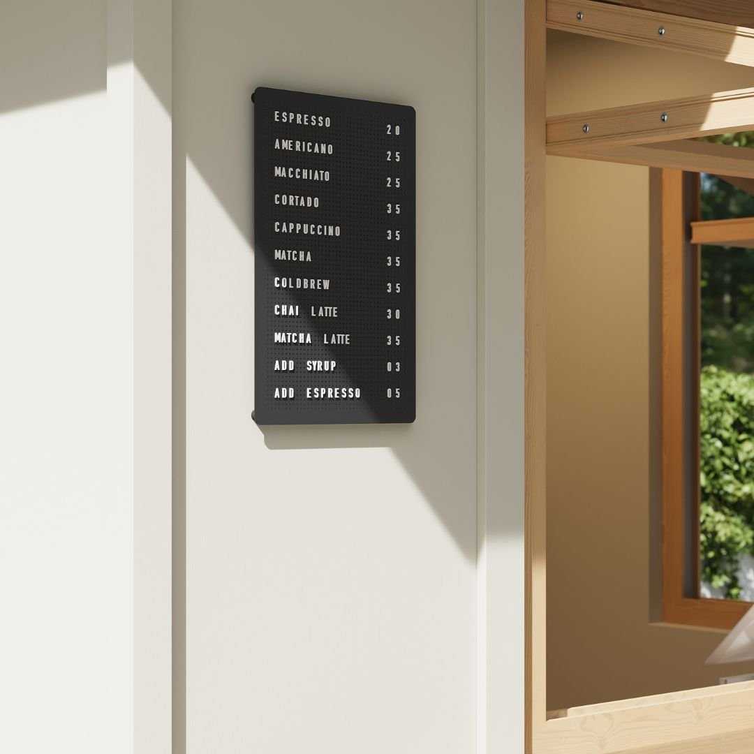
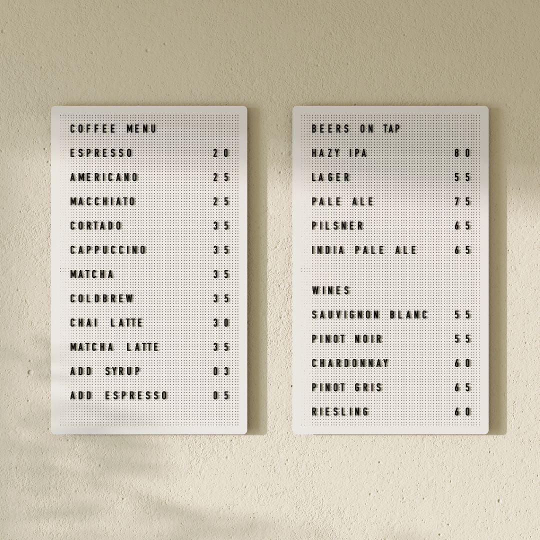
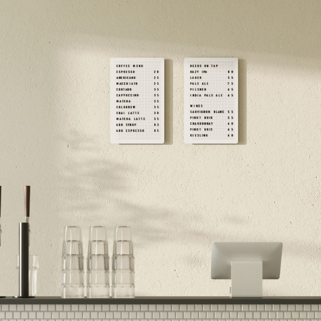
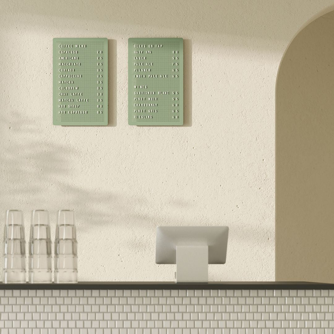
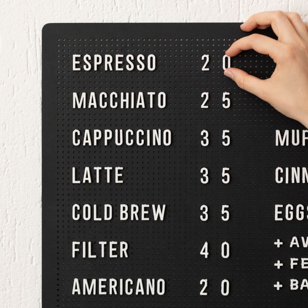
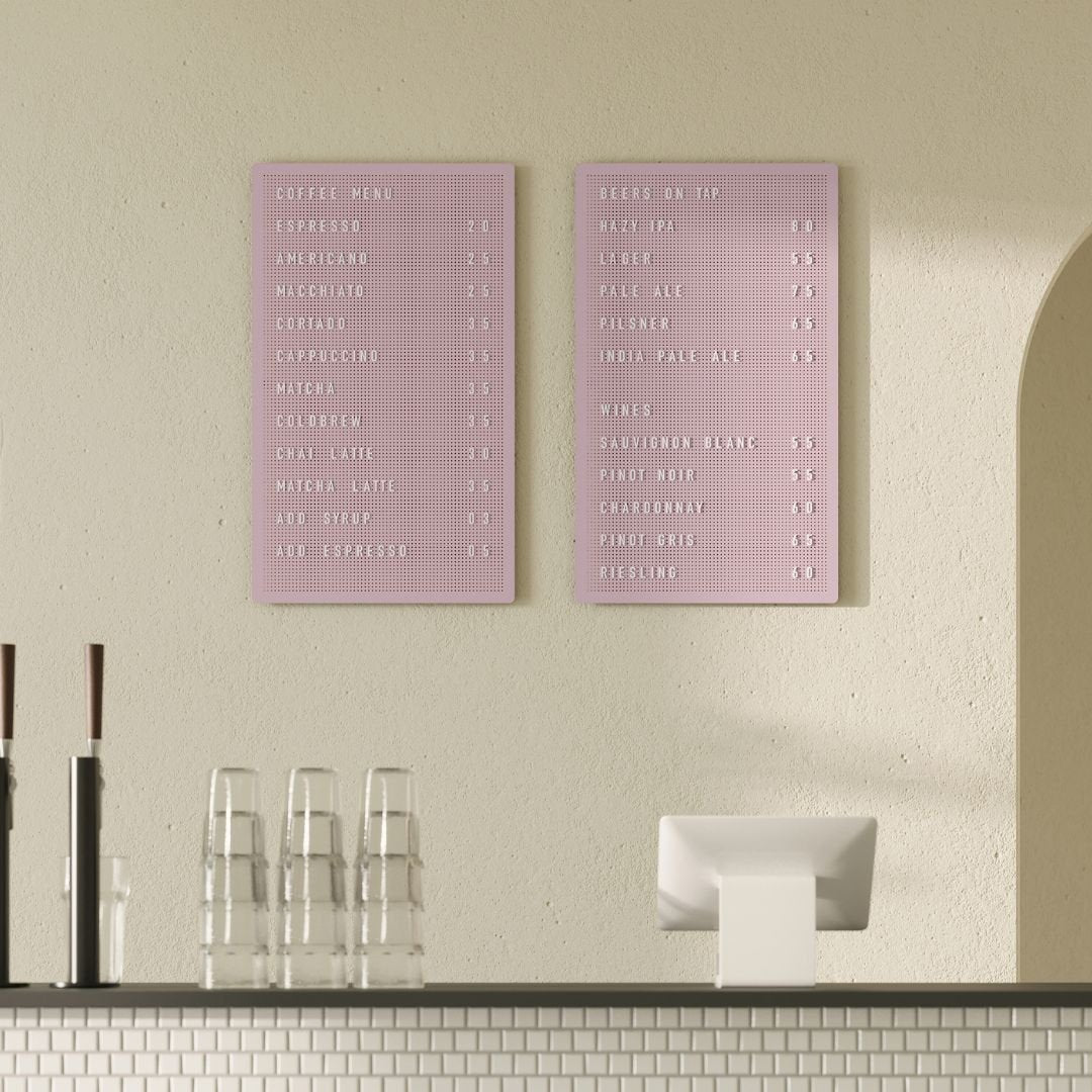
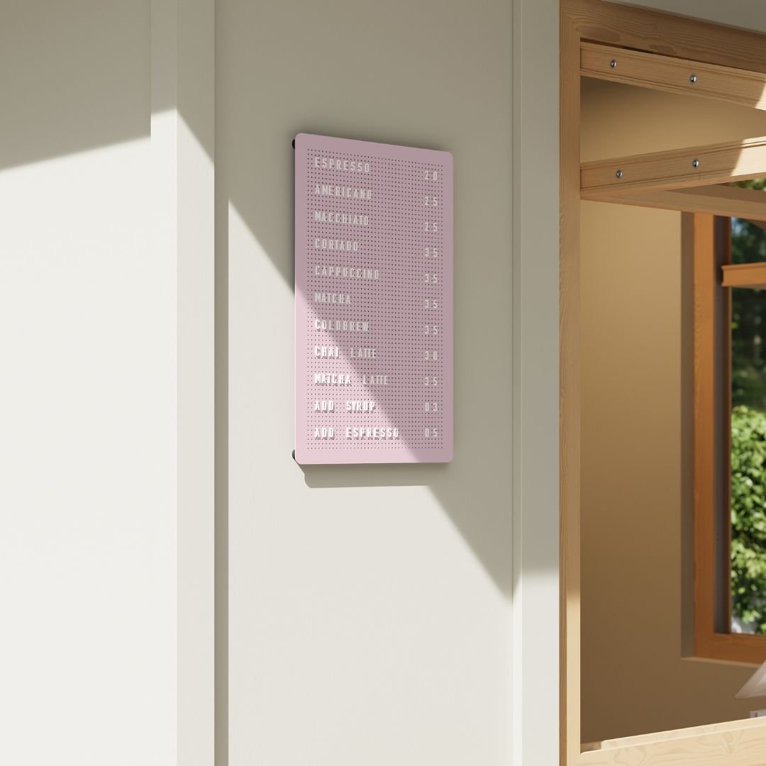
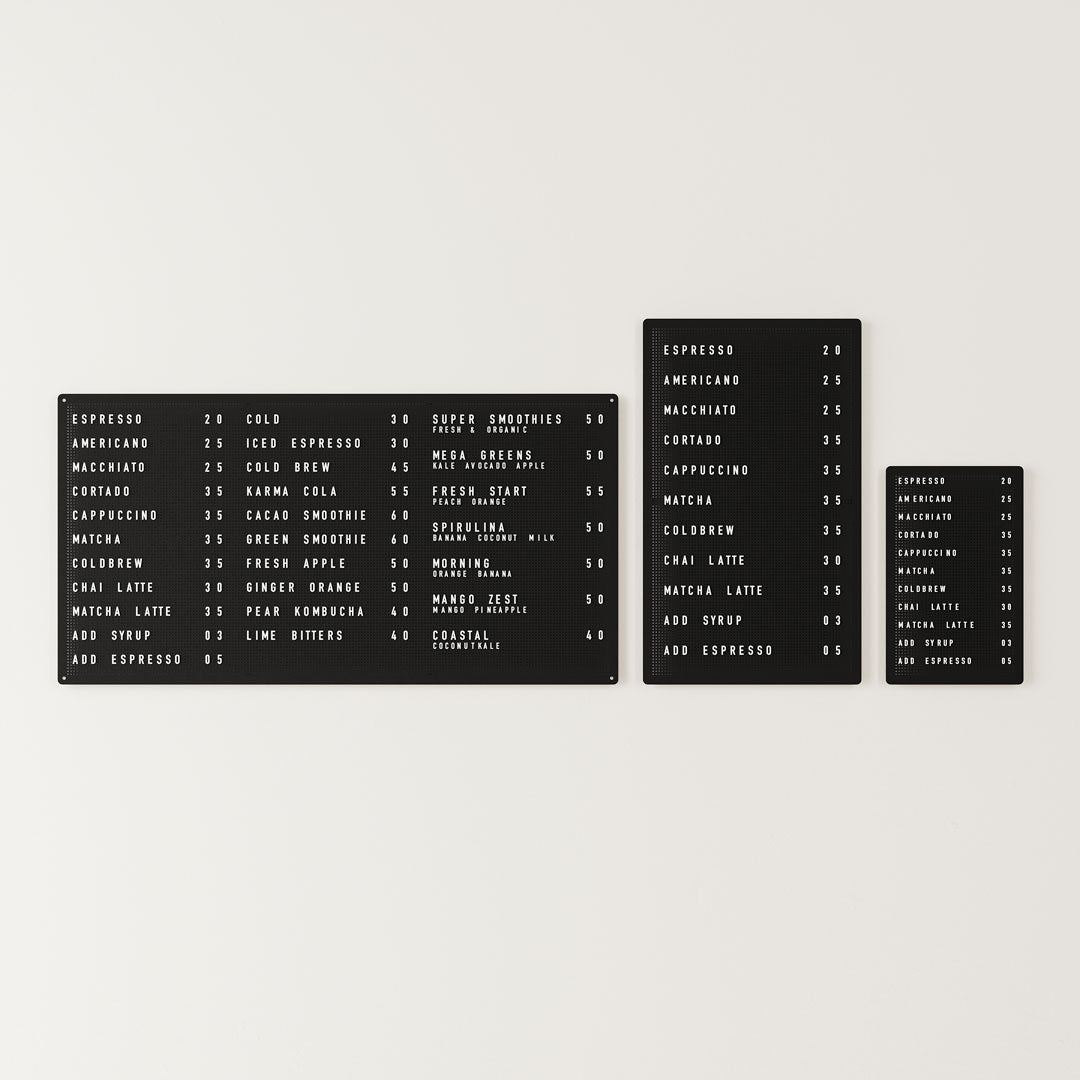
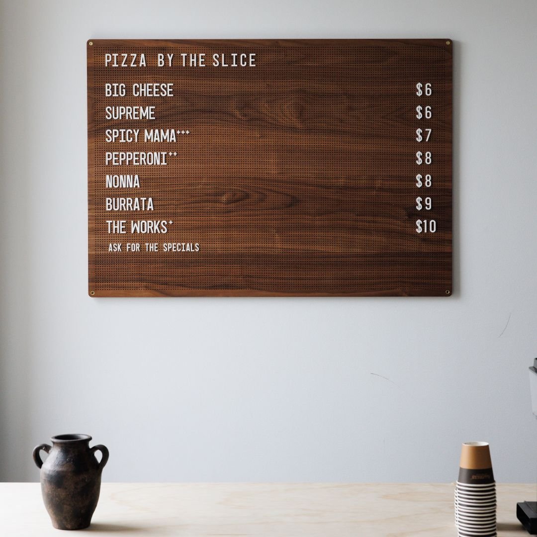
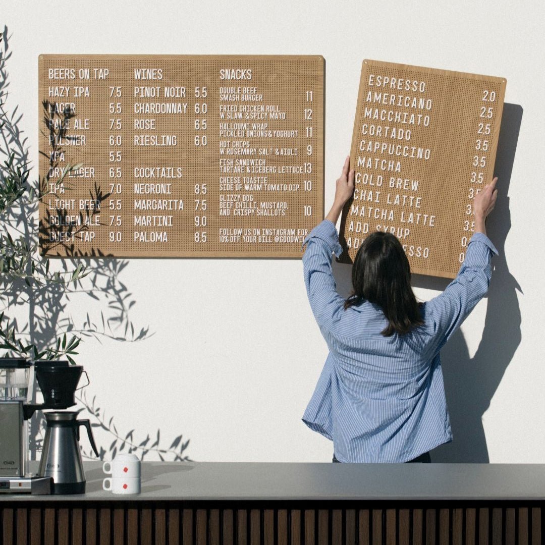
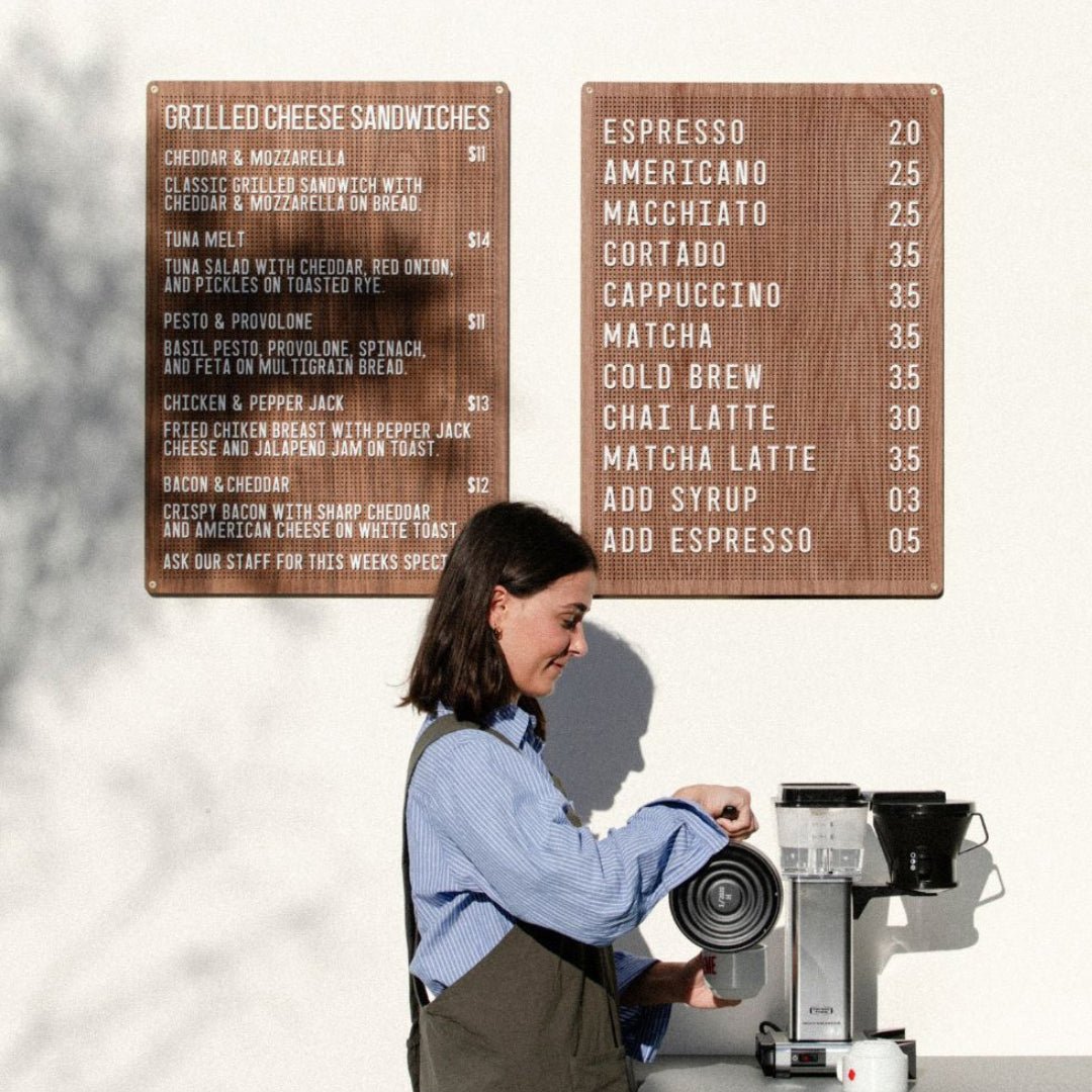
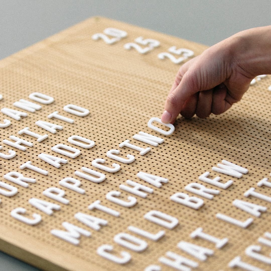
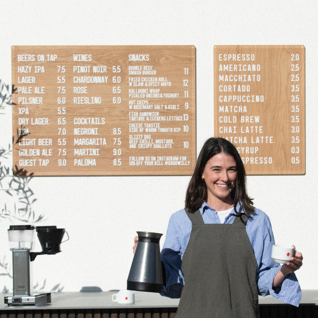
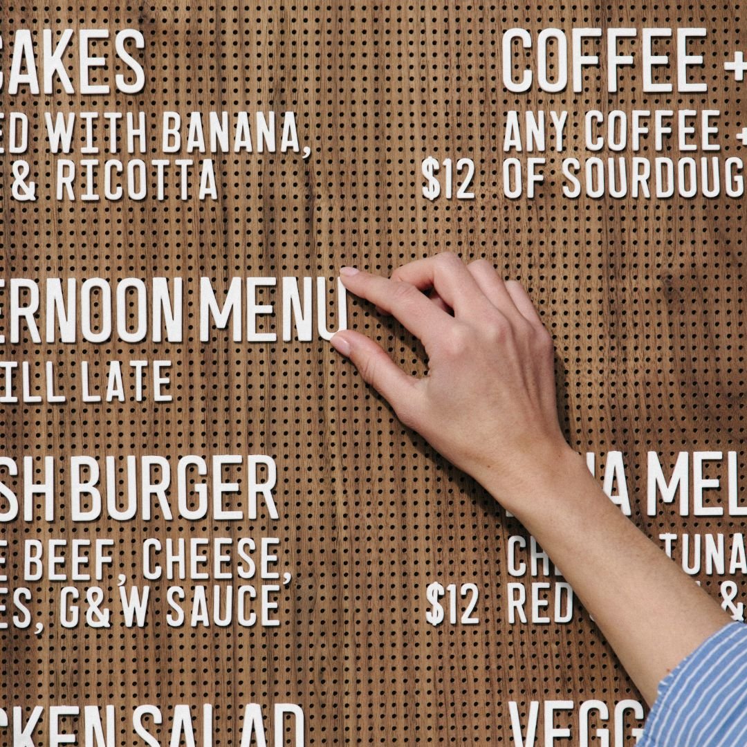
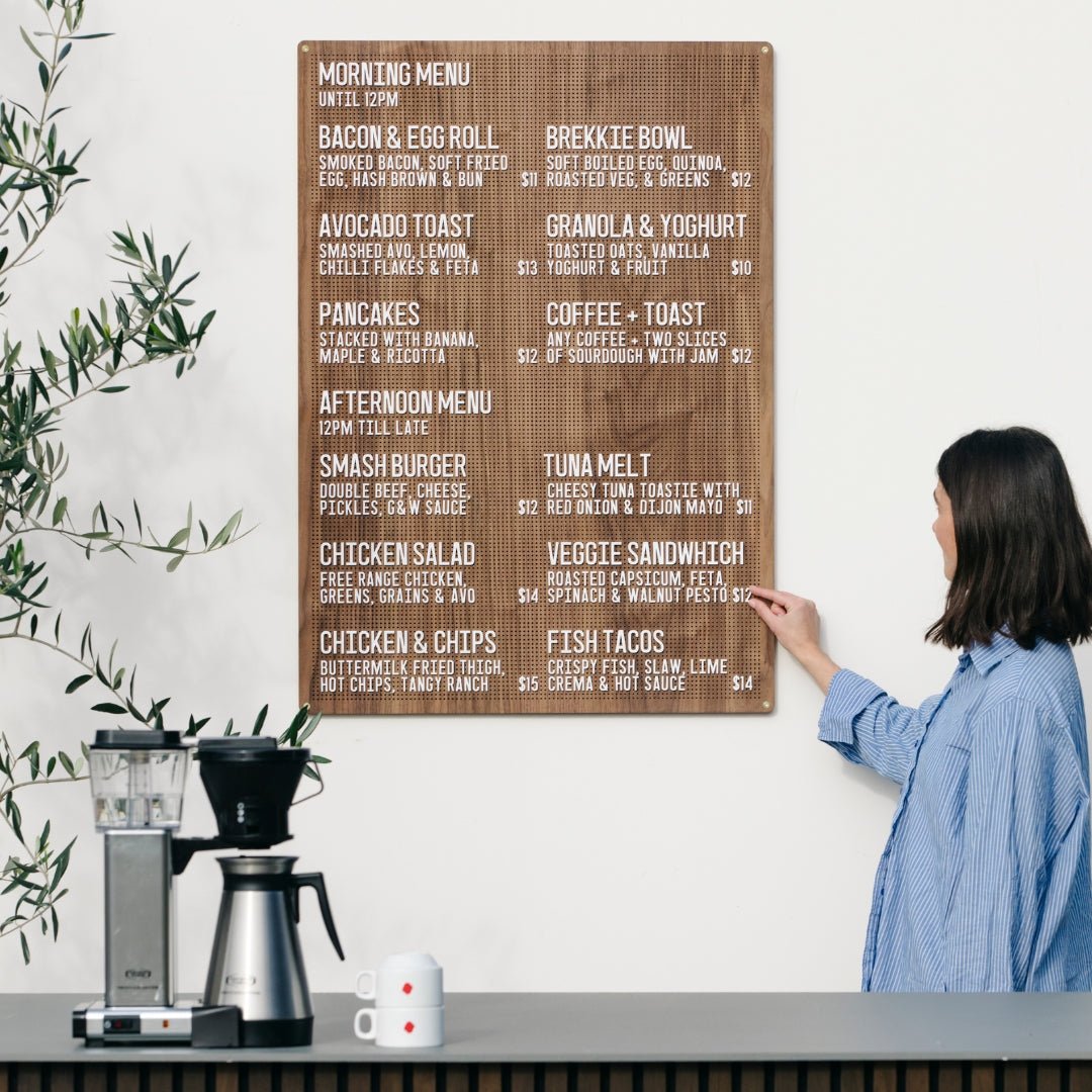
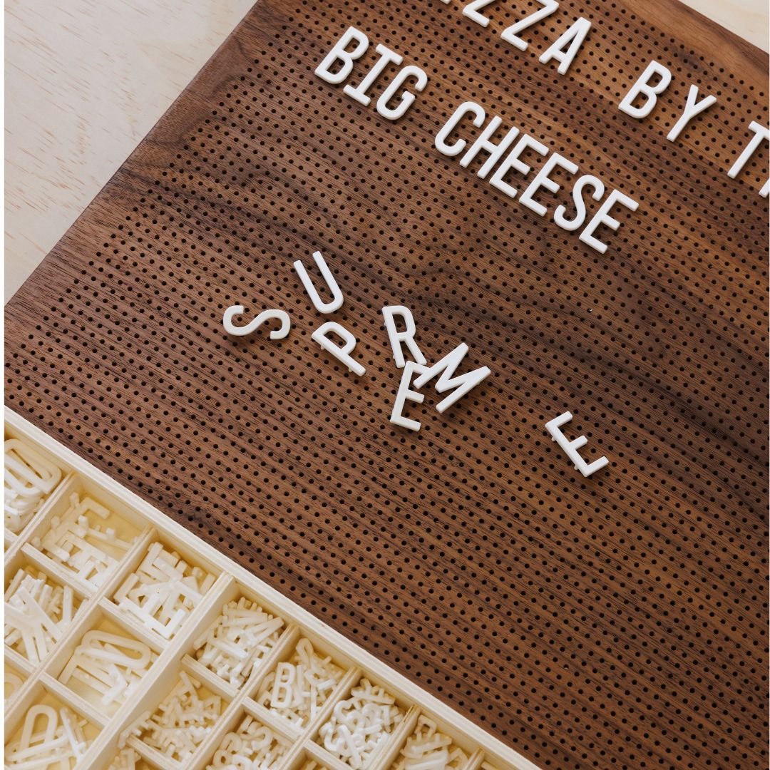
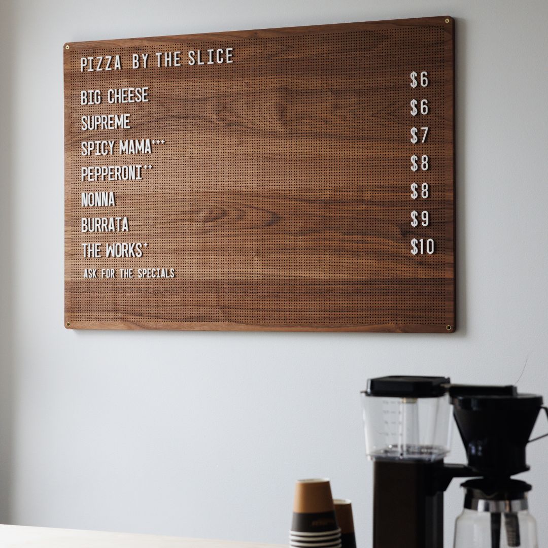
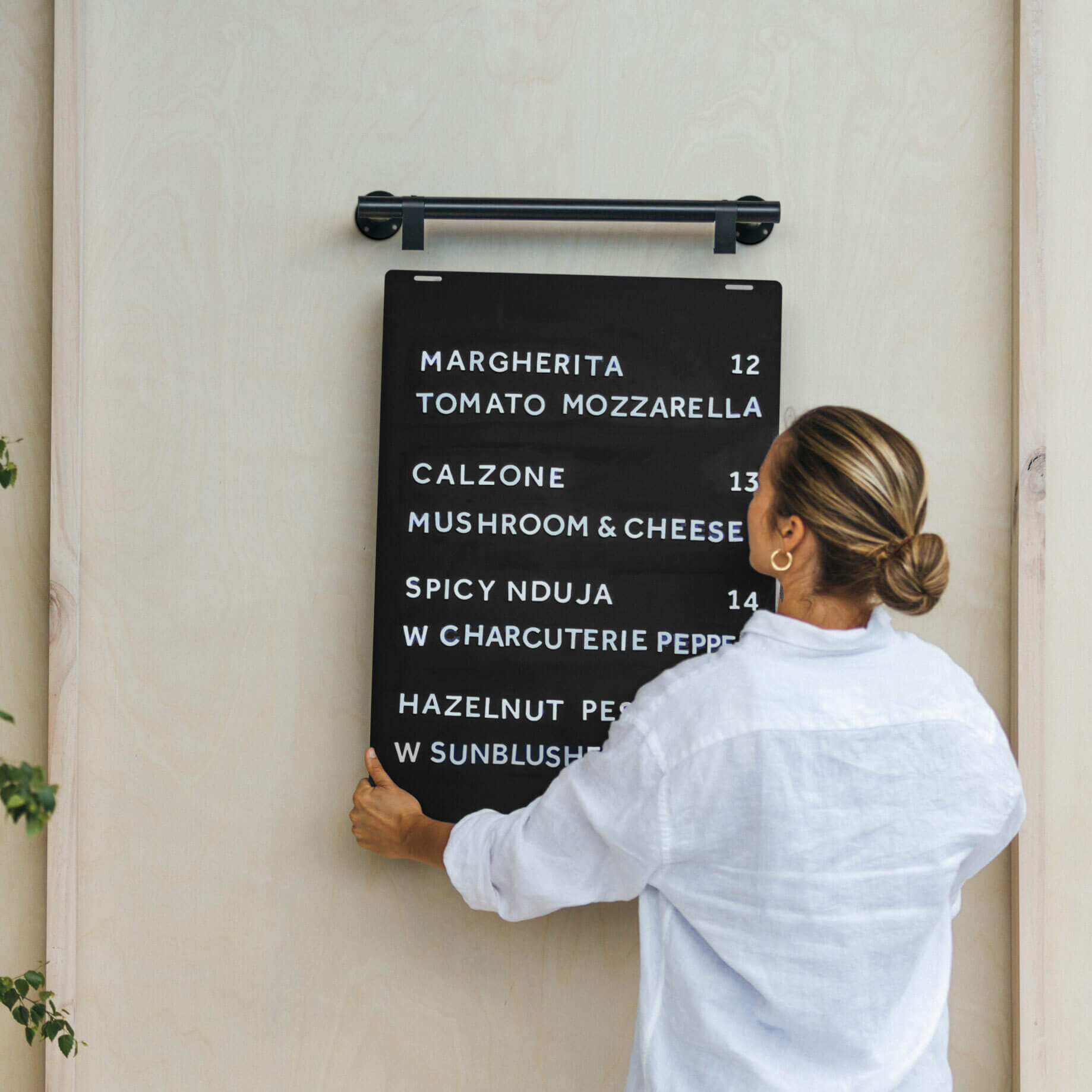
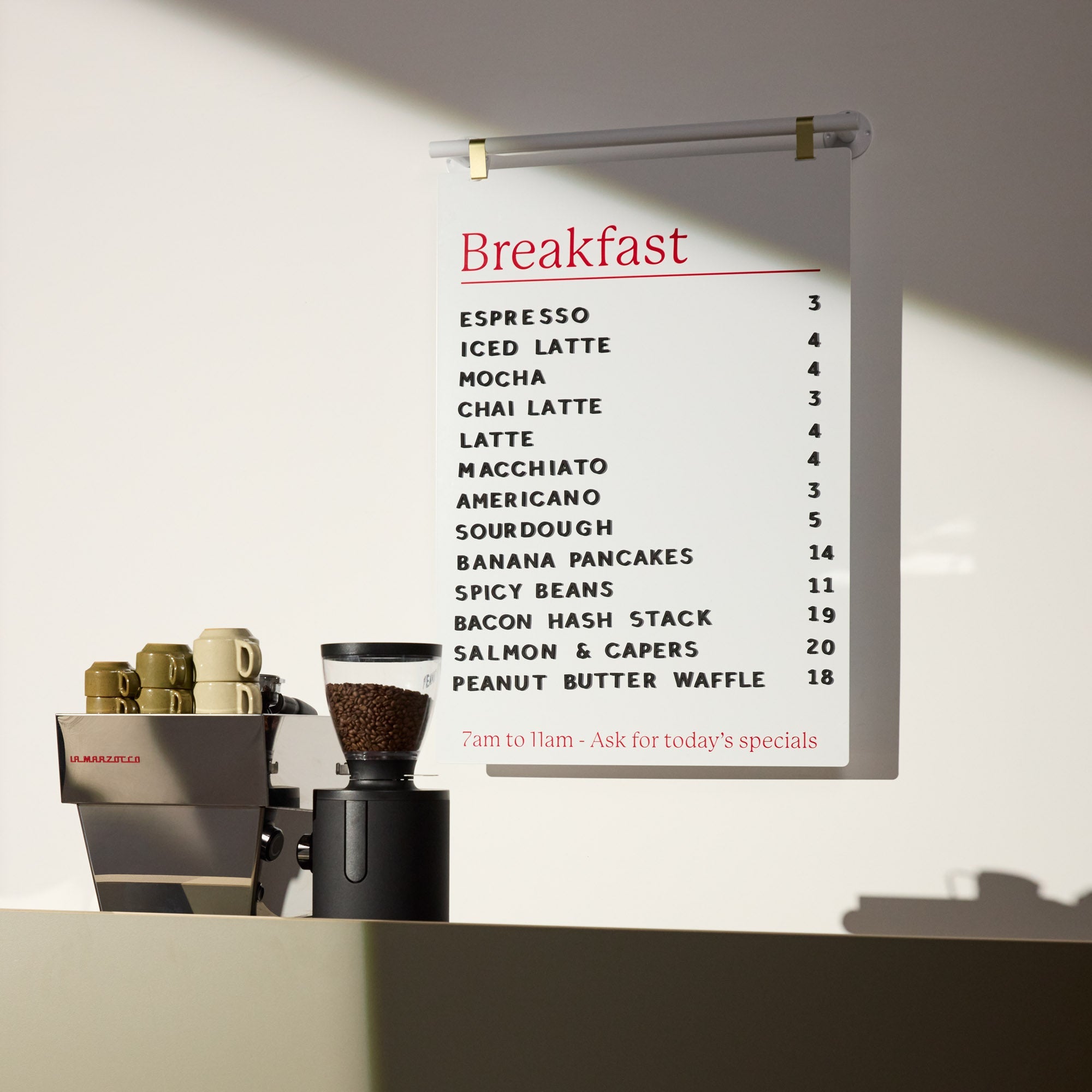
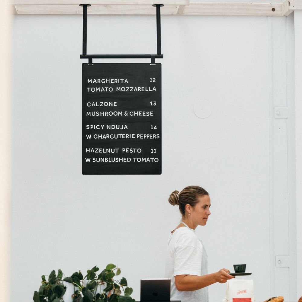
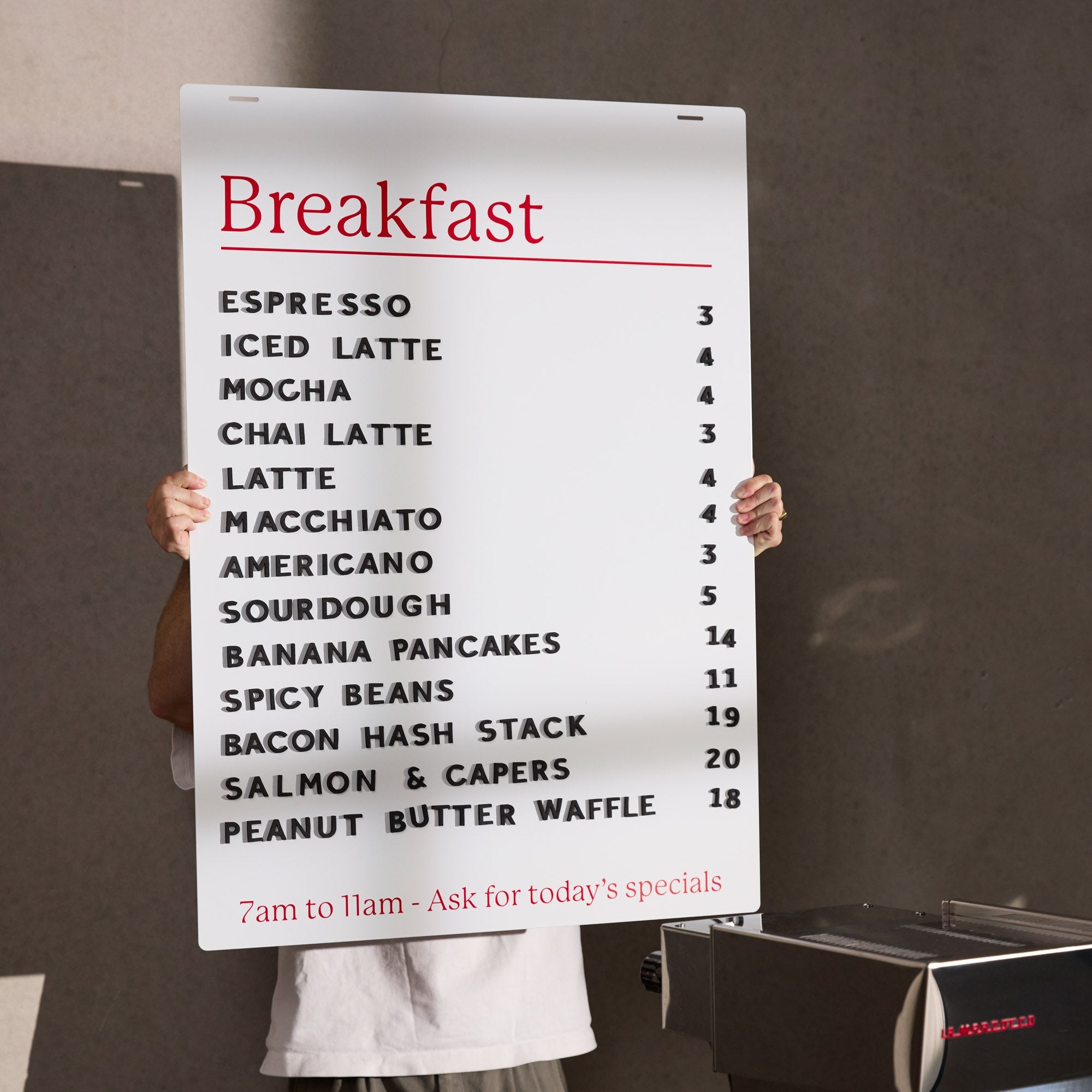
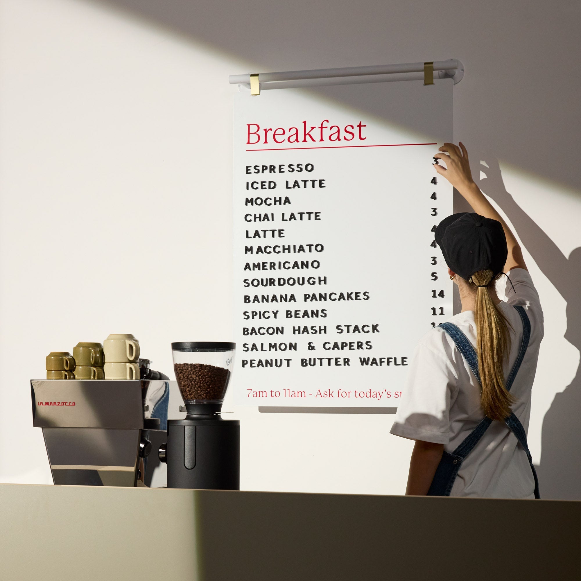
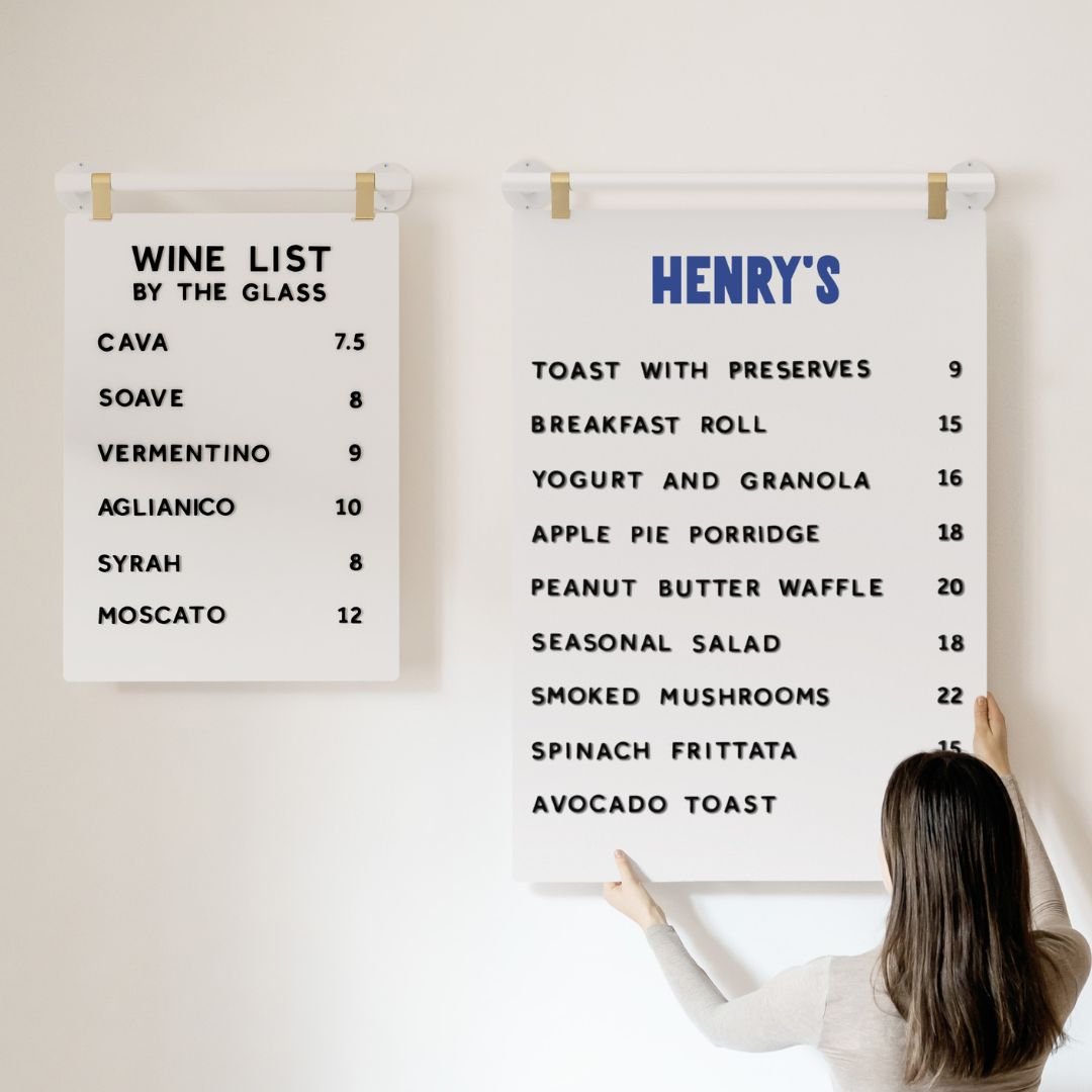
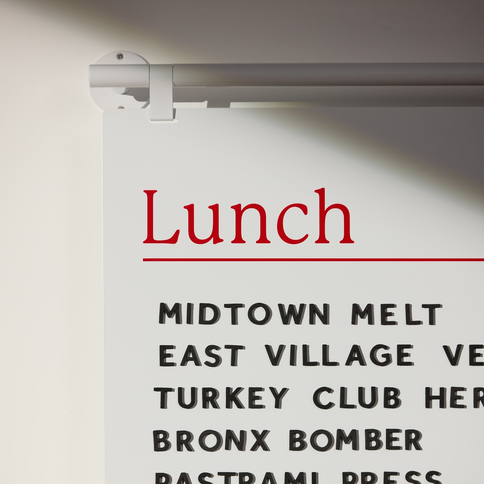
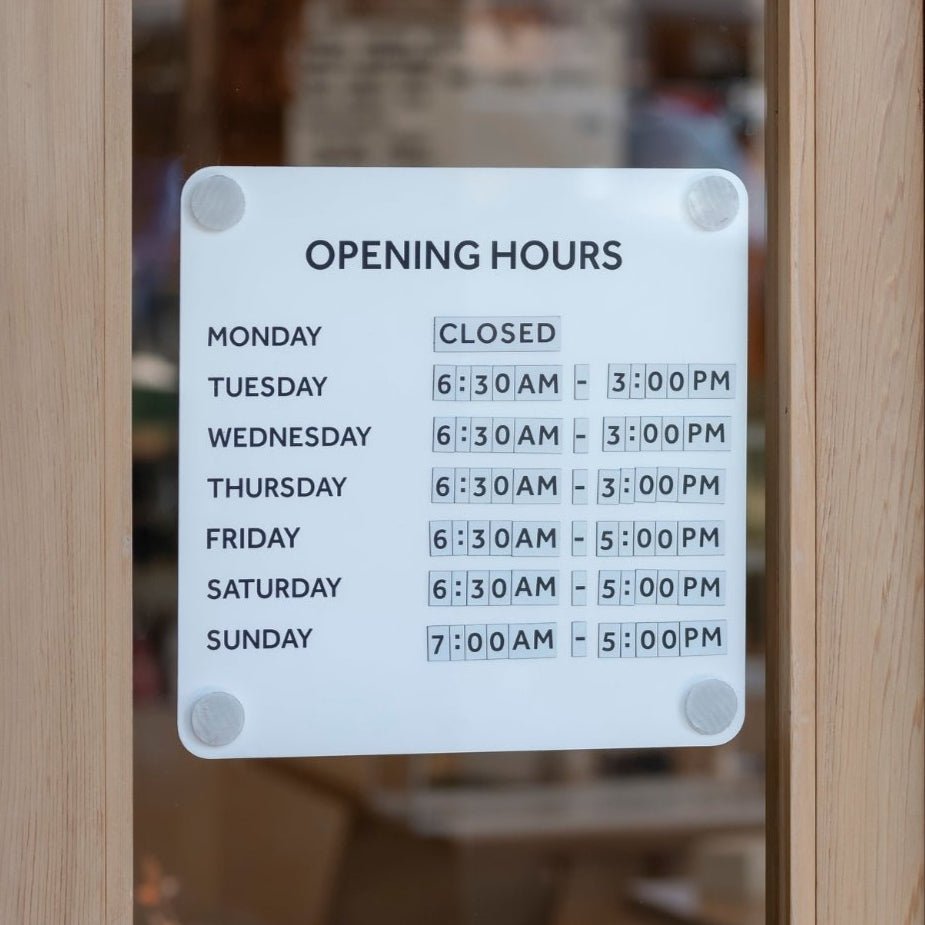
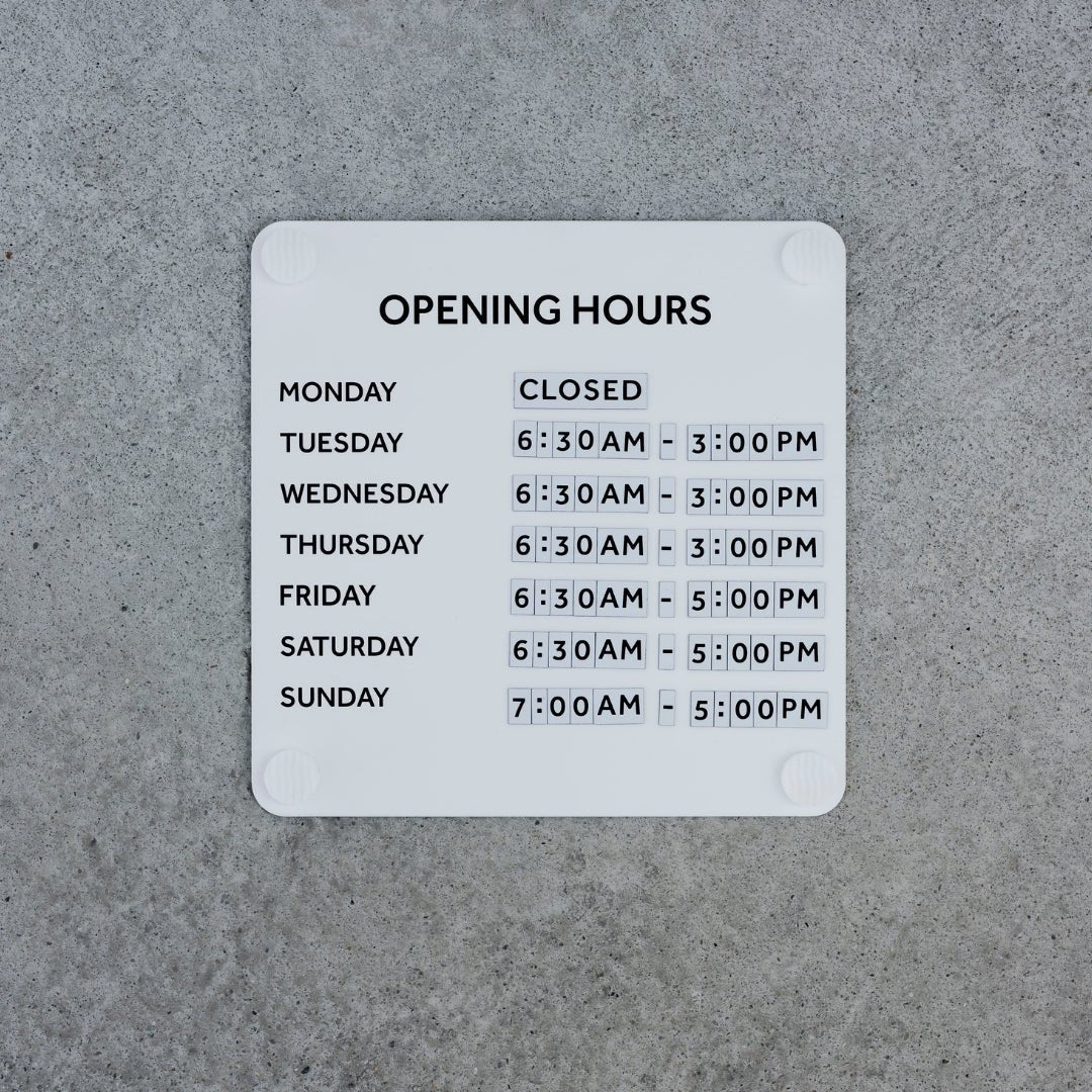
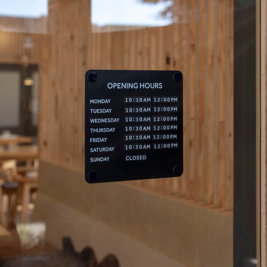
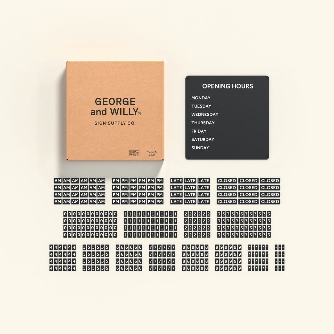
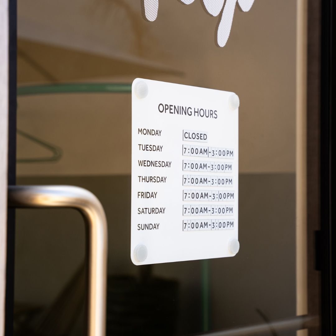
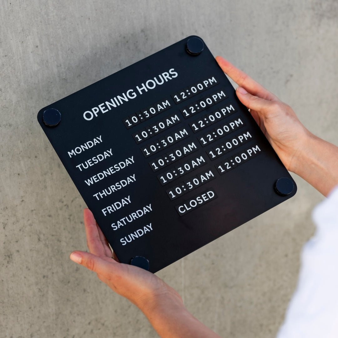
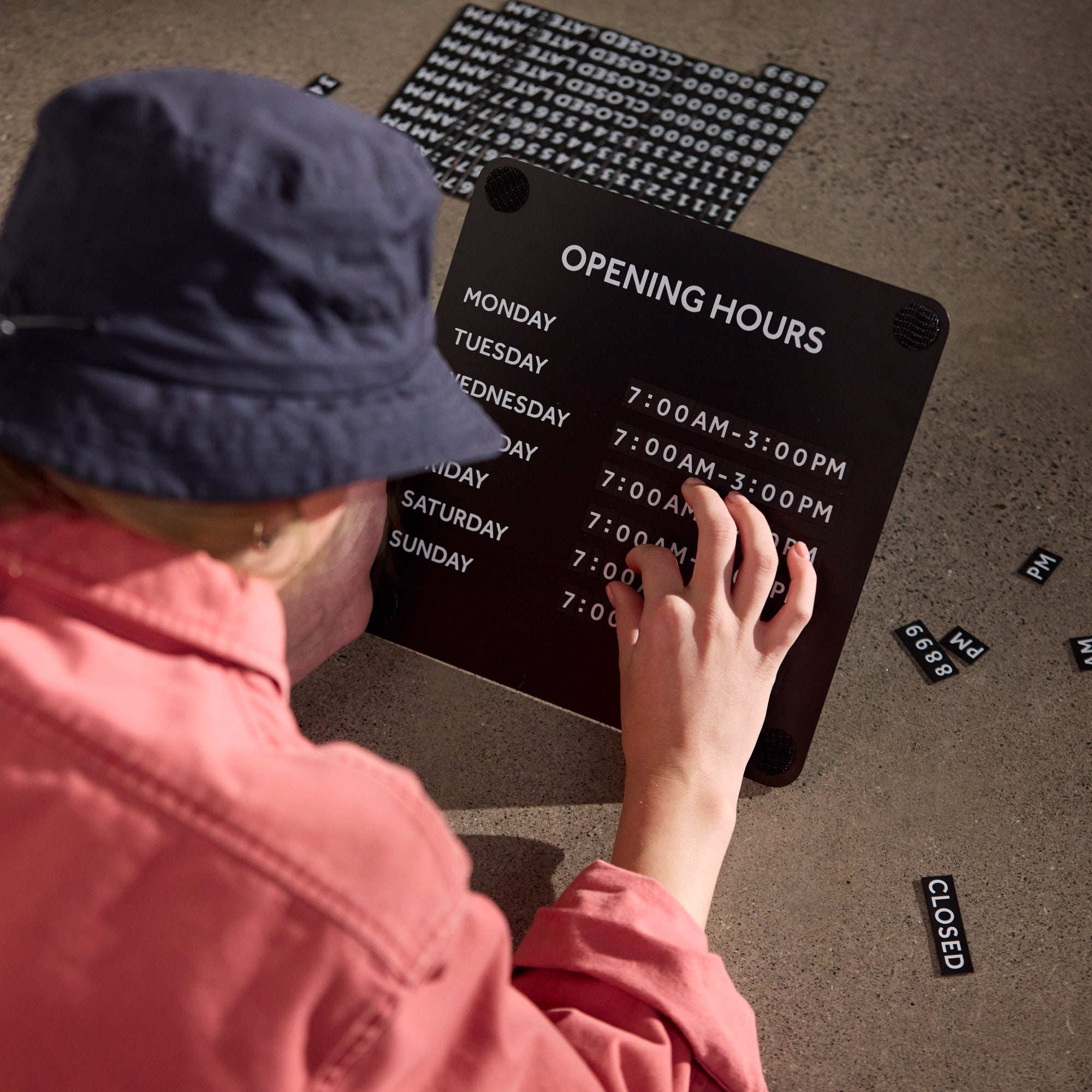
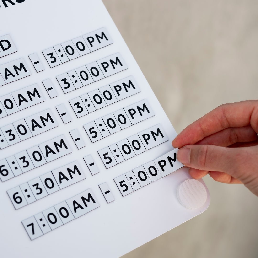
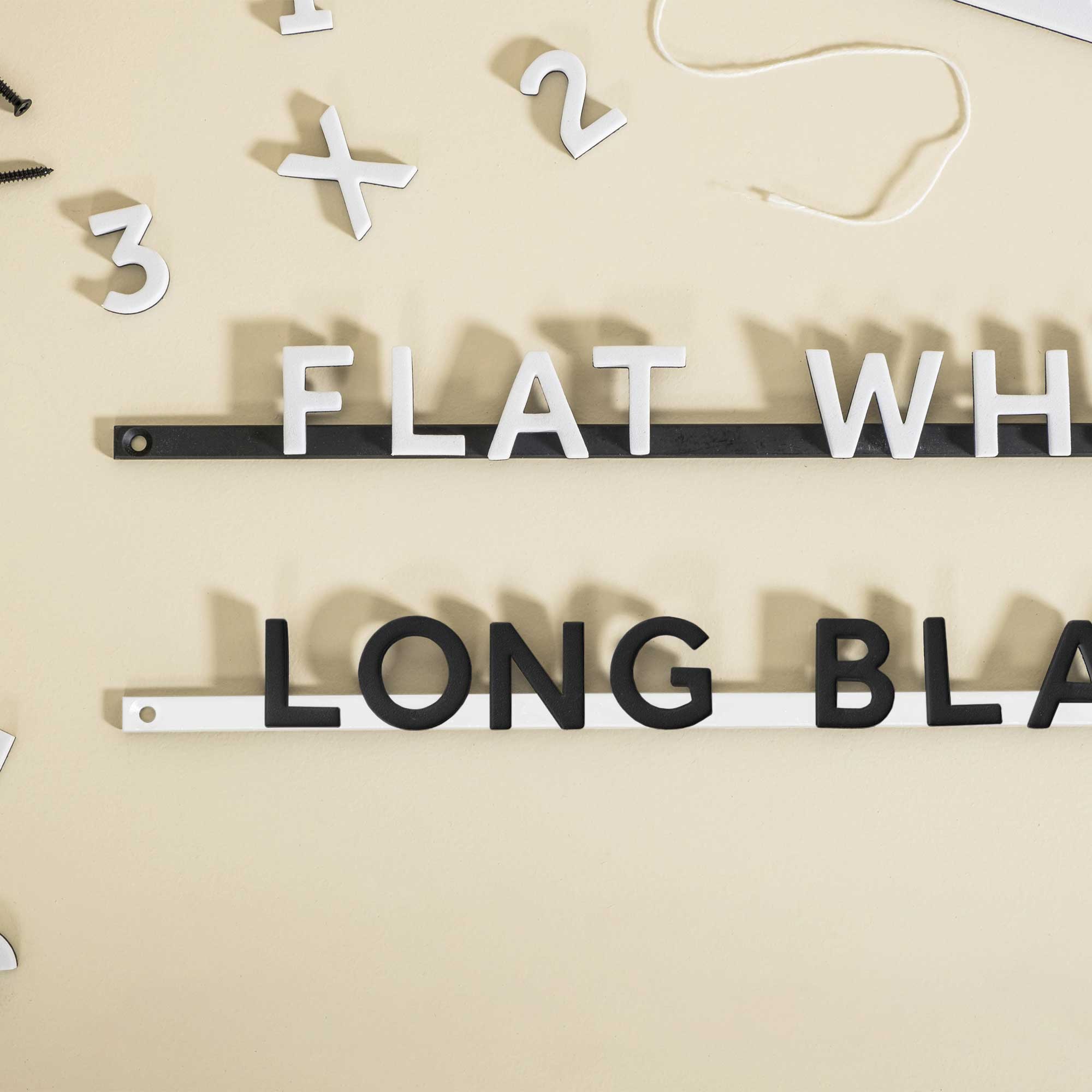
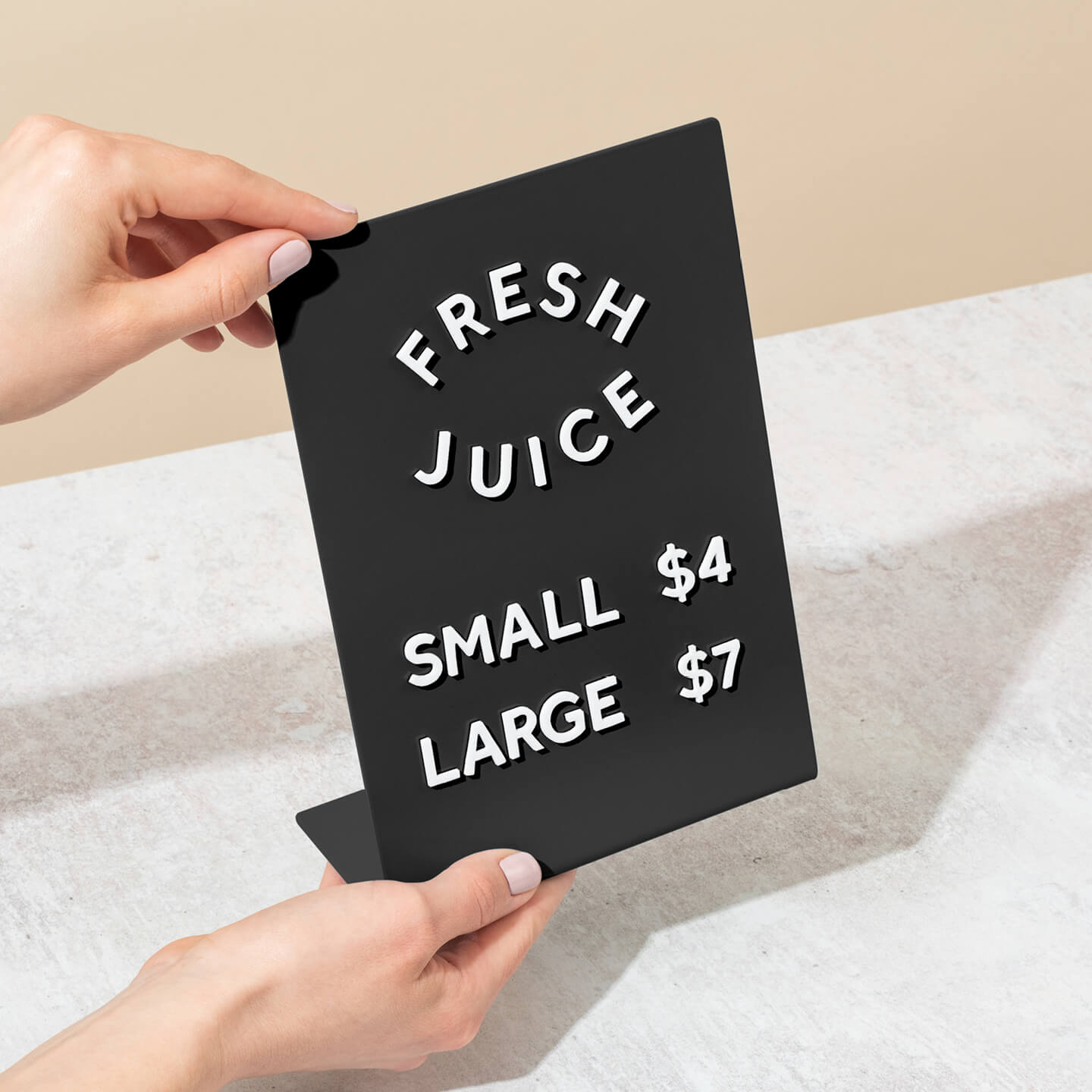
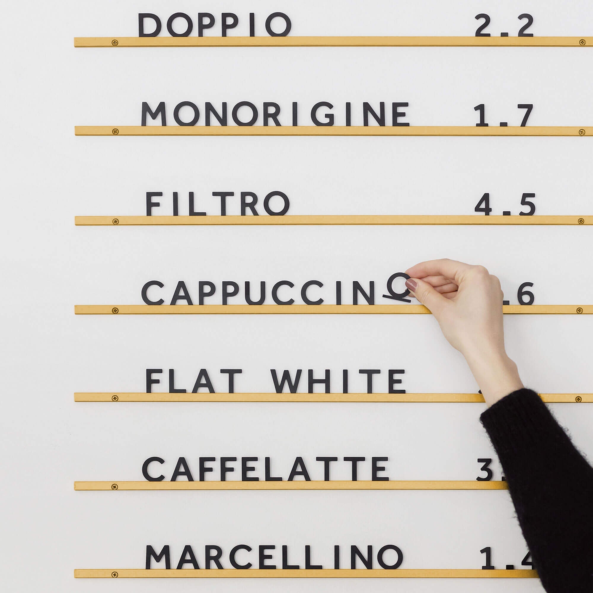
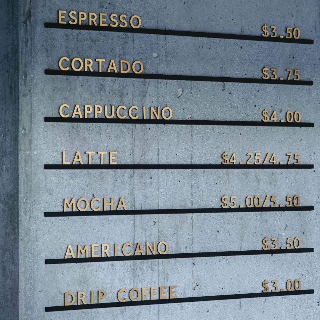
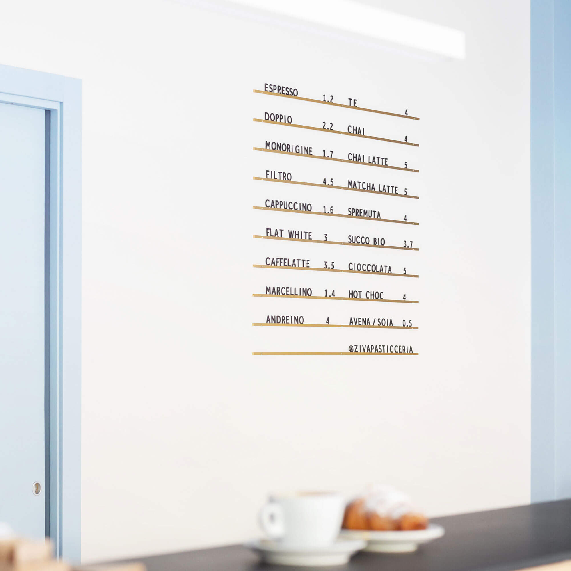
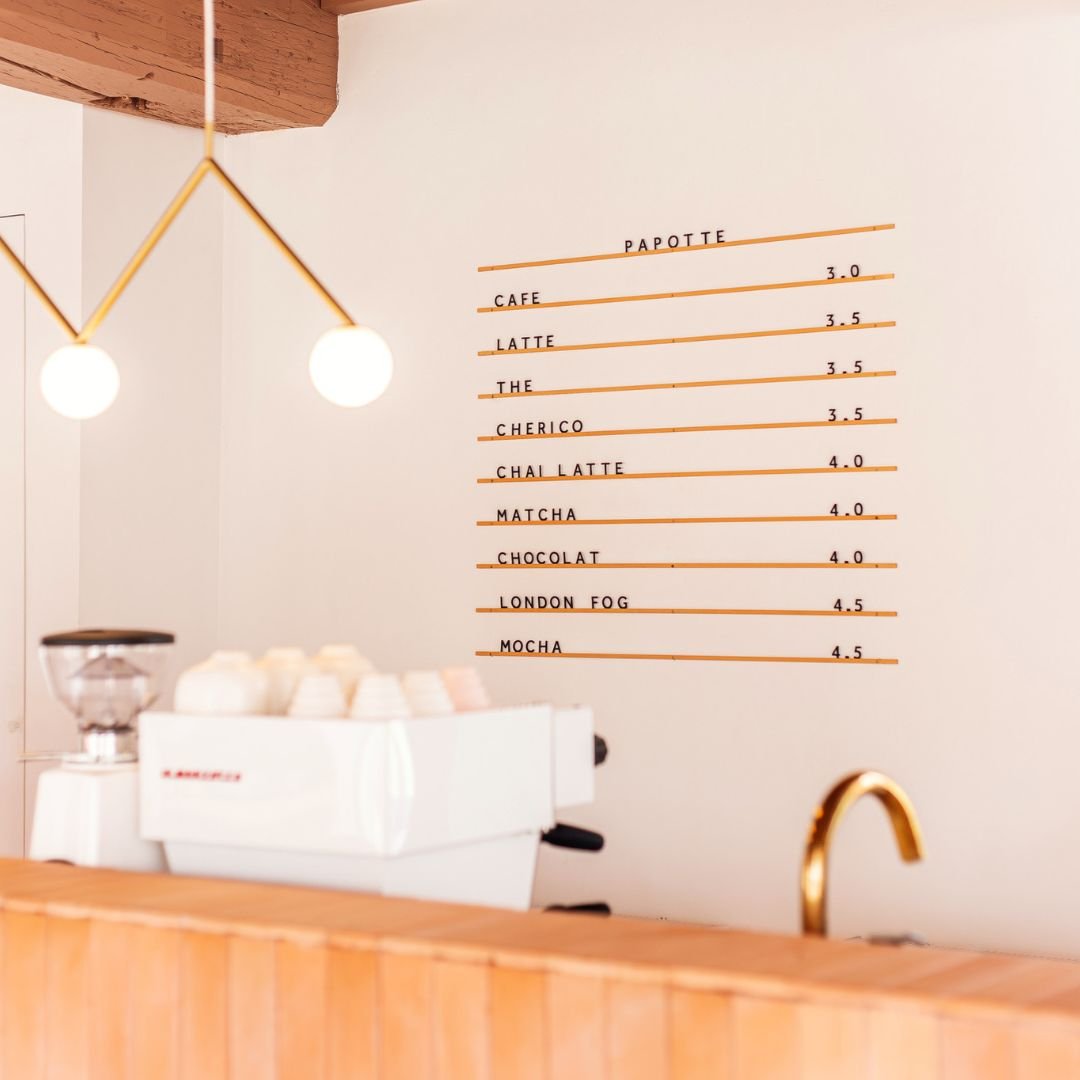
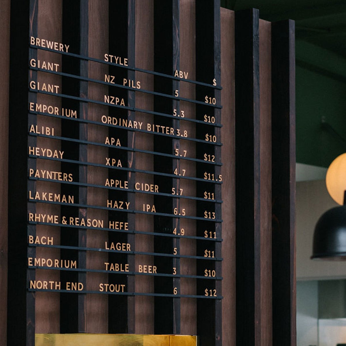
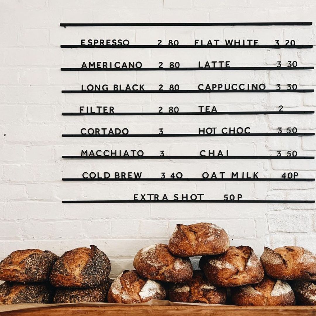
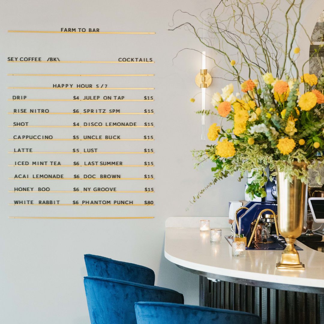
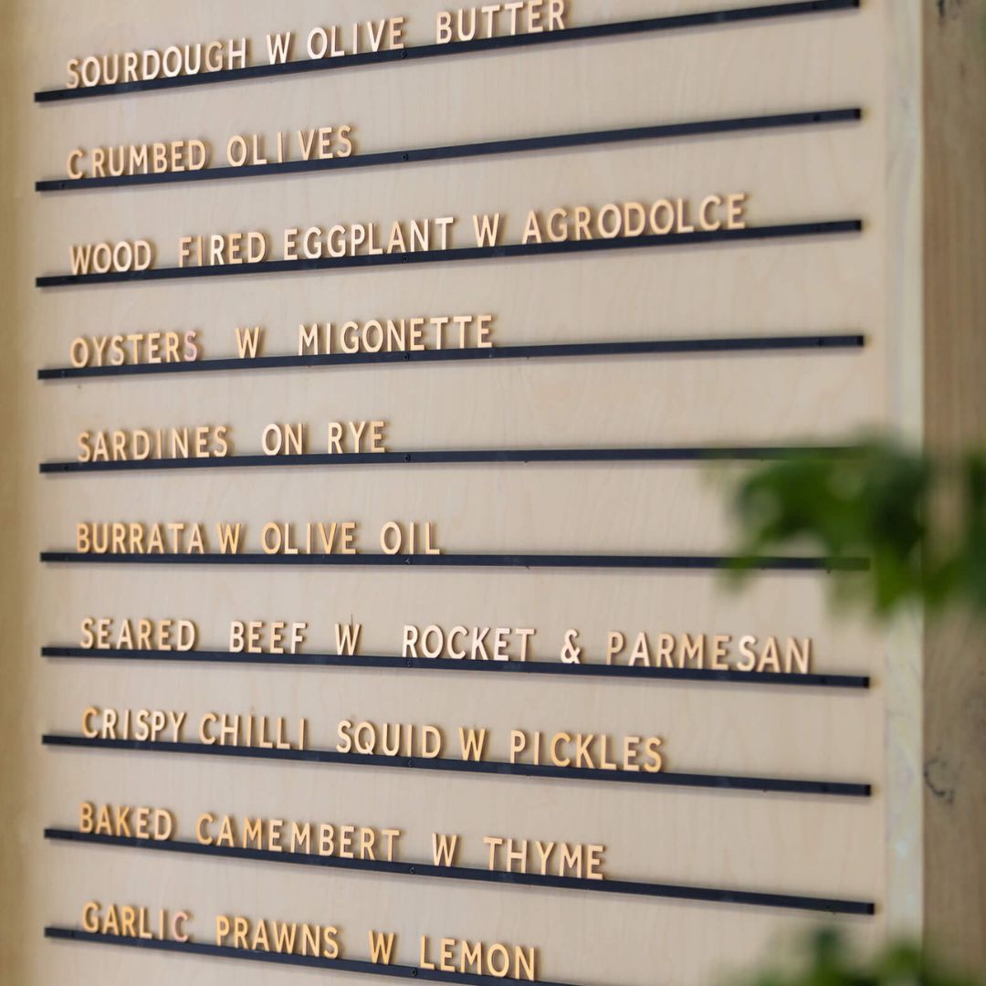
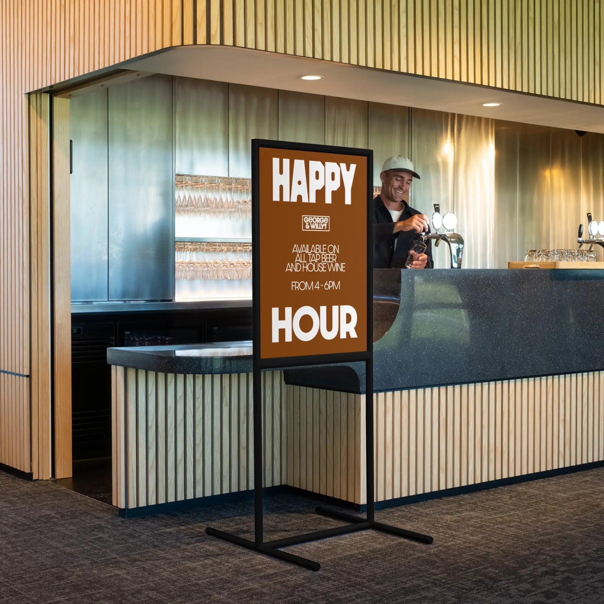
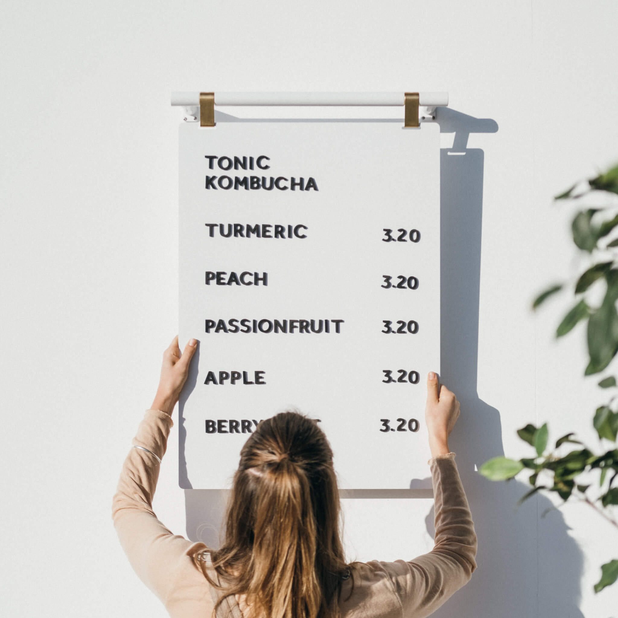
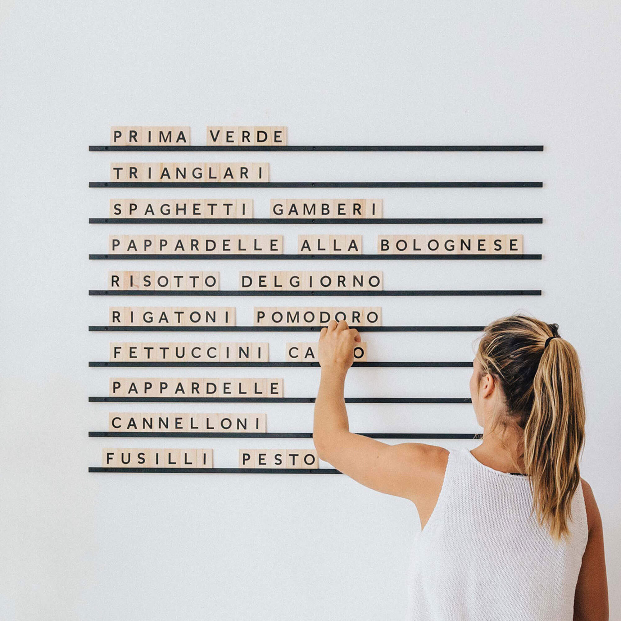
Menu Displays: Use easily changeable menu systems like magnetic or peg letter boards to update daily specials without hassle.
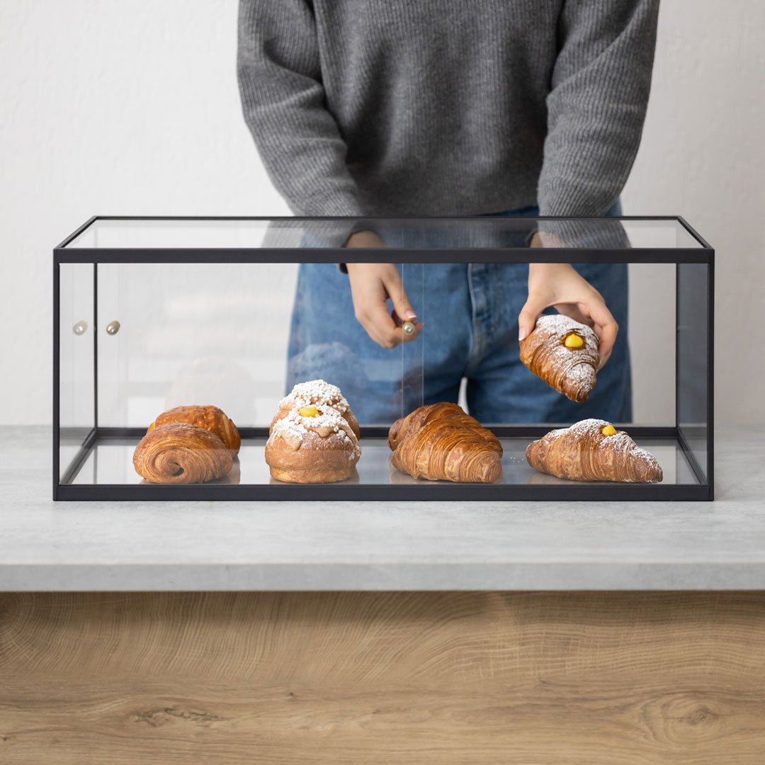
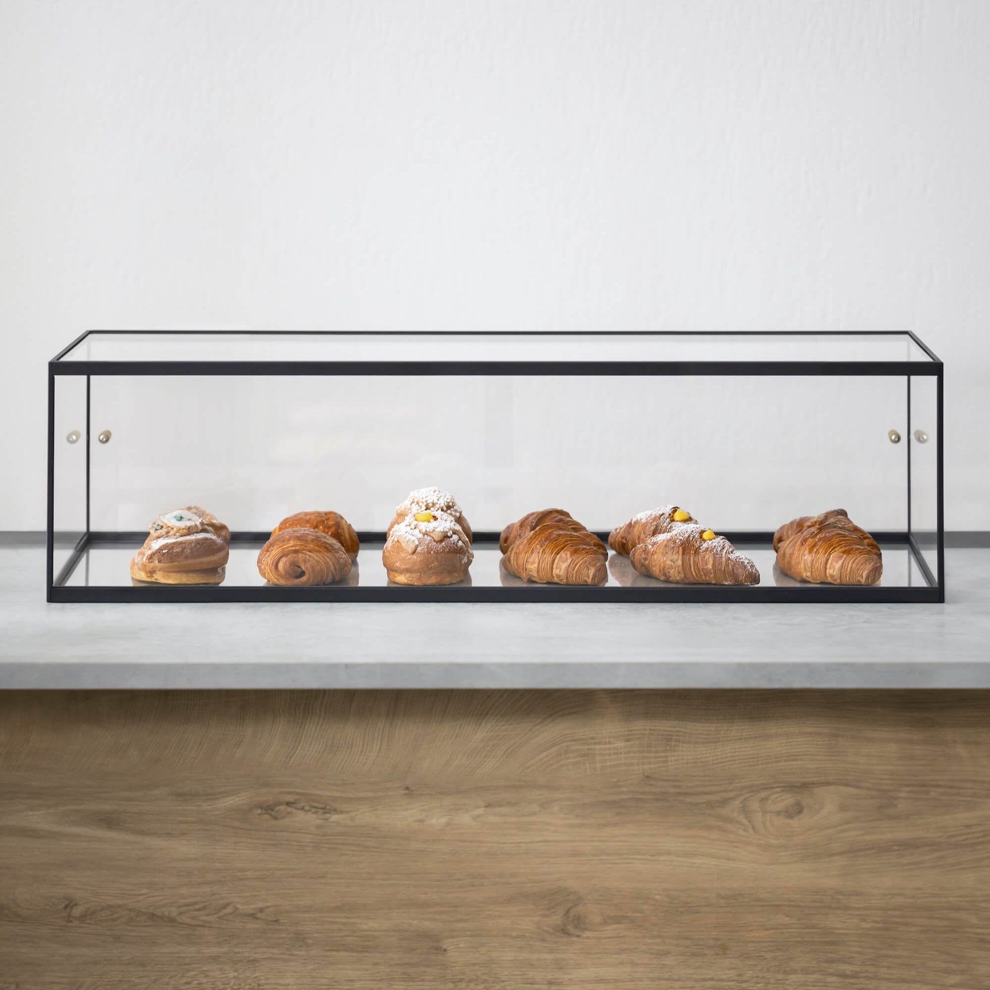
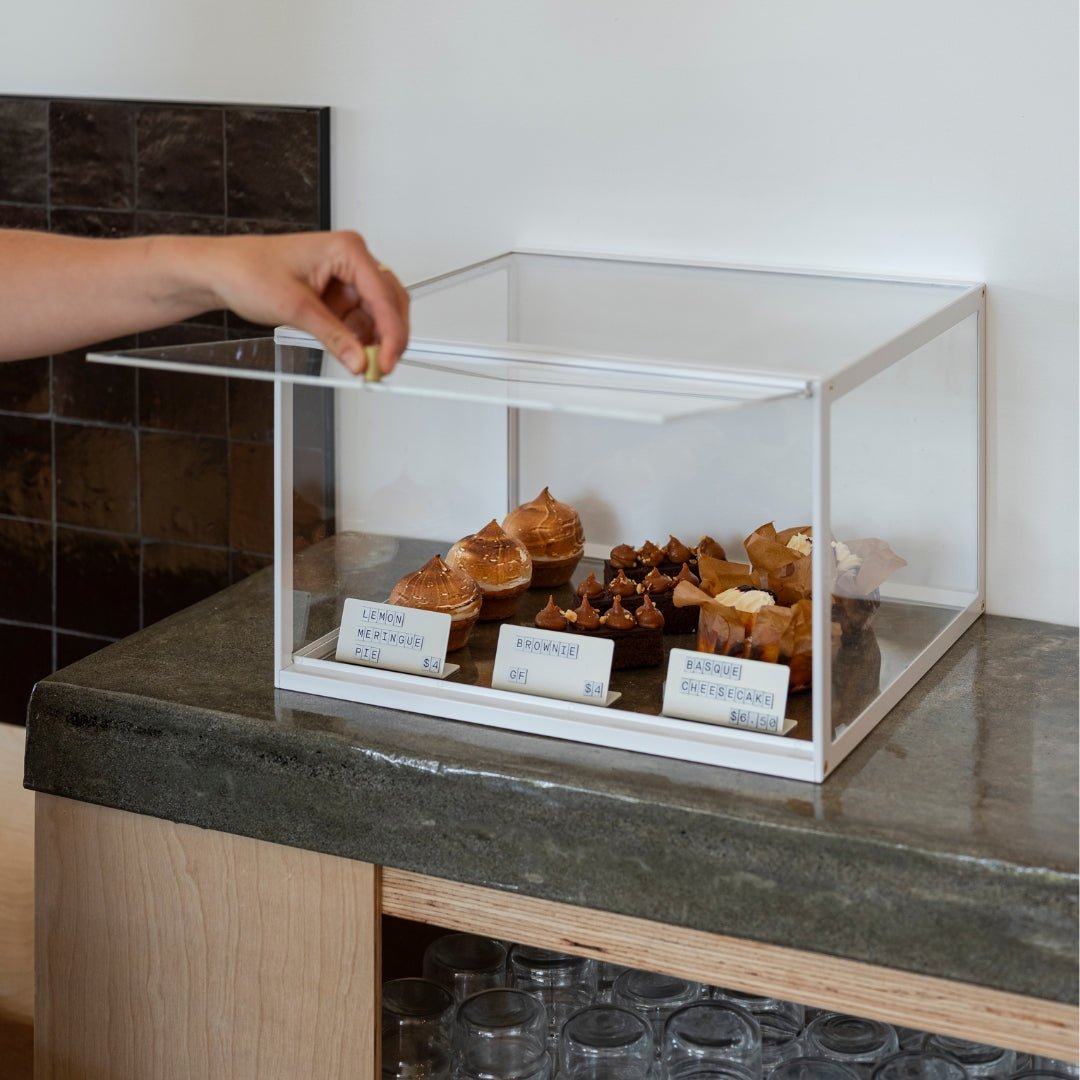
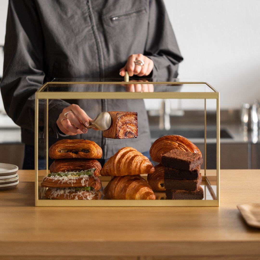
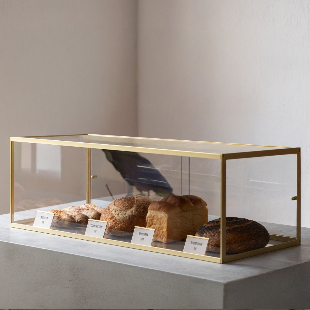
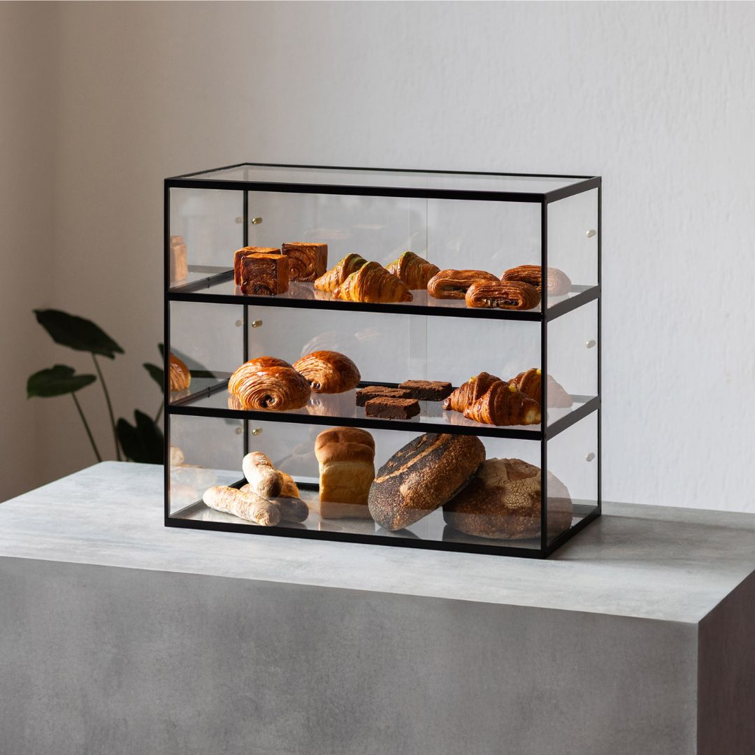
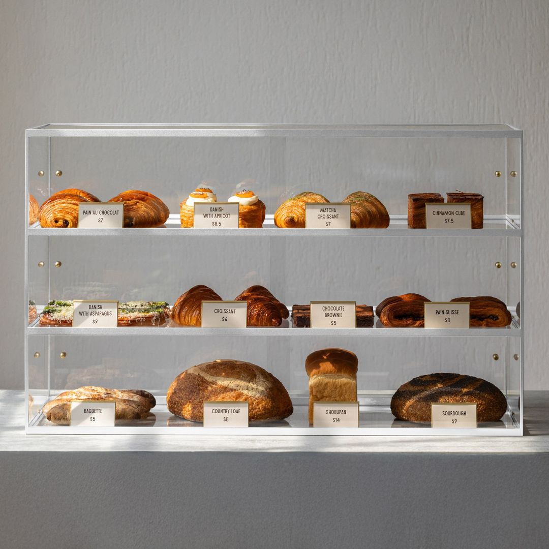
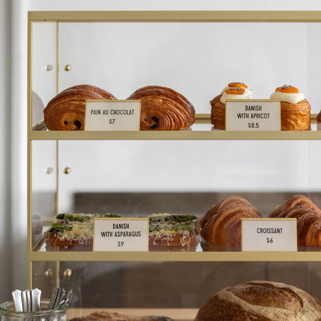
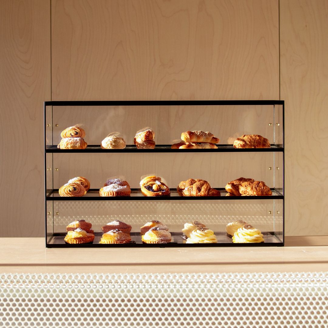
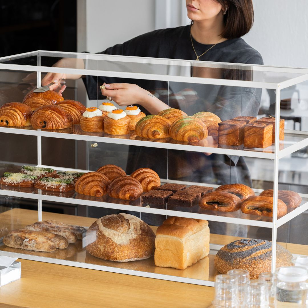
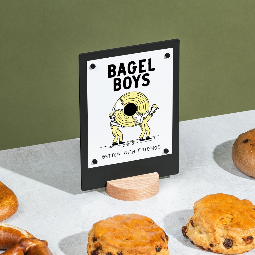
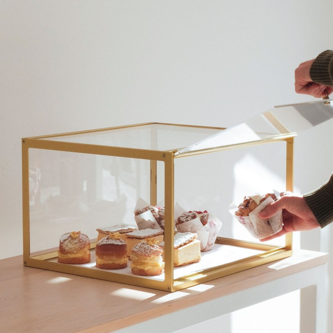
Countertop Appeal: A Bakery Display Case not only keeps goods fresh but also presents them beautifully. Use smaller Table Talkers to promote specials or share your Wi Fi password.
For Boutiques and Retail Stores
In retail, displays must tell your brand’s story and highlight product quality.
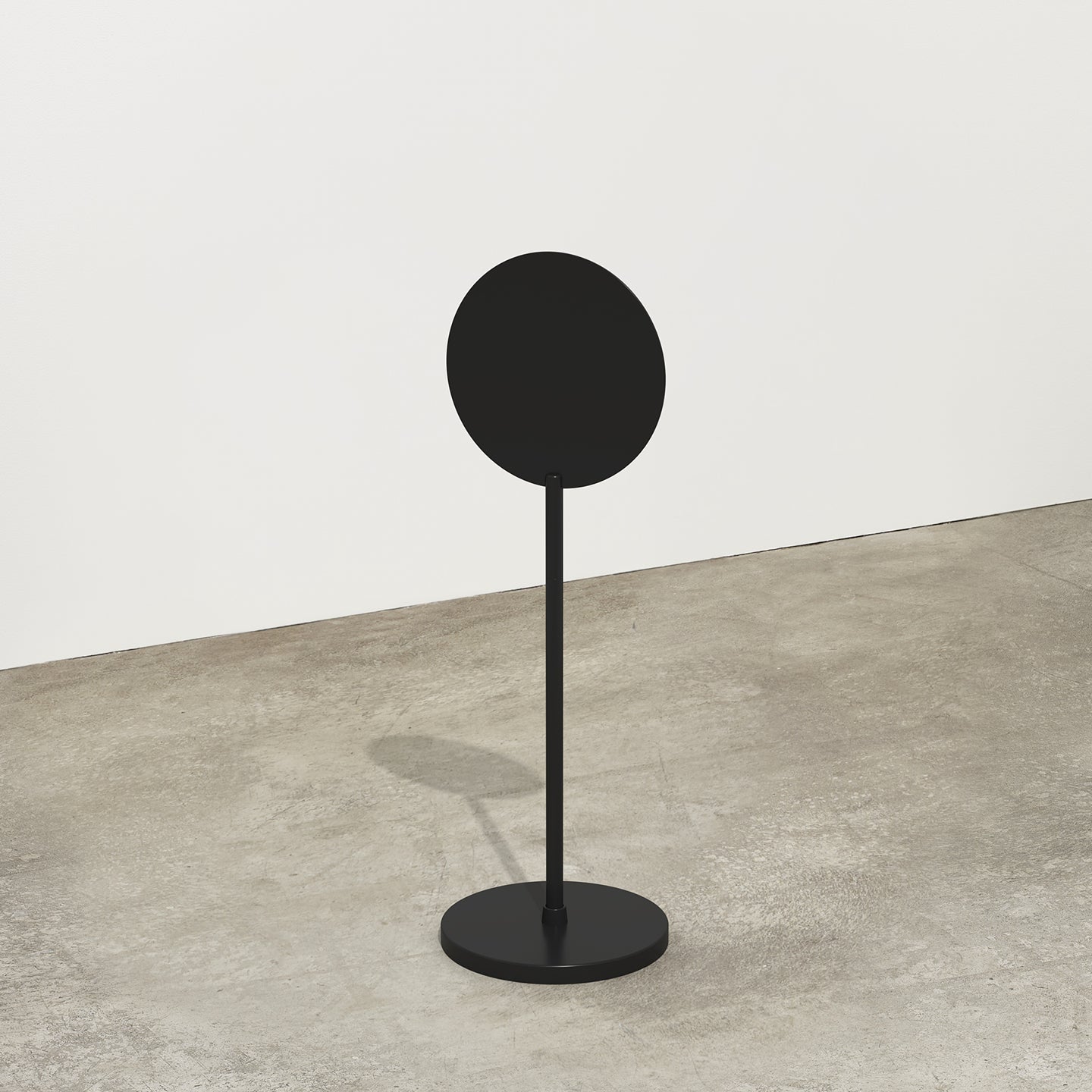
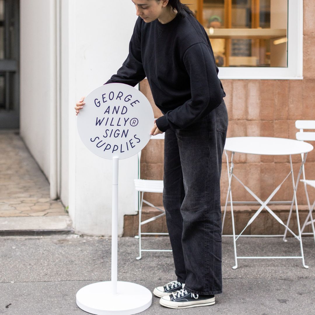
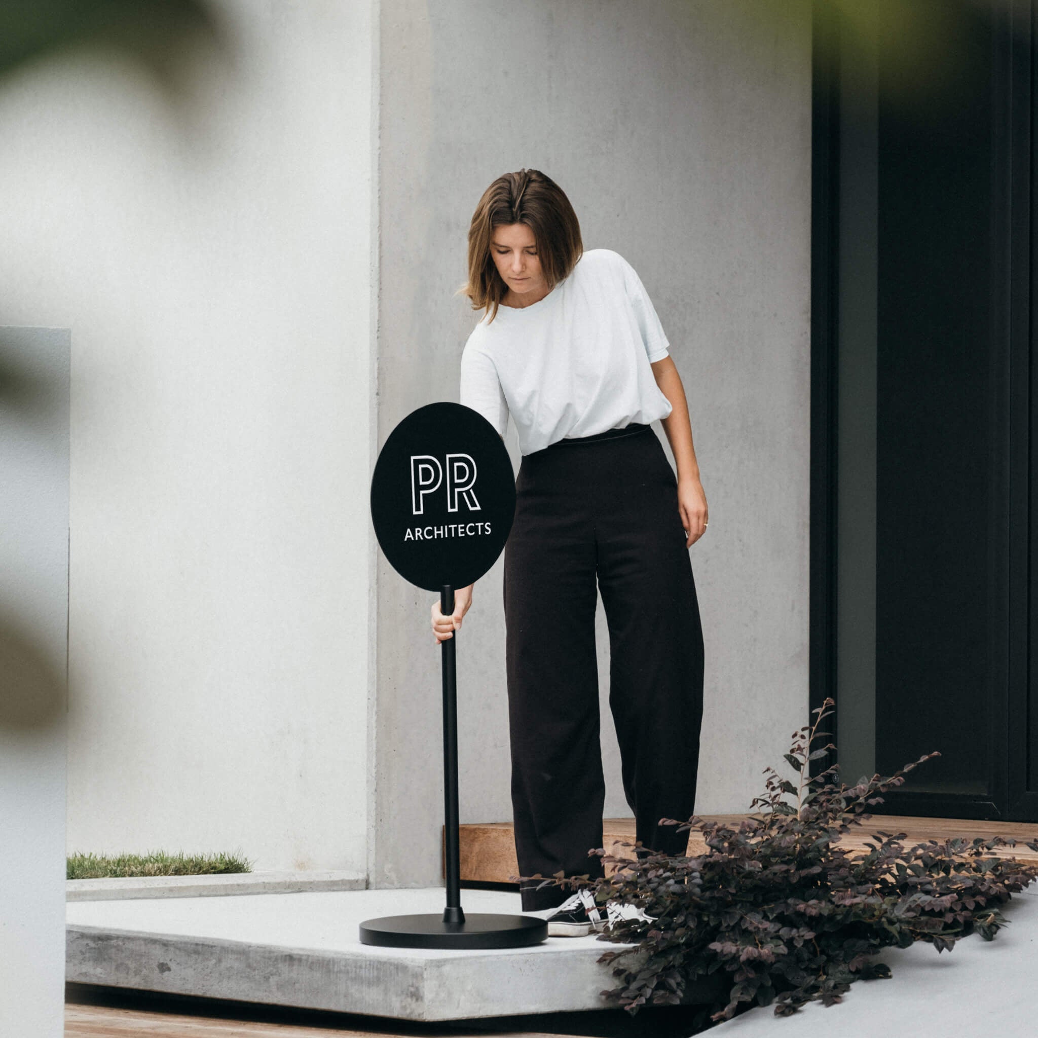
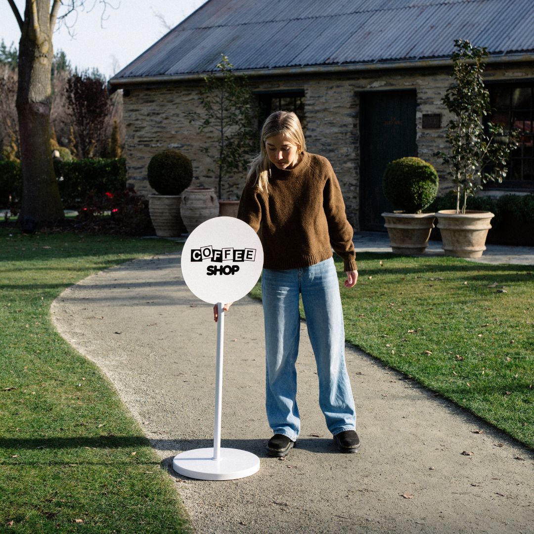
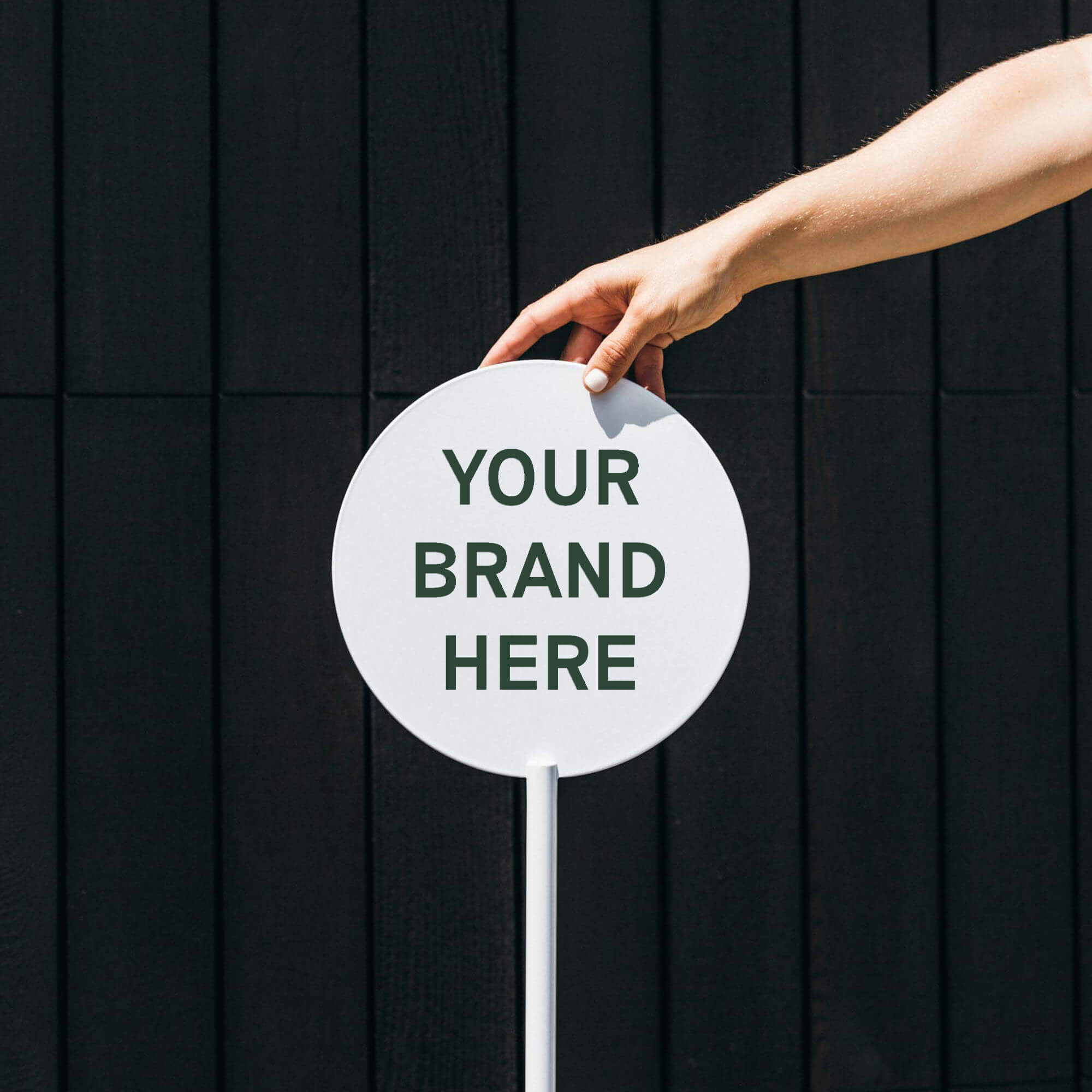
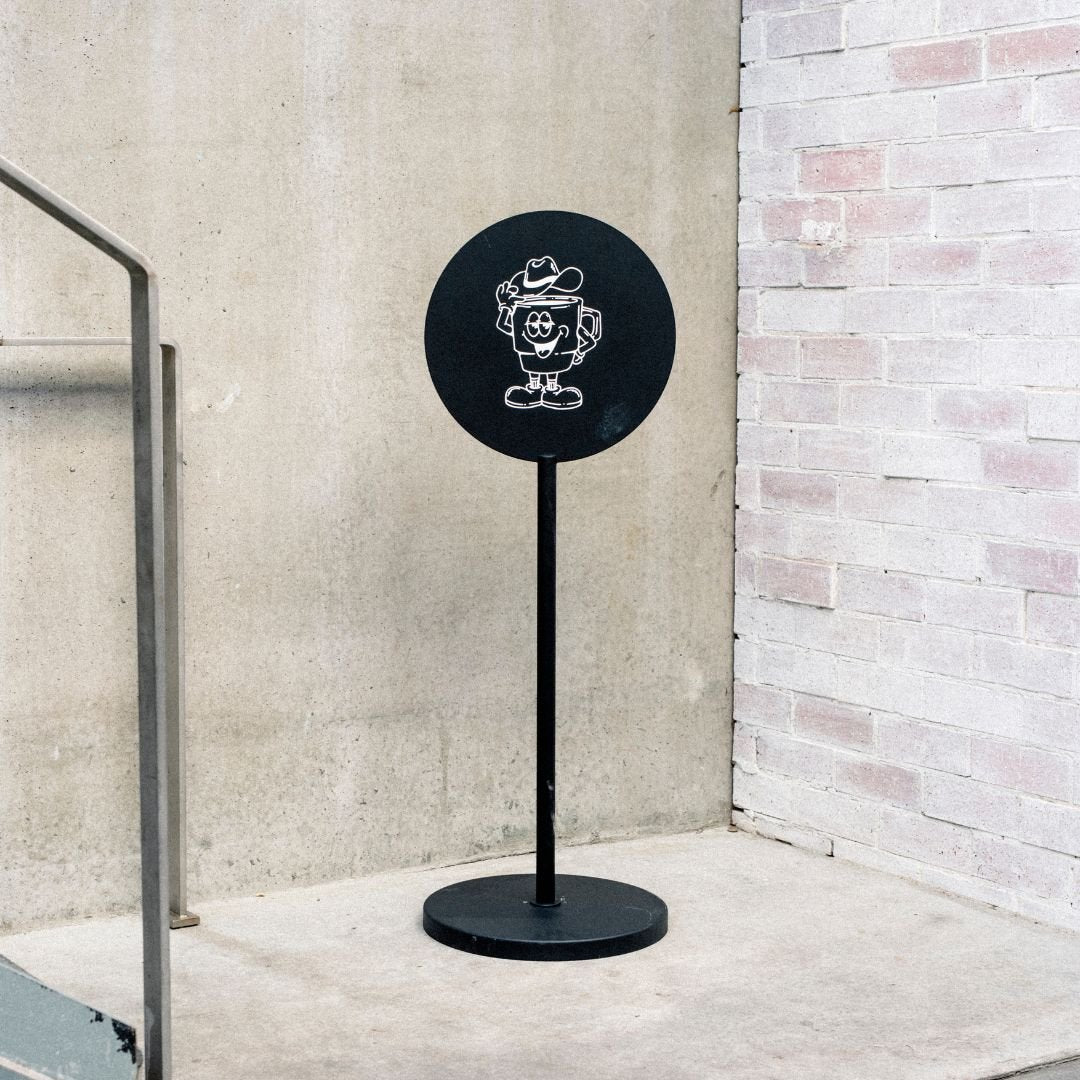
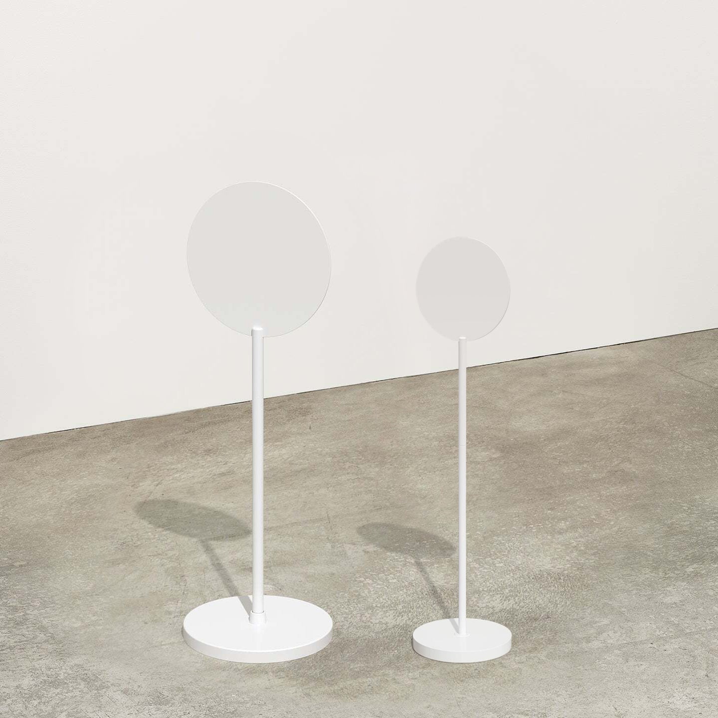
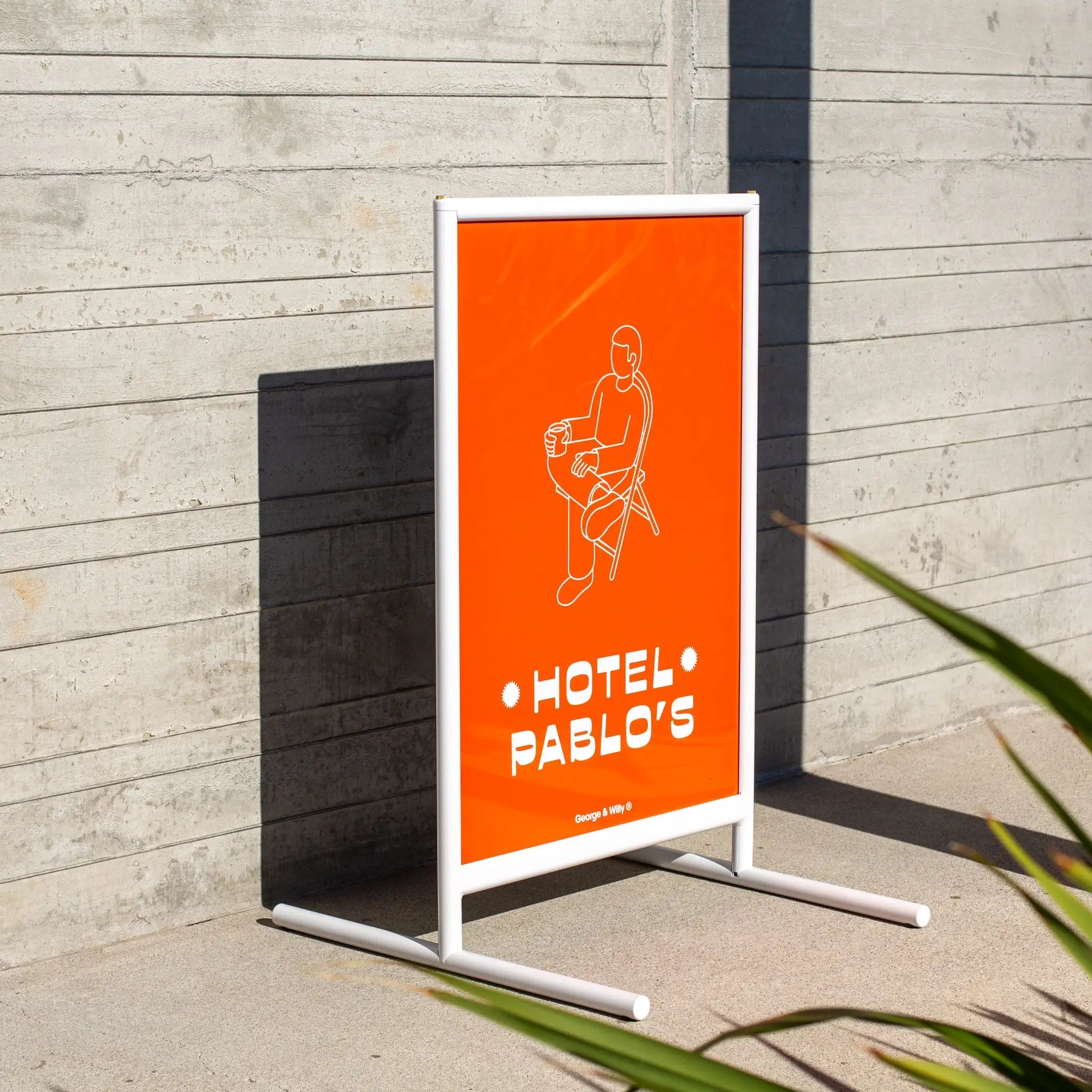
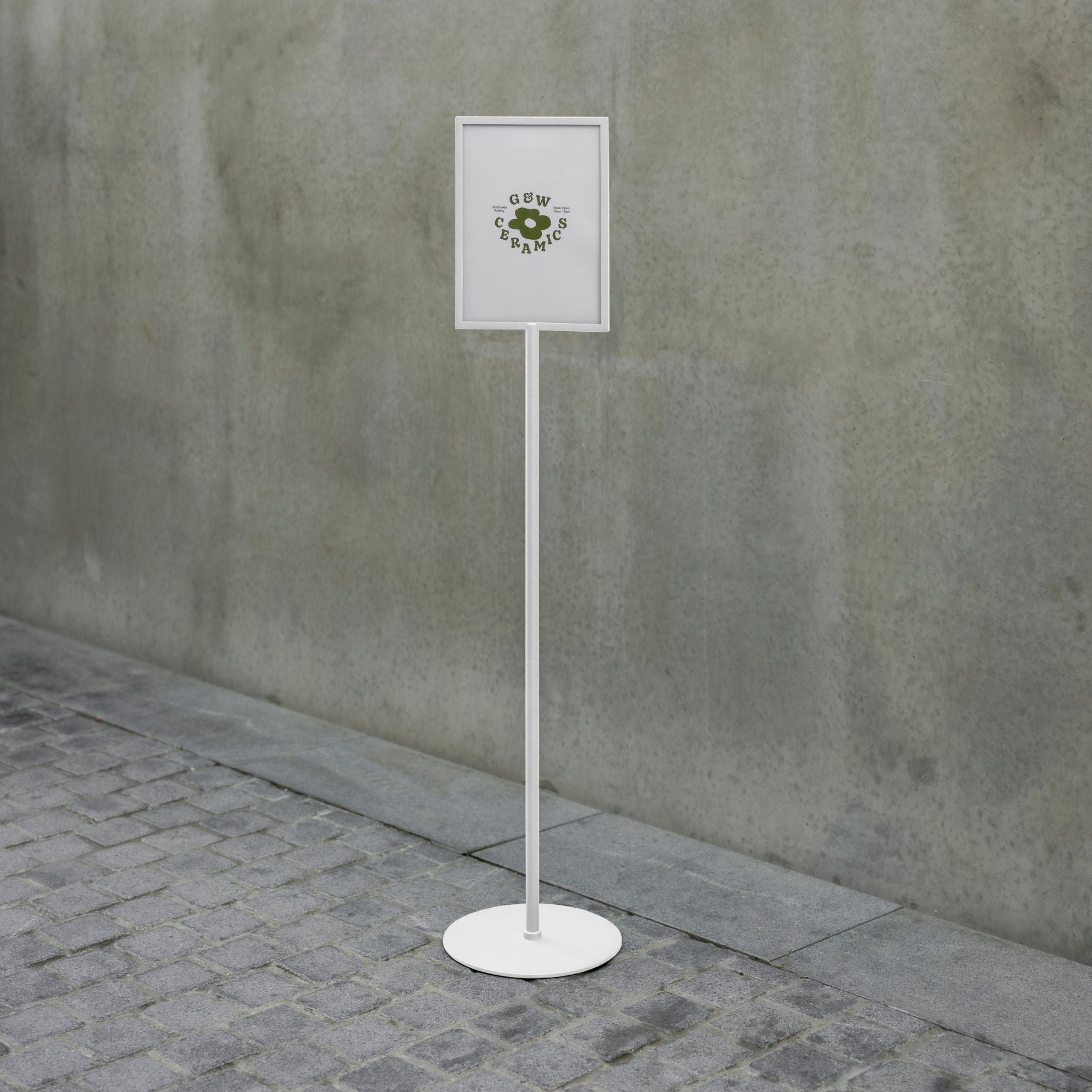
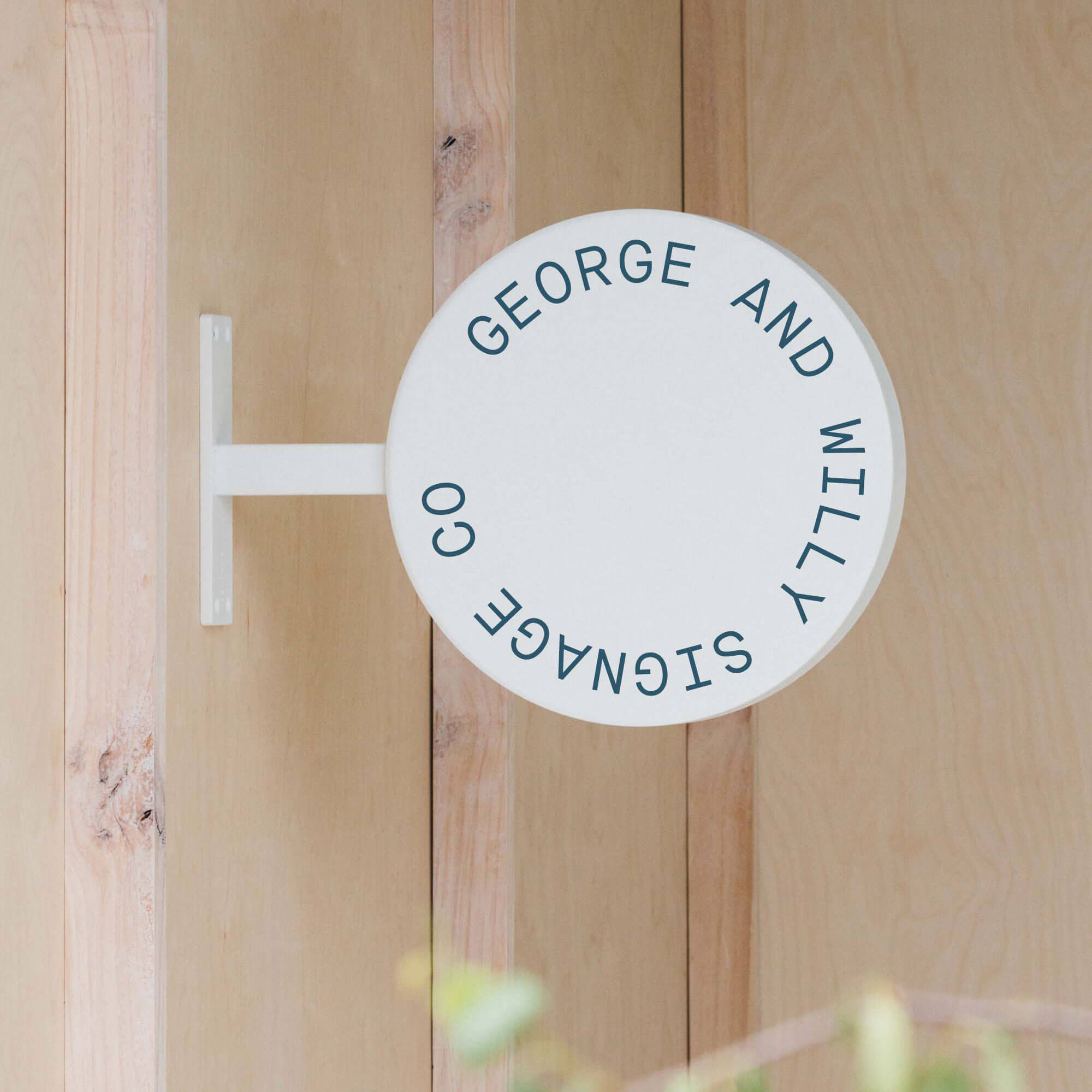
Window Displays: Your window is your billboard. Create a compelling scene that changes with the seasons to draw people in, and pair it with a Round Outdoor Shop Sign to boost visibility from the sidewalk.
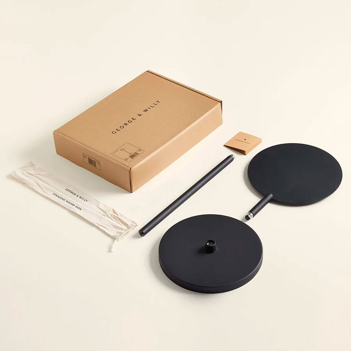
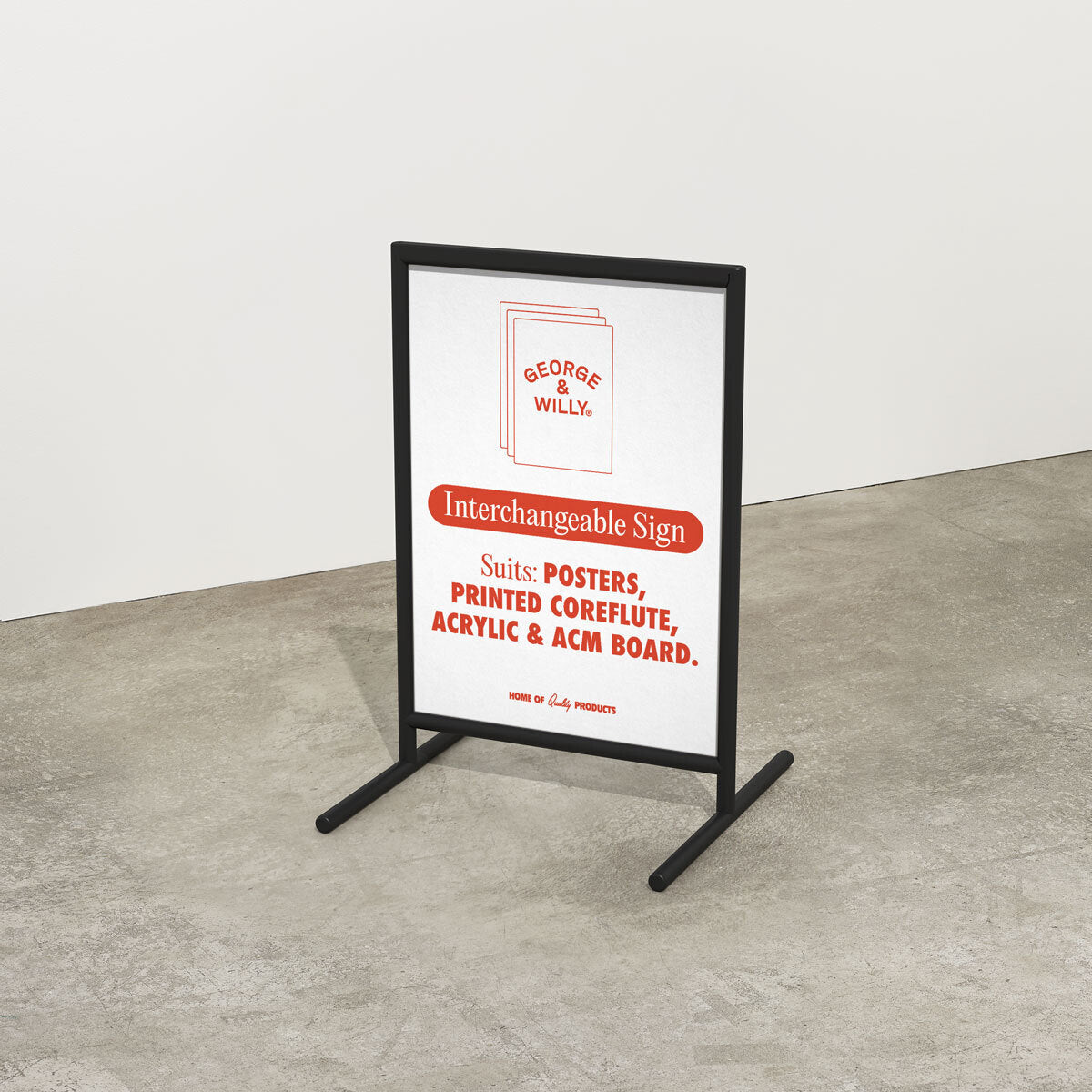
Cohesive Signage: Use a consistent family of signs, from a stylish A‑Frame Sign on the sidewalk to a Rectangle Blade Sign at the entrance, plus interior pricing signs, to create a polished and professional brand image.
For Wellness Studios and Salons
Create a calming and organized environment that reflects the services you offer.
Information Displays: Use a felt letter board or a Daily Roller to elegantly display class schedules, promotions, or inspirational quotes.
Retail Shelving: Display wellness products on clean, minimalist shelving to encourage add on sales after a service.
Measure and Optimize Your Displays
Creating beautiful displays is only half the battle; you also need to know if they are working. Tracking performance is essential for refining your strategy and maximizing your return on investment.
Start by setting clear goals for each display. Are you trying to increase sales of a specific product, drive traffic to a certain department, or promote a seasonal collection?
Here are a few ways to measure success:
Sales Data: This is the most direct metric. Track sales of featured products before, during, and after a display is up.
Foot Traffic: Observe how customers interact with your displays. Are they stopping to look? Are they picking up the products?
Customer Feedback: Don’t be afraid to ask customers what they think. Their insights can be invaluable.
A/B Testing: Try two different retail display ideas in similar locations and see which one performs better. Even small changes in product placement or signage can have a big impact.
By regularly analyzing what works and what doesn’t, you can continuously improve your visual merchandising and create a more effective shopping experience.
Conclusion: Design for Connection, Not Just Conversion
Ultimately, the most successful retail display ideas are about more than just moving merchandise. They are about creating a connection with your customer. They communicate your brand’s values, create a welcoming atmosphere, and make shopping an enjoyable, inspiring experience. By focusing on storytelling, understanding shopper psychology, and using high quality, design forward fixtures, you can transform your physical space into your most powerful marketing tool. Well designed displays show customers you care about the details, building trust and turning casual shoppers into lasting fans.
Ready to elevate your space? Explore the collection of timeless signage and display solutions at George & Willy.
Frequently Asked Questions
What makes a retail display effective?
An effective retail display grabs attention, tells a clear story, and makes the product desirable. It uses a combination of a strong focal point, good lighting, clear branding, and an uncluttered layout to guide the customer and encourage a purchase.
How can I create good retail display ideas on a budget?
You don’t need a huge budget for great retail display ideas. Focus on creativity. Use affordable props that fit your theme, create your own signage, and focus on one powerful focal point rather than filling an entire space. Keeping displays clean, simple, and well lit costs very little but has a huge impact.
How often should I change my retail displays?
It depends on your business, but a good rule of thumb is to refresh your main displays every 4 to 6 weeks. High traffic areas like window displays or entryway tables should be updated more frequently, perhaps monthly or to align with specific seasons, holidays, or new product launches.
What are some key retail display ideas for small items?
For small items like jewelry or accessories, use risers and trays to create different height levels and prevent clutter. Group items by color or style to create a cohesive look. Good lighting is critical to make small details stand out. A clean, minimalist display case or countertop sign can also add a premium feel.
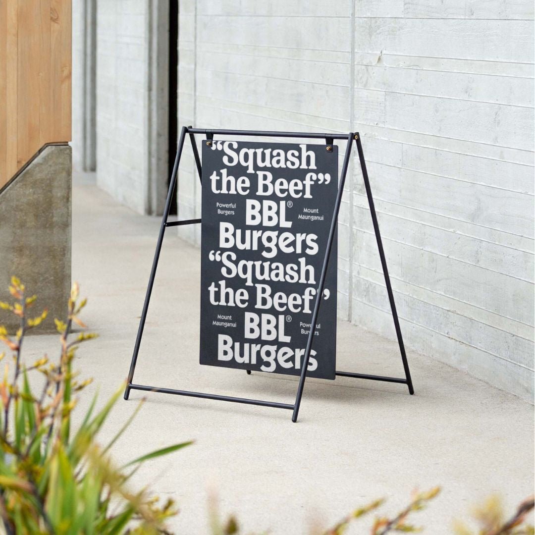
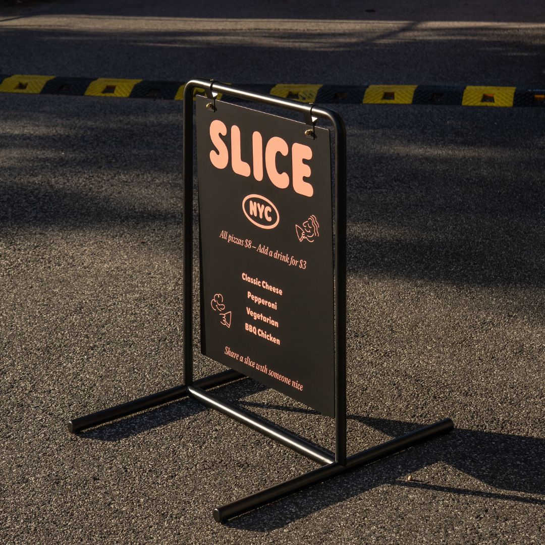
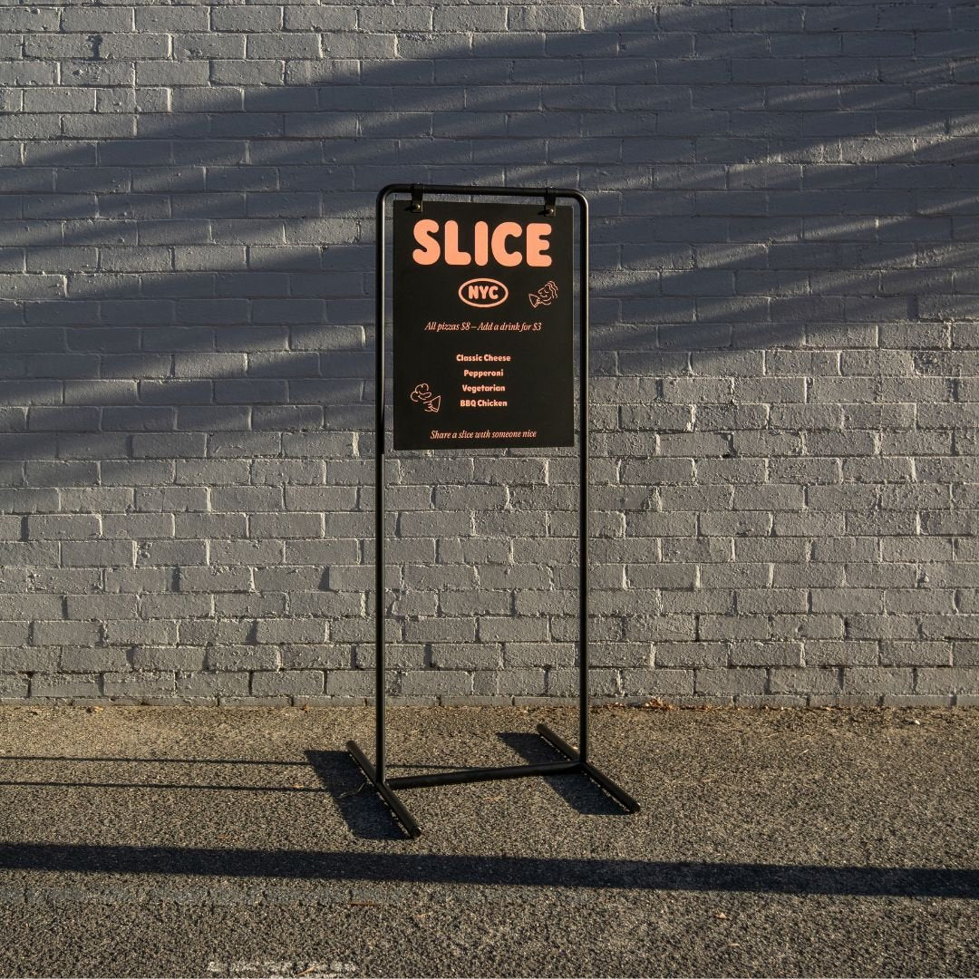
Why is an A Frame sign a good retail display idea?
An A Frame or sidewalk sign is one of the most effective retail display ideas because it captures customer attention before they even enter your store. It extends your brand presence onto the street, announces promotions or new arrivals, and can directly increase foot traffic by giving pedestrians a compelling reason to step inside.